by Frank | Nov 30, 2010 | illustration
…or, my job is the best in the world.
Last winter I created dinosaur illustrations for Cardiff’s National Museum of Wales. They helped tell the tale of Albie, a nervous Apatosaurus, and his adventures through the noisy Jurassic jungle. This tale in turn helped illustrate to young children the noises we believe dinosaurs made.
Last month, the Museum got in touch again. They wanted some quick, simple line-art dinosaur masks that, after visiting the Museum’s fantastic dinosaur displays, children could paint, crayon, stick lentils and pasta shapes to and generally do all the messy things little nippers like to do when Making Something.
I got books out from the library, looked up images on line and penciled out the drawings for approval. To retain some of the skull shape of the dinos, I put the eye-holes where the nostrils are on most of the masks. After approval I inked them with brush and indian ink.
I can’t believe I get paid to do this stuff.


by Frank | Nov 16, 2010 | doodles, illustration
Well, so I’m waiting for someone to send me a logo so I can finish of a layout they’ve asked me to do, and instead of frittering my time away looking at cowboy boots on ebay I thought I’d do constructive, ie., show y’all a purty picture.
The lovely Noreen of be amazing today commissioned me to create an illustration for her: something she could use on her website, newsletters and other publications. She gave me a very loose brief, and basically told me to use my instinct. I both love it and hate it when clients say that – it’s wonderful when people place such faith in you, but it makes things quite pressurised! Anyhow, I started doodling in graphite pencil, brought the doodle into Photoshop and added colour and more texture, as well as her logo. I then sent Noreen the result. She loved it – phew! Here it is:

by Frank | Nov 15, 2010 | branding, CIO Connect, graphic design, illustration
Hello, this one’s a bit late too. I’m catching up, see. Being organised and that.
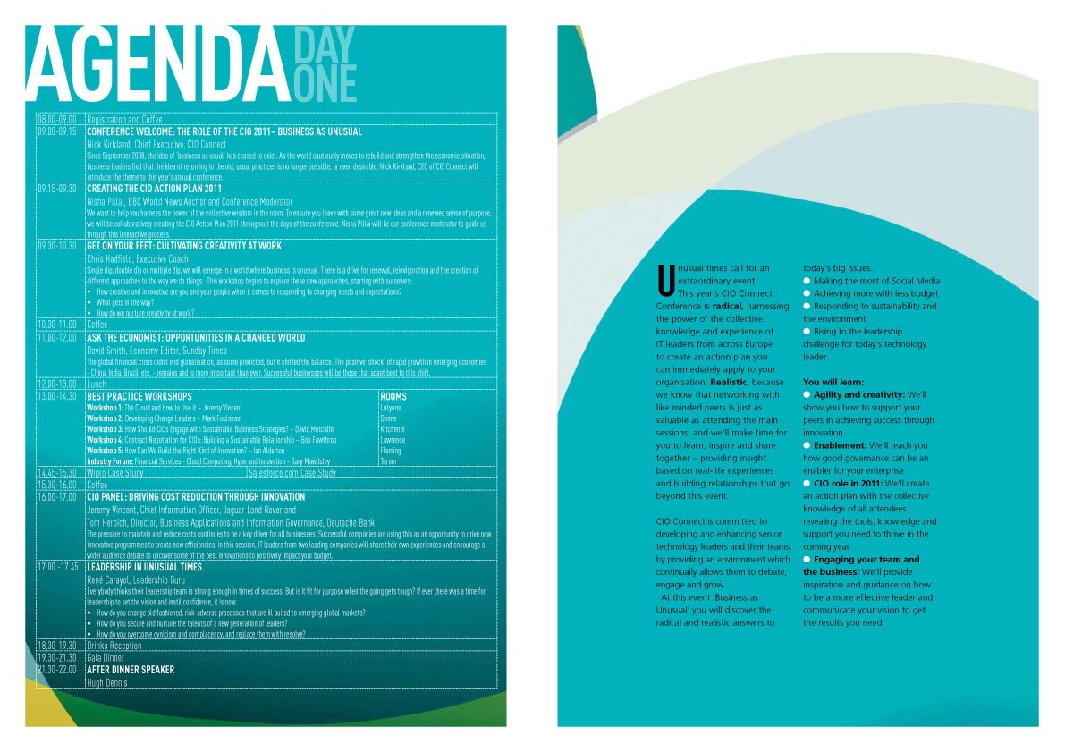
CIO Connect asked me to create a brand for their annual conference, held in October. The title was “Business as Unusual”. I was to create a logo-illustration for the event, and supply designs for tickets, a microsite, brochures, newsletters, an invite for a PA party and all the surrounding bits and bobs to go with it.
The first thing I did was come up with some concepts for the logo-illustration. One was approved – a cube morphing into the CIO Connect marble, which I’d designed some time before.
After this, I could come up with the brochure design, which was created with in-house printing in mind (hence the 10mm border around everything):


I also designed an invite to go out to PAs of the CIOs invited to the conference, requesting their attendance at a party thrown for them. CIO wanted something elegant and a little more feminine, although not overly so (not all PAs are women and not all women appreciate girly designs). I came up with a design using Japanese cherry blossom and the CIO Connect green. It folds up, so that when placed on a desk with the green front towards you, the white back faces away and advertises the event to the PA’s CIO boss. Clever, see?

And the other significant thing I designed was the CIO Connect Conference microsite. I supplied a photoshop document and then a CSS wizard created the live site, which can still be found here at the moment. Here’s my original design:

by Frank | Oct 17, 2010 | graphic design, illustration
Peter Taylor, a scientific analyst from ethos UK, was commissioned by the Lifeworks Foundation to write a report about international aid. He found, among other things, that only 5% of world development aid addresses the grass-roots need for a healthy and ecologically-sound environment. Most of the money is directed at economic problems – moving people off the land, industrialising production and globalising markets. He asks whether a monetary index is an appropriate way of measuring poverty, and whether economic aid will exacerbate ecological problems. He speculates over political reasons behind aid decisions and alternative, more sustainable, ways of spending that money.
Lifeworks were so impressed with the report that they commissioned Peter to turn it into a book, and he asked me if I would typeset it, redraw all the graphs and graphics and illustrate the cover. I was glad to. Below is the result.


by Frank | Jul 21, 2010 | graphic design, illustration
I received a phone call on Saturday from Sara – a friend of a friend. “I hear you’re a brilliant graphic designer?” she said. “Um, I think so,” I think I replied. She had been let down and needed someone to design some large (6ft x 2.5ft) billboards for a local park. They were to stand next to two beautiful Cedars of Lebanon – old, much-loved but ailing trees which are in danger of dropping their substantial branches on passing school-children and picnic-eaters.
The billboards present tomograms to the public – sound-wave generated images which show how rotten the trees are. The public are asked to contribute their ideas about what should happen to the trees.
I brush-and-inked the tree illustration and transferred it to Illustrator, where I added the copy, the Ealing Council and Heritage Lottery Fund logos, and the tomogram images. I did most of the work yesterday until late last night, making final amends today. All gone off to print now – and they should be up under the trees on Saturday. Phew!
I’ve got another project for Sara and Ealing in the pipeline which I’ll probably be able to post up tomorrow.

by Frank | Jul 19, 2010 | illustration
Hello, crazy-busy today. Just a quick note to show you these little critters I drew for the National Museum in Cardiff. They’re brush and ink, and simple as they’re reproduced pretty small in some activity sheets I’ve designed for the Museum. Hope you like them!


