Hello, this one’s a bit late too. I’m catching up, see. Being organised and that.
CIO Connect asked me to create a brand for their annual conference, held in October. The title was “Business as Unusual”. I was to create a logo-illustration for the event, and supply designs for tickets, a microsite, brochures, newsletters, an invite for a PA party and all the surrounding bits and bobs to go with it.
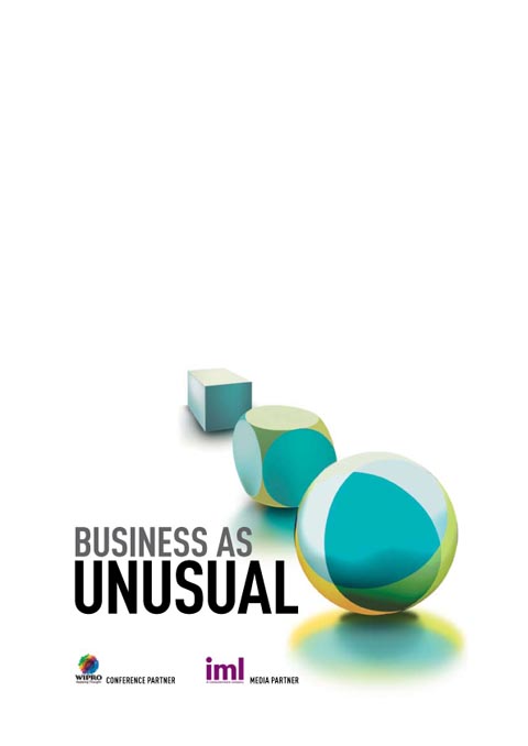
The first thing I did was come up with some concepts for the logo-illustration. One was approved – a cube morphing into the CIO Connect marble, which I’d designed some time before.
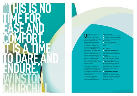
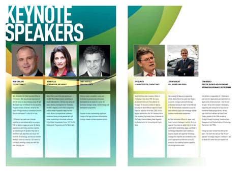
After this, I could come up with the brochure design, which was created with in-house printing in mind (hence the 10mm border around everything):
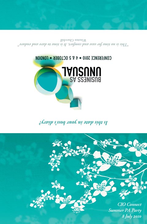
I also designed an invite to go out to PAs of the CIOs invited to the conference, requesting their attendance at a party thrown for them. CIO wanted something elegant and a little more feminine, although not overly so (not all PAs are women and not all women appreciate girly designs). I came up with a design using Japanese cherry blossom and the CIO Connect green. It folds up, so that when placed on a desk with the green front towards you, the white back faces away and advertises the event to the PA’s CIO boss. Clever, see?
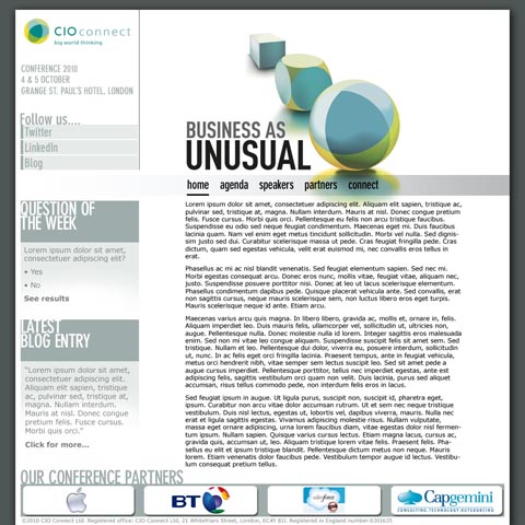
And the other significant thing I designed was the CIO Connect Conference microsite. I supplied a photoshop document and then a CSS wizard created the live site, which can still be found here at the moment. Here’s my original design:

