by Frank | May 23, 2017 | branding
 Nobody’s perfect and one of the things I am rubbish at is asking clients for feedback on the work I’ve done for them. I’ve only just got around to asking the amazing Sam Grady of The Cornish Vegan Pasty Company if she’d write me a testimonial for the logo design I did for her. Her response blew my mind so naturally I’m sharing it everywhere. So chuffed to have been asked to help out a fellow vegan business with their graphic design and even more chuffed that she should be so lovely about the process! She said:
“I feel extremely blessed to have found Frank! Frank took my rough idea, developed a handful of concepts (all of which would have actually been great) and worked with us to refine the logo, develop our product labels, and think about our brand. Ironically, when Frank first described one of the logo concepts I thought it would be my least favourite, but it’s now our logo! I love it and get so much positive feedback about it. Frank is extremely talented, the combination of graphic design & illustration means that Frank’s work can be corporate or creative or a combination.
“Choose Frank, trust Frank, and like me you’ll never need anyone else!”
Sam’s also bought one of my fox prints in support of the hunt ban and it’ll be on display at their new premises in St Agnes, which I’m over-the-moon about.
by Frank | Jun 22, 2015 | branding, graphic design, thoughts
Okay, so I wrote a whole 24-page thingumy about how to write graphic design briefs and you can download it here (all you have to do is subscribe to my monthly-ish newsletter in return) but what this post specifically addresses is ways to communicate your style likes and dislikes with a designer.
Design briefs in brief
A design brief is a document you create in order to tell your chosen designer(s) the specifics of what you need from them, how you need it, your target audience, your budget, etc etc.
The part of this I’ve really seen clients struggle with is the bit where you try and communicate the kind of style that you’d like them to use. Of course, by describing your target audience well, your designer will already have some styles in mind and could suggest a few. If you’d like to cut some time out of the conceptual part of the design (and therefore potentially save yourself some money), the more specific you are about what you’re looking for the easier it’ll be for everyone.
I know what I want
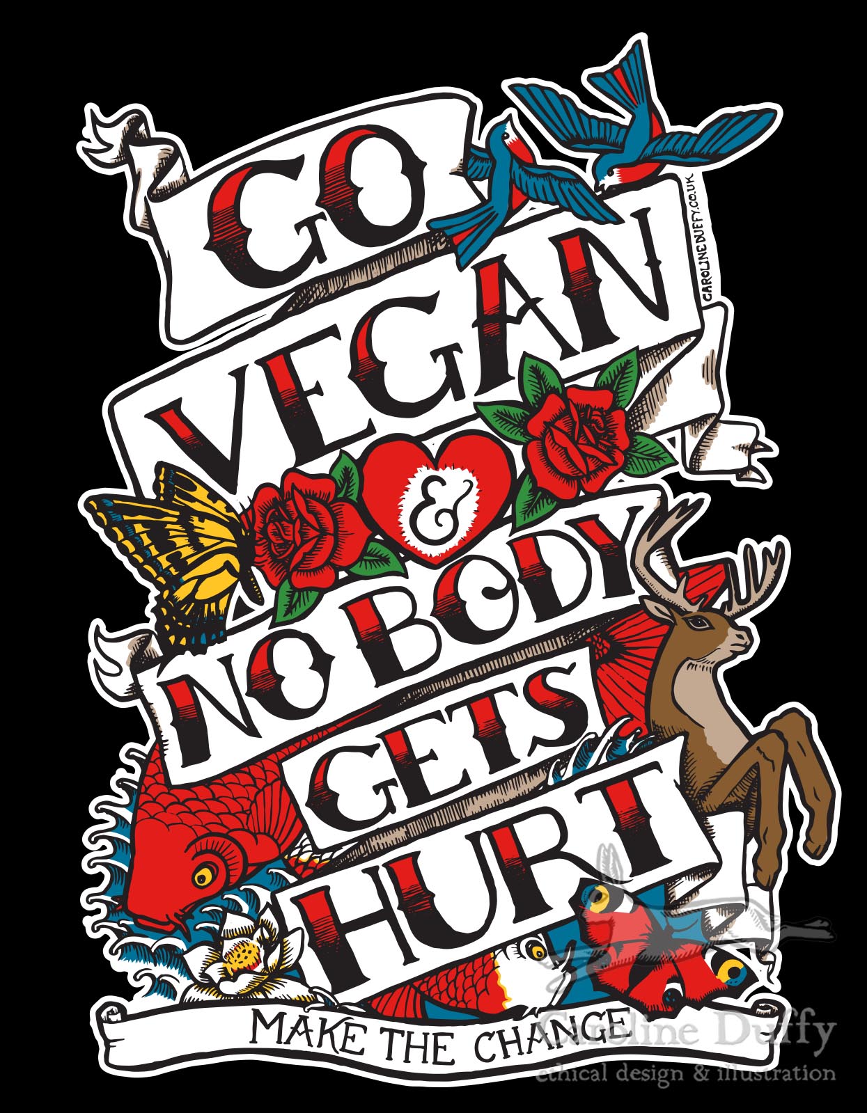
Andrew Norton of Naturally Kind Foods was clear about wanting his t-shirt illustration created in the style of Sailor Jerry / Ed Hardy tattoos, and so that’s what I gave him…
I don’t have the words for what I want
But you might not be so clear about what you want, and you and your designer might not share the same vocabulary to describe a particular look. The word “vintage” might mean one thing to me and another to you.
So here are a few ideas you might consider in order to get your message across:
- pinterest boards – objects, adverts (particularly of a chosen era – 1950s, 1980s etc), drawings, logos, typefaces. These are invaluable.
- colour swatch ideas like designseeds
- magazines also aimed at your target audience. Even if the magazine isn’t designed quite the way you’d want, flick through and have a look at the adverts
- choose an actual object that sums up your business to you and show it to the designer. In the flesh. Is it a enamelled galvanised steel gardening bucket? A greasy spanner? You’d be surprised how effective this is.
- a mood board – cut out clippings of this and that. This can be more useful than pinterest as you can have it next to your desk and gaze at it and have Wonderful Moments of Inspiration
But also
Sometimes it is best to consider alternatives to what you have in your head – designers have been thinking visually a long time and will often have some great ideas about how to give you what you want. I recently read that a good percentage of design agencies who’d won tenders had ignored the brief in some way – often by pushing ideas further than the client had ever imagined they create something spectacular. So do be ready to keep an open mind!
I’d be interested in hearing how others have showed their preferences within or alongside a design brief – the weirder the better!
by Frank | Jun 25, 2014 | branding, thoughts
 Newsletters – whether of the almost-dodo-like paper kind or the increasingly-popular email kind – are a great way of keeping in touch with your customers – potential or current. If you’re selling a high-value product or service they give people an opportunity to get to know you and your work before committing to buy, and you can share exclusive offers, and news about exciting new services, with people who are already interested in your stuff.
However, if you make a bad impression you can really put people off your business. Here are six things I’ve seen people do that are pretty much the marketing equivalent of approaching someone you fancy while sporting nothing more than ugg boots, bad breath and a lime-green mankini. Some are design-related and some are more general. Read on!
1) Send people a newsletter without their permission

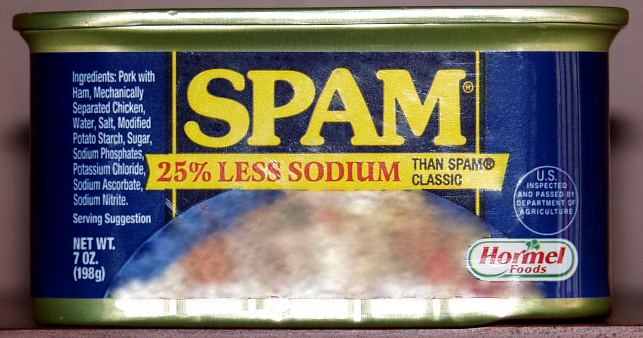
mmm…”mechanically-separated chicken”
This is basically spam, and how do we feel about spammers dear boys, girls and those who identify as neither? I make a note of anyone who does this to me and vow never to buy from them. I usually send them a curt email telling them that I have vowed never to buy from them specifically because they have spammed me. Hate hate hate.
Instead, promote your newsletter in email signatures, on your website, on social media, and give people the opportunity to read previous examples before they sign up.
Perhaps offer something in exchange for an email sign up – I offer my 24-page “Guide to creating awesome briefs”.
Also, make it really easy for people to unsubscribe – and tell them you’ve done this before they sign up.
2) Email out the newsletter without using your email client’s “BCC” function

obligatory Star Trek facepalm image
so that the recipient can see everyone else who’s been sent this particular email and, if they’re particularly nefarious, harvest their contact details for their own egregious purposes. What’s really fun is when people “reply-all” to these mails, thus sinking the inboxes of all concerned into a mire of abject clusterfuckery. Ugh. Set up email groups and use the blind-copy address box to avoid this hell – basic stuff, I know, but some people still haven’t figured it out. Or just use MailChimp or Mad Mimi or another newsletter-creation service to avoid the risk of doing this accidentally altogether. Which leads me to…
3) Poor or non-existent HTML skills
If your newsletter design is ropey your clients will most likely think that you are too. If your coding is less fluent than your English then consider using Mad Mimi, MailChimp, or similar services, that will help you create an appropriate style for your audience. In my experience you’re also less likely to end up in people’s junk mail folders by using these, as compared with sending an email directly.
4) Not designed with the reader in mind
By this I actually mean two things:
a) not aimed at the audience
A communication from a purveyor of fine Swiss watches sending out mail with text in bright pink Comic Sans, for example. Either get a designer to help create a theme for you, or research your audience fully and observe how other companies marketing at the same sector produce their stuff. If you sell bridal wear have a look at bridal magazines and design similarly.
b) not designed in a way that makes someone actually want to read the damn thing
I’m thinking great big wodges of text. Reams and reams of times new roman – a glut of words impenetrable enough to embarrass Derrida – which only the most bored or the most desperately procrastinating can be bothered to tackle.
Break your text up:
- headings
- sub headings
- paragraph breaks
- pull-quotes, box-outs
- bullet-pointed lists
- photos
- gifs of kittens in sinks
All of these things draw the reader in, pique their interest and get them, well, reading.
Your writing style is obviously important, too. You need to be entertaining. I attempt to draw my readers in through swearing, poorly-thought-through metaphors and gifs of kittens in sinks but you might want to consider some sort of level of professionalism instead. Personally I save professionalism for the actual work I do – being my rather silly self in communications seems to elicit more positive responses than when I’m attempting to be polite or some such. Whatever works for you and your audience is the thing to do.
5) not sent out at the right frequency
For me, weekly newsletters are too much. It’s a bit like running into someone every other day that you don’t really know but aren’t quite friends with – gets pretty awkward rather quickly. Monthly is good and I’ll generally not unsubscribe from those. I did know of someone who created options for receiving different frequencies of newsletters – there was even a daily one, but you had to pay for that service! Also, creating a newsletter takes quite a bit of time – a few hours for me, generally – so don’t commit yourself to more work than you can realistically handle. Make it clear on your sign-up form how often you intend to infiltrate inboxes so people know what they’re getting into right from the start.
6) Poor choice of content
I get one newsletter that basically just features photos of new lines of vegan shoes and how much they are. Job done – perfect for what I want from them. Other newsletters I love to receive are long, rambling, beautifully-researched, written and illustrated affairs that require jasmine green tea in a bone-china cup and all of the use of my brain (highly recommended SIGN UP FOR NOREEN’S EMAILS THEY ARE SIMPLY DELIGHTFUL). I try to break things up by having:
a) an intro describing what’s in the newsletter
b) a brief paragraph about what I’ve been up to – work I’ve had printed, illustrations I’m half-way through, blog posts I’ve written
c) a longer piece about something design-wise I’ve been chewing over
d) (sometimes) the month’s special offer
e) things that have inspired me that month – art exhibitions, photos of snails etc
f) a little suggested activity to get your creative juices flowing
g) a brief look forward to goings on in the next month
I try to keep things short and sweet but you do what works for you, your audience, and the service you are selling.
Well, I think that’s everything I can think of right now. Most of the time I find it pretty fun writing my newsletter – it’s a wonderful way to talk about what I’m up to and how I can help people’s businesses without being to in-your-face and salesy. Hope this list was of some use – do let me know if you can think of any other bug-bears that you have with newsletters and verily I shall add them!
by Frank | Apr 18, 2013 | branding, graphic design, illustration
I’ve heard a few people recently devaluing the work of graphic designers. One of these people, unbelievably, is a designer herself. Instead of defending what it is that we do, I’m instead going to show you the process I’ve been through with my most recent branding exercise.
The client-designer relationship
I’ve been working for CIO Connect pretty much since I became a full-time freelancer nearly 10 years ago. Their magazine editor Mark Samuels jokes that I am their longest serving employee. In meetings with them I will often tell them things they didn’t know about the company – like the fact that the magazine used to be bimonthly instead of quarterly, or that I didn’t do their original company branding (I’ve been working for them so long everyone just assumes that I did!). I’ve been doing their conference branding for five years (last year I did this for them). So, I know them pretty well, I know their audience and I’m used to working with them – all things that are rare in logo design. Usually the company and its designer are new to each other at this point. So, I should be able to bash something out in half an hour, right? Hmm.
The brief
Emma at CIO Connect commissioned me to brand their 2013 conference, to be entitled “the Game-Changing CIO”, along with a brief description of what that meant, and I went to work a-scribbling.

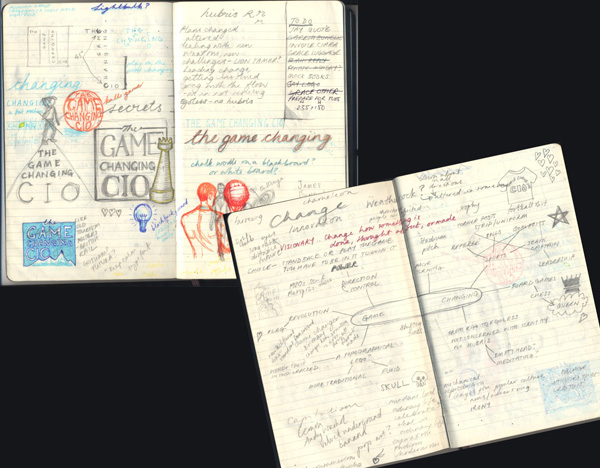
scribbles, or, the frightening things inside my head
Initial concepts
I came back with these three rough ideas based on three aspects around the idea of game-changing – risk-taking, leading and pioneering.

initial rough ideas
Second concepts
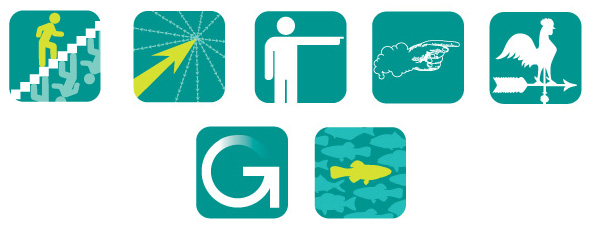
Thanks, said CIO Connect, but could we have something that looks like an app logo, such as you get with the iPad, etc? I went back to my drawing board and came back with these little squares in CIO Connect’s brand colours:

app-style ideas in the rough
You have to be fairly clear and clean and simple with an app logo – it’s expected to work very small. Hence the stylised nature of these ideas.
Developments on second concepts
We like the stairs and the pointy hand – can you develop, said they. So I did.

Here are four developments – all fancied up, said I. One of the stairs and three various colour-ways of the pointy hand, which I had spent a long time drawing and inking in before scanning and tracing in Illustrator and of which I am very proud.
Third concepts
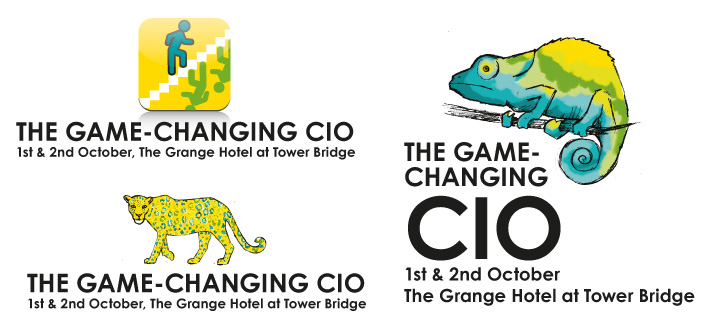
Hmm, we’re not sure about the app thing, said they. Can you go back to the drawing board again, said they? Think about someone who changes the nature of things. And also can we look at the stairs again but with different colours? So I did, and I sketched up these roughs. The second is a chameleon changing his colours and the third is a leopard changing his spots.

more scribbled concepts
Fourth concepts
Well, we sort of like the leopard, they said, but we’d really rather go back to the app idea, and look at images of actual people standing out from the crowd and maybe with our logo ball involved, they said.

Standing out from the crowd concepts
Yes! they said. Number three, they said.
Phew, I said. And here it is:

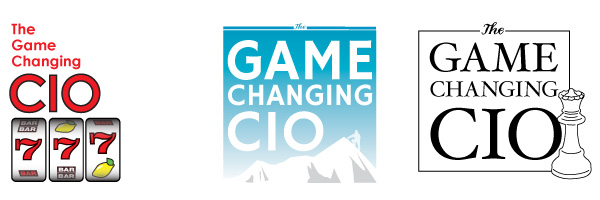
the finished logo
Of course, there was a little bit of back and forth about the font and the text position too, but I think I’ve made my points: that these things can take weeks to get right, that even the clients most experienced in briefing designers can change their minds, and that having even the closest of client-designer relationships does not mean the designer can get it right first time.
In conclusion
Some might infer that the client company needed to clarify its intentions – that confusion as to aims was why the process took quite a long time despite us knowing each other well. In its defence it is a reasonably-sized organisation with a several people making the final decision. Also, it’s common that a client will request that I work on one particular idea only to realise that it doesn’t work for them in the flesh, so to speak. I would say that I could perhaps have asked more questions at the initial briefing – my relationship with them made me a bit complacent about being able to hit the sweet spot straight away – and in future I will be interrogating them much more forcefully for a more detailed brief, with a big bright lamp and maybe some waterboarding too*, to make sure I have all the information I need.
In truth the process above, as drawn out as it seems, is not dissimilar to the process we designers go through for a lot of logos. It is work that is specialised. It is work that requires intuition, lateral thinking, a knowledge of what works graphically across various formats from websites to twitter avatars to twenty-foot banners, software skills and of course drawing skills. It requires time (obviously), expensive hardware and expensive software, not to mention years of training and experience. And this is why I won’t do logos for £50. Designer Renato Pequito sums it up beautifully from a different angle here with a blog post about public misunderstanding surrounding the cost of branding a government entity, while I finish with a (perhaps apocryphal) story which illustrates this wonderfully:
Pablo Picasso was in a park when a woman approached him and asked him to draw a portrait of her. He agreed, and quickly sketched her. When he handed her the finished work she was pleased with the likeness and asked how much money she owed him. “$5,000” said he. The woman screamed, “but it took you only five minutes!” The artist replied, “No, Madam, it took me all of my life.”
*Joke, of course. I actually only torture the clients who don’t pay.
by Frank | Mar 28, 2012 | branding, CIO Connect, graphic design, illustration
CIO Connect has been a loyal client since 2003 and I’ve been designing the branding for their annual conference for top IT types for, hmm, three or four years now. Looking back on the way we came to this year’s final image, I thought it might be a great illustration of how I work together with my clients to create an image that works.
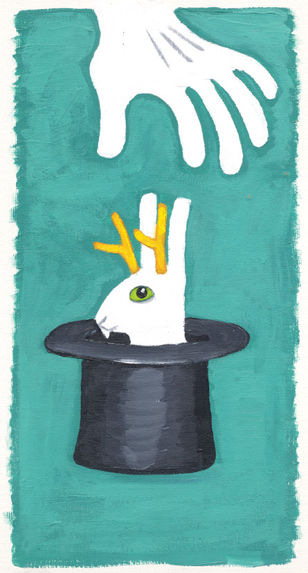
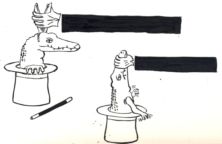
This October’s conference theme is “Embracing the Unexpected”; so late last year (they are organised types at CIO C) they asked me to come up with some ideas around the theme.
I came up with the following rough ideas:


CIO Connect said that they liked the Jackalope (being a ferocious antlered version of a rabbit) coming out of the magician’s hat, but they thought it might not be obvious enough. Perhaps something more overtly ferocious might work? So I created some rough inkings of crocodiles (text was to go across the black arm of the magician). At first I struggled with the idea of what the magician was to grasp, & so gave the croc some bunny ears. Then the jaw-holding idea came to me. I sent both ideas to the client, despite thinking the latter a lot stronger. Normally I wouldn’t do this (David Carson said once never to show the client something you don’t like as that’s what they’ll choose) but I trusted the people at CIO C to pick the better one – and also, sometimes great ideas are born from humble beginnings. Thus:

We like the second one, they said. Can you develop it?
Well, I redrew and I inked and I scanned and I coloured and dear reader, I made this, the final design, with lettering and brand colours:

The response: “I love it!! …thank you so much it’s fab and so different from our usual!”
by Frank | Apr 19, 2011 | branding, thoughts
Those of you who subscribe to my newsletter will know that I have recently been despairing at the way some companies communicate with their customers and prospective customers. I am saddened, and sometimes angered, by poor communication. I think of how much better it could have been if the sender had thought for a moment and reviewed what they were about to do.
This is a subject I’ve been considering a lot lately. I think the issue is authenticity.
I have learned the hard way over the years to be authentic. By that I mean to show clients who I am and what I stand for. I am not going to try to pretend to be someone else. The work I produce and my work ethos I take 100% seriously; the rest of life I do not. You’ll see from my Twitter feed that I swear a bit, rant a bit, talk in LOLcat sometimes, laugh a lot, and discuss and debate new ideas with people. That is who I am. I used to be afraid of showing myself – I used to think clients would want something else. Something more normal (whatever that means). Which is silly, because clients who want someone creative are expecting that person, that one who thinks along strange lines, to be – how shall we say? expressive.
If you are not trying to get to know your clients – if you just want to take their money from them – you will behave in strange ways
Thinking along these lines enables you to see your clients as not just clients. You encourage the authenticity in them too. This is important, because if they cannot show you who they are, you are not going to see them and be able to give them what they want, which in my case, is sort of to reveal – to enable the revealing – of the visual dimension of whatever they are trying to communicate.
Thus, talking in LOLcat once in a while makes me a better designer. QED.
But seriously (SRSLY), let’s take this step one further. If you are not trying to get to know your clients, if you are not interested in their authenticity, if you just want to take their money from them, you will behave in strange ways. You might sign them up to your newsletter or marketing crap without calling and asking first (this is illegal in the UK, by the way), in the assumption that they actually care about what you’re selling. No, they won’t care, they’ll think you rude, and they may well report you to the Information Commissioner’s Office for spamming. You might treat them badly because they’re leaving your services. You might forget that word-of-mouth is probably the most important marketing tool you have, and that your reputation is possibly your greatest asset, and that annoying the fuck out of people damages both of these.
Be yourself, and communicate from yourself, not from some made-up droid you think your clients want (because those are not the droids they’re looking for). And don’t treat them like droids either. Sure, create a logo and a brand which reflects the market position you’d like to occupy. Be aspirational. But make sure it’s still you, albeit a dead fancy and successful you. Because, well, I probably don’t know you, but I’m pretty sure you’re just fine the way you are.
 Nobody’s perfect and one of the things I am rubbish at is asking clients for feedback on the work I’ve done for them. I’ve only just got around to asking the amazing Sam Grady of The Cornish Vegan Pasty Company if she’d write me a testimonial for the logo design I did for her. Her response blew my mind so naturally I’m sharing it everywhere. So chuffed to have been asked to help out a fellow vegan business with their graphic design and even more chuffed that she should be so lovely about the process! She said:
