Why I don’t do logos for £50
I’ve heard a few people recently devaluing the work of graphic designers. One of these people, unbelievably, is a designer herself. Instead of defending what it is that we do, I’m instead going to show you the process I’ve been through with my most recent branding exercise.
The client-designer relationship
I’ve been working for CIO Connect pretty much since I became a full-time freelancer nearly 10 years ago. Their magazine editor Mark Samuels jokes that I am their longest serving employee. In meetings with them I will often tell them things they didn’t know about the company – like the fact that the magazine used to be bimonthly instead of quarterly, or that I didn’t do their original company branding (I’ve been working for them so long everyone just assumes that I did!). I’ve been doing their conference branding for five years (last year I did this for them). So, I know them pretty well, I know their audience and I’m used to working with them – all things that are rare in logo design. Usually the company and its designer are new to each other at this point. So, I should be able to bash something out in half an hour, right? Hmm.
The brief
Emma at CIO Connect commissioned me to brand their 2013 conference, to be entitled “the Game-Changing CIO”, along with a brief description of what that meant, and I went to work a-scribbling.
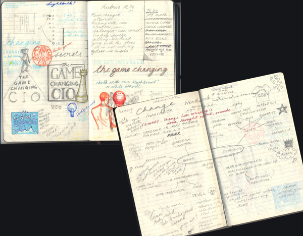
scribbles, or, the frightening things inside my head
Initial concepts
I came back with these three rough ideas based on three aspects around the idea of game-changing – risk-taking, leading and pioneering.
initial rough ideas
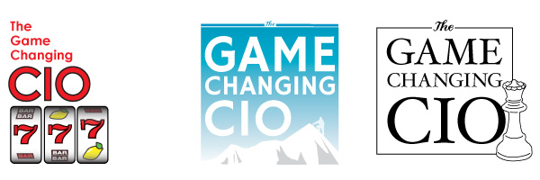
Second concepts
Thanks, said CIO Connect, but could we have something that looks like an app logo, such as you get with the iPad, etc? I went back to my drawing board and came back with these little squares in CIO Connect’s brand colours:
app-style ideas in the rough
You have to be fairly clear and clean and simple with an app logo – it’s expected to work very small. Hence the stylised nature of these ideas.
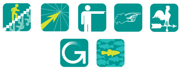
Developments on second concepts
We like the stairs and the pointy hand – can you develop, said they. So I did.

Here are four developments – all fancied up, said I. One of the stairs and three various colour-ways of the pointy hand, which I had spent a long time drawing and inking in before scanning and tracing in Illustrator and of which I am very proud.
Third concepts
Hmm, we’re not sure about the app thing, said they. Can you go back to the drawing board again, said they? Think about someone who changes the nature of things. And also can we look at the stairs again but with different colours? So I did, and I sketched up these roughs. The second is a chameleon changing his colours and the third is a leopard changing his spots.
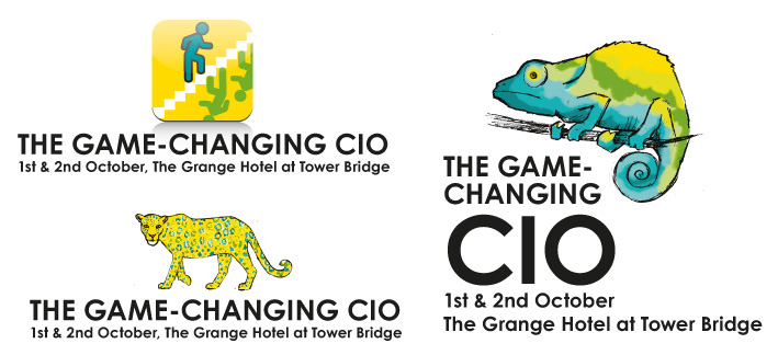
more scribbled concepts
Fourth concepts
Well, we sort of like the leopard, they said, but we’d really rather go back to the app idea, and look at images of actual people standing out from the crowd and maybe with our logo ball involved, they said.
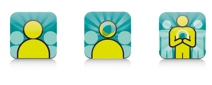
Standing out from the crowd concepts
Yes! they said. Number three, they said.
Phew, I said. And here it is:
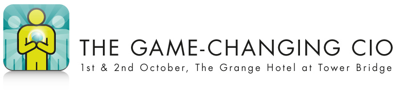
the finished logo
Of course, there was a little bit of back and forth about the font and the text position too, but I think I’ve made my points: that these things can take weeks to get right, that even the clients most experienced in briefing designers can change their minds, and that having even the closest of client-designer relationships does not mean the designer can get it right first time.
In conclusion
Some might infer that the client company needed to clarify its intentions – that confusion as to aims was why the process took quite a long time despite us knowing each other well. In its defence it is a reasonably-sized organisation with a several people making the final decision. Also, it’s common that a client will request that I work on one particular idea only to realise that it doesn’t work for them in the flesh, so to speak. I would say that I could perhaps have asked more questions at the initial briefing – my relationship with them made me a bit complacent about being able to hit the sweet spot straight away – and in future I will be interrogating them much more forcefully for a more detailed brief, with a big bright lamp and maybe some waterboarding too*, to make sure I have all the information I need.
In truth the process above, as drawn out as it seems, is not dissimilar to the process we designers go through for a lot of logos. It is work that is specialised. It is work that requires intuition, lateral thinking, a knowledge of what works graphically across various formats from websites to twitter avatars to twenty-foot banners, software skills and of course drawing skills. It requires time (obviously), expensive hardware and expensive software, not to mention years of training and experience. And this is why I won’t do logos for £50. Designer Renato Pequito sums it up beautifully from a different angle here with a blog post about public misunderstanding surrounding the cost of branding a government entity, while I finish with a (perhaps apocryphal) story which illustrates this wonderfully:
Pablo Picasso was in a park when a woman approached him and asked him to draw a portrait of her. He agreed, and quickly sketched her. When he handed her the finished work she was pleased with the likeness and asked how much money she owed him. “$5,000” said he. The woman screamed, “but it took you only five minutes!” The artist replied, “No, Madam, it took me all of my life.”
*Joke, of course. I actually only torture the clients who don’t pay.