by Frank | Feb 14, 2018 | illustration, thoughts
(or, why following your dreams is bloody terrifying)
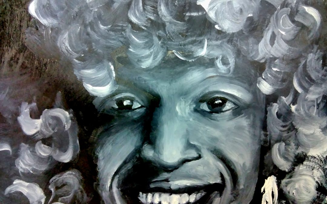
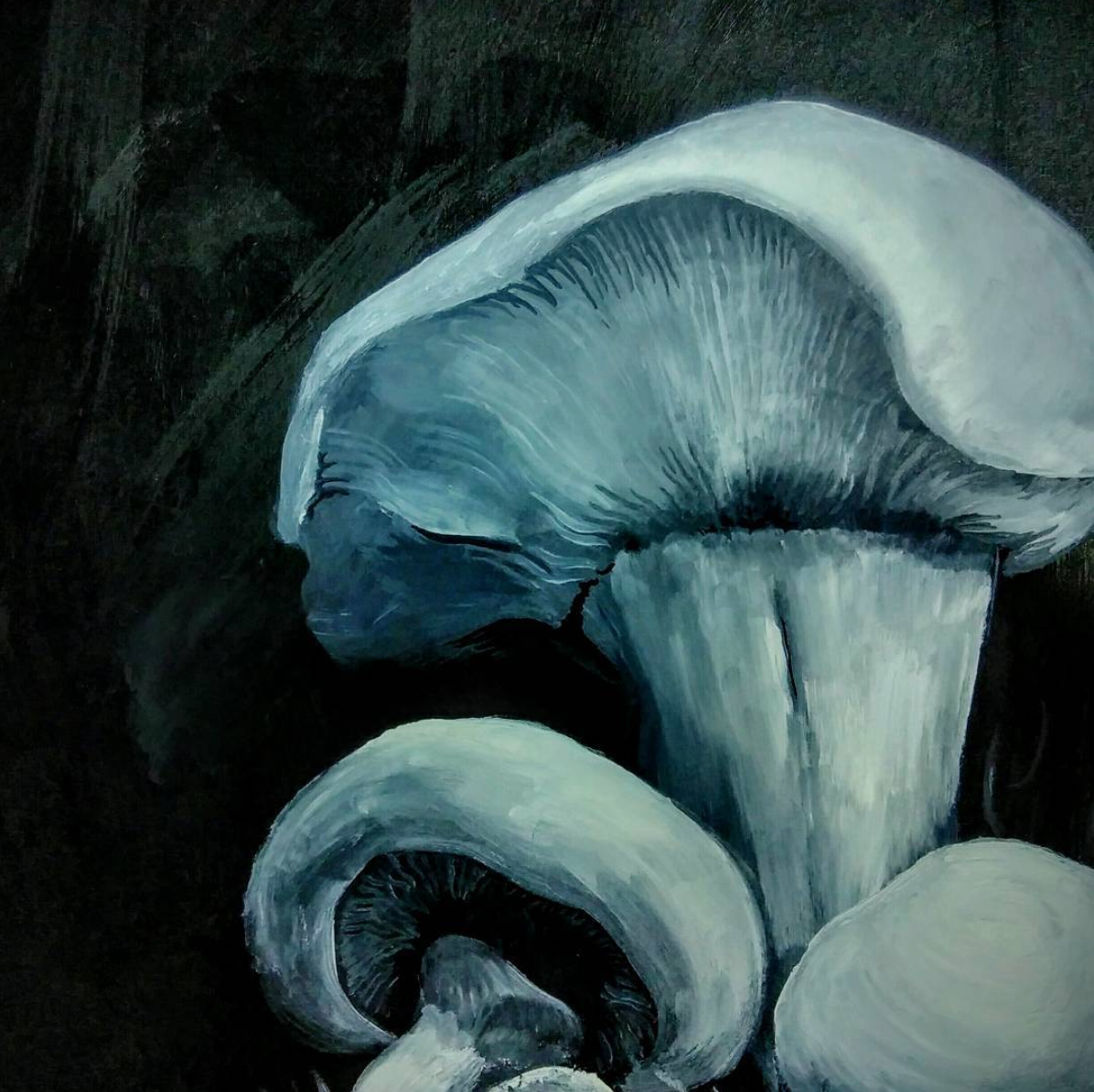
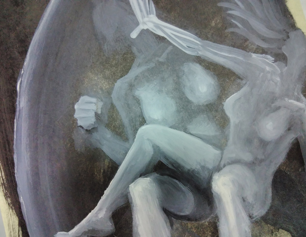
Maybe you’ve seen some of the lovely weird images I’ve been sharing on social media? smeary black and white oil paintings of Princess Diana, ghostly mushrooms, bleak storms at sea and other blurred visions from the edge of purgatory?
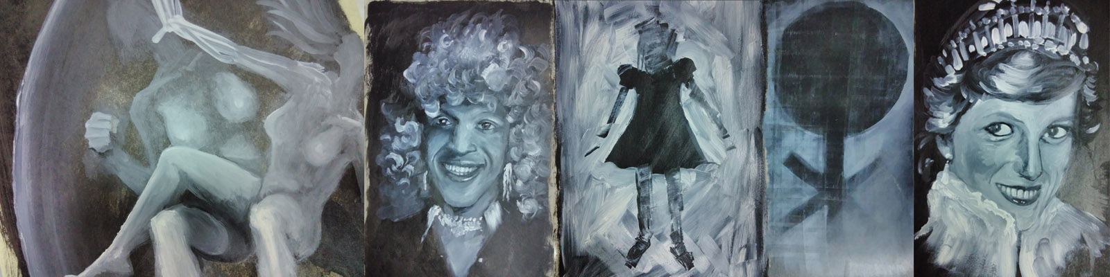
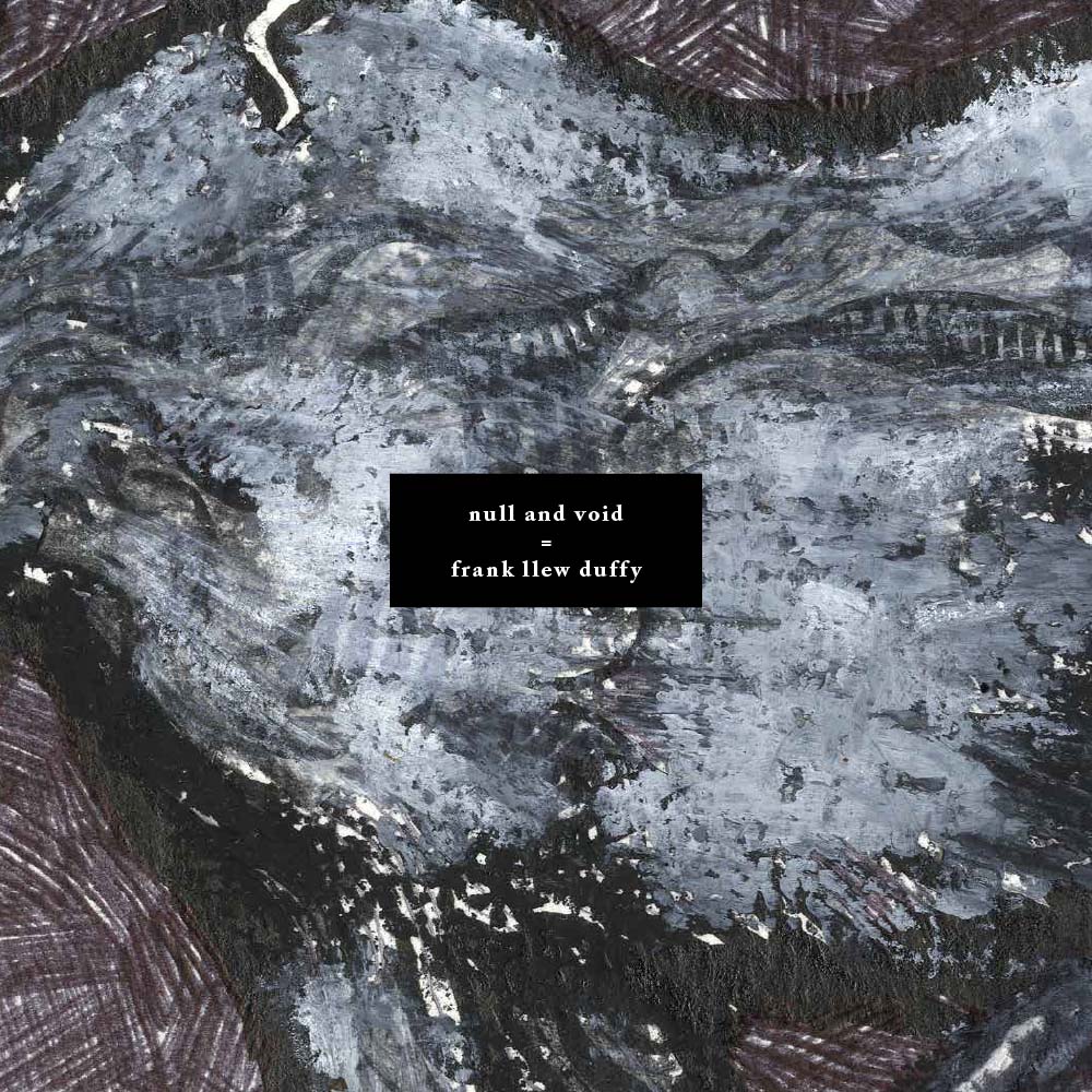
They’re possible illustrations for this project. It’s the final major work for my Master’s in Illustration: Authorial Practice at Falmouth University.
(go back to academia! follow your dreams!)
I’ve written a book of 33 passages of 333 words focused on gender, queerness, being outcast, depression, breakdown, death, magic and cats. I’m thinking about the inconsistent nature of the self, the unreliability of memory, of irony and earnestness and the definition of queer.
Once I have finished the book it will be printed and made-up and bound (book binding is one of the many very useful things they are teaching us on this course) and I will crowd-fund to publish it in a limited edition press. This will be around September/October 2018.
The sales pitch (don’t worry, I’ll move onto The Terror shortly, because I know we’re both more comfortable with that state of affairs)
If you’d like to support the creation of the project I’d recommend signing up to my patreon
(you would say that, you say)
(ah but have you seen the rewards? you get many and varied lovely things in return, say I. It is a win-win deal, say I)
You’ll get to read excerpts, see illustrations as they progress and, depending on the amount you subscribe for (up to $10 USD a month) you’ll get lots of art and maybe a copy of the book. There’ll also be little essays – thought responses – to the theory I’m reading and the art I’m looking at.
I’m working part-time to do this MA – I couldn’t afford to take the time off to work on it full-time, so your support of my patreon really does keep me going.
I’m creating this book because of the dire need for a diversity of trans voices.
I’ve read egregious well-meaning cisgendered people’s writing about the trans experience that are deeply harmful and it makes me want to sick up my lungs.
There are good trans writers out there and they are getting published – hooray! – but this work is different from what I’ve seen so far, straddling image and text, fiction and biography, and if I can do it right, it will lead you somewhere else. I’m very proud of it and I’m only halfway through. I can’t wait to share it with you.
That’s the sales pitch done – and now onto the terror
the terror is this: that I should be working on a cute kids’ book aimed at big publishers
the terror is that I am being self-indulgent, that no-one wants to read about trans experience, and that I should stick to drawing dinosaurs
the terror is that I have taken out a £10,000 student loan for these two years during which I should be Doing Something For My Career
And the protestant work ethic and conditioning of late capitalism is such that though I am exploring all sorts of wonderful things, though I am communicating just what I want to in these images, in this writing, though I know that this work is needed, and that it will set me off towards what I want to be doing, the voices (and ah, they are in the tone of my dear departed mother) the voices are concerned that This Work Will Not Be Profitable
this is the terror
and quite frankly, the terror can get fucked.
I have done a children’s book, and very popular it was too, and perhaps I will do another one one day. But now – now is the time of the queerdo. Now is the time for portraits honouring Marsha P Johnson, of fear and queer lust, of dark intentions and bright bones. Now is the time to other heteronormativity, to centre the weird, the obscure, the frayed-at-the-edges.
I hope you will join me on my journey, and I hope that we will both enjoy ourselves beyond and above the bite of terror.
And all shall be well
and all manner of thing shall be well
when the tongues of flame are in-folded
into the crowned knot of fire
and the fire and the rose are one
-T S Eliot
by Frank | May 23, 2017 | illustration, thoughts
 Some of you will know that I’m studying for a part-time Master’s degree in Illustration: Authorial Practice at Falmouth University. I can say, hand on heart, that the decision to do this is one of the best choices I’ve made. It’s pushed and shaped the ways I’ve thought about illustration and my own approach to it much further than I ever anticipated – and I’m only a quarter of the way in.
 I handed in my first essay recently – the first I’ve written in 17 years. I was really proud of it – it is definitely the best thing I’ve ever written, but most importantly it was the first time in the whole of my academic career – from GCSEs, A-level, Art Foundation and BA Hons, that I’ve written an essay and learnt and developed from it, rather than it just being an exercise where I jump through a hoop and get a grade reward.
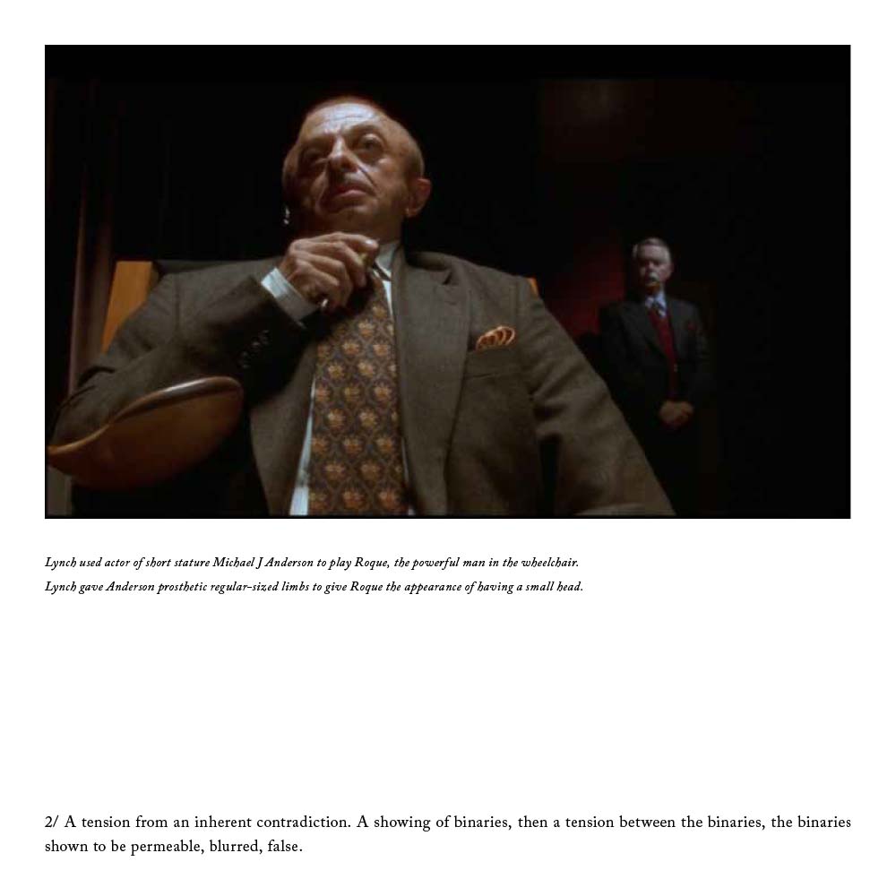
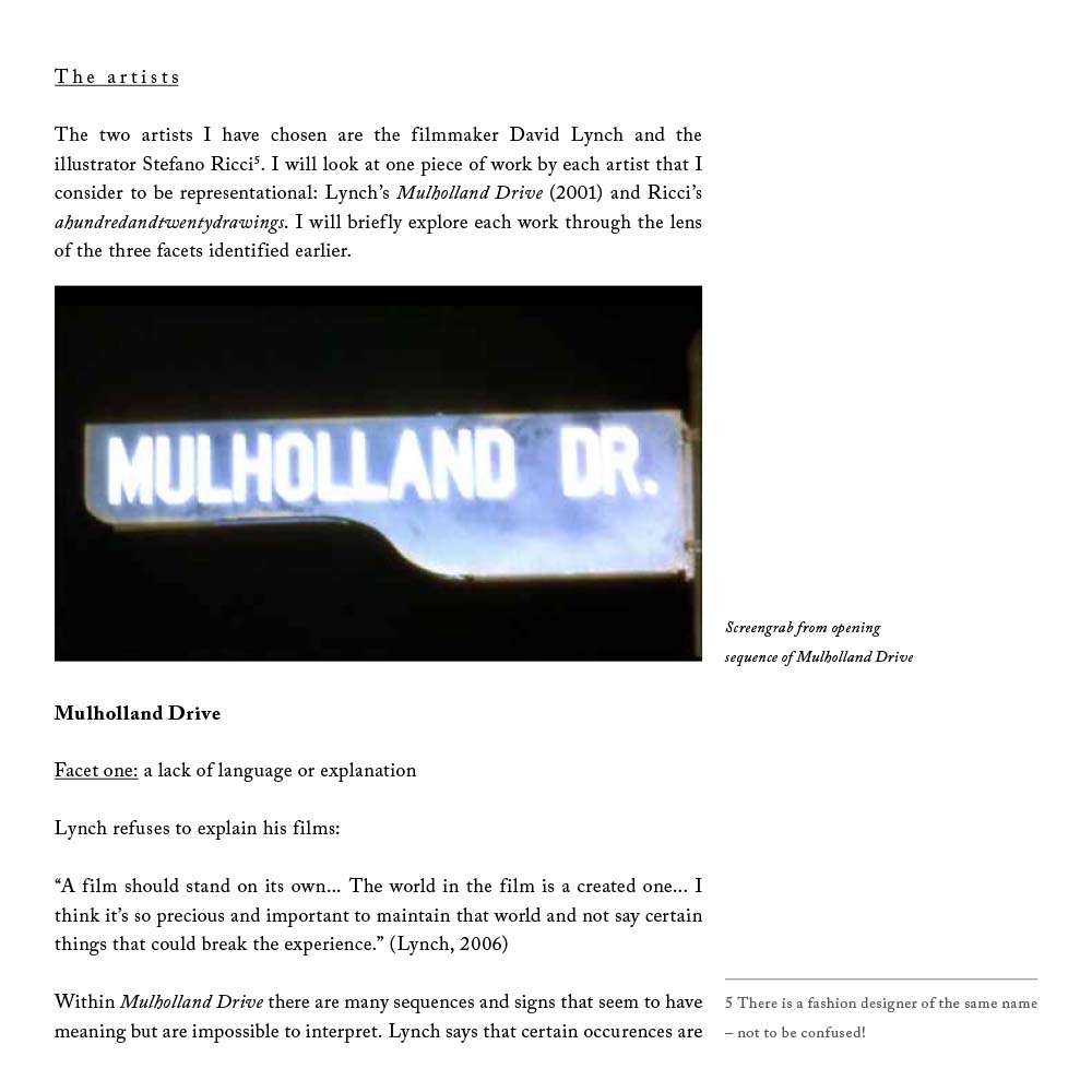
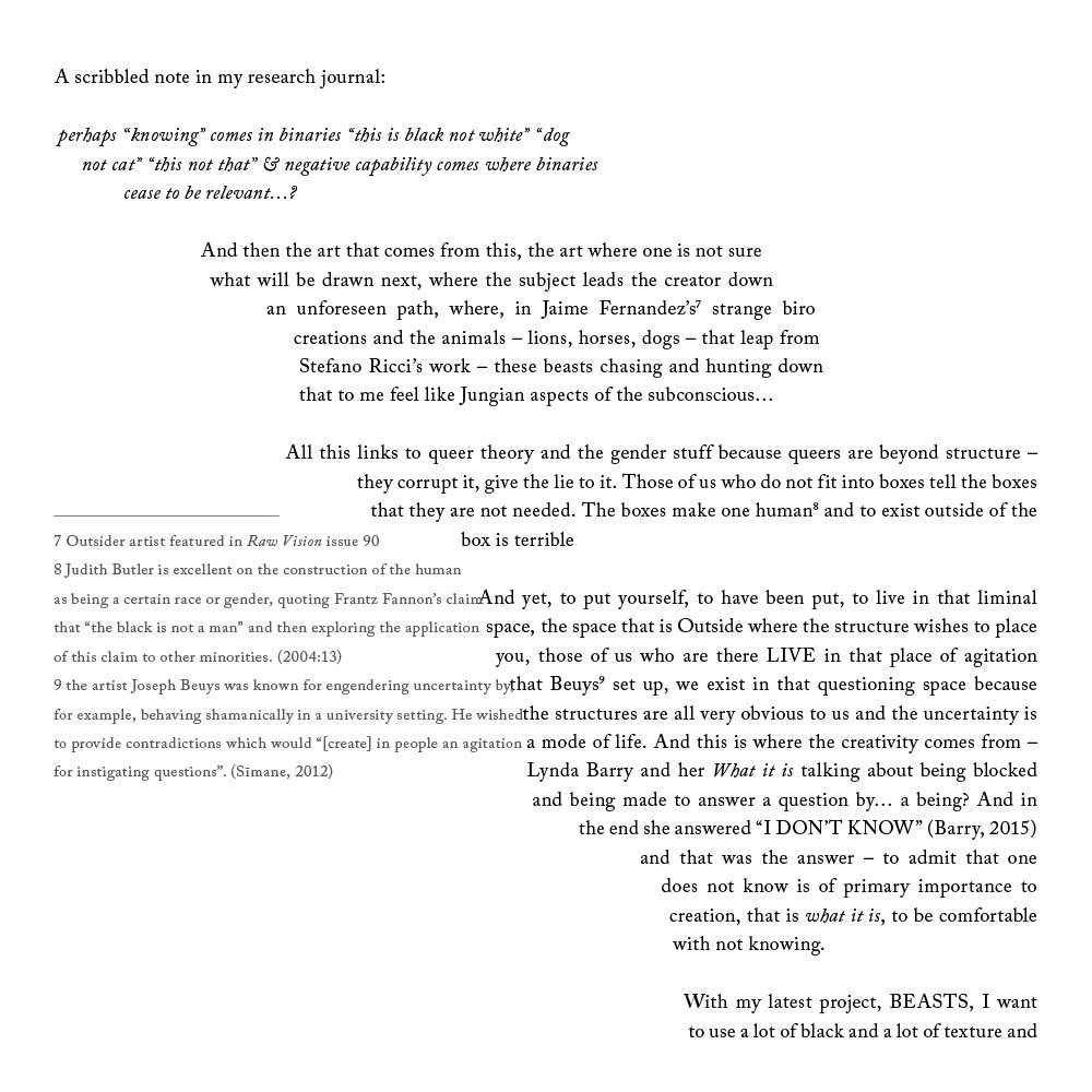
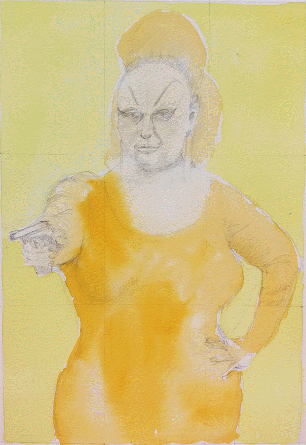
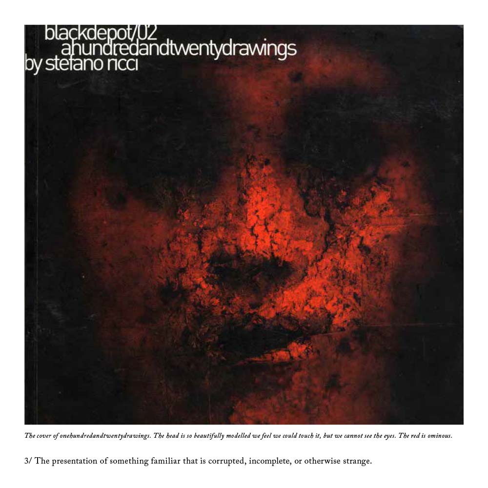 I wrote it about uncertainty in art, and took Twin Peaks director David Lynch’s Mulholland Drive and illustrator Stefano Ricci’s Depositonero as case studies. I looked at the use of uncertainty – something I’m fascinated with – through the lenses of queer theory, Jungian psychoanalysis and deconstructionism and showed how I was using it in my own practice. A percentage of the marks given were for the design and presentation of the essay – it was supposed to reflect the content. I printed it on tracing paper, cut it to loose-leaf squares and handed it in in a black hand-made cardboard box. I wish I’d taken some photos now!
 I just got my marks back. 50% is a pass, 60% is a merit and 70% is a distinction. I got 80% which is the best mark I’ve got for anything since my GCSEs. It’s amazing what you can do when you’re passionate about something! We were encouraged to be creative with the essay-writing process, so while the first two chapters were fairly standard in their academic writing style, the third was fully-referenced stream-of-consciousness, and the layout reflected this, the main body text flowing through the page and the footnotes bashing up against it:
The word count was 3,000 which was torturous – I could have easily written 10,000 words. But it was a truly satisfying process and the discipline of editing is a vital one to develop.
If you’re interested in studying for an MA you can now get student loans to pay your tuition fees. I’m enjoying every moment of mine and I have noticed tangible improvements in the quality of my client work because of it. 
by Frank | May 10, 2017 | prints, thoughts
Hunting ban: all profits from the sale of my fox and hare prints will be donated to the League Against Cruel Sports
 11/05/17 edit: £90 raised so far!
Those of you who know me will know that I cannot bear animal cruelty. Vegetarian from the age of eleven and vegan for five years now, and from a long line of animal lovers (my farmer great-grandfather wouldn’t allow the hunt on his land), hunting with dogs represents for me every pointlessly abhorrent exploitation we visit upon our fellow animals and our environment. Though it is so frequently flouted, the hunting ban was a great moral victory: a watershed moment where Britain decided that this kind of cruelty was unacceptable.
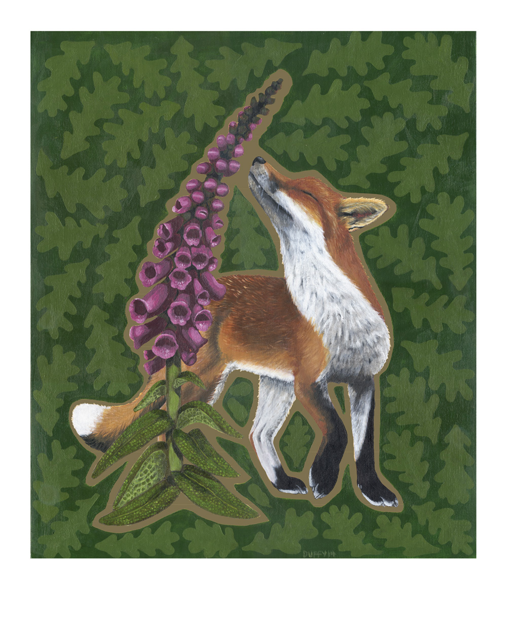
Fox print available here
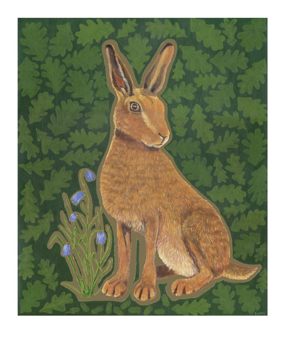
Hare print available here
I loathe a lot of things about this tory government – its incompetent boneheadedness over Brexit, its treatment of people in poverty, disabled people, refugees, its stance on renewable energy and on, and on, and on.
But when Theresa May announced yesterday that, should she win the election, she will hold a free vote to reinstate the anachronism (one that continues to be inflicted on foxes and stags across the country illegally), I thought, well, this is something I have the capacity to do something about.
I had these prints made a few years ago for a side project I was running that I needed to mothball, and I figured I would put them to good use. They’re printed in using the modern lithographic method (standard professional printing to the layperson) using a special gold ink. They’re from a couple of paintings that I created. They’re printed on 100% post-consumer-waste recycled paper with a silk finish and are richly detailed.
Every penny after cost of printing, packaging and posting will go to The League Against Cruel Sports whom I feel are best placed to win this battle of hearts and minds.
I would love to get this message spread far and wide so please do feel free to share.
Frank x
by Frank | Feb 7, 2017 | illustration, thoughts
Master’s in Illustration: Authorial Practice
Queer Iconography
I thought I’d share the first project I worked on for my master’s. It’s completely different from anything I’ve ever done before.
What I’ve done is create three 60-ish second looped animated gifs of icon-like works of art becoming and undoing. The subject of each work is a queer person. This is what I wrote about the first one, of Divine, in my research journal:
Every frame of each GIF is a stage in the process of making and unmaking an image of Divine from the publicity still of his breakthrough film Pink Flamingos. The image is never complete – I use different media, stick paper and images to it, paint over, pull the paper off, scrape paint off – and all the while the image jerks and warps because I took each photo from slightly different angles. I wasn’t attached to perfection and decided to be playful. There are some frames that show a quick flash of a religious icon of the Madonna and Child – a smiling reference to subliminal imagery, and to reinforce the fact that this work in continual progress is a religious icon itself.
Divine
Why?
Reading J Halberstam and Judith Butler, I have shown how queer lives can be seen as continually constructed and reconstructed, asserted and reasserted, in response to the monolithic societal norms. So I showed Divine in process, never whole, never finished.
Why Divine?
In Pink Flamingos Divine is “the filthiest person alive” and the whole film, billed as “an exercise in bad taste” attempts to be as abhorrent and offensive as possible. Divine is in competition to be the filthiest person with another couple, and naturally wins. The movie still is iconic – Divine is powerful, monstrous, beautiful in some weird way. My proposal aimed to focus on bringing the deviant into sacred space and Divine here is the epitome of deviance. Divine himself was someone who endured a huge amount of stigma because of his sexuality and I felt this powerful and tragic figure was irresistible for this project.
Why religious icons?
Because I love them. I love the low gold glowing from them as they flicker in the candlelight of Russian Orthodox churches. I am not Christian and was not raised that way but there is something numinous about them. More importantly, for this project, they represent something to aspire to – the lives of the saints are there to give moral instruction and support. Using Divine in this context is not ironic (although yes, I’ll grant you, it appears this way!) which leads me to…
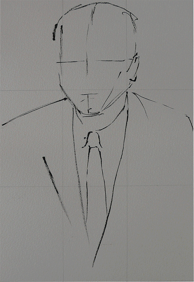
Billy Tipton
What is this illustrating?
This project is my response to Mark Aguhar’s poem “Litanies to my Heavenly Brown Body”. The litanies express what is sacred – those things that are regarded often as profane – the queer, the fat, the people of colour, the unknowns. The litanies are assertions and reassertions of the inherent value, the inherent humanness (cf. Judith Butler) of the liminal people. I wanted to create a sacred space for queer liminal types, a space where they would be honoured and valued and yet still representative of the notion that queer lives must be continually made and remade in the face of heteronormativity.
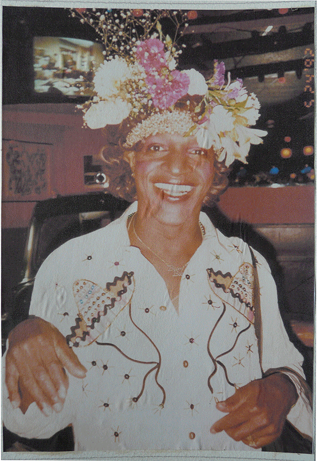
Marsha P Johnson
How would this be displayed?
Ideally I would have four minute-long animations, that is, four animations that are 60 seconds long each, one queer saint for each. I submitted three in total – Divine, Billy Tipton (a jazz band leader who achieved some fame, married several women and only after death was discovered to have been assigned female at birth), and Marsha P Johnson (a black queer femme who is alleged to have started the Stonewall Riot). I imagine they would be back-projected through something like Polydraw, about a metre high, on the four walls of a small dark square room. There would be candles and incense. I imagine the space being a cube of two metres at every edge (though, it occurs to me, it would need a door).
I’ll finish this post with a quote from Judith Butler, from Undoing Gender:
“[Queer persons] make us not only question what is real, and what “must” be, but they also show us how the norms that govern contemporary notions of reality can be questioned and how new modes of reality can become instituted. These practices of instituting new modes of reality take place in part through the scene of embodiment, where the body is not understood as a static and accomplished fact, but as an ageing process, a mode of becoming that, in becoming otherwise, exceeds the norm, reworks the norm, and makes us see how realities to which we thought we were confined are not written in stone. Some people have asked me what is the use of increasing possibilities for gender. I tend to answer: Possibility is not a luxury, it is as crucial as bread. I think we should not underestimate what the thought of the possible does for those for whom the very issue of survival is more urgent. If the answer to the question, is life possible, is yes, that is surely something significant.”
by Frank | Jun 24, 2015 | thoughts
Musings on creativity, doing things differently and public parks involving Virginia Woolf quotes
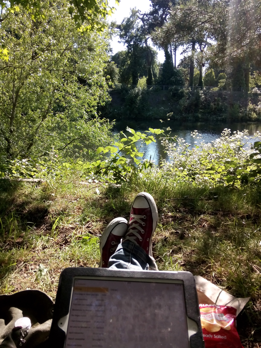
I’m sat in Cardiff’s glorious Bute Park next to Thomas Martin who’s composing some incidental music for a mutual client and the sun is shining and the pine tree over us whispers with the breeze and we’ve just eaten some giant vegan jaffa cakes and are drinking coffee and all is right with the world.
These are not things that we do very often (the Welsh weather sees to that) but they are probably things we should do more often. Tom has been stuck for ideas about his guitar piece and I have been scratching my head about ways to radically update the design of an educational brochure. Lo and behold, sit thee by a river in a park in summer and the eureka moments they will come.
Tom hears a car beep in the distance at the same time as a picking a particular chord and realises in a flash that the track needs some plaintive Scandinavian horns in the background. I observe the colours of the sky, the pine, the river and the magenta of someone’s coat on the other side of the Taff and that’s my colour palette sorted. I think of ways to replicate that feel of sunlight filtered through branches and remember distant walks through pine forests to a beach in the South of France when I was small, and I wonder how to bring that child-like sense of wonder, sense of awareness into this educational brochure.
Here is Virginia Woolf describing the experience of her character Peter Walsh in Regent’s Park, from Mrs Dalloway:
By conviction an atheist perhaps, he is taken by surprise with moments of extraordinary exaltation. Nothing exists outside us except a state of mind, he thinks; a desire for solace, for relief, for something outside these miserable pigmies, these feeble, these ugly, these craven men and women. But if he can conceive of her, then in some sort she exists, he thinks, and advancing down the path with his eyes upon sky and branches he rapidly endows them with womanhood; sees with amazement how grave they become; how majestically, as the breeze stirs them, they dispense with a dark flutter of the leaves charity, comprehension, absolution, and then, flinging themselves suddenly aloft, confound the piety of their aspect with a wild carouse.
I think a lot of us office-types are conditioned to feel bad about time spent away from our desks, but our desks are rarely the places where the inspiration is. In my one-and-only proper 9-5 job my boss couldn’t really understand my urge to go and stand outside, or go for a walk, or stare at the fishtank for 20 minutes in order to get an idea. I think he thought I was skiving. Isn’t it weird that we should be made to feel guilty about one of the most pleasurable parts of our job – the eureka moment?
 The Awen, the Muse, they are a flighty and tentative creature, more at home under trees and beside streams; while bramble-picking and beach-walking, in canvas tents and under a canopy of stars. I’ve had some of my best ideas while out surfing. I’ve been freelancing 12 years next month and still I feel guilty about this part of the process, this work which is not work, these conditions which are necessary for the most original and stirring creativity to occur.
I am continuously overawed by the beauty and wonder of it all, and in these spaces of just being, that buddhist no-mind where there is nothing but the breeze ruffling the fine hairs of my arms, the warmth of the sun on my shoulders and the crunch of copper leaves underfoot, those spaces where I am no longer my name or occupation or species or anything at all in particular, those are the spaces into which the ideas come tumbling.
And I wonder how many other kinds of occupations could be made more creative, more efficient, more innovative, by half an hour in a park with a coffee and, perhaps, a giant vegan jaffa cake. I am thinking of the news that some public parks will “have” to be privatised because of council cuts and how arse-backwards that is – that we need these parks, we, as a whole, as a society, need them in a very real and tangible way, and that like the libraries which we’re also losing, they need to be freely available to all. I am thinking of how Woolf wrote about parks in Mrs Dalloway, as places where all kinds of people met and saw and crossed over and interacted and how they are spaces where boundaries are blurred and strange things can happen. Places of meditation, interaction, of peace and of noise, of crowds and of solitude, and how spaces like that could be important to all of us.
Septimus, the WW1 veteran haunted by shell-shock experiences Regents Park in Mrs Dalloway:
Happily Rezia put her hand with a tremendous weight on his knee so that he was weighted down, transfixed, or the excitement of the elm trees rising and falling, rising and falling with all their leaves alight and the colour thinning and thickening from blue to the green of a hollow wave, like plumes on horses’ heads, feathers on ladies’ so proudly they rose and fell, so superbly, would have sent him mad. But he would not go mad. He would shut his eyes; he would see no more.
But they beckoned; leaves were alive; trees were alive. And the leaves being connected by millions of fibres with his own body, there on the seat, fanned it up and down; when the branch stretched he, too, made that statement. The sparrows fluttering, rising, and falling in jagged fountains were part of the pattern; the white and blue, barred with black branches. Sounds made harmonies with premeditation; the spaces between them were as significant as the sounds. A child cried. Rightly far away a horn sounded. All taken together meant the birth of a new religion–
Google throws up plenty of academic studies into the benefits of public parks. The Design Council says that quality public space is important for economic reasons, for mental and physical wellbeing, for biodiversity, for traffic reduction, for children and young people’s development and for the reduction of crime. That’s pretty serious stuff. Any government that wanted to reduce the availability of green space to its citizens should expect to be fought tooth and nail. Just being in Bute Park has eased me through periods of grief, depression and uncertainty, never mind the number of times it has filled me with inspiration and enthusiasm, and I regard it, and spaces like it, as vital to my work and my wellbeing.
by Frank | Jun 22, 2015 | branding, graphic design, thoughts
Okay, so I wrote a whole 24-page thingumy about how to write graphic design briefs and you can download it here (all you have to do is subscribe to my monthly-ish newsletter in return) but what this post specifically addresses is ways to communicate your style likes and dislikes with a designer.
Design briefs in brief
A design brief is a document you create in order to tell your chosen designer(s) the specifics of what you need from them, how you need it, your target audience, your budget, etc etc.
The part of this I’ve really seen clients struggle with is the bit where you try and communicate the kind of style that you’d like them to use. Of course, by describing your target audience well, your designer will already have some styles in mind and could suggest a few. If you’d like to cut some time out of the conceptual part of the design (and therefore potentially save yourself some money), the more specific you are about what you’re looking for the easier it’ll be for everyone.
I know what I want
Andrew Norton of Naturally Kind Foods was clear about wanting his t-shirt illustration created in the style of Sailor Jerry / Ed Hardy tattoos, and so that’s what I gave him…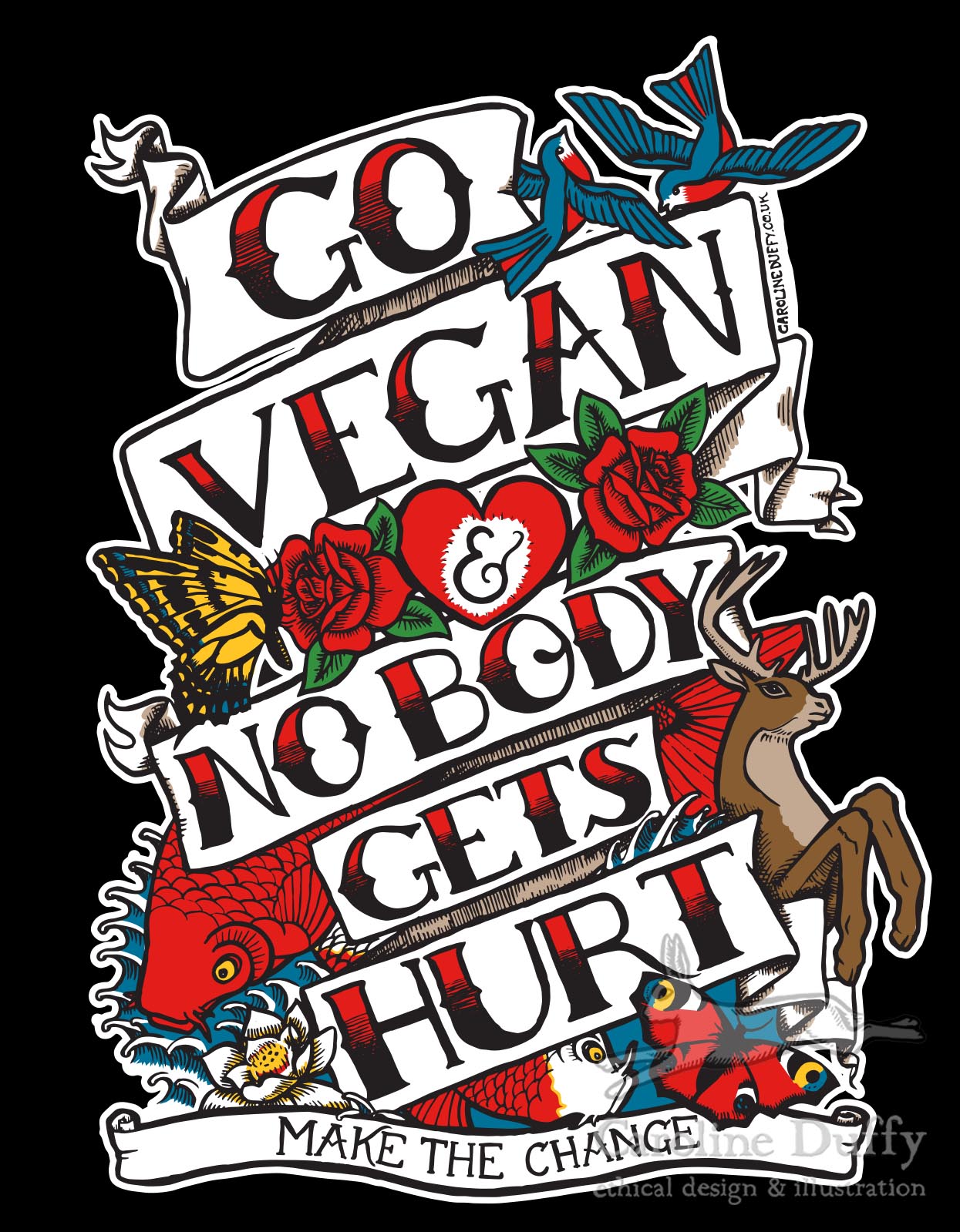
I don’t have the words for what I want
But you might not be so clear about what you want, and you and your designer might not share the same vocabulary to describe a particular look. The word “vintage” might mean one thing to me and another to you.
So here are a few ideas you might consider in order to get your message across:
- pinterest boards – objects, adverts (particularly of a chosen era – 1950s, 1980s etc), drawings, logos, typefaces. These are invaluable.
- colour swatch ideas like designseeds
- magazines also aimed at your target audience. Even if the magazine isn’t designed quite the way you’d want, flick through and have a look at the adverts
- choose an actual object that sums up your business to you and show it to the designer. In the flesh. Is it a enamelled galvanised steel gardening bucket? A greasy spanner? You’d be surprised how effective this is.
- a mood board – cut out clippings of this and that. This can be more useful than pinterest as you can have it next to your desk and gaze at it and have Wonderful Moments of Inspiration
But also
Sometimes it is best to consider alternatives to what you have in your head – designers have been thinking visually a long time and will often have some great ideas about how to give you what you want. I recently read that a good percentage of design agencies who’d won tenders had ignored the brief in some way – often by pushing ideas further than the client had ever imagined they create something spectacular. So do be ready to keep an open mind!
I’d be interested in hearing how others have showed their preferences within or alongside a design brief – the weirder the better!
