Surfing illustration
A sort of how-to. Tools used: indian ink, ProArte Prolene 101 brush size 1, scanner, Photoshop.
I thought I’d share with y’all how I put together the surfing illustration for the Spring 2014 issue of CIO Connect magazine. I love learning about how other illustrators put things together and I’ve had a few people ask how I work, so…
Firstly, the idea for the article’s illustration came from the concept that a lot of IT leaders have too much data to be able to work with it – hence they ‘drown’ in it, but some smart ones find a way to make all this data work for them, so I guess they surf it, surfing being all about using the power of the water. Illustration ideas are just a form of metaphor creation for me!
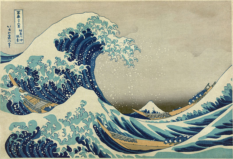
The Great Wave off Kanagawa by Hokusai; image from Wikimedia
The inspiration from the style came from two sources, one probably influenced by the other. The first was The Great Wave Off Kanagawa by Hokusai; the second is this Nike advertisement postcard found in a surf magazine a few years back and stuck on my office wall along with all of the other things I find that I like and may reference later.
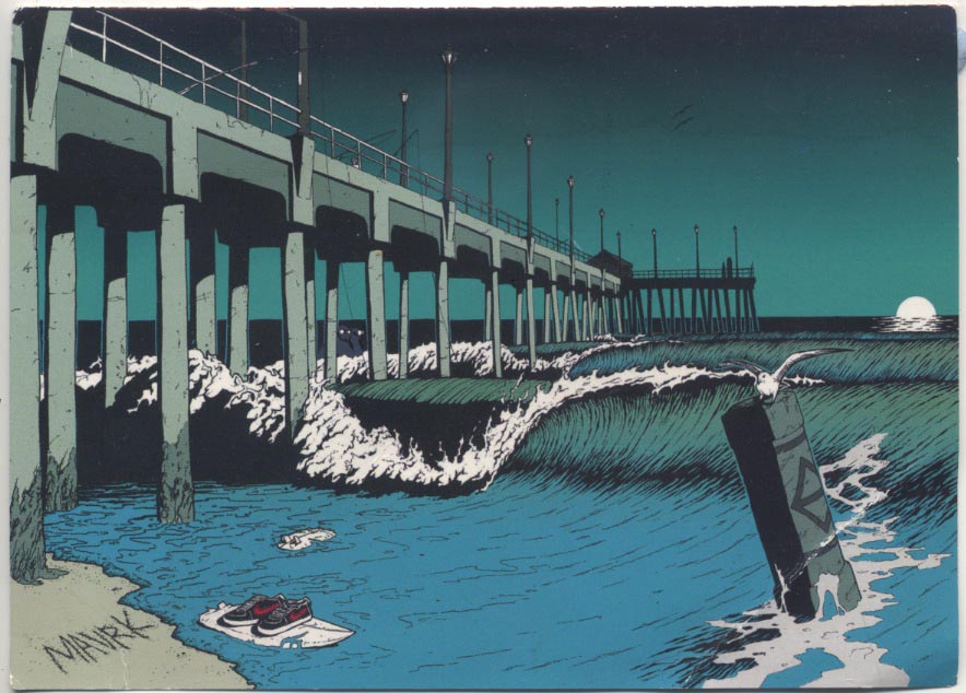
A postcard that fell out of a surfing mag way back when; I stuck it on my wall with all the other things I like. Pretty sure it references an early scene in Dog Town and the Z boys which is an excellent movie if you are into skating and surfing and such
I drew the whole scene in pencil from the inside of my head and memories of surfing, without reference to photos (sometimes I use photos to accurately capture a particular object, or person’s position, or something).
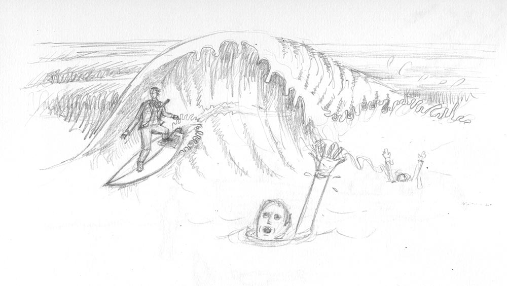
initial pencil rough of illustration. The purpose of this is just to show the editor what’s in my head and give them some idea about final composition
My editor Mark Samuels approved it with the one condition that I changed the gender of the surfer (yay!)- IT is a rather male-dominated industry and we try to rebalance that at the magazine as much as possible – and so I inked up the drawing using a brush and black Indian ink, paying close attention to the way Hokusai and the Nike advert had depicted the waves. Anything that is constantly moving, like fire and water, is very hard to draw, and so I make no apologies for nicking the way someone else has successfully managed to get it right!
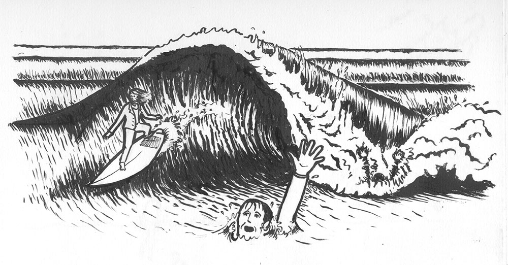
The illustration, redrawn carefully and then inked up using Indian ink and a watercolour brush
I then scanned the inked-up version into photoshop and cleaned it up, and then changed the black to sea green. I often use a cardboard base for my illustrations – it lends a nice texture and prevents the illustration becoming too “clean”. I have a pre-scanned piece I use all the time; I placed this into the background, changing the inked layer’s blending mode to “multiply” so as to hide the white.
I put a sky-blue gradient layer effect onto the cardboard layer, and then all that was required was to add detail colour to the scene using photoshop’s brush tools and a graphics tablet, making sure to highlight the surfer.
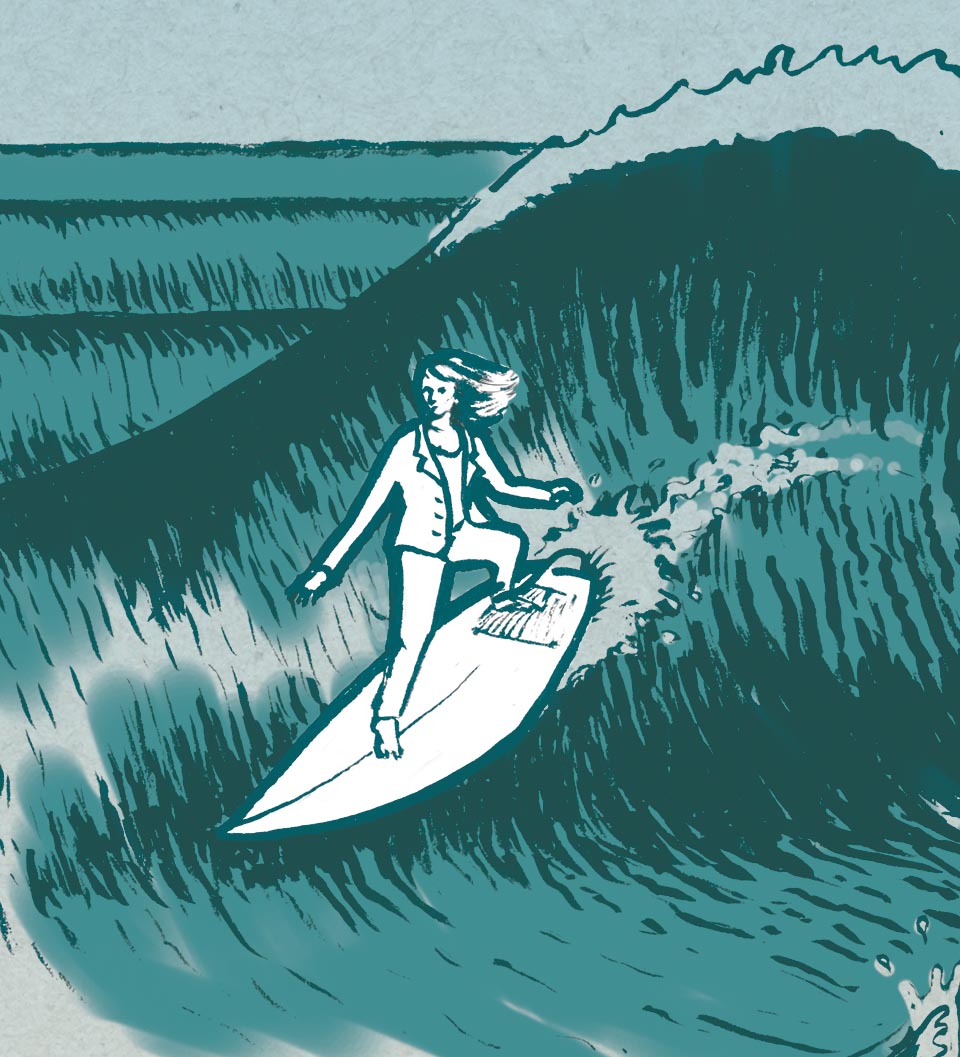
Close up of the surfer – giving her a white background when everything else has a turnquoisey cardboard feel makes her stand out more
The final page design divides the page up into thirds. I usually work with the Rule of Thirds or the Golden Section because it makes creating powerful visual hierarchies so much easier.

And there we have it! Hope you enjoyed this post 🙂