by Frank | Feb 14, 2018 | illustration, thoughts
(or, why following your dreams is bloody terrifying)
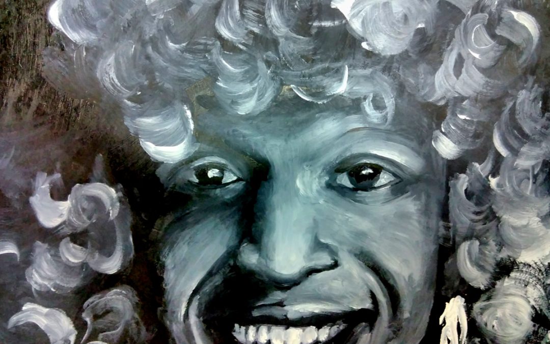
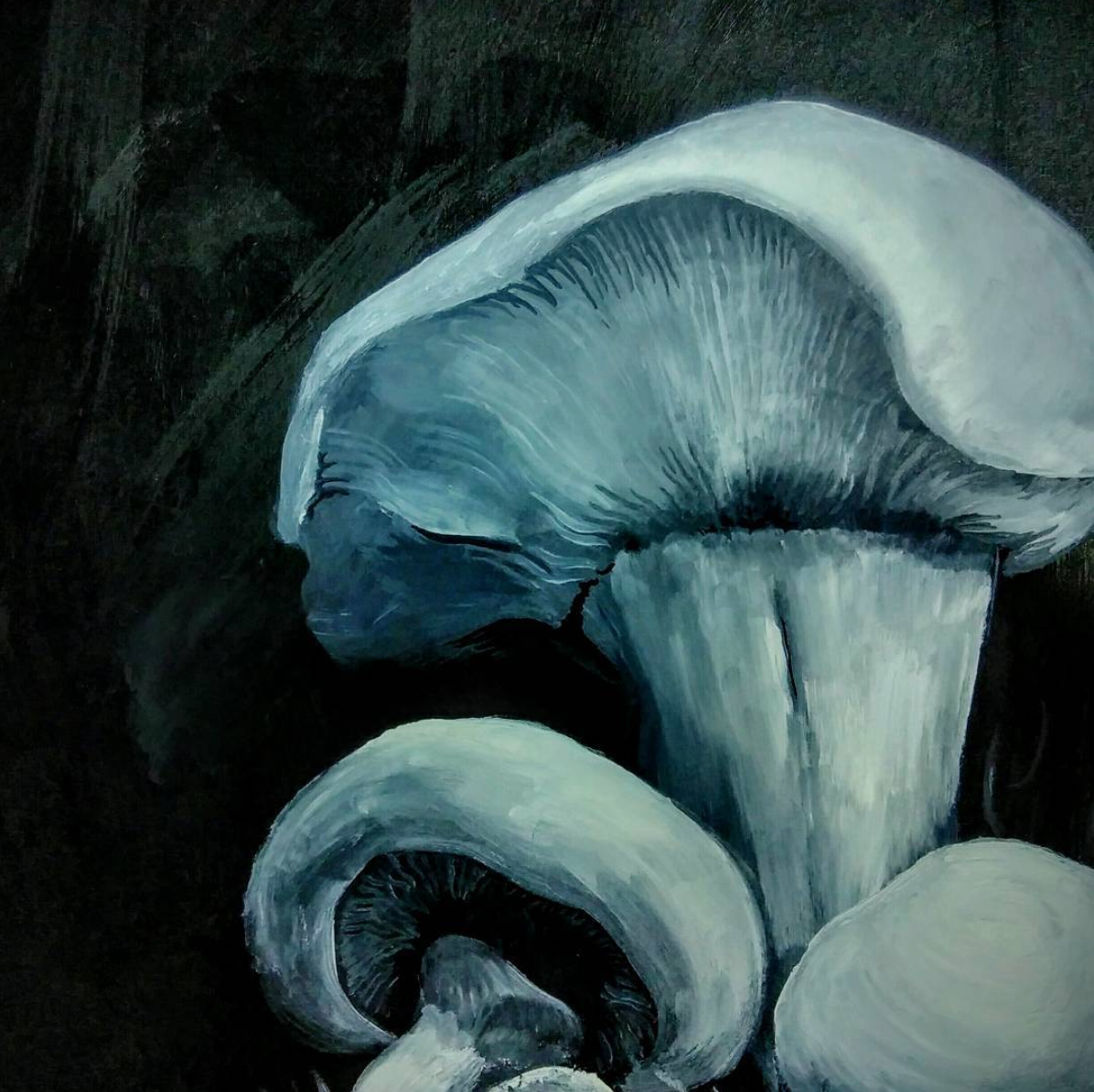
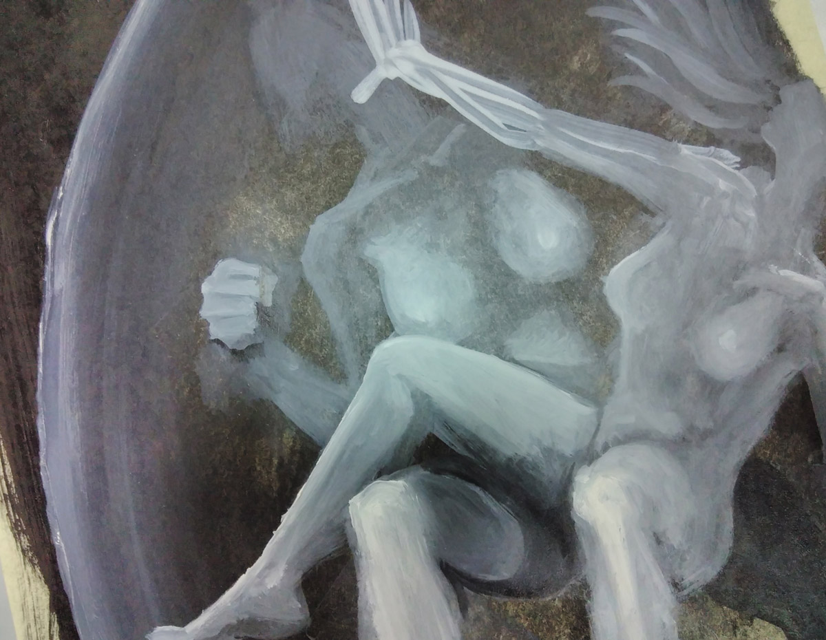
Maybe you’ve seen some of the lovely weird images I’ve been sharing on social media? smeary black and white oil paintings of Princess Diana, ghostly mushrooms, bleak storms at sea and other blurred visions from the edge of purgatory?

They’re possible illustrations for this project. It’s the final major work for my Master’s in Illustration: Authorial Practice at Falmouth University.
(go back to academia! follow your dreams!)
I’ve written a book of 33 passages of 333 words focused on gender, queerness, being outcast, depression, breakdown, death, magic and cats. I’m thinking about the inconsistent nature of the self, the unreliability of memory, of irony and earnestness and the definition of queer.
Once I have finished the book it will be printed and made-up and bound (book binding is one of the many very useful things they are teaching us on this course) and I will crowd-fund to publish it in a limited edition press. This will be around September/October 2018.
The sales pitch (don’t worry, I’ll move onto The Terror shortly, because I know we’re both more comfortable with that state of affairs)
If you’d like to support the creation of the project I’d recommend signing up to my patreon
(you would say that, you say)
(ah but have you seen the rewards? you get many and varied lovely things in return, say I. It is a win-win deal, say I)
You’ll get to read excerpts, see illustrations as they progress and, depending on the amount you subscribe for (up to $10 USD a month) you’ll get lots of art and maybe a copy of the book. There’ll also be little essays – thought responses – to the theory I’m reading and the art I’m looking at.
I’m working part-time to do this MA – I couldn’t afford to take the time off to work on it full-time, so your support of my patreon really does keep me going.
I’m creating this book because of the dire need for a diversity of trans voices.
I’ve read egregious well-meaning cisgendered people’s writing about the trans experience that are deeply harmful and it makes me want to sick up my lungs.
There are good trans writers out there and they are getting published – hooray! – but this work is different from what I’ve seen so far, straddling image and text, fiction and biography, and if I can do it right, it will lead you somewhere else. I’m very proud of it and I’m only halfway through. I can’t wait to share it with you.
That’s the sales pitch done – and now onto the terror
the terror is this: that I should be working on a cute kids’ book aimed at big publishers
the terror is that I am being self-indulgent, that no-one wants to read about trans experience, and that I should stick to drawing dinosaurs
the terror is that I have taken out a £10,000 student loan for these two years during which I should be Doing Something For My Career
And the protestant work ethic and conditioning of late capitalism is such that though I am exploring all sorts of wonderful things, though I am communicating just what I want to in these images, in this writing, though I know that this work is needed, and that it will set me off towards what I want to be doing, the voices (and ah, they are in the tone of my dear departed mother) the voices are concerned that This Work Will Not Be Profitable
this is the terror
and quite frankly, the terror can get fucked.
I have done a children’s book, and very popular it was too, and perhaps I will do another one one day. But now – now is the time of the queerdo. Now is the time for portraits honouring Marsha P Johnson, of fear and queer lust, of dark intentions and bright bones. Now is the time to other heteronormativity, to centre the weird, the obscure, the frayed-at-the-edges.
I hope you will join me on my journey, and I hope that we will both enjoy ourselves beyond and above the bite of terror.
And all shall be well
and all manner of thing shall be well
when the tongues of flame are in-folded
into the crowned knot of fire
and the fire and the rose are one
-T S Eliot
by Frank | Feb 13, 2018 | graphic design, illustration
Poster illustration and design
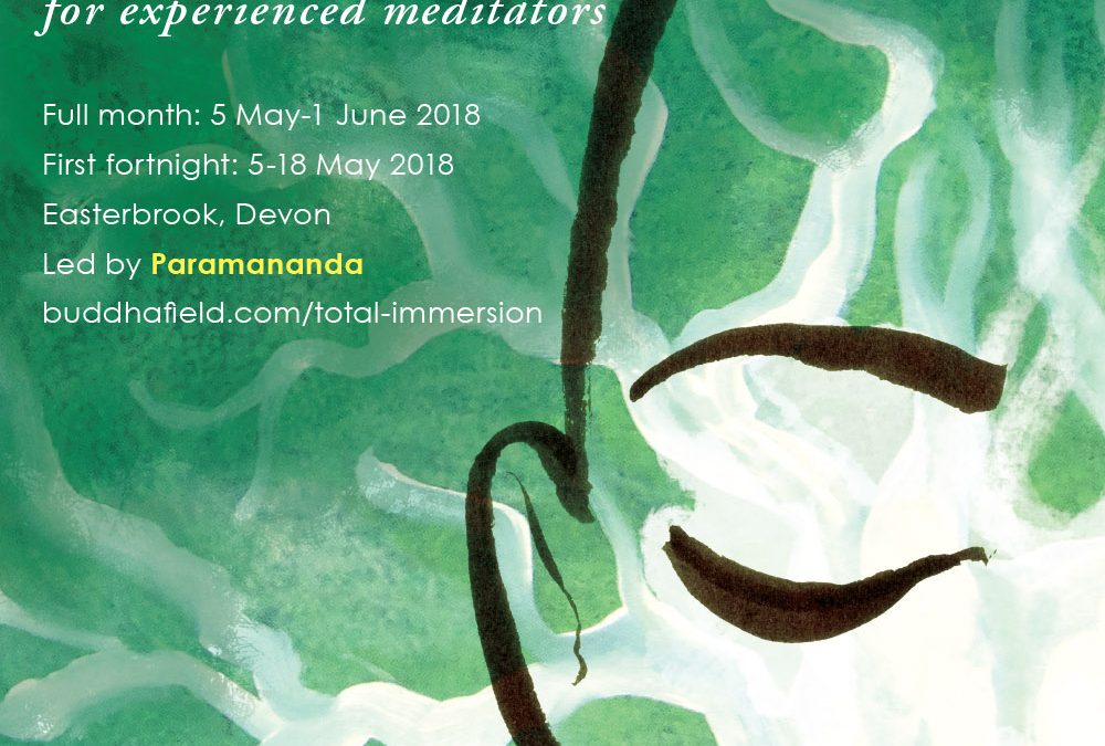
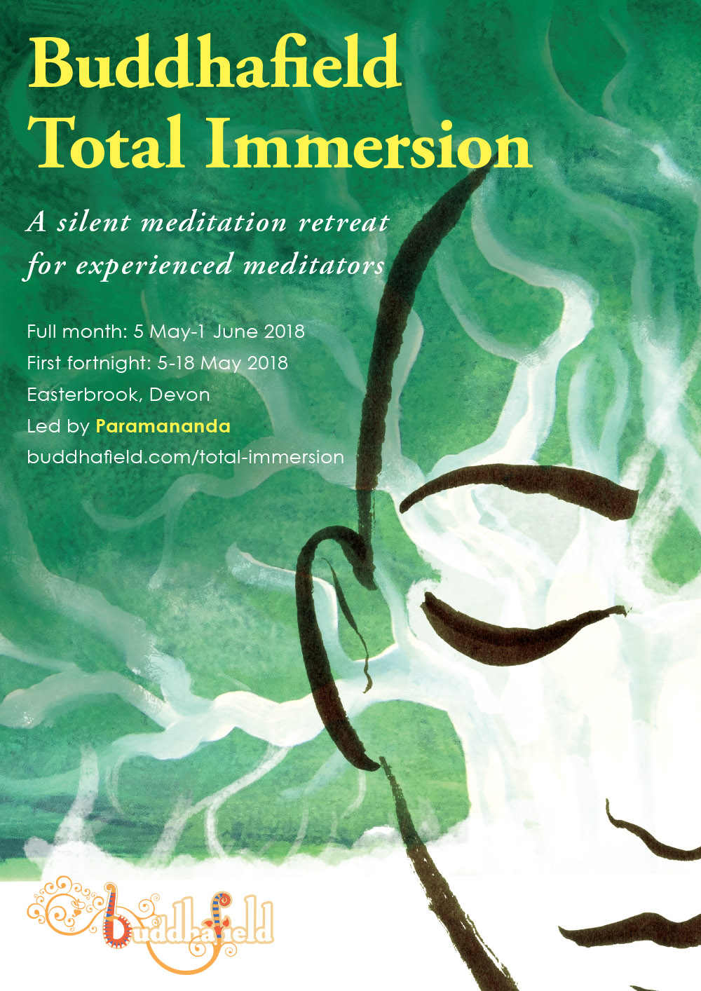
I was commissioned by Buddhafield to create a poster advertising their popular month-long Total Immersion retreat. I meditated (of course) on the themes of stillness, mindfulness, nature and the sacred, and came up with this.
I’m very excited because it is the first time I have created a paid commission in oil paints. The green and white treeness is oils and acrylics (I threw the rulebook out of the window and mixed them together and the mismatch lends the depth and texture of the green). The face is created with my usual medium of Japanese ink brush and photoshopped on top. Lastly I added clean and simple typography, making sure the words had plenty of space and room to breathe.
by Frank | Oct 30, 2017 | illustration
I created these fabric wall hangings for a client in West Wales. They’d just had an extension to their house and wanted large and striking artworks that would also soften the reflective sound – the echoes – from all the new plaster and glass in the room.
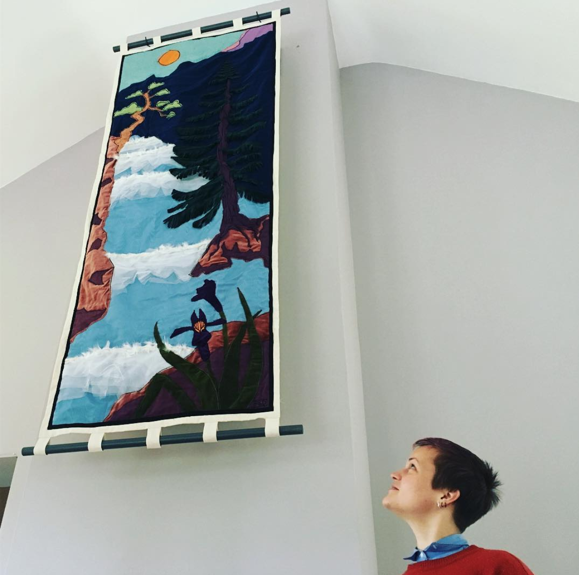
Fabric wall hangings – how we did it
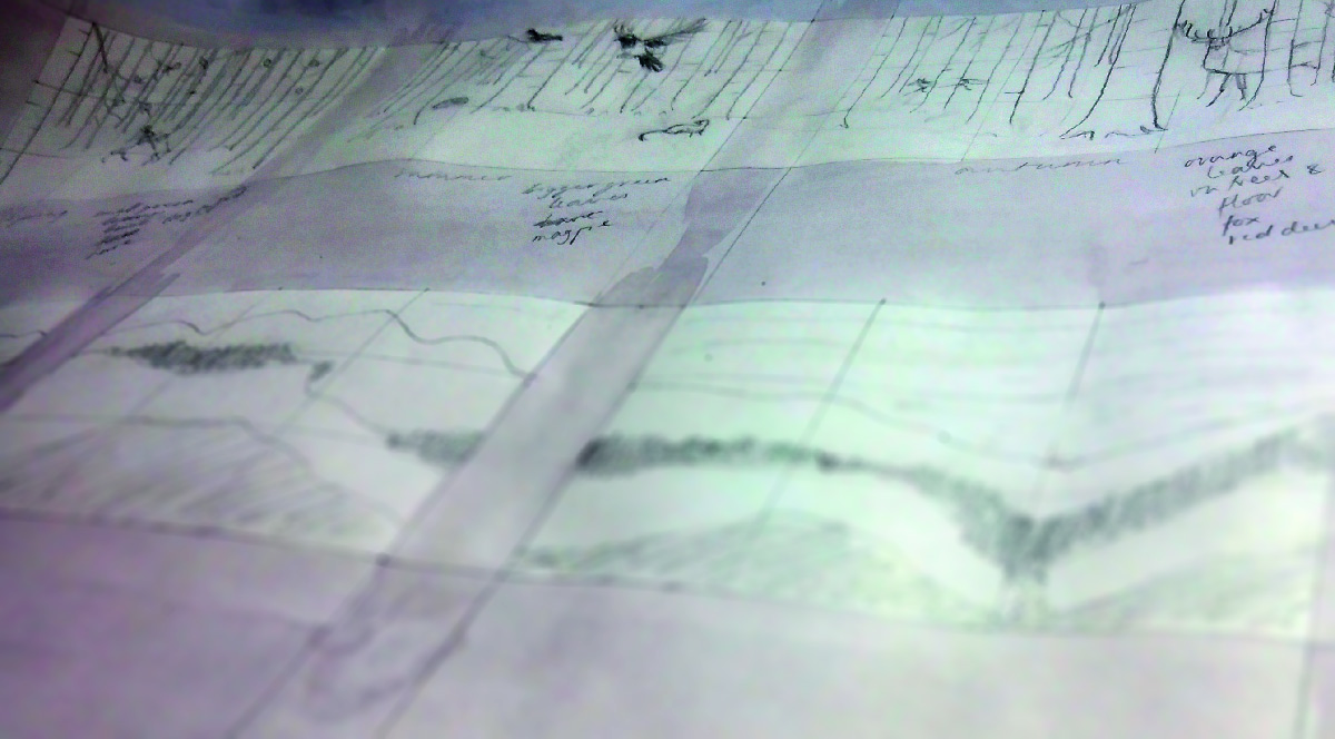
The first part of the work was like any other illustration project. We chatted about what the client liked and what they wanted. I came up with six designs sketched in pencil – three for the tall hanging and three for the sets of four. Here they are:
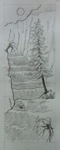
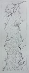
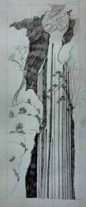
![]()


The client chose one of each and I created larger, more carefully-drawn versions which were to scale, and decided on a colour palette. Though the fabric wall hangings are different colours they are all based on the same colours.
Here they are coloured up:
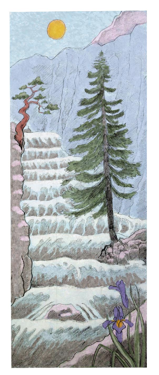

And here is the colour palette:

Fabrics for wall hangings
Once I had the designs and colours approved I stuck together enough paper to create full-size versions of the designs. The tall one is 2.1m high by .8m wide and the four are .8 high by 1.2m wide each. I chose a sturdy cotton twill for the background and dyed it using two different colour dyes for the four. I salted these while wet to give a slight mottled effect and then dripped acrylic paint onto the bottom third of these to create a forest floor.
As for the other fabrics, many I got from a friend who has an amazing collection, and some I bought from a local shop. I wanted to create interest with texture and pattern, because accurate detail is difficult with a sewing machine! I cut out the shapes using my full-sized paper guides, and with the animals I actually drew them carefully and cut them out to make templates. I pinned the fabrics to the surface, working from the background to the foreground, and satin-stitched them into place with a sewing machine. Some fiddly bits – the feathers in the water froth and the long-tailed tits, for example – had to be glued and hand-sewn.
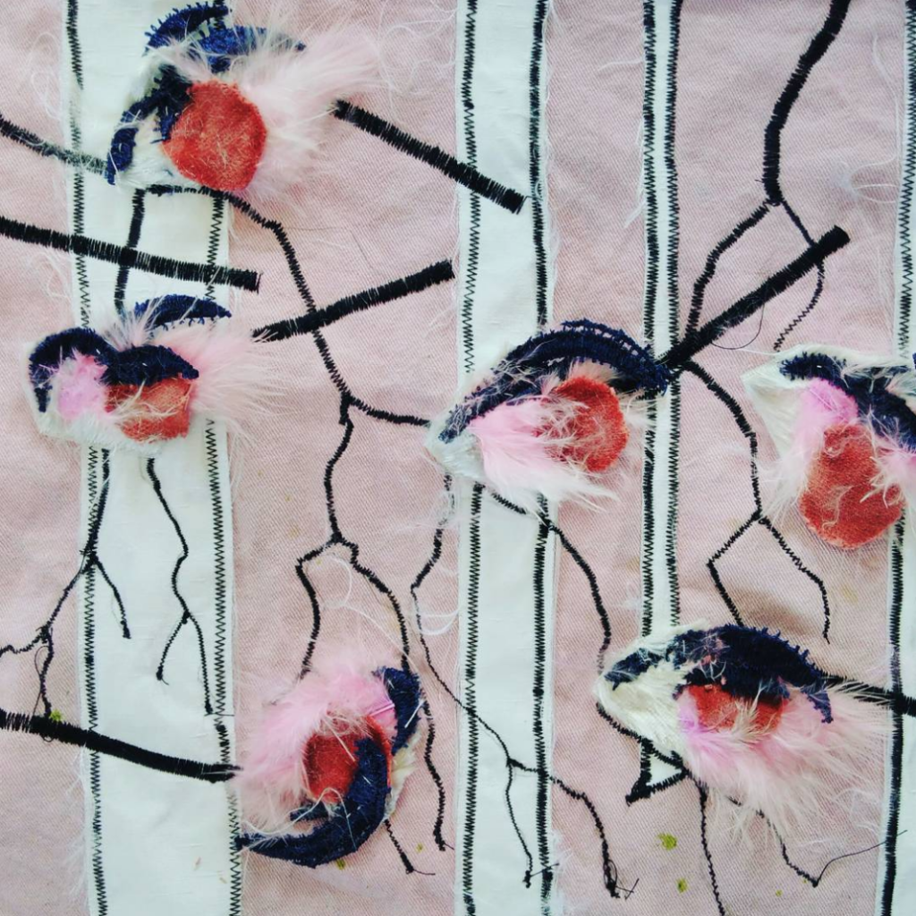
Silver birch bark was created by ironing on backing to a satin with a slub, and then with dilute acrylics darkening the bases. Sharpie ink held onto the satin so it bled works magic for the horizontal dark bands on the tree trunks.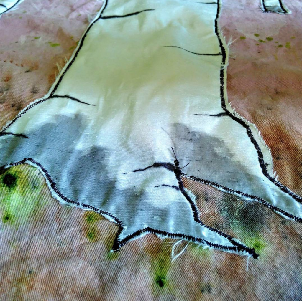 The branches are decreasing widths of satin stitch.
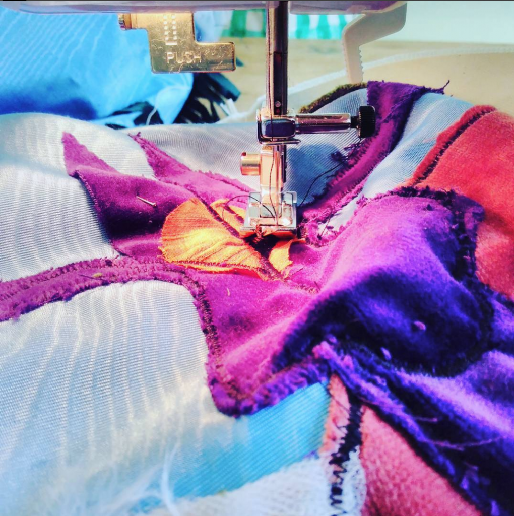 Some parts of the sewing – alright, most parts of the sewing – were very fiddly, but it was really exciting to see it come together. Once the panels were created I sewed fabric loops top and bottom, bearing in mind the diameter of the poles to be used to hang them. I then encapsulated sheets of thick wadding slightly smaller than the panels (so they can’t be seen from the front) in curtain liner and sewed that to the backs. This is the sound insulation.
And then they were hung!
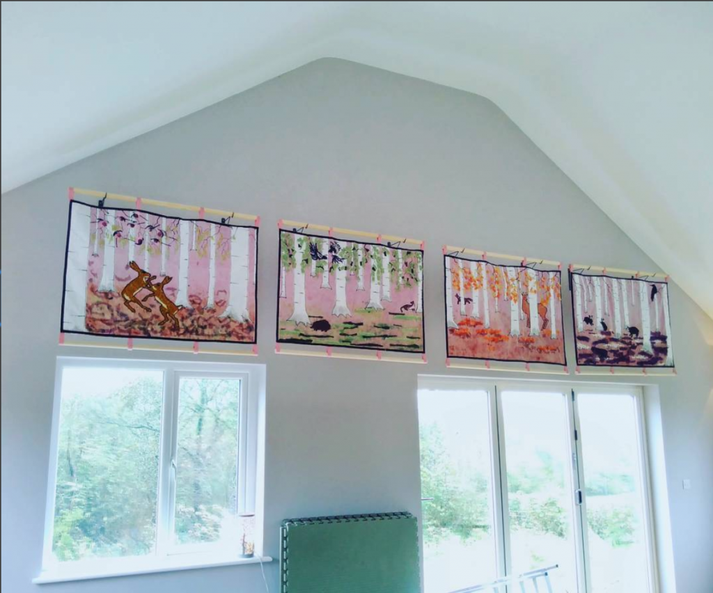
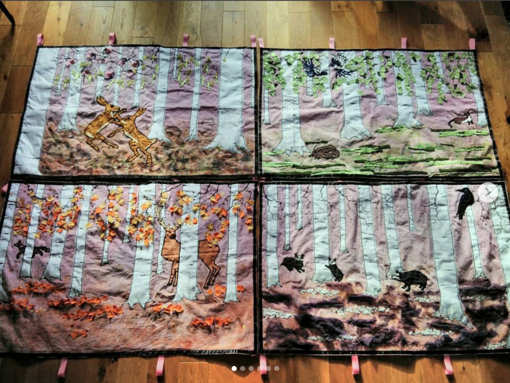
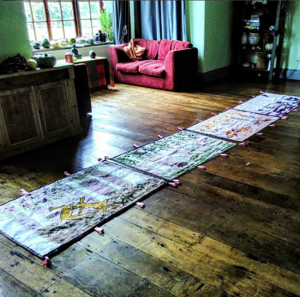
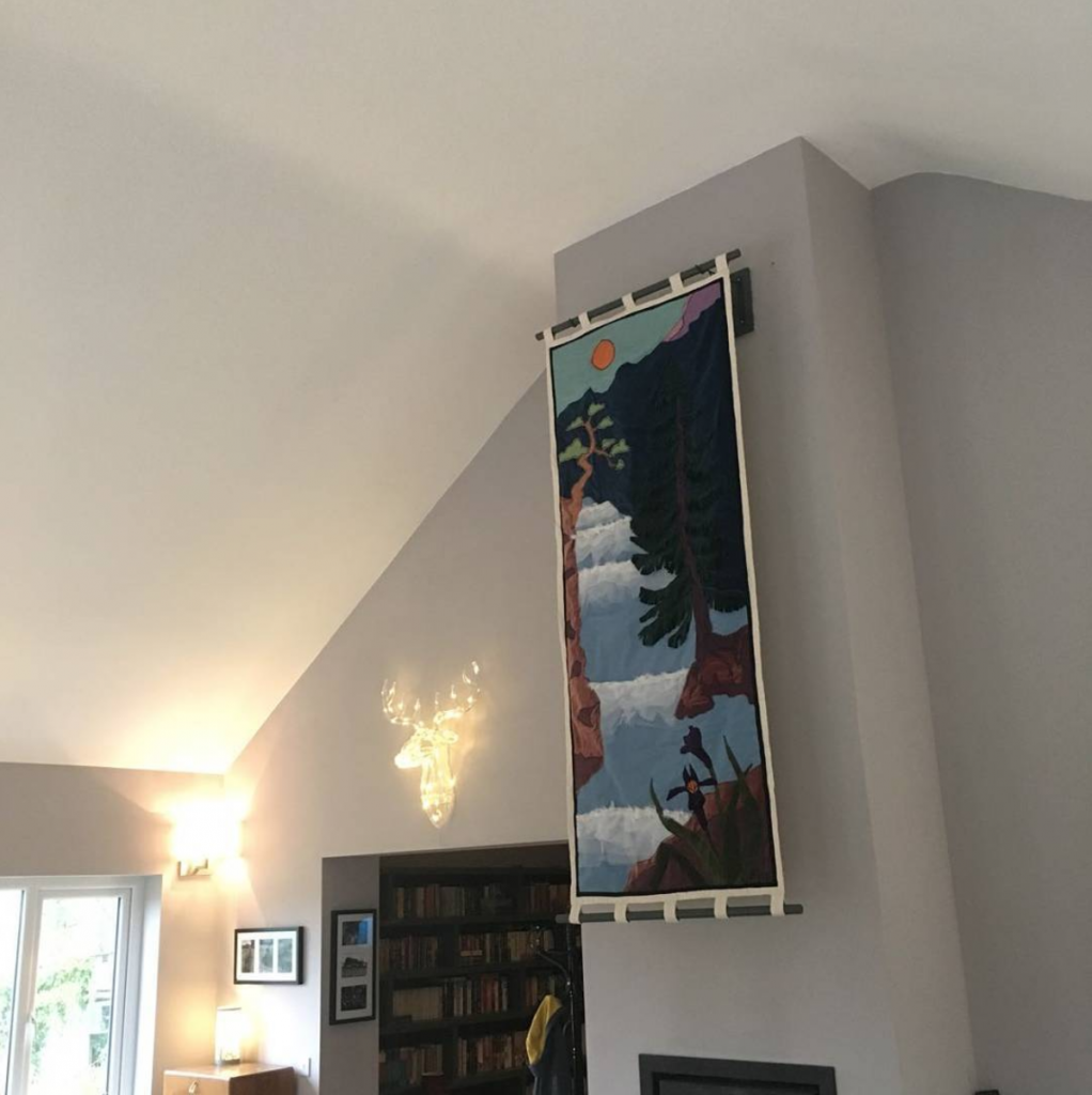
As you can see from the process involved these aren’t the cheapest or quickest creations to make but if you are looking for a large statement piece they really do grab the eye but with a wonderful softness. Commission me!
I’ve created many large works in the past – most recently these A1+ maps for National Army Museum and this huge mural for Wales Millennium Centre.
by Frank | Jul 10, 2017 | blog news, illustration
I get asked to do a lot of weird and wonderful things and this request has been my favourite in a long while – illustrated fabric wall hangings.
The client has recently had a house extension and has large areas of his new living room to cover with art – and he also wanted to soften the reflection of noise on the bare walls.
I’m no stranger to creating large works – I created this four-metre bilingual mural using watercolour pigments and salt for the Wales Millennium Centre, but this is even bigger – four panels that together make a forest scene progressing through the seasons that is five metres by .8 metres, and one tall piece to go above a fireplace that is 2.1 metres by .8 metres.
I’ve initially working the illustrated fabric wall hangings up in pencil: the first job was coming up with various concepts using rough layouts – below is a close up of the set of four panels as roughs.
 The next job was working up the selected concepts to a larger scale to improve the composition and increase the detail. Here are some critters from the seasonal scene, set in a forest of silver birch.
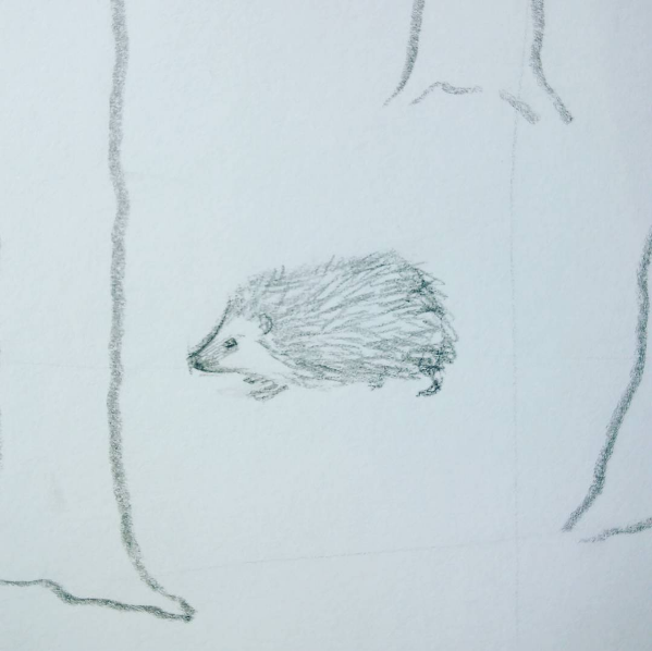
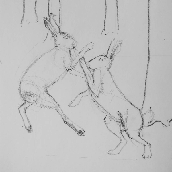 I’m keeping the designs fairly simple. I’m planning to do a lot with colour and texture on them – I see them as being a delicate balance between detail and simplicity. So the birch trees will be of a fabric with a subtle sheen: in spring they will have catkins dangling from their branches, in summer leaves, in autumn the leaves will be orange and in winter there will be snow. There will be a subtle gradient of colour in the sky in the background and the ground will be textured.
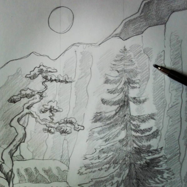
Snippet of design for tall illustrated fabric wall hanging
The next job is to work in colour – I have a strong palette in my head (I am obsessed with colour – did you know this? I really am) and I can see them coloured up very clearly – now the pencil works are all approved I will colour them up. The client’s paintwork is a slightly lavender grey and my colours will work well with that.
Once we have the colours, it’s on to buying the materials and creating some of the details in advance – the animals, for example. The hangings will be appliqued and machine-sewn with some embroidery, quilted to aid the limiting of sound reflection, and hung from bamboo poles. I’ll travel up with my sewing machine to Cwm Gwili and spend a week constructing these illustrated fabric wall hangings. I cannot wait to see them in the flesh!
PS have you seen my new rook screen prints?
by Frank | Jun 26, 2017 | illustration
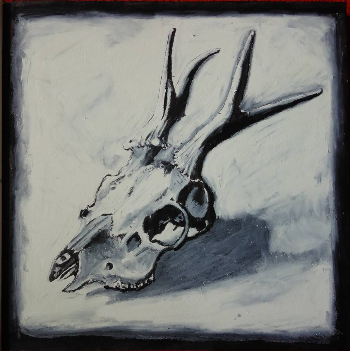
I had a few hours spare this afternoon so thought I’d play around with mixing brush pen and oil pastels to create this deer skull illustration, and I’m really pleased with the result.
I embarked on my Master’s in Illustration in order to improve my illustration style – I wanted to learn how I could impart more depth and feeling into my drawings.
I’ve been playing around with very quick drawings using oil pastels and other fairly crude media (by crude, I mean that which is difficult to work fine detail – the shadows and colours you can get with pastels are sublime). I’ve never really bothered with oil pastels before, but I’m using this part-time degree to experiment as much as I can and I’m loving it.
I’m particularly excited about this deer skull illustration because it uses the brush pen – a medium I use for commercial illustration all the time – for detail, and then over this I work in the pastel and it gives a kind of subtle viscerality (if that is a word). There’s a body to it, a meaty-ness, and the background has as much life as the subject.
I’m going to work this style with other pieces and see where it gets me.
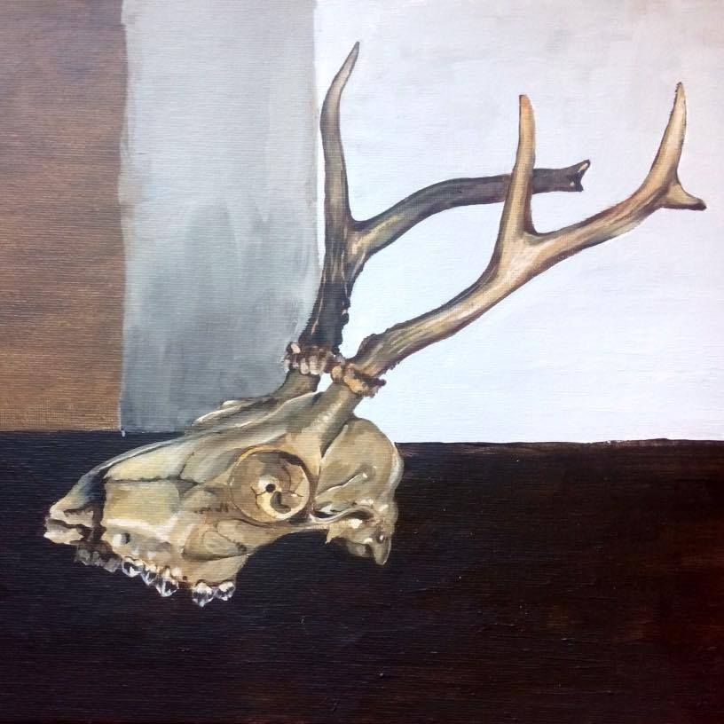
Here’s another painting I did of the same skull about a year ago:
by Frank | Jun 1, 2017 | graphic design, illustration, interpretation
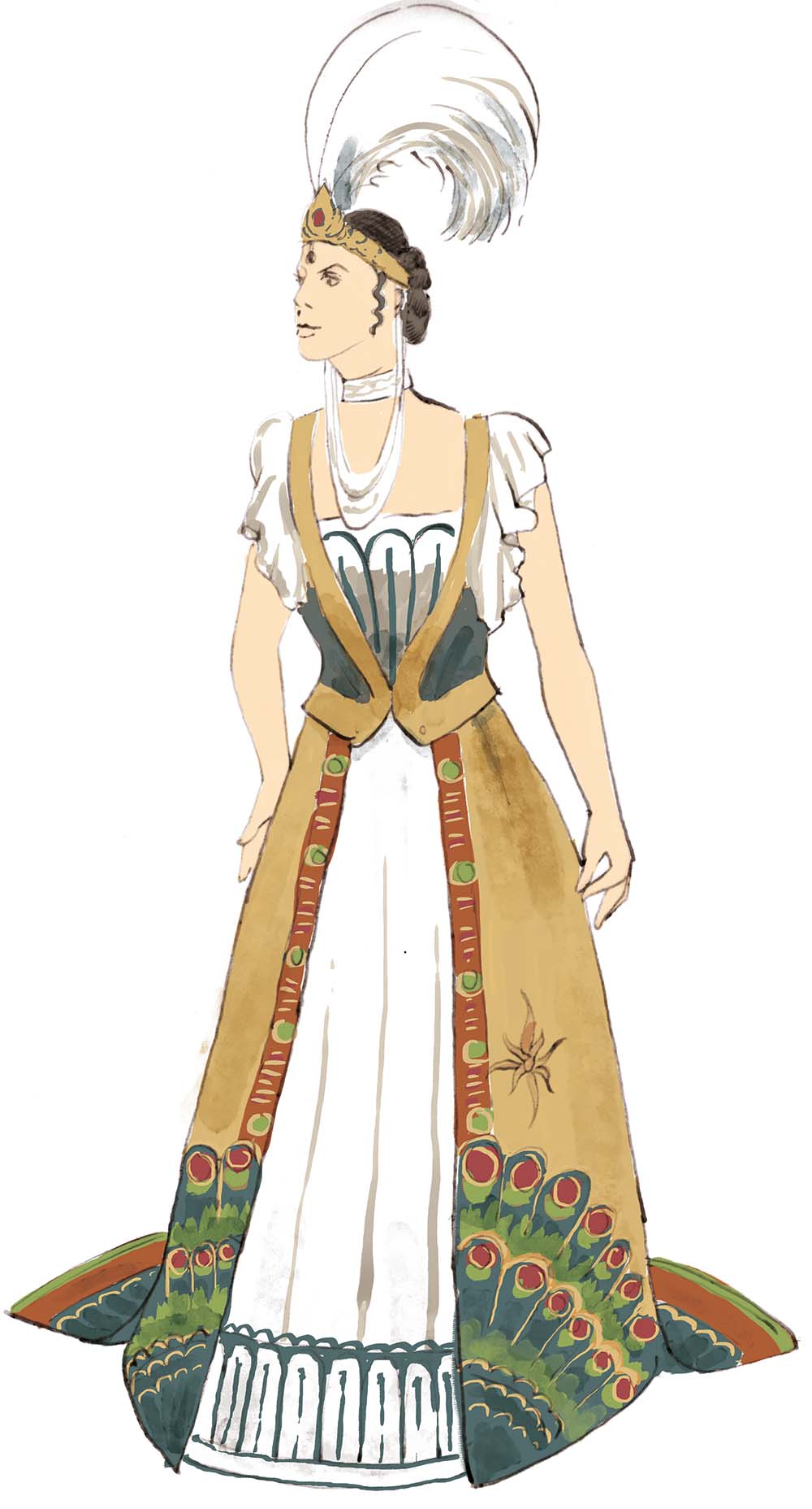
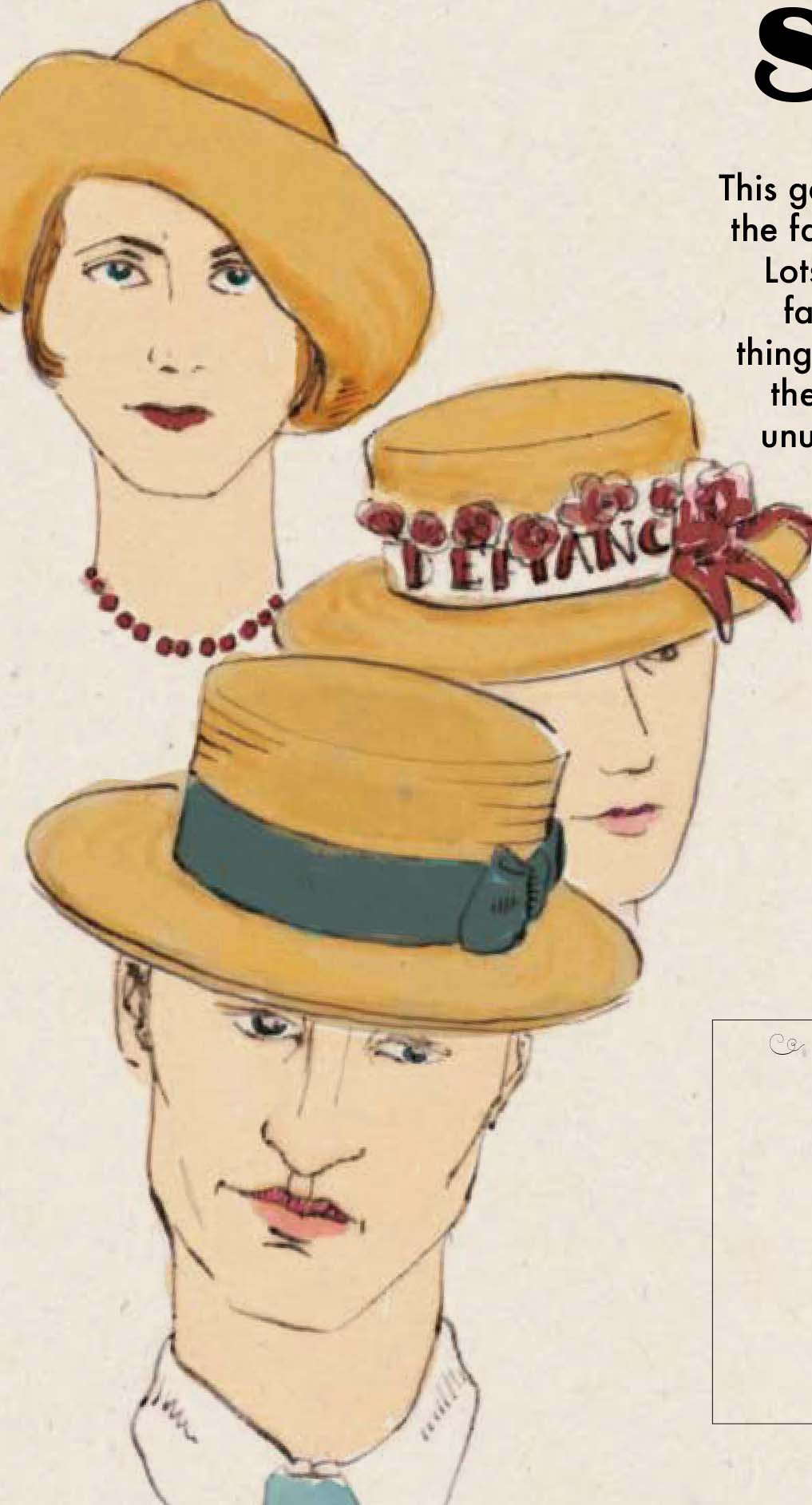
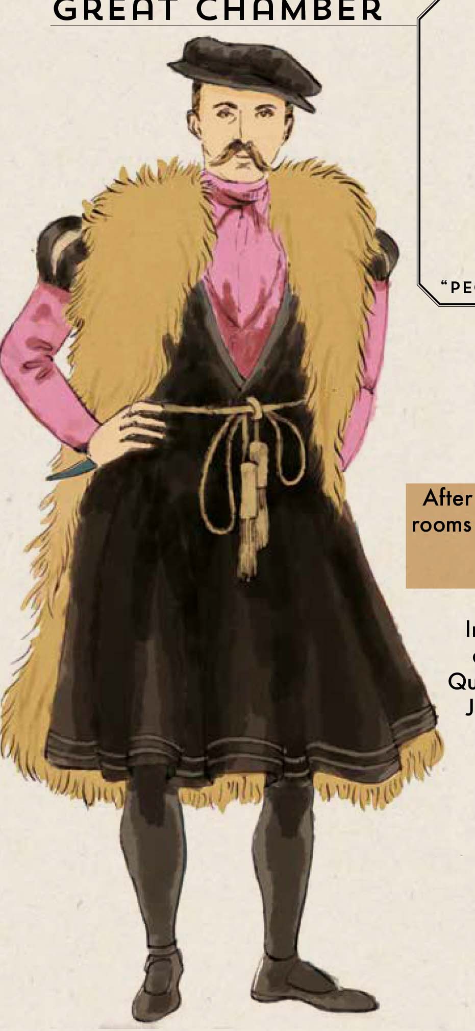
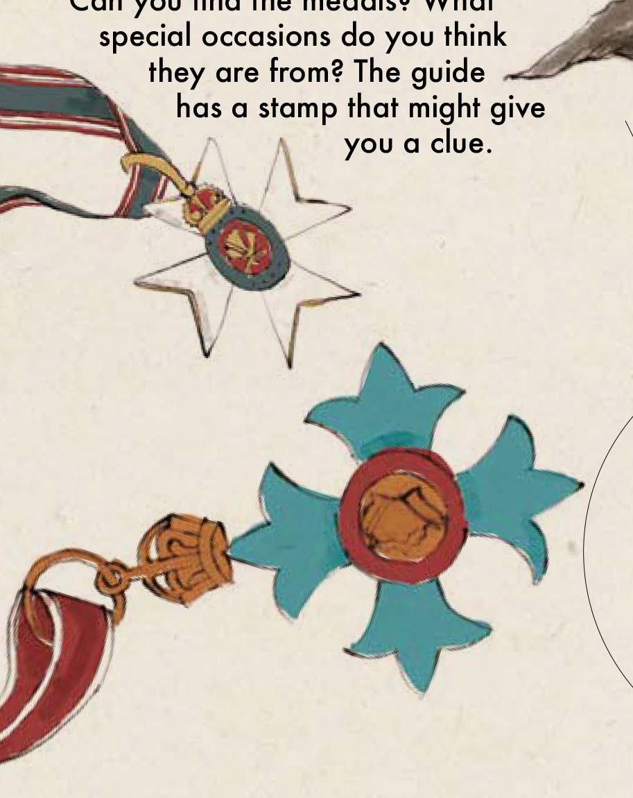
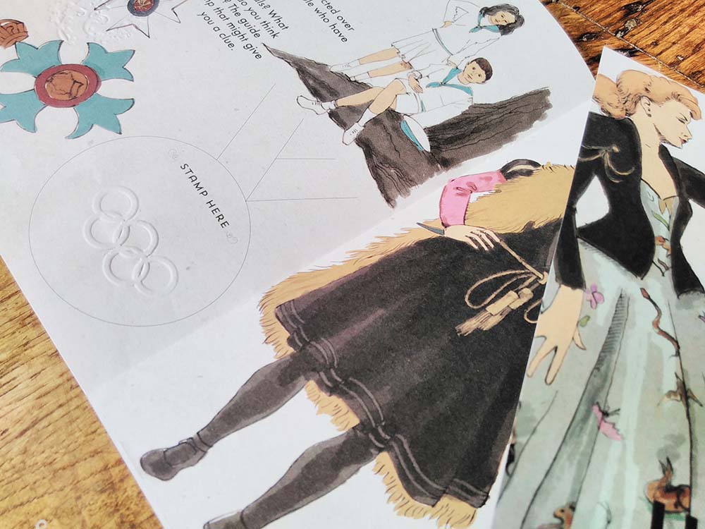
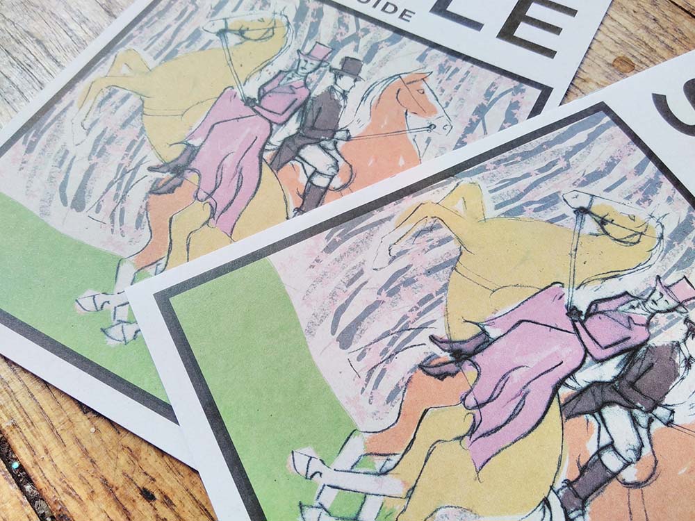
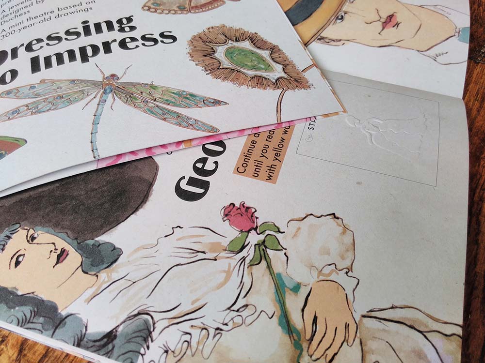 I recently completed this illustrated interpretation trail for a top heritage visitor attraction. I’ve done a lot of illustrated interpretation trails, like this, this and this. I’ve created them as single pages to bigger bilingual activity booklets, many for National Museums Wales. It was wonderful to be contacted by such a big name on the strength of my previous work.
Contractors aren’t allowed to mention the name of this client in their publicity material so I have to keep quiet about who it was created for, which I’m sad about because I am so chuffed to have worked with them!
I was asked to tender along with 6 other graphic designers and was delighted to have been selected. A wonderful thing the client did was to offer to pay people for submitting tender work – other buyers take note – you’ll get a much better quality of submissions.
The trail is 12 pages at A5 on uncoated paper. I used a different illustration technique from usual – dip pen and ink. I really like the effect – elegant and light – and am going to be using a lot more in future.
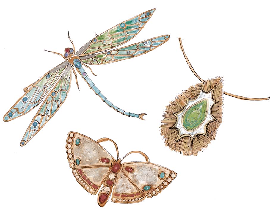
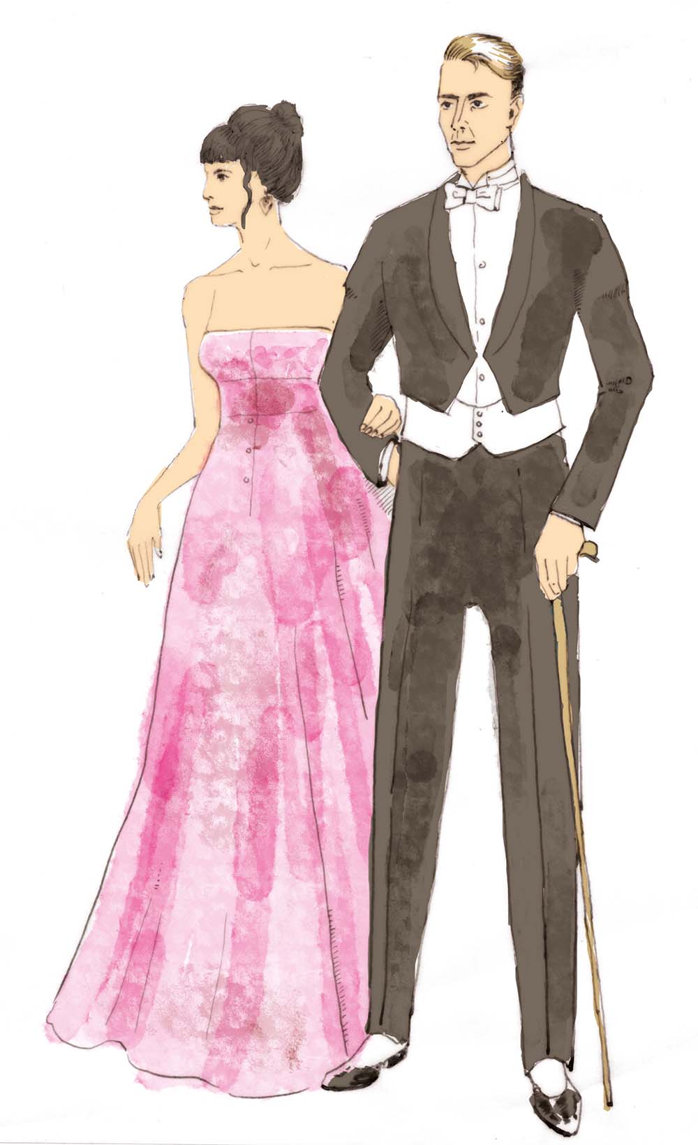
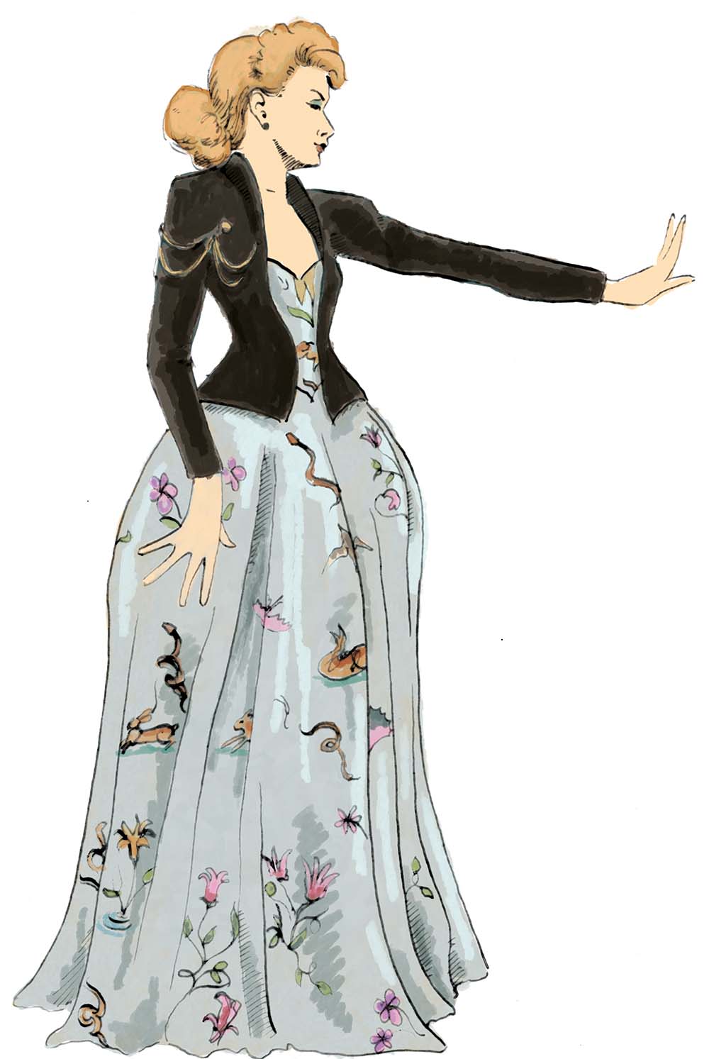
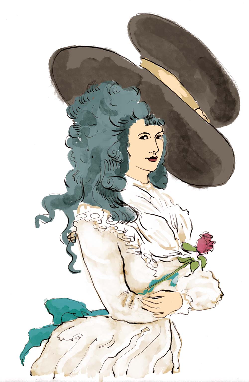
The exhibition the illustrated interpretation trail has been created for is one of fashion through the ages and so I drew some wonderful clothes – ball gowns, fancy dress, children’s clothes, along with accessories like jewellery and hats.
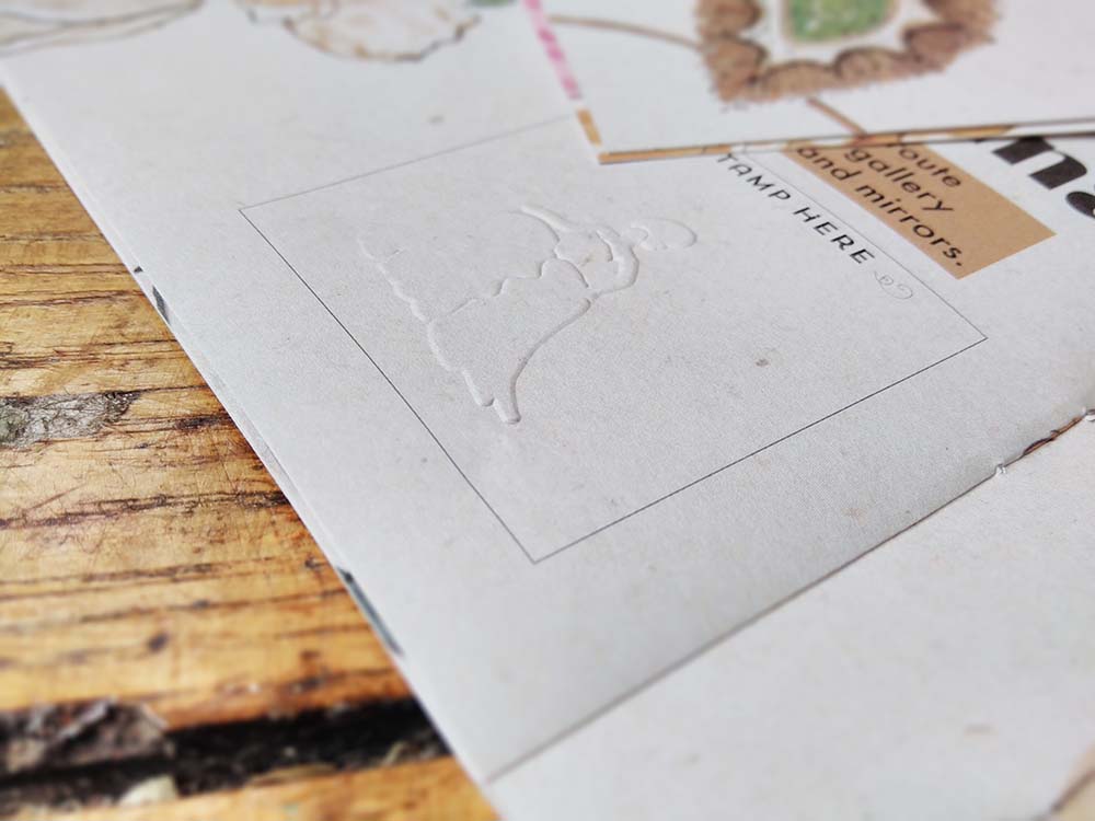
Because the client is a heritage site, ink can’t be used in the building, so where families complete the activities as they work their way around the exhibition they will be given an embossing stamp to mark their achievements. There’s a space on most pages for the stamp and each activity has a different stamp.
I really enjoy the creation of interpretation trails. They involve me blending my love of learning and encouraging learning, of explaining pictorially, and I get to draw some incredible things. But the best bit is watching families using and enjoying the trails – and seeing the way children often draw over the top of my work and make it their own.
This was a fabulous opportunity and I enjoyed every moment!


 The branches are decreasing widths of satin stitch.
 Some parts of the sewing – alright, most parts of the sewing – were very fiddly, but it was really exciting to see it come together. Once the panels were created I sewed fabric loops top and bottom, bearing in mind the diameter of the poles to be used to hang them. I then encapsulated sheets of thick wadding slightly smaller than the panels (so they can’t be seen from the front) in curtain liner and sewed that to the backs. This is the sound insulation.


 The next job was working up the selected concepts to a larger scale to improve the composition and increase the detail. Here are some critters from the seasonal scene, set in a forest of silver birch.
 I’m keeping the designs fairly simple. I’m planning to do a lot with colour and texture on them – I see them as being a delicate balance between detail and simplicity. So the birch trees will be of a fabric with a subtle sheen: in spring they will have catkins dangling from their branches, in summer leaves, in autumn the leaves will be orange and in winter there will be snow. There will be a subtle gradient of colour in the sky in the background and the ground will be textured.


 I recently completed this illustrated interpretation trail for a top heritage visitor attraction. I’ve done a lot of illustrated interpretation trails, like