by Frank | Feb 13, 2018 | graphic design, illustration
Poster illustration and design
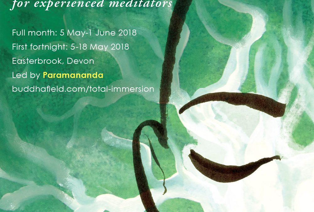
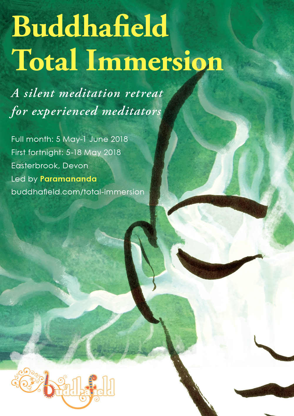
I was commissioned by Buddhafield to create a poster advertising their popular month-long Total Immersion retreat. I meditated (of course) on the themes of stillness, mindfulness, nature and the sacred, and came up with this.
I’m very excited because it is the first time I have created a paid commission in oil paints. The green and white treeness is oils and acrylics (I threw the rulebook out of the window and mixed them together and the mismatch lends the depth and texture of the green). The face is created with my usual medium of Japanese ink brush and photoshopped on top. Lastly I added clean and simple typography, making sure the words had plenty of space and room to breathe.
by Frank | Feb 12, 2018 | graphic design
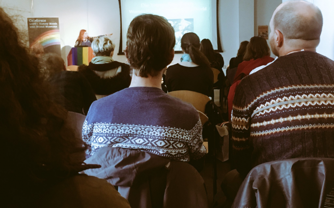
A great job for LGBT History Month – pop-up roller banners for a series of queer-themed talks at M Shed in Bristol. You can see one of them at the end of the room on the left!
by Frank | Jun 1, 2017 | graphic design, illustration, interpretation
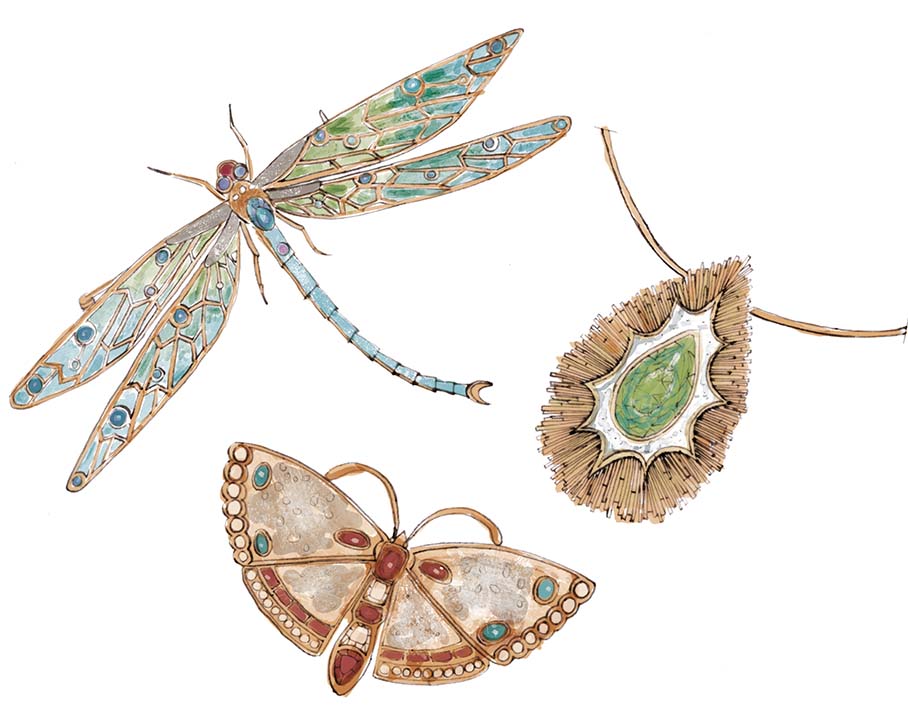
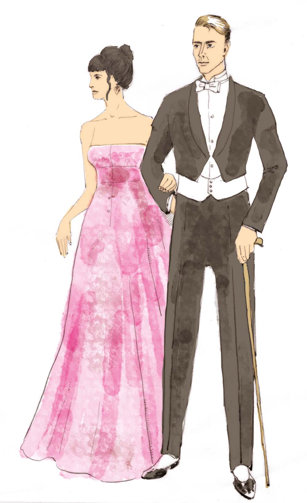
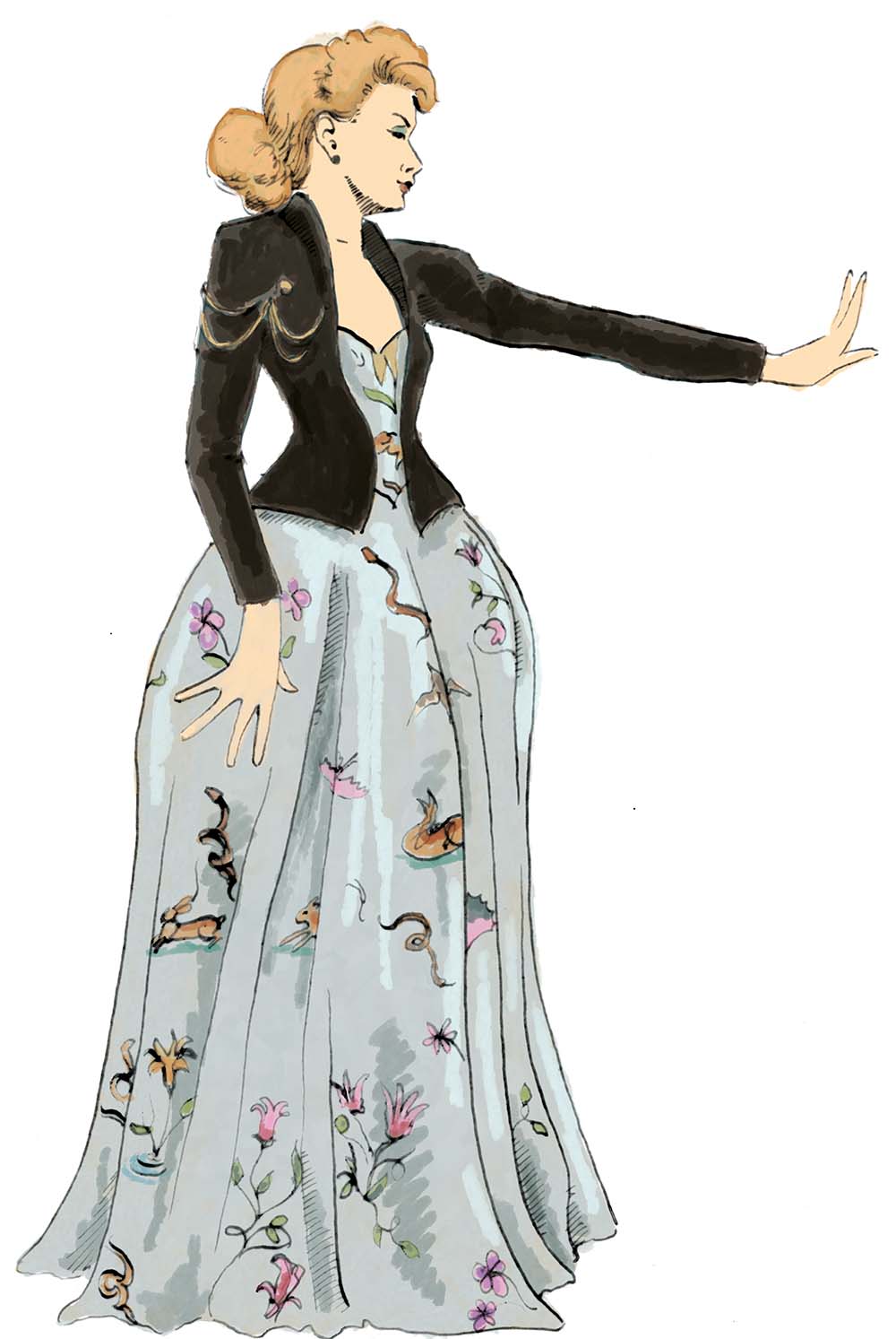
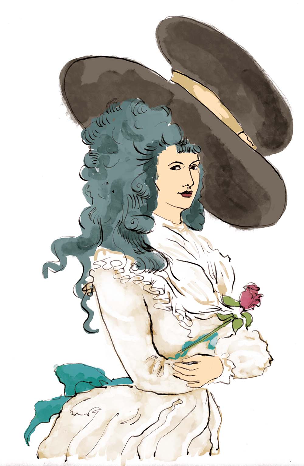
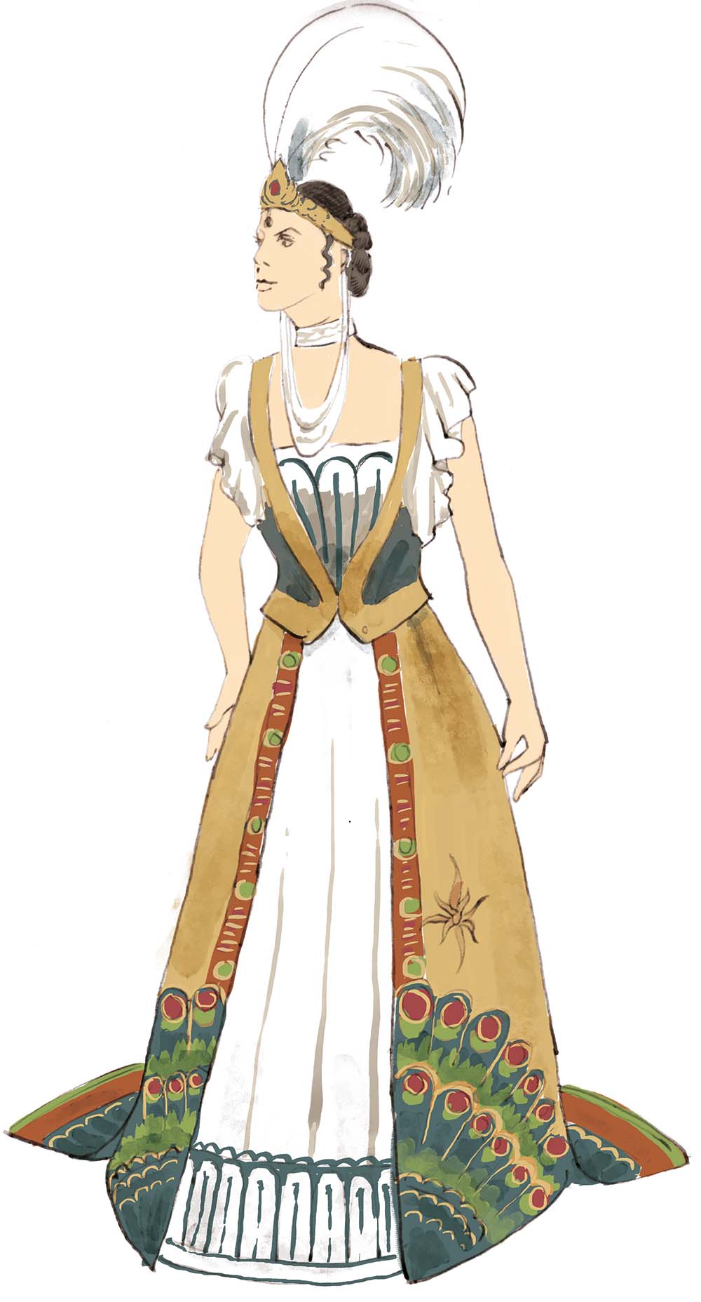
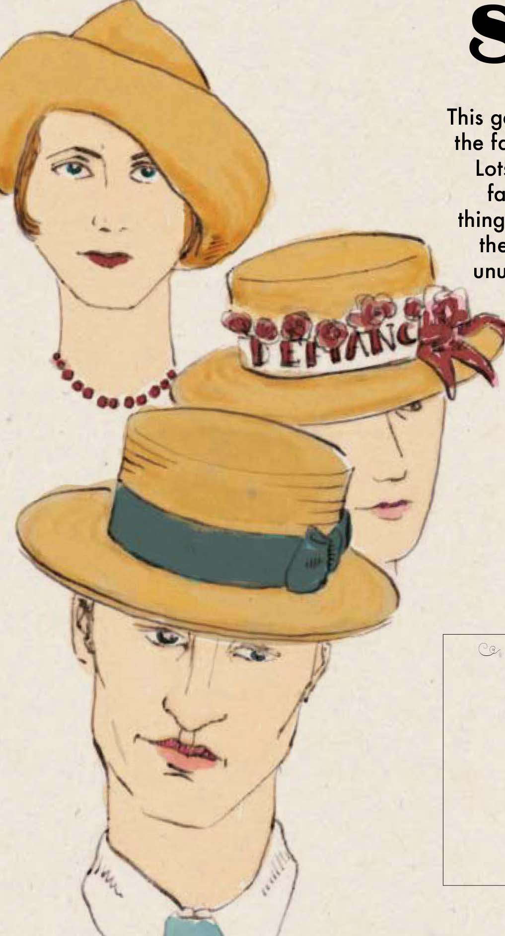
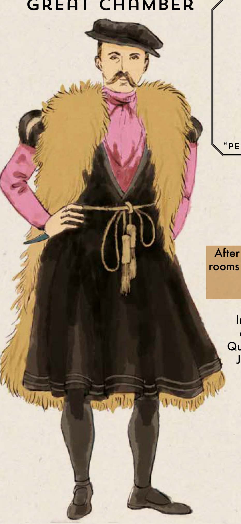
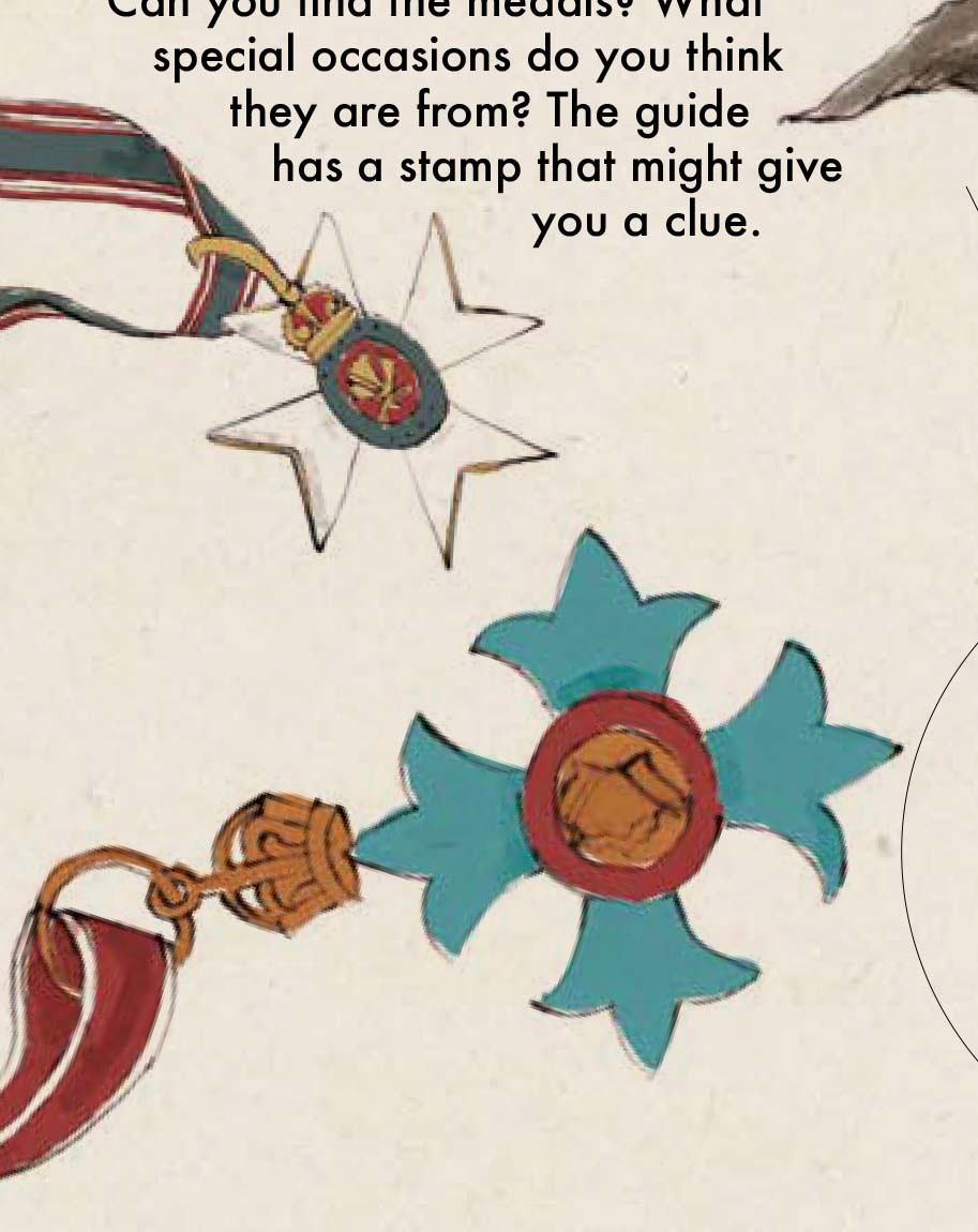
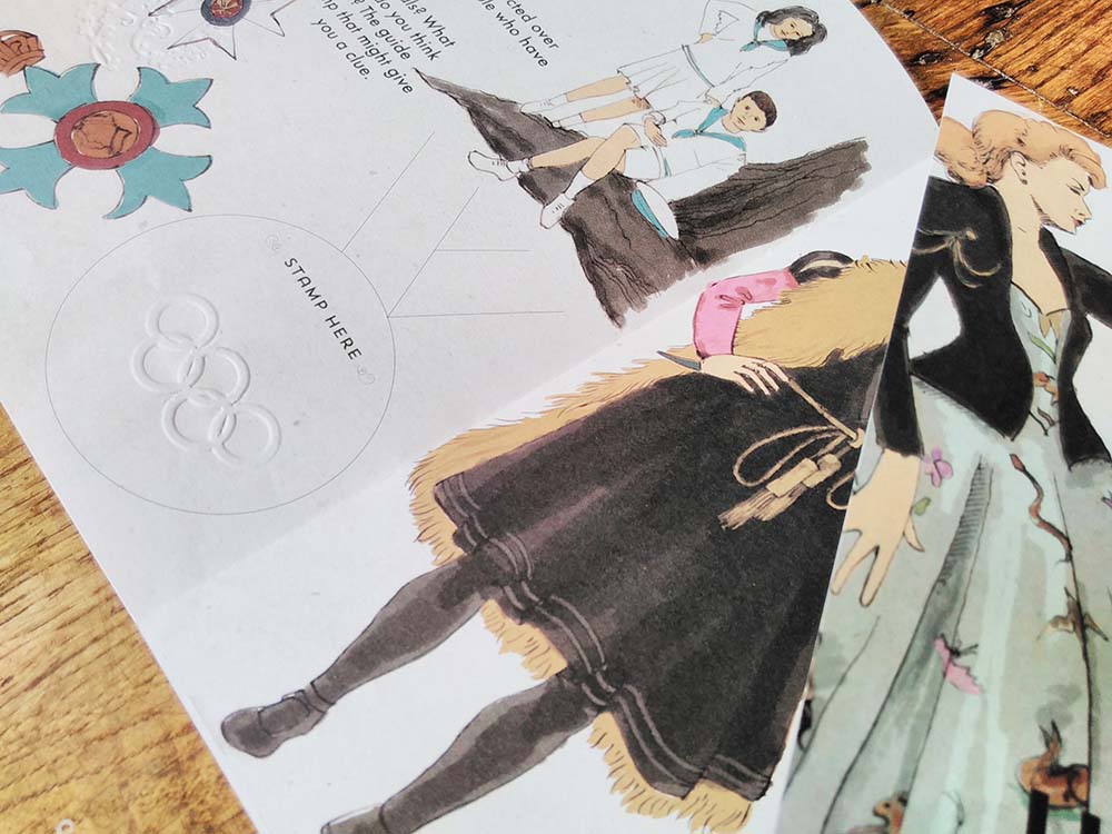
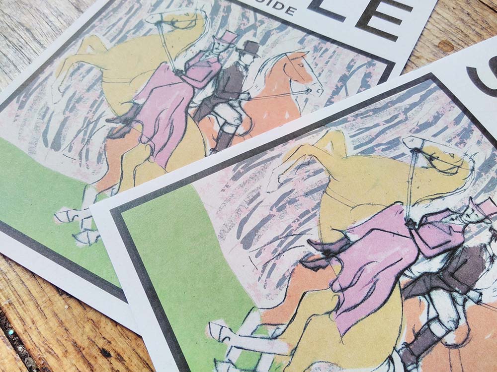
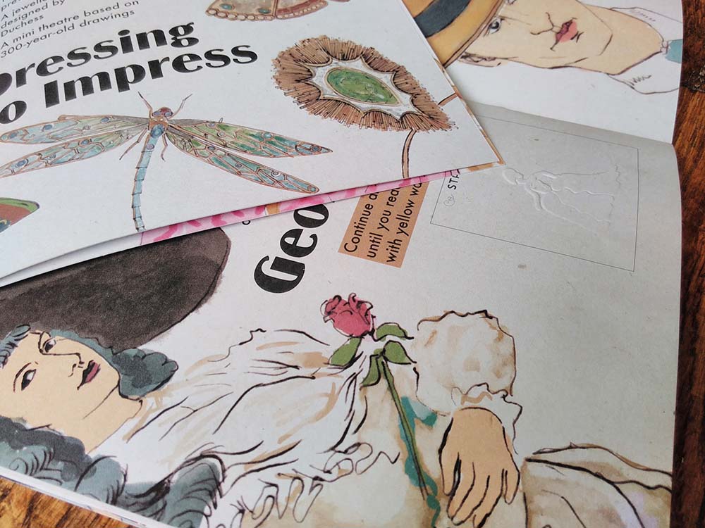 I recently completed this illustrated interpretation trail for a top heritage visitor attraction. I’ve done a lot of illustrated interpretation trails, like this, this and this. I’ve created them as single pages to bigger bilingual activity booklets, many for National Museums Wales. It was wonderful to be contacted by such a big name on the strength of my previous work.
Contractors aren’t allowed to mention the name of this client in their publicity material so I have to keep quiet about who it was created for, which I’m sad about because I am so chuffed to have worked with them!
I was asked to tender along with 6 other graphic designers and was delighted to have been selected. A wonderful thing the client did was to offer to pay people for submitting tender work – other buyers take note – you’ll get a much better quality of submissions.
The trail is 12 pages at A5 on uncoated paper. I used a different illustration technique from usual – dip pen and ink. I really like the effect – elegant and light – and am going to be using a lot more in future.
The exhibition the illustrated interpretation trail has been created for is one of fashion through the ages and so I drew some wonderful clothes – ball gowns, fancy dress, children’s clothes, along with accessories like jewellery and hats.
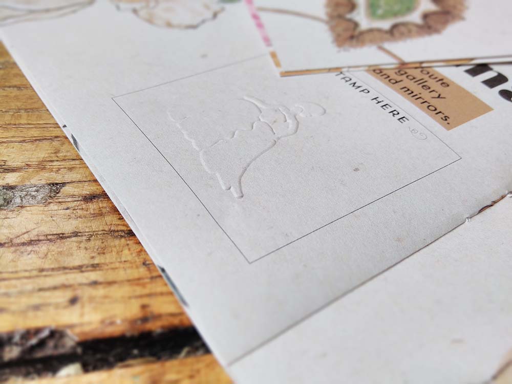
Because the client is a heritage site, ink can’t be used in the building, so where families complete the activities as they work their way around the exhibition they will be given an embossing stamp to mark their achievements. There’s a space on most pages for the stamp and each activity has a different stamp.
I really enjoy the creation of interpretation trails. They involve me blending my love of learning and encouraging learning, of explaining pictorially, and I get to draw some incredible things. But the best bit is watching families using and enjoying the trails – and seeing the way children often draw over the top of my work and make it their own.
This was a fabulous opportunity and I enjoyed every moment!
by Frank | Jan 5, 2017 | graphic design
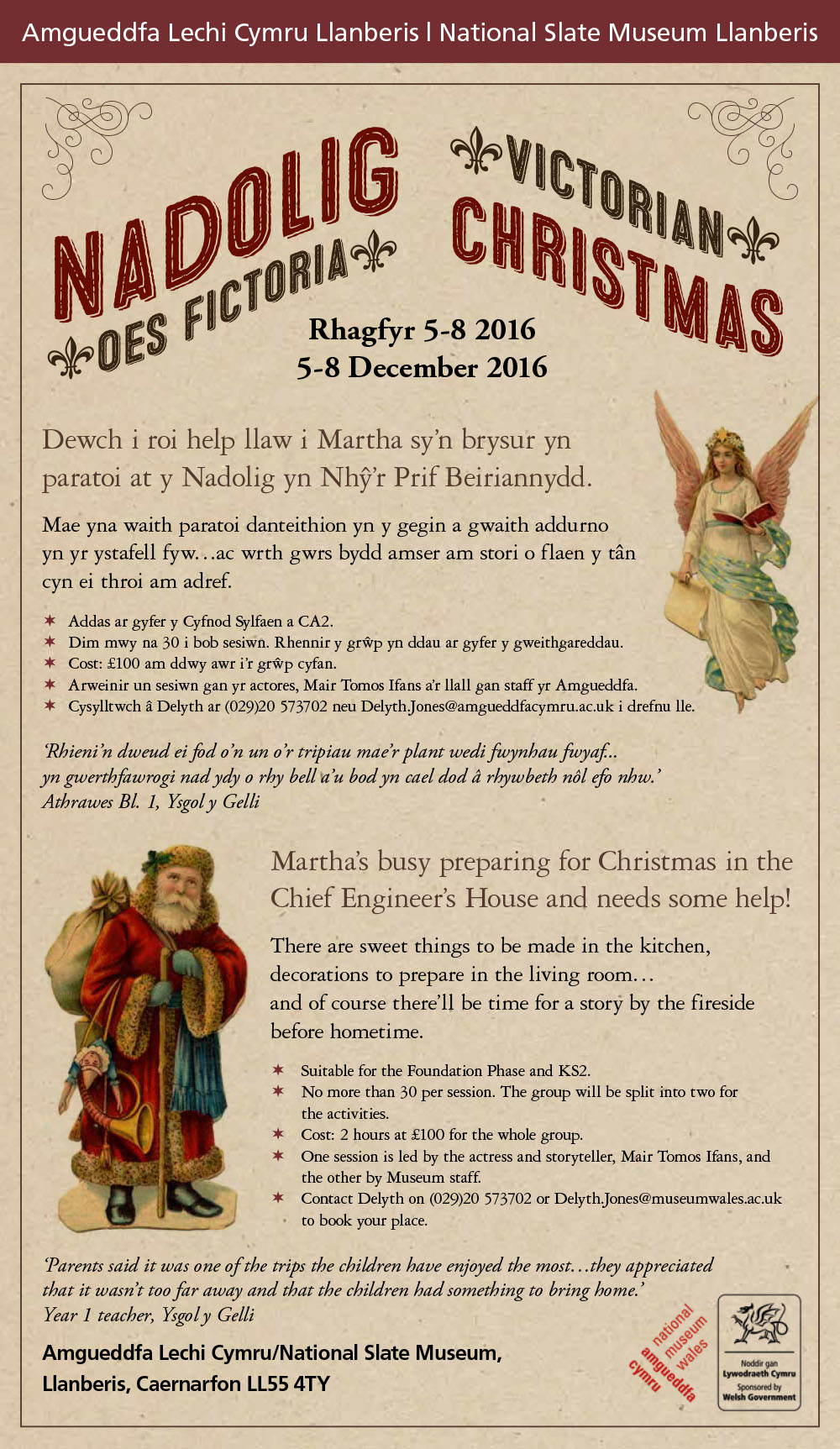
Here’s a quick little email marketing job I did just before Yule. The National Slate Museum (which is brilliant and also in one of my favourite parts of the whole world – do pay them a visit and also climb the mountain while you’re there – you may as well) in Snowdonia asked me to create an attachment that could be emailed out to schools that would promote their Victorian Christmas workshops for school groups. It needed to be bilingual and also have a Victorian – and a Christmassy – feel. They supplied the text and I trawled the web for free-to-use period graphics. And that’s what we have here!
by Frank | Aug 9, 2016 | graphic design, illustration, interpretation
You may have seen me boasting about my beautiful new interpretation brochure on social media. Here’s a blog post sharing a bit more about it.
Showcasing interpretation work
Its aim is twofold – to showcase my work to potential clients and also to demonstrate what can be done when you decide to employ more unusual papers and printing techniques.
The brochure is printed on 100% recycled unbleached Cairn Kraft paper from Paperback. It’s been printed by Ashley House printers in Exeter using the HP Indigo – a fabulous new digital press that can print with white ink. WHITE INK. As any long-standing designer will tell you, the ability to print with white (other than through techniques like screen printing) has been something almost as long-desired and elusive as the Holy Grail so this new technology is very exciting indeed.
I used the white in three ways – to make my logo stand out, as white text on a coloured background, and as an underlayer for the regular cyan, magenta, yellow and black inks, to lift the colours as if they were printed on standard white stock. Where I used the coloured inks directly onto the stock the effect is subtle and muted and generally less in-your-face.
The brochure is 210mm square and also features white stitches.
It’s focused on interpretation – work that I love, that I feel I’m good at and that I’d like more of. Mostly it’s just the work with some rather lovely testimonials from clients. It features everything from a quick fluid line drawing of an ant to huge 2 metre high display boards about plesiosaurs; from a children’s workshop illustration of a dinosaur to an exploded vector map of Wales’ most prestigious arts venue.
I’m really grateful to have been able to work with such a creative and ecologically-minded printers like Ashley House, and for all their help and encouragement with this project.
It’s my first ever promotional brochure, so I’m over the moon to hear that they are going to be entering it into several competitions. How exciting!
I’m initially only printing 100 of these, so if you commission interpretation work, or you know someone who does, and you’d like a copy, get in touch tout-suite!
Buy the print of the cover!
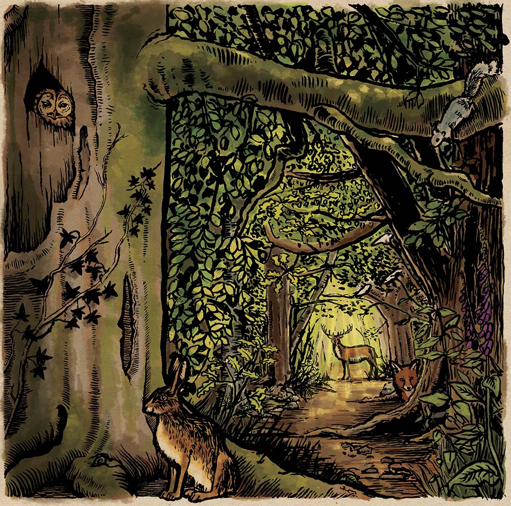 After several requests I’ve decided to release a very limited edition numbered and signed print of the cover illustration. Click here if you’re interested in purchasing one of these rare beauties. At time of writing there’s only nine left…
by Frank | Jun 20, 2016 | blog news, graphic design
New website design
Welcome to my new and improved website!
I had started to get frustrated with my old one – the theme just wasn’t flexible enough for my needs. This one is constructed with a fabulous premium theme called Ronneby, and I am delighted with its capabilities. One could design quite literally hundreds of websites with it and they could all look completely different.
I used to design themes myself but with responsive requirements that’s become beyond my ken as a simple CSS fiddler. And there’s no need when themes like this exist.
But just because there’s very little coding involved that doesn’t mean there’s no work involved – it’s taken me days to get this up and running and to the design I wanted. Now I know the theme better (they’re all constructed differently and take some getting used to) I can work more quickly around it. I anticipate doing a little more fiddling with it just to get it how I want it but I’m over the moon with it – I love the subtle animations (there’s loads to choose from), the functionality of the slider plugin (very much like After Effects), the ease of the page builder, the way the portfolio works and just the general elegance of the whole thing. I wouldn’t say it’s a theme for WordPress newbies (although there are templates you can download and install to upload your own content so maybe I’m wrong there) but it is very straight forward.
If it’s a theme you’d like to work with but you’re feeling a little intimidated about getting it up and running do get in touch and we can talk about how I can help you get something all lovely and handsome like this.