by Frank | Nov 23, 2015 | graphic design, illustration
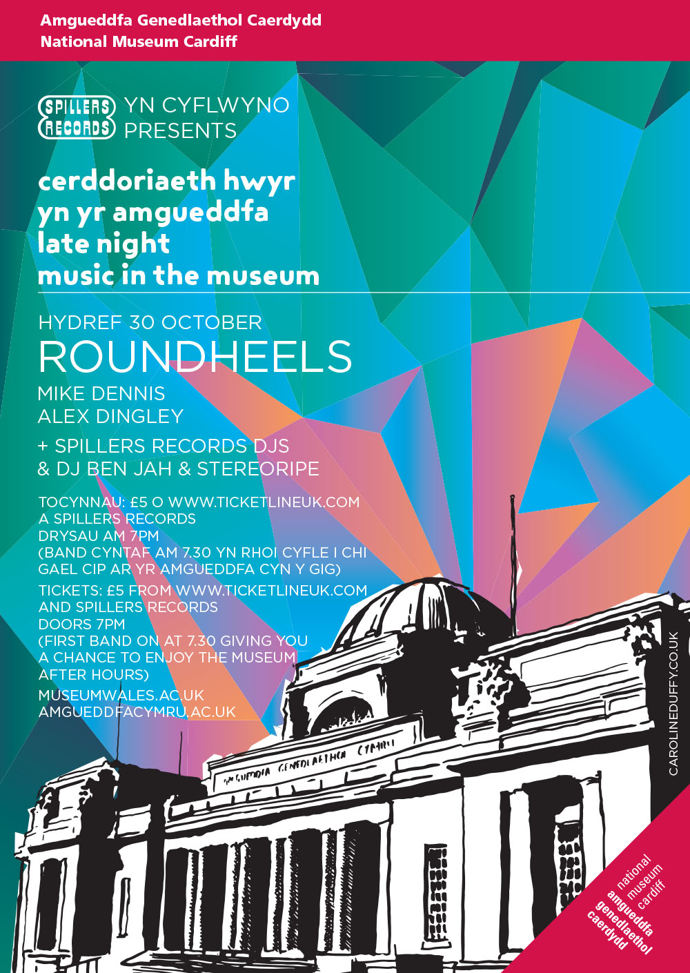
In the spring I created a poster for a groundbreaking couple of events – the first gigs to take place in an actual art gallery in National Museum Cardiff. In October the Museum reprised the events and I updated the poster with new colours.

by Frank | Nov 20, 2015 | illustration
 Way back in July I had an email from someone who wanted to commission illustrations for a short story she had written inspired by the legend of the Selkie – a fairy that can transform from seal to human. I was initially circumspect – fellow illustrators are sure to nod their heads with understanding when I say that four out of five enquiries we get from members of the public (as opposed to publishers or agencies) who want illustrations for a book they have written tend to have no idea about the level of work involved and thus balk at the cost. Which tends to wear down one’s enthusiasm – getting all excited about a wonderful project and then being told that you’re basically urinating all over someone’s dream by wanting a hell of a lot more than the £30 per illustration that they thought you’d require.
Jane Russ was different, however. A published writer who is married to a graphic designer, she appreciated exactly how much work was involved, and considered my quote fair. She had previously worked with a couple of other illustrators on the project but it hadn’t worked out. Her husband, on seeing my quote, remarked “at last, a professional!” which I took to be a compliment indeed. She decided to get in touch with me because a) my logo is a hare, and she is chairman of the Hare Preservation Trust, and b) the cover image of my website, the surfing one, shows I know the sea and how to draw it!
The project
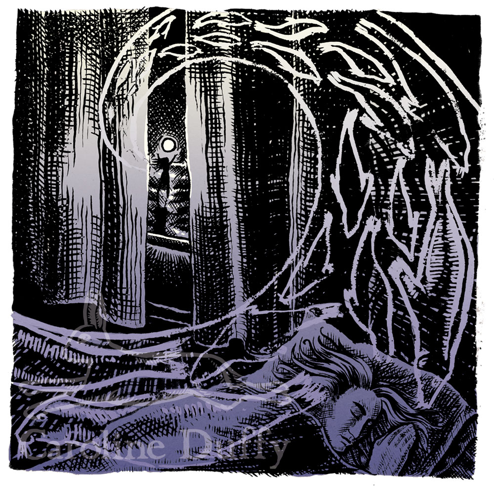
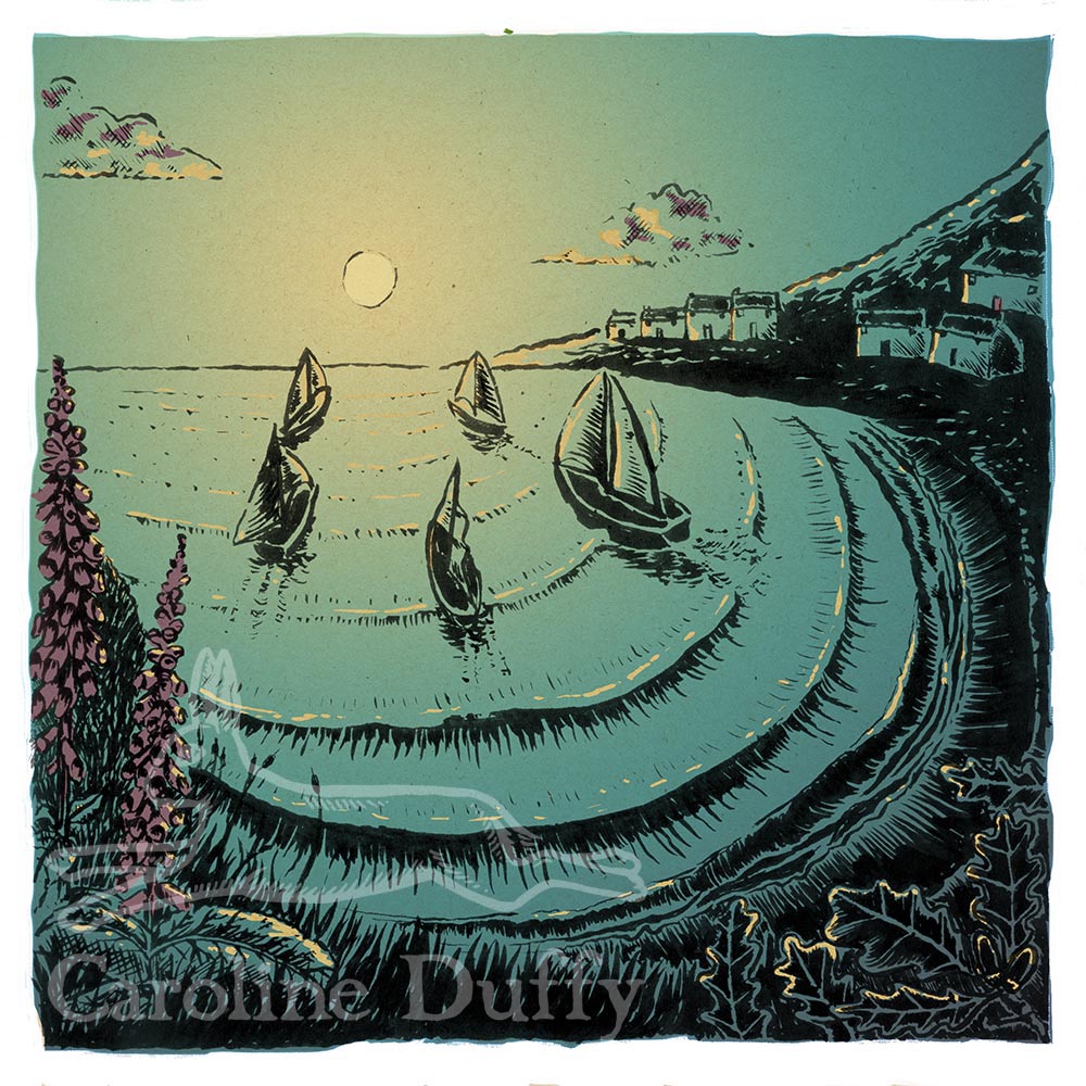
The story – about a Selkie who bewitches a fisherman – is a short one: sixteen paragraphs of prose and an illustration for each paragraph. It’s traditionally a children’s story – do watch the wonderful Song of the Sea film that came out last year – but this story is more for adults. The aesthetic is somewhat based on the Eragny Press – little hardback books with woodcut-style images, subtly coloured, and bordered with stylised blocks and beautiful letterpress typesetting. Jane said she wished to create a “jewel” of a book. I got very excited about this, as you can imagine!

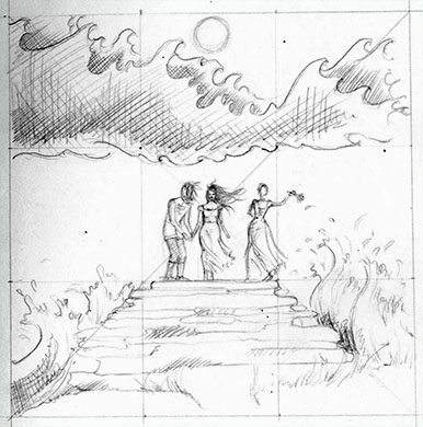
Pencil rough. You can see faint lines of the Rule of Thirds composition I’ve used for all the illustrations.
The schedule
With her previous illustrators Jane had worked a system where each illustration was developed to completion in turn, but that didn’t work for me. For the story to have a visual flow – spirit of continuity – I advised that we created the roughs all at the same time. We worked out a schedule together which balanced this need for continuity with Jane’s needs, which were that work was done – and payment made – in stages. She needed to have a small selection of these illustrations to submit the project to publishers, and also I was an unknown quantity so she wanted to make sure she liked my work and working with me before committing to paying me for the whole project. There are to be sixteen illustrations in all, so first of all we had a long chat on Skype and agreed that I was to draw roughs for the first 8 illustrations. I requested 50% payment in advance for these (it’s a really good idea to get payment upfront for new clients to make sure that someone is serious about the work and values your time and talent) and got to work.
Jane loved the first sketches. We made a few amends and then I went on to doing the rest of them. I then inked one up and then coloured and added texture in Photoshop. We then agreed that I would ink and colour two more illustrations, as well as creating edging blocks, before her husband Mick created the layout which they would then submit to various publishers.
What’s happening now
The three illustrations you see are being worked with the text by Mick (example spread below) and then will be submitted to suitable publishers. I’ll let you know of any future developments!

This is just the most exciting project I’ve ever had the good fortune to work on – it’s pushing my illustration skills further and enabling me to develop my visual storytelling. I can’t wait to see a published book!
by Frank | Nov 19, 2015 | graphic design, illustration, interpretation
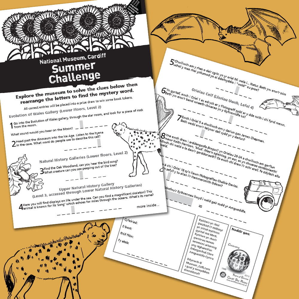
 For the last few summers the Learning Department at National Museum Cardiff has run a Summer Challenge for children, the prize being some book tokens, and they’ve asked me to design and illustrate it. It’s just a simple black and white affair – 4 page A4 with Welsh one side and English the other. This year’s illustrations included a bat, a hyena and a harp!
by Frank | Nov 18, 2015 | illustration
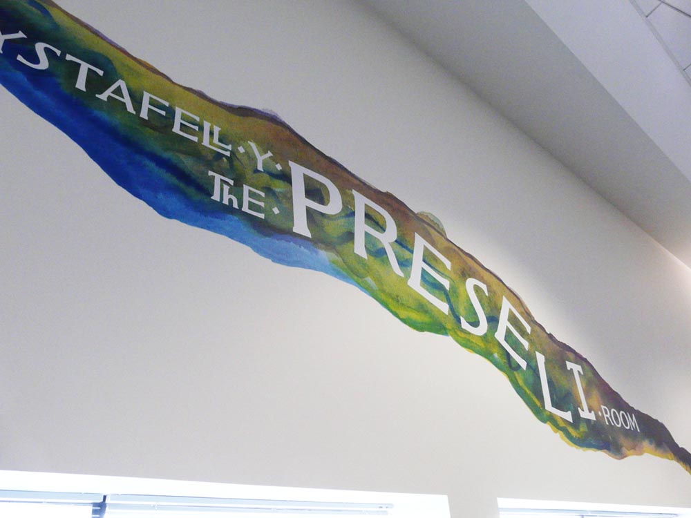
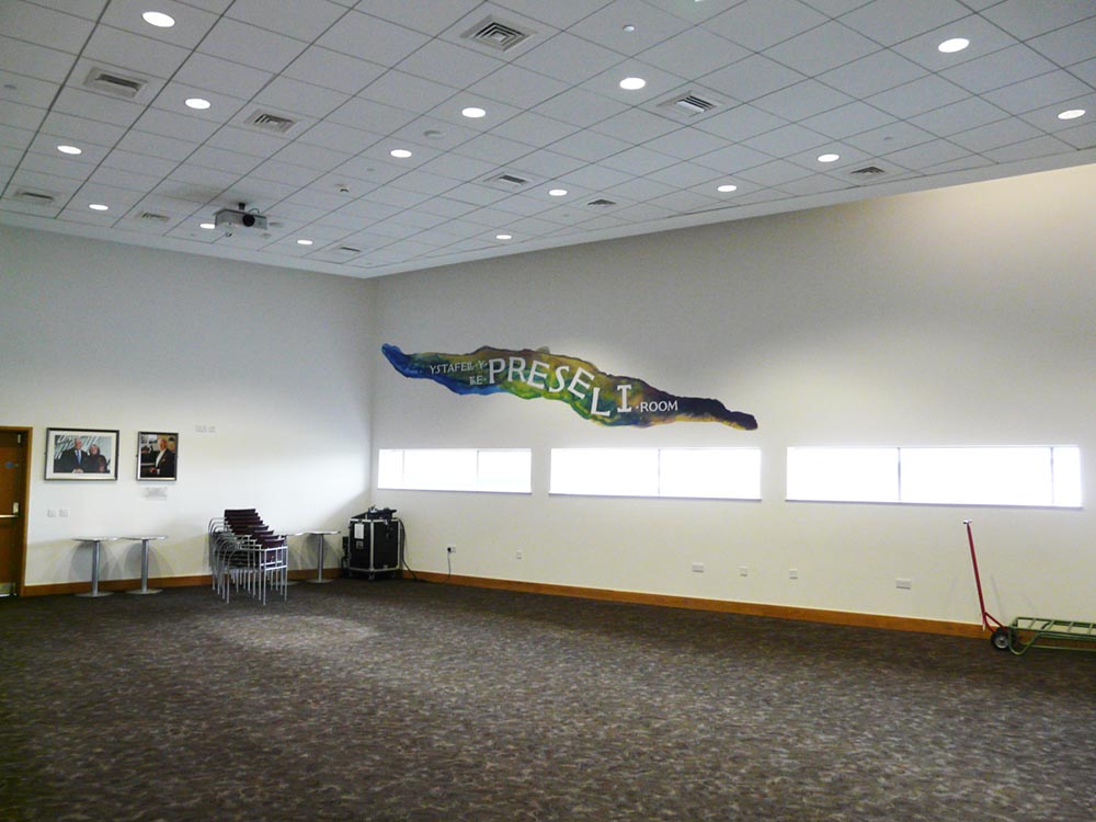
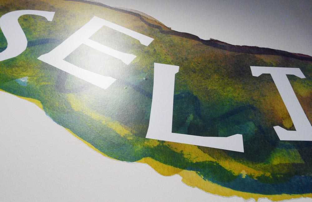
 Wales Millennium Centre asked me to create illustrative signage, in the form of a large mural, to celebrate the support of Dyfrig and Heather John Charitable Trust for one of the arts centre’s important spaces.
Dyfrig John has a love for the Preseli mountains, and so the room was renamed The Preseli Room / Ystafell y Preseli, and I was commissioned to create a large artwork that reflected the feel of the mountains. A wonderful project – but I had only a week to do it!
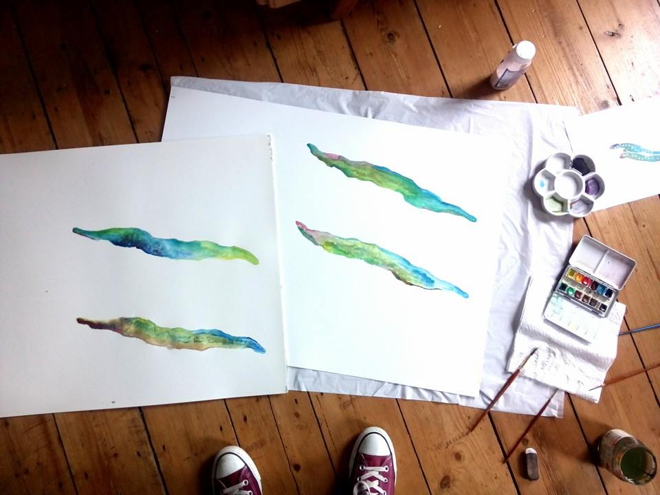
For me, the Preselis are colourful, rainy mountains, wild and natural and scattered with stone circles and burial chambers. They are the source of the huge blue dolmens from which Stonehenge was built. I wanted to capture this colour, this wilderness. I worked with watercolour paints, blending different colours together on variously textured papers, creating interesting effects as various pigments ran and clashed and feathered together.

I sent over various options and using the Centre’s own font (famous for being on the frontage of the building) I played with different ways of displaying the name of the room bilingually. The Centre’s team chose their favourite and I scanned in the watercolour at 2000dpi. The artwork was printed and installed by Semaphore.

The Centre reported that Dyfrig and Heather John were thrilled with the mural and said it’s transformed the room from a bland space to something far more vibrant.

by Frank | Nov 10, 2015 | blog news, ethics
I’ve been quiet for a little while because of a holiday and lack of internet but am delighted to announce that I have moved to a wonderful eco housing co-operative in mid Devon!
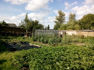
Beech Hill is a 17th-ish century manor house and has been occupied as a housing co-op since the early 80s. There are around 6 acres here comprising of wildish areas, a camping paddock circled by magnificent beeches, two poly-tunnels, two cob-walled gardens, an orchard… and a swimming pool. It’s also an hour’s drive from one of Britain’s best surf breaks. Yep, I know. Heaven!

the first walled garden
The community has solar, wood-fire and biomass-heated water and central heating, a wind turbine, grows much of its own vegetables – all organically, buys other food also organically from a workers’ co-op, recycles as much as it can, hosts a local composting scheme… I could go on. It’s a wonderful place to live and, because living here is cheaper than in Cardiff, I can spend more time working in the garden, developing my illustration style and also getting involved in some volunteer work.

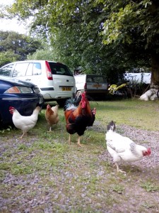
Of course there are chooks too
I’ve been working on some fascinating and really exciting projects in the meanwhile which I’ll start to share with you shortly. I’ll still be working with clients in Cardiff and all over the country, and intend to be back in South Wales every month or six weeks, so if you’re looking for an experienced and friendly graphic designer or illustrator wherever you are then do get in touch 🙂

