by Frank | Jun 26, 2017 | illustration
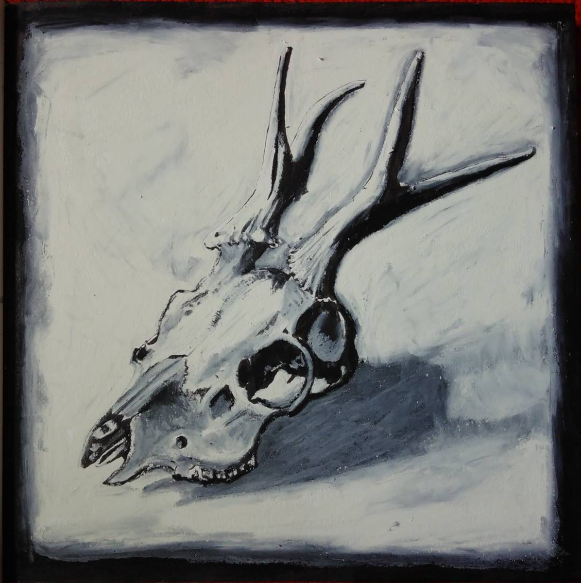
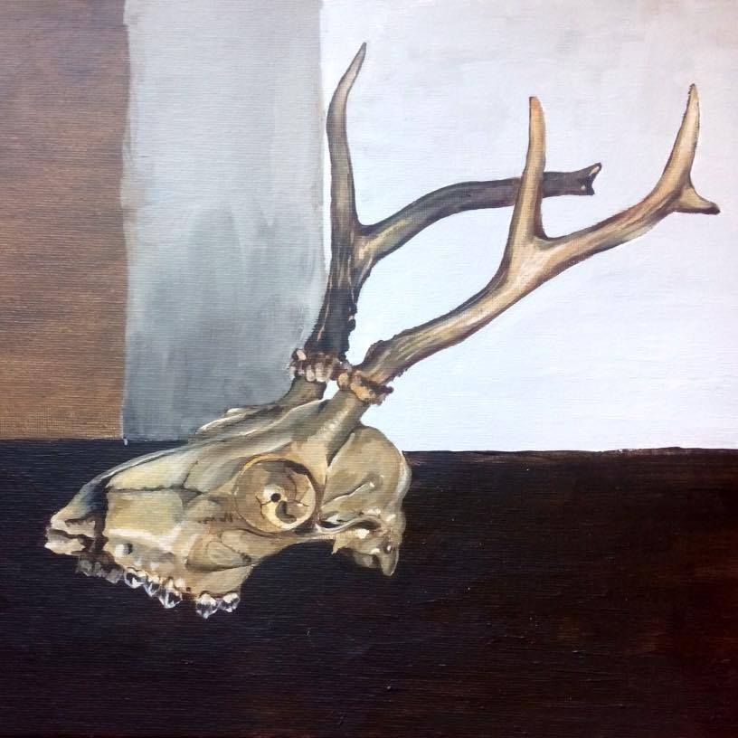
I had a few hours spare this afternoon so thought I’d play around with mixing brush pen and oil pastels to create this deer skull illustration, and I’m really pleased with the result.
I embarked on my Master’s in Illustration in order to improve my illustration style – I wanted to learn how I could impart more depth and feeling into my drawings.
I’ve been playing around with very quick drawings using oil pastels and other fairly crude media (by crude, I mean that which is difficult to work fine detail – the shadows and colours you can get with pastels are sublime). I’ve never really bothered with oil pastels before, but I’m using this part-time degree to experiment as much as I can and I’m loving it.
I’m particularly excited about this deer skull illustration because it uses the brush pen – a medium I use for commercial illustration all the time – for detail, and then over this I work in the pastel and it gives a kind of subtle viscerality (if that is a word). There’s a body to it, a meaty-ness, and the background has as much life as the subject.
I’m going to work this style with other pieces and see where it gets me.
Here’s another painting I did of the same skull about a year ago:
by Frank | Jun 1, 2017 | graphic design, illustration, interpretation
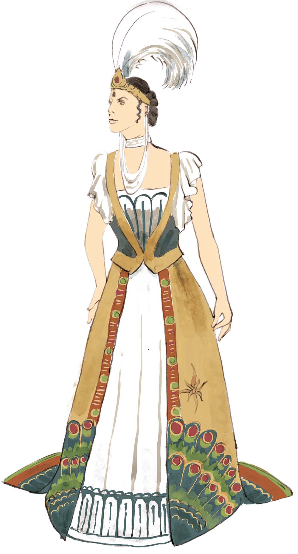
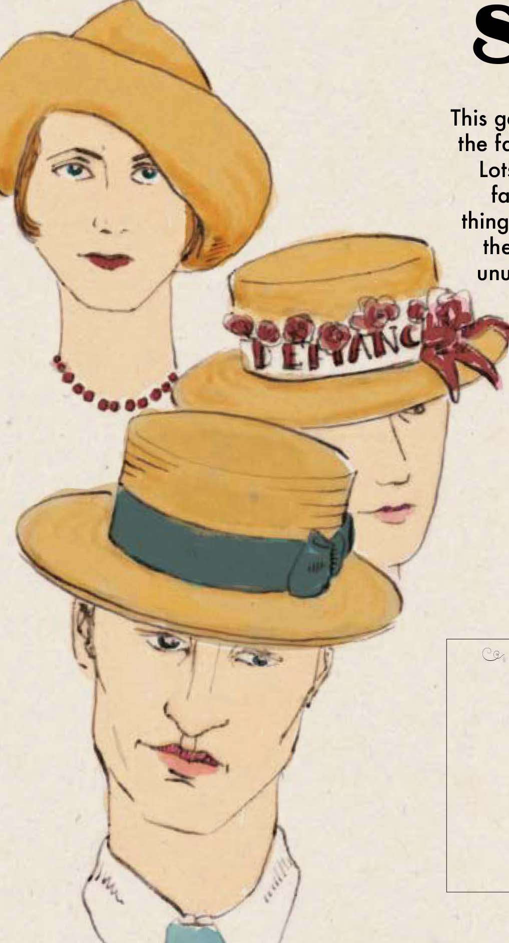
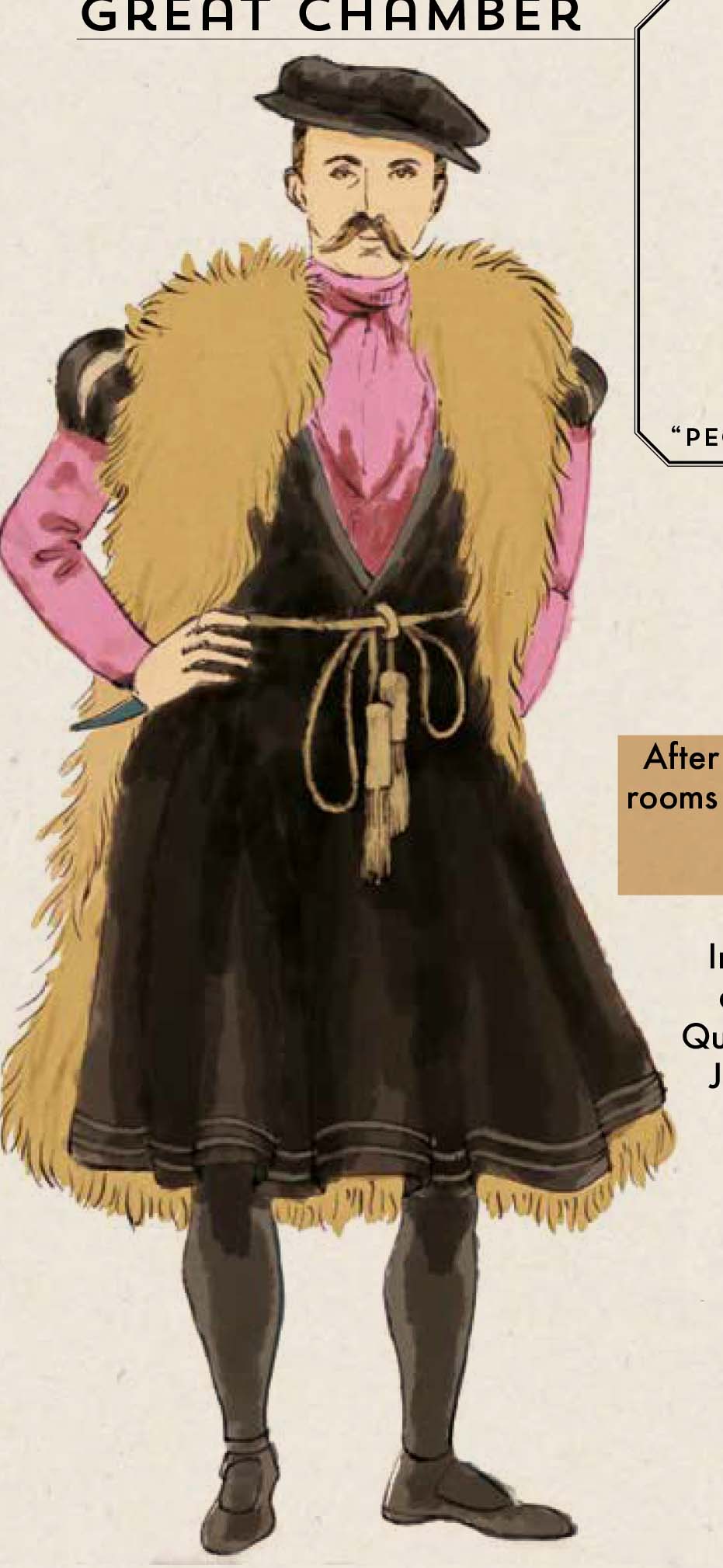
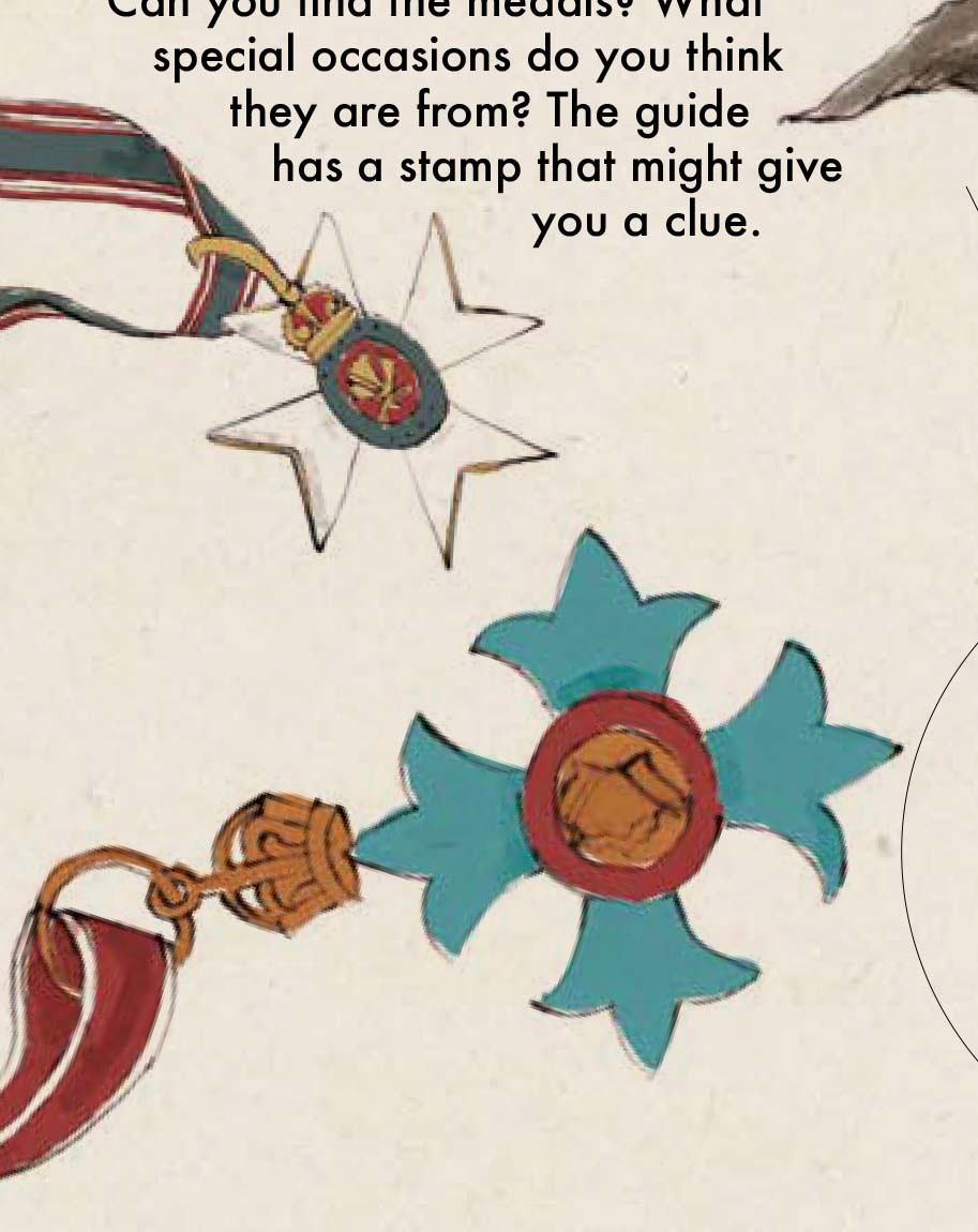
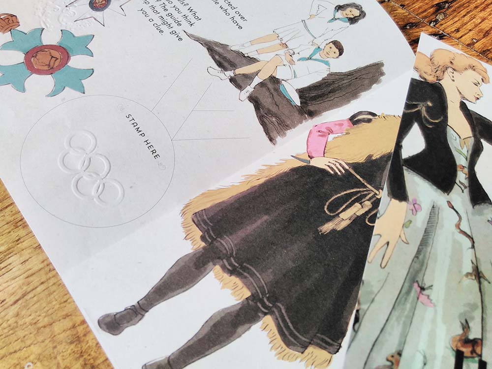
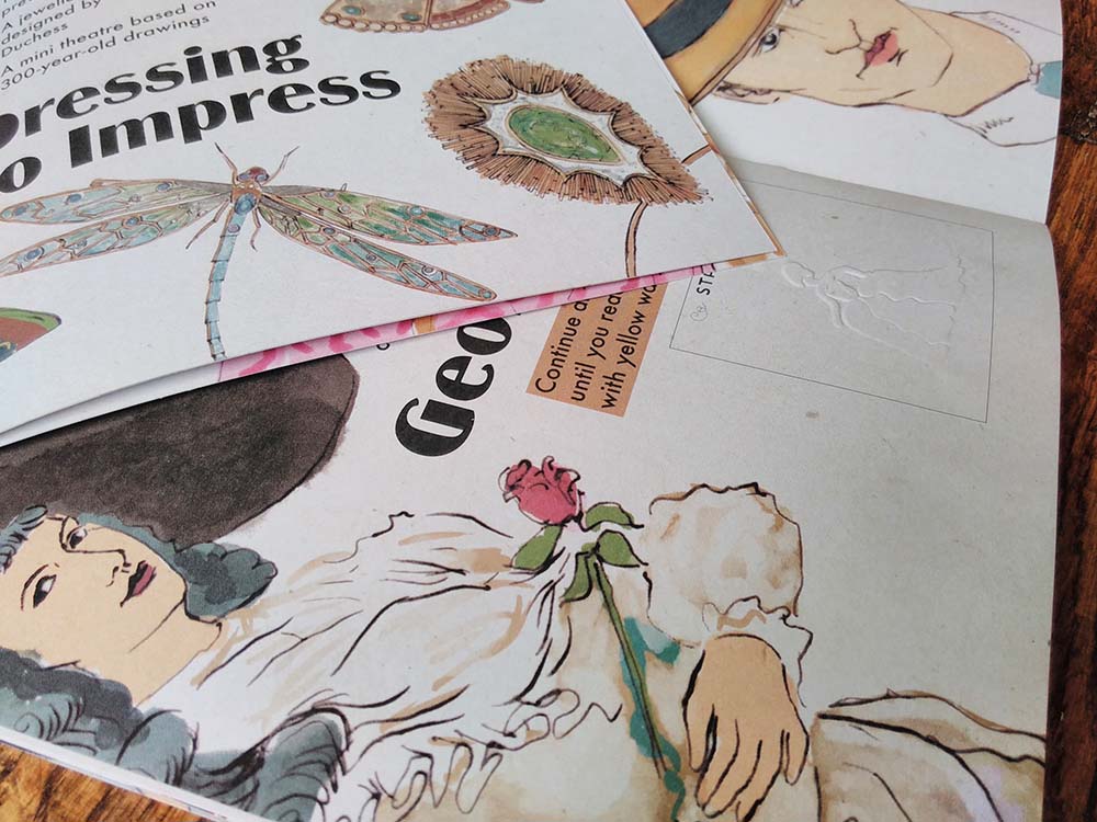 I recently completed this illustrated interpretation trail for a top heritage visitor attraction. I’ve done a lot of illustrated interpretation trails, like this, this and this. I’ve created them as single pages to bigger bilingual activity booklets, many for National Museums Wales. It was wonderful to be contacted by such a big name on the strength of my previous work.
Contractors aren’t allowed to mention the name of this client in their publicity material so I have to keep quiet about who it was created for, which I’m sad about because I am so chuffed to have worked with them!
I was asked to tender along with 6 other graphic designers and was delighted to have been selected. A wonderful thing the client did was to offer to pay people for submitting tender work – other buyers take note – you’ll get a much better quality of submissions.
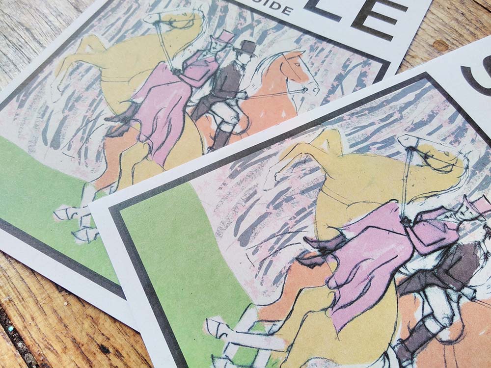
The trail is 12 pages at A5 on uncoated paper. I used a different illustration technique from usual – dip pen and ink. I really like the effect – elegant and light – and am going to be using a lot more in future.
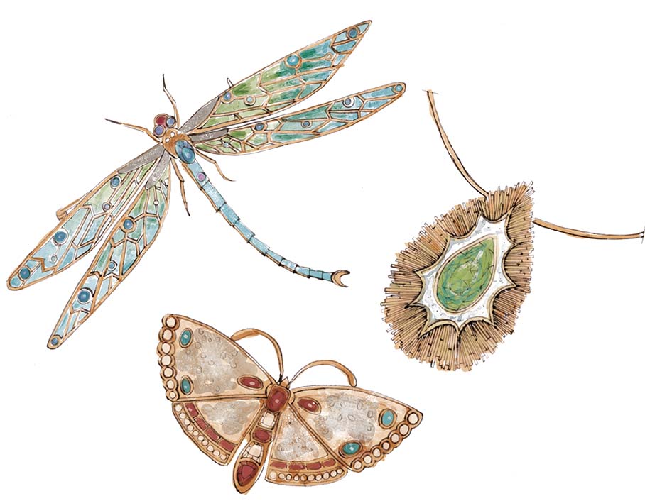
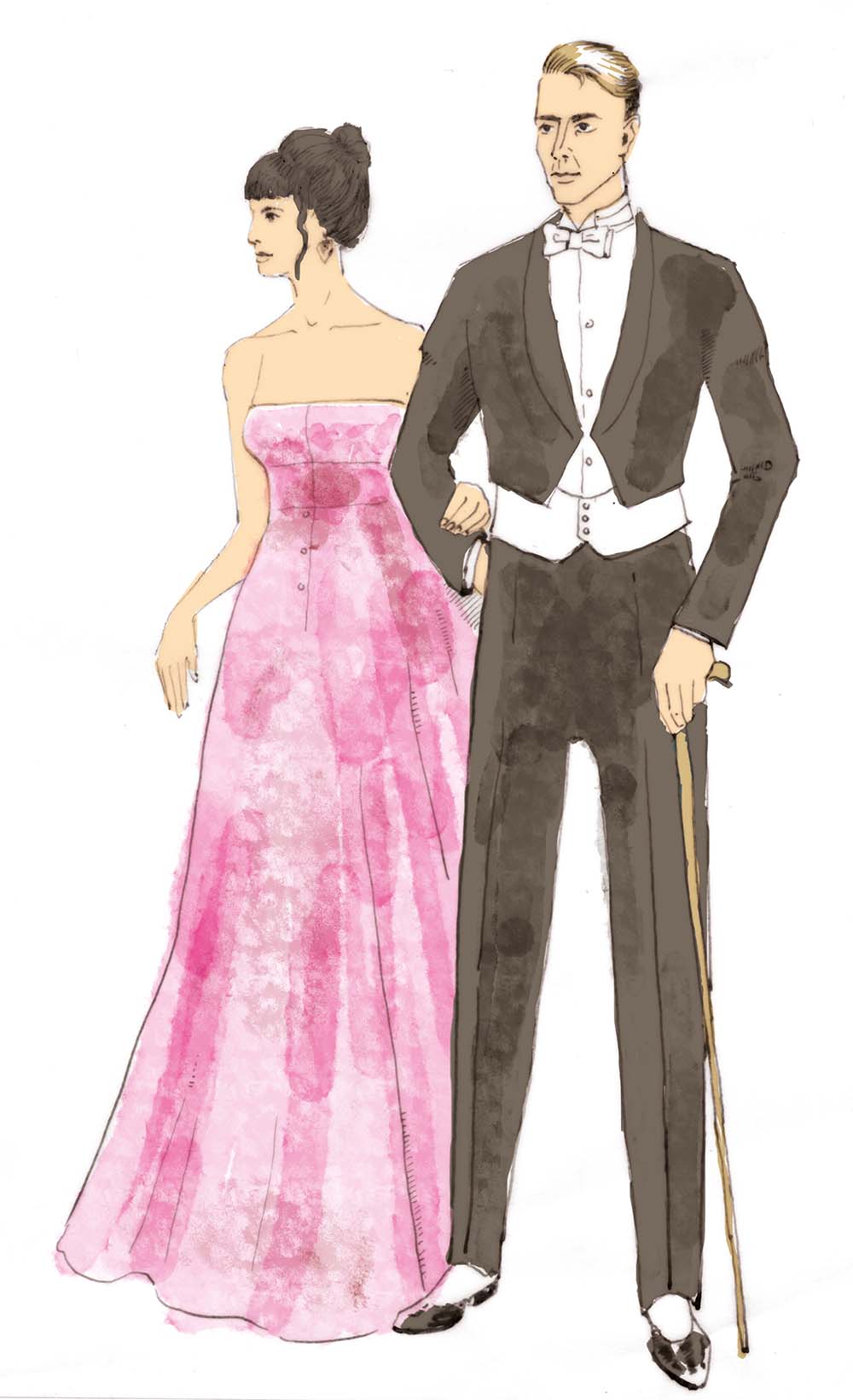
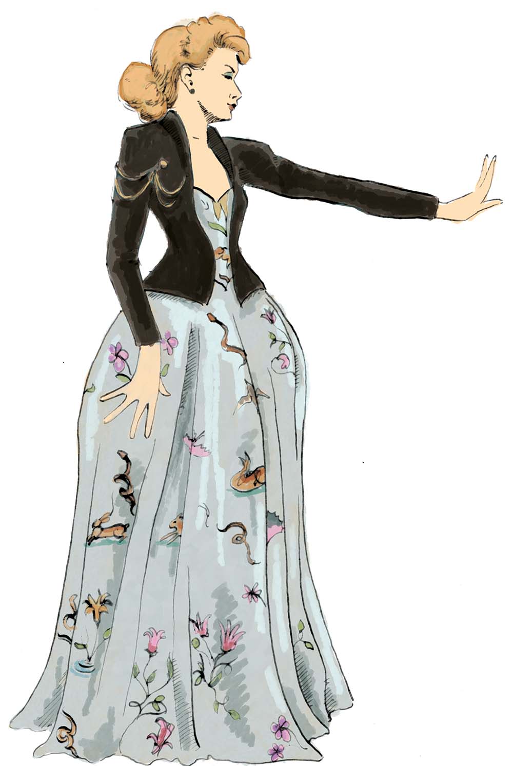
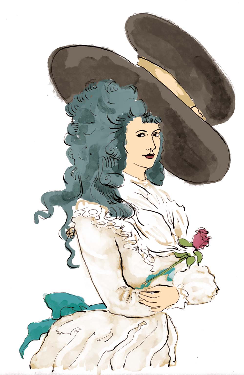
The exhibition the illustrated interpretation trail has been created for is one of fashion through the ages and so I drew some wonderful clothes – ball gowns, fancy dress, children’s clothes, along with accessories like jewellery and hats.
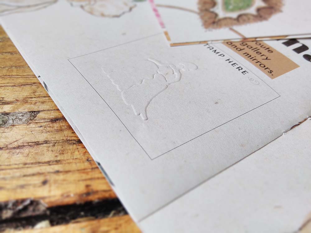
Because the client is a heritage site, ink can’t be used in the building, so where families complete the activities as they work their way around the exhibition they will be given an embossing stamp to mark their achievements. There’s a space on most pages for the stamp and each activity has a different stamp.
I really enjoy the creation of interpretation trails. They involve me blending my love of learning and encouraging learning, of explaining pictorially, and I get to draw some incredible things. But the best bit is watching families using and enjoying the trails – and seeing the way children often draw over the top of my work and make it their own.
This was a fabulous opportunity and I enjoyed every moment!


 I recently completed this illustrated interpretation trail for a top heritage visitor attraction. I’ve done a lot of illustrated interpretation trails, like