Responsive wordpress website ahoy!
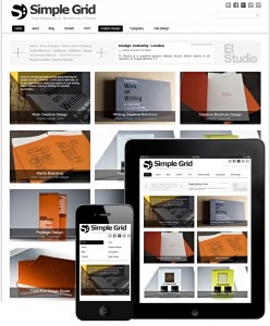
The Simple Grid Responsive wordpress theme design is free from Dessign.net and works equally well on tablets and mobile phones
This weekend I’ll be starting (and maybe even finishing!) a new design for this here (hare, here) website.
I want something a little cleaner, a little clearer, a little better organised. Alright, a lot better organised. I meant to finish this site off with a portfolio page but I never got round to it: as I removed my focus from the site and went back to regular client work I kept sort of forgetting that, y’know, a portfolio page might be A REALLY GOOD IDEA for a designer and illustrator to have. I also want to exploit RSS – something I’ve not bothered with before.
I decided not to bother updating this particular theme as technology has moved on since I designed it. The best websites are now responsive: they adapt to smartphones and tablets and massive desktop displays with equal ease. And there are some BEAUTIFUL ajax and j-query portfolio-ey sites to be had. Here are some of the best blogs I’ve found featuring new responsive free and premium wordpress themes:
https://creatiface.com/freebies/wordpress-responsive-themes
https://www.tripwiremagazine.com/2012/08/wordpress-portfolio-themes.html
https://designtuto.com/25-completely-free-responsive-wordpress-themes/
and a special mention has to be made for über theme designer dessign who creates just the MOST GORGEOUS minimalist themes, many of them free, many of them responsive.
These themes will work straight out of the zip-file for you (and me) but obviously I’mma gonna have me a good fiddle with CSS and what-not to make the theme completely unique. Why not start from scratch, you might ask? Well, the issue here is time. And I’m not very patient. I have never claimed to be a web developer – I have always been quite clear that what I do is I take a good solid free wordpress theme and hack it to bits until it looks how I want it to. This very website, and this one, and this one, and this one, and yes this one too, are all developed from the same favourite theme, believe it or not. I just use it as an interior decorator might use a building – I move some of the walls around, add a window here and there, change the colours and the wallpaper and the furniture and BISH BOSH a new website is born.
So that’s what I’m going to do here.
The other thing is that full-time web developers have invested a lot of time in learning complex code – php, j-query, ajax, html5, javascript etc. I, on the other hand, am mostly a print designer and illustrator and thus have spent most of my time learning Indesign and Photoshop and Illustrator and how to draw and paint and suchlike. I *could* learn said languages (I’m pretty handy with a bit of CSS, the code that prettifies WordPress, obviously) but I’d only use them rarely, and thus, my brain working as it does in that it only stores info that it’s using, that info would be flushed out of my head faster than you can say MySql.
The only thing that troubles me is the ethics of not designing your own website from scratch. That’s why I’m always completely open about the way I work – and how the the way I work makes things quicker and therefore cheaper for my clients. Obviously, in the footers of my web designs I credit the original theme design, but this time I’ll be going a little further and donating some money to the theme creator to thank them for all that time and effort and brain-mushing code-learning they’ve saved me.
It seems like the right thing to do.

