by Frank | Mar 24, 2011 | graphic design, illustration, magazine design
 I’m on holiday for ten days tomorrow and my brain has given up work already, so instead of some clever-yet-groanworthy dad-pun of a title, you can have a Monty Python quote, as I couldn’t think of anything else. This post was nearly entitled “Romans they go to the house”, but I feared it was too tenuous and only actually funny in my own head, being a grammar nerd who’s attempting to learn Yr Iaith Cymraeg.
Anyhoo, what happened was last summer the National Roman Legion Museum in Caerleon contacted me about a newly-conceived project involving a magazine by young people for young people that would help illustrate parts of Roman history relevant to the lives of teenagers. “We want it to look a bit like Kerrang!,” they said. “No problem,” I said.
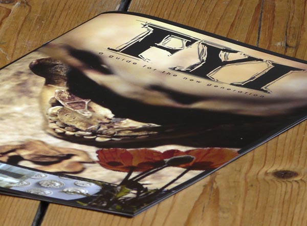
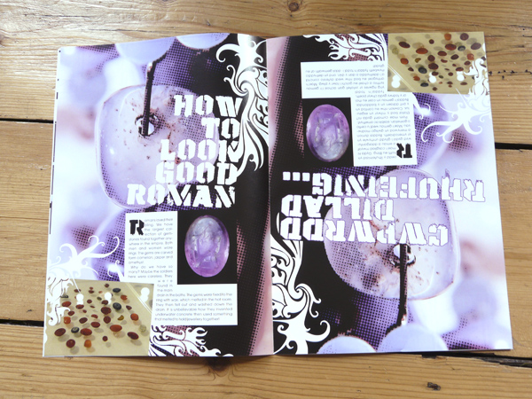
The main differences between Kerrang! and this little publication are that a) FYI only has six pages per language (it’s a bilingual flip-and-turn type thing) and b) Kerrang! has an awful lot more information on each page. Luckily we managed to source some interesting photos, and with a little photoshop magic to increase the grunginess I think FYI captures some of the action.
It took a little while for the students to arrange the subjects and copy they wanted including, so the project developed slowly over the months, and finally went to press in March. Many of the images were supplied by the Museum, some I found free on websites like Stock Exchange and some I provided or illustrated myself. Inky and charcoaly lines, lots of textures and halftone patterns and a limited colour palette help roughen the look.
 For extra interest, the little mag is 90% of the size of A4 (it’s a good thing to note how much more attractive non-standard-sized publications are to readers) and is beautifully finished on silk stock, thanks to sourcing print via my brilliant independent print sales expert. The Museum emailed me to say that they are really happy with the finished product. Phew!
by Frank | Mar 15, 2011 | graphic design, illustration
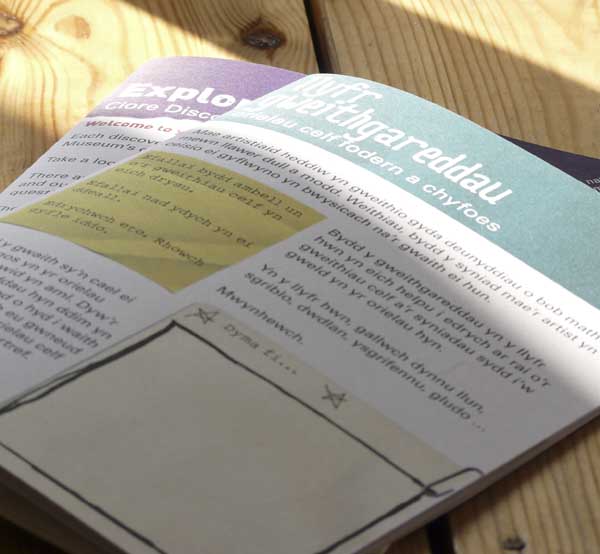
 I received a very handsome surprise package in the post today. Handsome surprise packages always light up my life, but the contents of this one made me hop up and down with joy. Within, you see, were bundles of printed file copies of a couple of lovely jobs I’d just completed for the National Museum Cardiff. They’re activity books, designed and written for children visiting the museum, and very exciting.
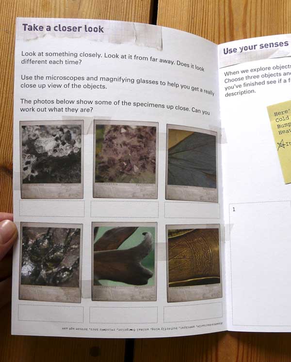
I was asked by staff in the Learning Department to come up with designs that looked a bit like scrap books, while still retaining the Museum’s branding style. The two booklets – one for the Clore Discovery Centre and one for the newly re-opened art galleries – are thus filled with scanned scraps of paper, post-it notes, paper-clips, sellotape, Polaroid photos and blu-tak.
 I used three typefaces on each project – Univers, which is the Museum’s standard typeface, to ensure brand consistency, a rough typewriter font (one that works with the ŵs of the Welsh language, too – hooray!) for highlighted text, and crumpled playful grungy fonts for the headers.
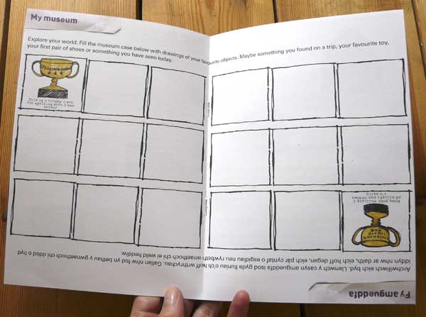
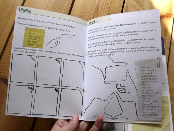
The booklets are Welsh one side and English the other, with a united page in the centre spread that works for both.
 I did plenty of fun quick little illustrations for each booklet – starred asterisks, inky boxes, felt-pen trophies and hands pulling shapes.
  Click on any pic for bigger.
The challenge for this sort of work is two-fold. Firstly, the booklets were to be interesting and engaging and have this rough, curated feel. I was shown examples of other museums’ efforts and asked if I could produce something that didn’t copy them but had the same hand-finished feel. Yet the booklets still had sit within the Museum’s branding and not feel at odds with the rest of their publications. This is achieved with the band at the top of each cover, and with the Museum’s own typeface as body-copy, as mentioned.
Secondly, when presented with a request to create something that feels hand-made and cobbled together, there’s a real risk of a lack of balance. It’s pretty easy to enter the perilous realm of the dog’s breakfast. The thing to do is to establish some rules. I stuck to a rigid three-column grid with 5mm margins. Overall, colours are fairly limited, margins are always adhered to and there is a consistency of inky line all the way through. The post-its are regular little notes to encourage readers to act, and all the pages are given structure with standard headers.
Hope you like these as much as I do!
by Frank | Mar 14, 2011 | CIO Connect, graphic design, magazine design

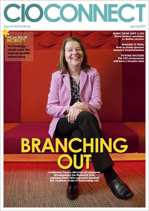
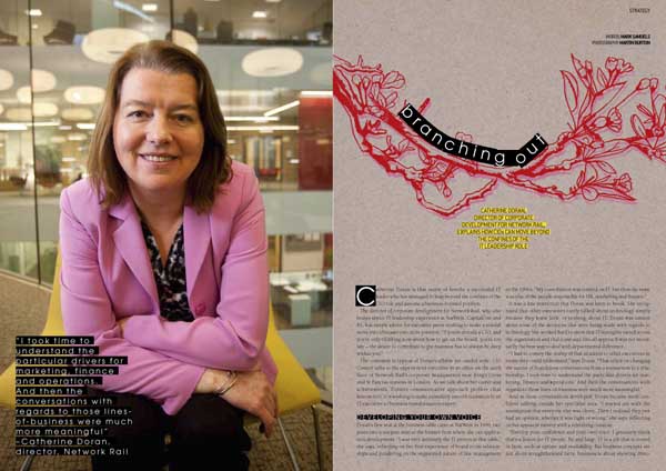
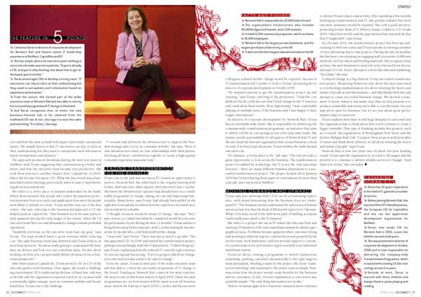
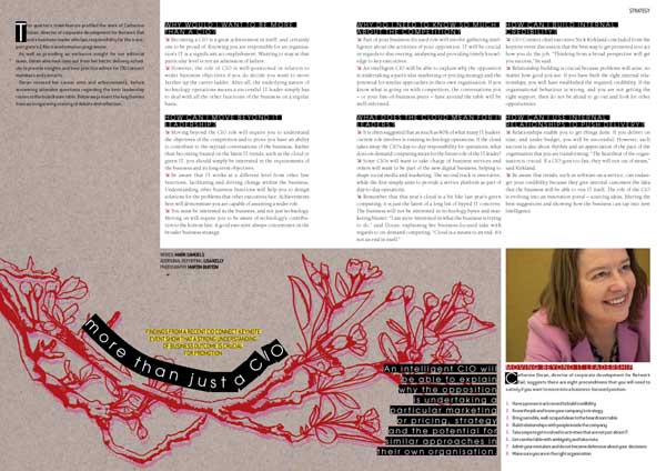
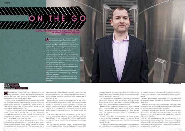
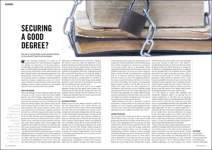
Yes, I do. It’s possibly my favourite thing to do. It’s all about retaining a united look for the whole publication, but differentiating articles from each other. Tis a fine balance. My general rules of thumb would be:
• choose a few key fonts. I’ve cut down the amount I use for each publication over the years; at present I probably use three font families with CIO Connect magazine, and two with Pulse. Body fonts, header fonts, subheads, captions and general page-furniture should all fit nicely together. Contrast the old with the new; pay attention to the rhythm and shapes of combinations of typefaces.
• restrict the palette of colours used for each article. Echo or juxtapose with the main imagery.
• and while we talk about imagery – the better this is, the better your publication will look. It’s not impossible, but it is time-consuming, frustrating and demoralising to polish a turd. If you’re relying on other people to send photos to you, get them your specs early and remind them often. Request professional photography. Nevertheless, you will be sent blurred dark low-resolution images. It’s a fact of life, like aging and Jimmy Carr.
• never underestimate how much structure – and therefore beauty – one can add with clever page furniture. Page numbers and kickers might seem like dull must-haves but, if done well and used with elegant column and margin proportions, they really lift and frame a page. They are like the eyebrows of the magazine, if you like.
As ever, click on the pics for bigger versions. And if you’d like me to design your magazine to look this good, get in touch!


by Frank | Mar 4, 2011 | graphic design, illustration, magazine design, slider
I’m always doing a big song-and-dance about CIO Connect magazine, for the simple reason that it’s a dream to work on. The editor is top class (I understand he was recently named as one of twitter’s top 100 journalists to follow – number 91, if you credit that sort of thing) they use a wonderful photographer and professional journalists, it’s beautifully-printed and the end product is always something I’m very proud to have been involved with.
But all that glitter and gloss costs money. What about the companies that don’t want to spend so much, but still desire a handsome regular publication to share with their members, customers, shareholders or what have you?
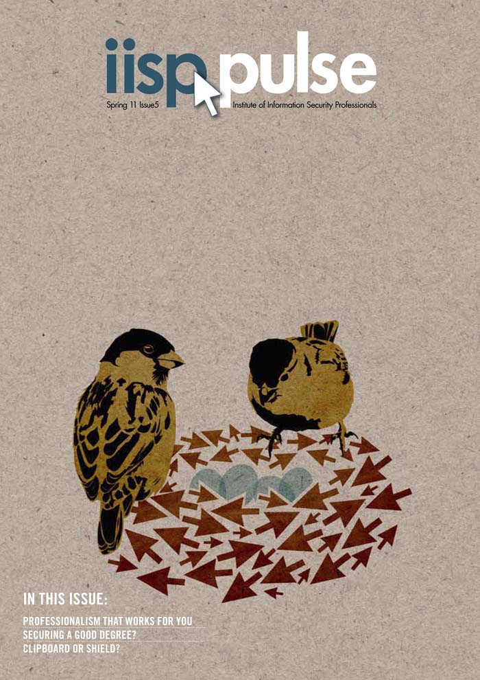
Never fear, it can be done. There’s a step up from the self-produced mediocrities begat by Microsoft Publisher, Comic Sans and clip-art. It’s possible to get a rather smart-looking result, using a skilled designer, cheap stock images and custom illustration. I design and illustrate such a publication. I’m not entirely sure if you’d call it a newsletter or a magazine. It’s a 16-page quarterly thingumy. The client supplies stories that their members have written along with thumbnail pics of the authors, an editor edits and collates, I illustrate a cover incorporating the arrow of the client’s logo and a reflection of the subject matters covered or the season we’re in. This season being Spring (and as I type, the sky is obediently blue, the daffodils obediently flashing upon that inward eye which is the bliss of solitude, and the sparrows obediently chirpy), I done made a nest of arrows and what-not. I have a thing about cardboard backgrounds (have you noticed? You have?) as they lend texture and earthiness to vector-based illustrations which can often be toe-curlingly clean and false. Here’s the cover (click on the image for a bigger version if you like):
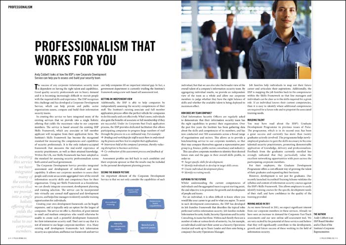
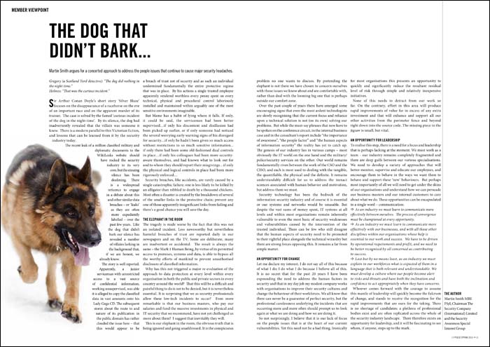
The illustration avoids us having to source what could be a very expensive cover photograph, plus it helps give style and character to the thingumy. Inside, I’ve kept everything very clean and clear, devising a layout which is quick and simple for me to lay out, thus saving money:
 Stock imagery is often difficult to use without it being a touch cheesy. I try to circumvent this by the use of interesting cropping and wrapping text around. Where possible I don’t choose the obvious image, but of course I am limited to what the image libraries can supply. Keeping everything clean and aligned to a grid adds needed class.

 So, there’s a middle ground. It’s possible to get interesting professional magazine design on a budget. It’s a line of work that can be really enjoyable, too. I think what makes Pulse a success is that I’m pretty much left to get on with it – and I find that when clients have that level of trust, designers can really step up to the mark.
by Frank | Mar 1, 2011 | magazine design, thoughts
I could rant for hours about the general ineptitude of PRs and their inability to see that the better the image they provide to us designers, the better their clients will look. Peter Bartram of PR Success Monthly cleverly managed to limit me to five minutes, though. Read his interview with me here!
 I’m on holiday for ten days tomorrow and my brain has given up work already, so instead of some clever-yet-groanworthy dad-pun of a title, you can have a Monty Python quote, as I couldn’t think of anything else. This post was nearly entitled “Romans they go to the house”, but I feared it was too tenuous and only actually funny in my own head, being a grammar nerd who’s attempting to learn Yr Iaith Cymraeg.
 For extra interest, the little mag is 90% of the size of A4 (it’s a good thing to note how much more attractive non-standard-sized publications are to readers) and is beautifully finished on silk stock, thanks to sourcing print via my brilliant independent print sales expert. The Museum emailed me to say that they are really happy with the finished product. Phew!
