by Frank | Oct 18, 2010 | graphic design

A while back, Richard Tierney of creative talks got in touch about a concept for a TV show he was planning on promoting. The show is about glamorous globe-trotting women, so naturally he came to me (ahem).
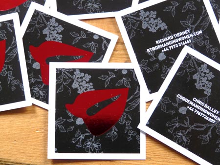
I originally created a logo featuring a pair of bright red lips. This time Richard wanted business cards. He wanted something special and I got rather excited, as is my wont, and ordered samples of all sorts of weird and wonderful paper stocks, got prices for die-cutting, foil-blocking, spot colours, spot UV and all manner of other technical stuff. Then I and my print consultant (a man of endless patience) whittled down the options to see what we could do in budget.
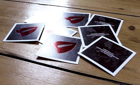
The resulting cards are these beautifully-printed square cards (yes, I have a thing for square cards at the moment), featuring a subtle dark-grey Japanese-style wallpaper pattern on black background. The lips shine out in indulgent scarlet foil blocking. The contact details are simply blocked on the reverse. I’m rather proud of them!

by Frank | Oct 17, 2010 | graphic design, illustration
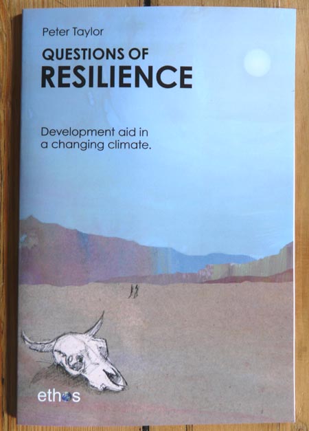
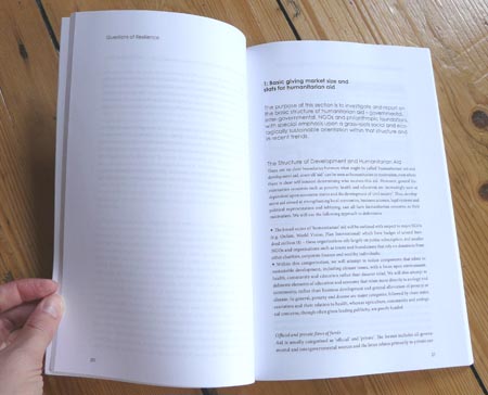
Peter Taylor, a scientific analyst from ethos UK, was commissioned by the Lifeworks Foundation to write a report about international aid. He found, among other things, that only 5% of world development aid addresses the grass-roots need for a healthy and ecologically-sound environment. Most of the money is directed at economic problems – moving people off the land, industrialising production and globalising markets. He asks whether a monetary index is an appropriate way of measuring poverty, and whether economic aid will exacerbate ecological problems. He speculates over political reasons behind aid decisions and alternative, more sustainable, ways of spending that money.
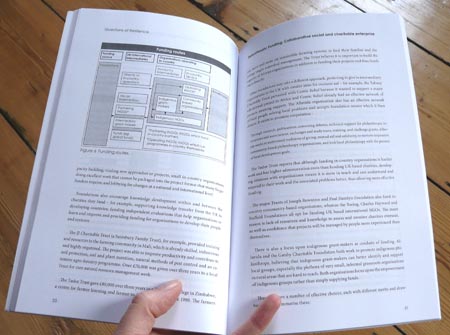
Lifeworks were so impressed with the report that they commissioned Peter to turn it into a book, and he asked me if I would typeset it, redraw all the graphs and graphics and illustrate the cover. I was glad to. Below is the result.


by Frank | Oct 15, 2010 | graphic design

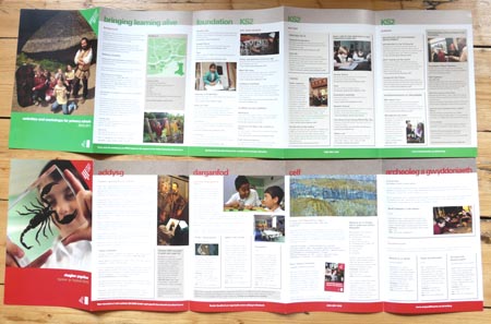
 Now this was a lovely job. I was asked by the Head of Learning at the National Museum of Wales if I’d be interested in quoting for a series of leaflets for schools. There’s one ten-page bilingual concertina publication for every museum in the group (The National Museum in Cardiff’s city centre, Big Pit coal-mining museum in Blaenafon, Caerleon’s Roman Legion museum, the National Slate museum in Llanberis, the National Wool museum in Camarthanshire and St Fagans’ National History museum on the outskirts of the capital). They’re printed to inform school teachers of the varied workshops and guided tours each museum offers, catering to various parts of the curriculum.
I was asked to maintain ties with the brand guidelines but, at the same time, create something fresh and clear and easy-to-use. There’s a lot of information on each page so I prioritised obvious boundaries, creating different boxes for different kinds of information.
I recommended a print supplier to the Museum and the resulting published leaflets seem to have gone down rather well.
by Frank | Oct 14, 2010 | graphic design

I have basically been really rather rubbish at keeping my blog updated. If that makes me a bad person, then stick me in a bunker with the missus and a couple of cyanide pills and call me Adolf (please don’t). I went on holiday for two weeks, and before that I was hella busy doing all the things you need to do before you go on holiday. Anyhow, sorry and that. Here is the first quite a few catch-up blogs…
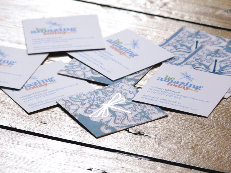
The lovely Noreen of be amazing today asked me to design some business cards for her. I’d done an illustration for her (that reminds me, I’ll have to blog about that, too, as it’s a bit bloody fab) which she will eventually get around to putting on her website. I’d also, of course, created her beautiful logo quite a while back. I wanted a marriage of the two that would be warm and simple and uncluttered. The illustration is quite complex, so I zoomed in on a dragonfly and we had that part spot-UVed (so the dragonfly is shiny while the rest of the card is matt). The front simply features the logo and contact details, in a square format to keep it a little different. I love them, and Noreen says (and I quote),
“…the business cards are the MOST AWESOMEST OF AWESOME. You, like, totally rock. (Hah! Quote that for testimonials!) 🙂 x”
So, naturally, I did. She also blogs about it here
I think she likes me…

