by Frank | Jul 22, 2015 | illustration
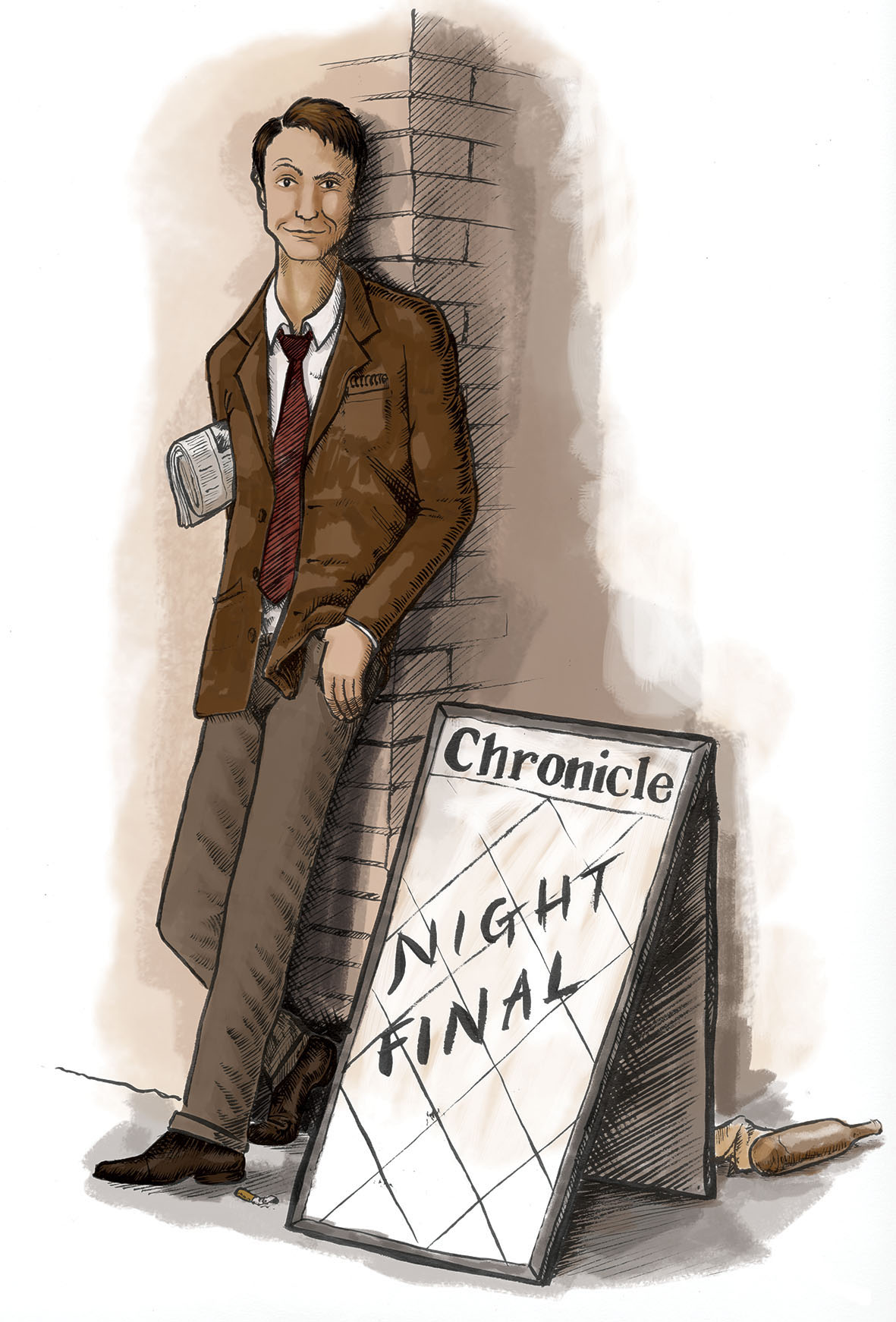
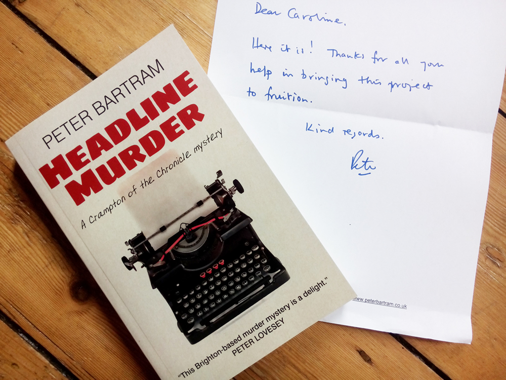
I’m delighted that the book illustration I created for writer Peter Bartram’s series of stories about crime-solving Brighton journalist Colin Crampton is finally here with me in the flesh!
Peter originally asked me to create a series of four illustrations for his stories, and this one of Colin himself is by far my favourite. I am very proud to have been involved.
You can buy Peter’s book here
by Frank | Jul 16, 2015 | illustration
 This map illustration is one of those strange jobs that I was asked to do purely out of luck and happenstance. And aren’t those the best ones?
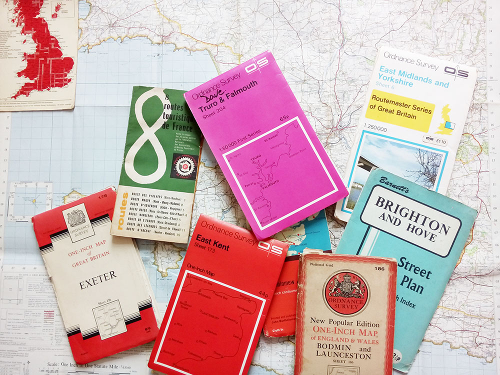
After creating the Women of the World art zine for Melissa Hinkin and Wales Millennium Centre, I went in to meet the lovely communications people at WMC to show them the range of work I’d done for other people and to ask if there was anything else I could help them with. I happened to mention that later that week I was off to a client meeting in North Wales and was planning to climb Snowdon while there; thus I happened to mention while chatting about said climbing of Snowdon that I’d bought two Ordnance Survey maps – one of Snowdonia and one for Anglesey, where I’d be staying, so I could have a good explore – and confessed that I have a bit of a thing about maps. I LOVE maps. I can spend hours pouring over an OS map, looking at all the Roman forts and Neolithic burial chambers and sacred wells and shake holes and such like. I consider them to be works of art in their own right: indicators of what we find worthy of recording in a landscape – a kind of social record, the beauty of which comes from their functionality. Plus some of the older maps have just the best graphic design.
Glorious!
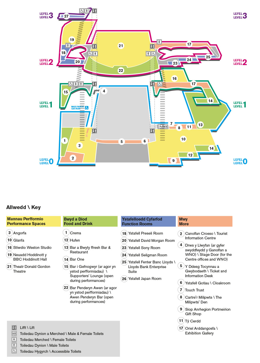
Anyway, enough about OS maps. On the way home from this meeting I got an email from Ceri at WMC who said that she’d bumped into a colleague and mentioned me and my (somewhat weird) obsession with maps. His immediate response was that the Centre desperately needed a new visitor map: the one they had was confusing. I had a look at it and I had to agree: as someone who is (obviously) well used to maps and who has rather good special awareness, I could make neither head nor tail of their map. Thus, I began my research.
I looked at all manner of public buildings: The Royal Opera House in Covent Garden, the Natural History Museum, the Tate Modern, the Sydney Opera House, the Albert Hall, the Southbank Centre, etc etc. I downloaded their visitor maps and studied how they’d chosen to represent themselves spatially to their visitors. I decided that I liked the Natural History Museum’s approach best: all of the floors are on one graphic, you can see the shape of the building and locations of lifts, toilets, stairs etc are very clear, without the image being overloaded with architectural irrelevances.
I showed these maps to WMC and talked through why I liked the Natural History Museum’s solution best, and how I thought it could be adapted to their building. They agreed, and so we set a date and time for me to trace the architect’s plans and to wander around the place taking photographs.

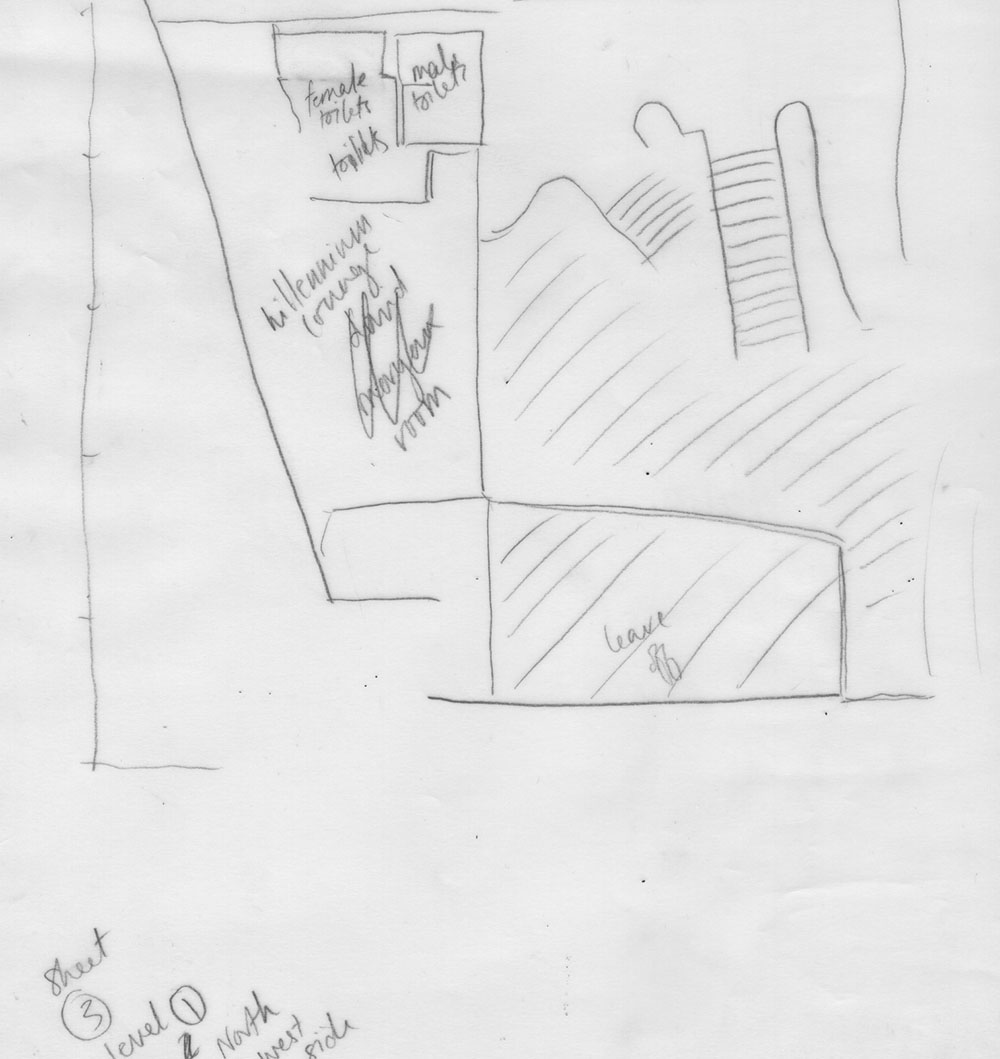
tracing of architects’ plans
I took the enormous sheets of tracing paper home and scanned them on my little A4 desk scanner, pieced the A4 scans back together in Photoshop, and traced them in Illustrator. I then had pretty accurate floor plans of the ground and first three floors of the Centre.
I then created a perspective grid in Illustrator and set about moving the building around until I got the most accessible view of it. What posed a real problem was a sort of “tail” part of the building out the back where various organisations – Urdd Gobaith Cymru, Hijinx Theatre etc – are based. Showing this tail and keeping the rest of the building easy to navigate was difficult, and on seeing my first draft Ceri decided that it wasn’t needed. (Later on she decided to include just the ground-floor plan from its original birds-eye view with the tail* to indicate to visitors where they could find these organisations in the building). So I went back to the original floorplans in Illustrator, removed the “tail” and set about redoing the perspective but this time from the front.

the first version of the map illustration with “tail” – the purple extension out the back
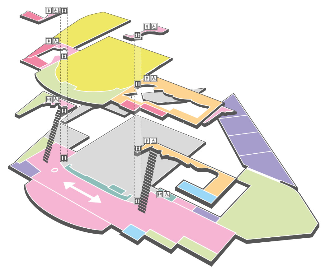
We decided on colour codes for each of the floor levels, and a separate colour code for the type of room (function room, performance space, food and drink etc). The toilets were clearly marked as were the stair and lift positions.
Lastly we added a key. We played around a bit with the various numbers and what would be easiest for people to understand and came up with numbers from starting north and moving south, ground floor to third floor, and then grouped the numbers by their colour-coded sections.
Thus we ended up with something that is as simple as it can be while still clearly showing the locations of all the various rooms and areas. Orientation is helped by the fact that the shape of the building can be discerned from the map, and by linking together the floors with the stairs and lift. You can easily find all the bars, the performance spaces, the function rooms, and it’s simple to discover what floor level you’re on.
As maps go it’s very different from what the Ordnance Survey produce, but I think it does the job pretty well!
*Of course you all already know this, dear reader, but always save altered files under a new name – when clients want to go back to versions you’ve altered (such as the previous floorplan that was drawn from above and has a tail) you can just open up the old file rather than having to redo lots of painstaking work.
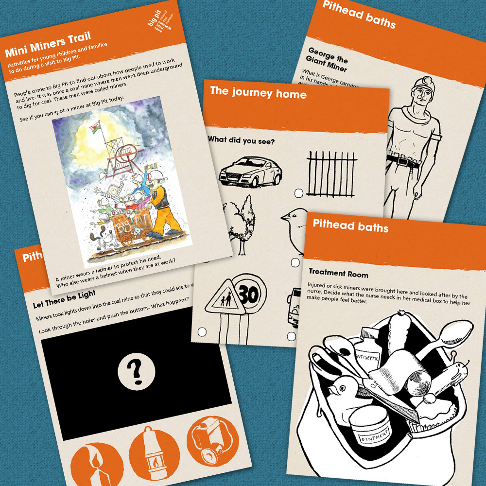
by Frank | Jul 2, 2015 | graphic design, illustration, interpretation
Big Pit National Coal Museum commissioned me to do the design & illustration of a trail booklet that families could follow as they made their way around the site. It’s now gone to press – I can’t wait to see it in the flesh!