by Frank | Mar 4, 2011 | graphic design, illustration, magazine design, slider
I’m always doing a big song-and-dance about CIO Connect magazine, for the simple reason that it’s a dream to work on. The editor is top class (I understand he was recently named as one of twitter’s top 100 journalists to follow – number 91, if you credit that sort of thing) they use a wonderful photographer and professional journalists, it’s beautifully-printed and the end product is always something I’m very proud to have been involved with.
But all that glitter and gloss costs money. What about the companies that don’t want to spend so much, but still desire a handsome regular publication to share with their members, customers, shareholders or what have you?
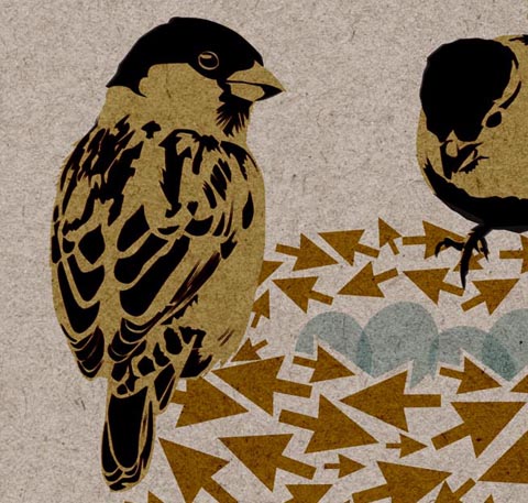
Never fear, it can be done. There’s a step up from the self-produced mediocrities begat by Microsoft Publisher, Comic Sans and clip-art. It’s possible to get a rather smart-looking result, using a skilled designer, cheap stock images and custom illustration. I design and illustrate such a publication. I’m not entirely sure if you’d call it a newsletter or a magazine. It’s a 16-page quarterly thingumy. The client supplies stories that their members have written along with thumbnail pics of the authors, an editor edits and collates, I illustrate a cover incorporating the arrow of the client’s logo and a reflection of the subject matters covered or the season we’re in. This season being Spring (and as I type, the sky is obediently blue, the daffodils obediently flashing upon that inward eye which is the bliss of solitude, and the sparrows obediently chirpy), I done made a nest of arrows and what-not. I have a thing about cardboard backgrounds (have you noticed? You have?) as they lend texture and earthiness to vector-based illustrations which can often be toe-curlingly clean and false. Here’s the cover (click on the image for a bigger version if you like):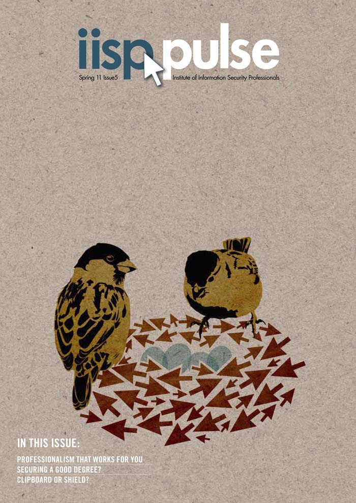
The illustration avoids us having to source what could be a very expensive cover photograph, plus it helps give style and character to the thingumy. Inside, I’ve kept everything very clean and clear, devising a layout which is quick and simple for me to lay out, thus saving money:
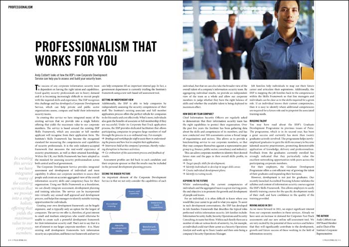 Stock imagery is often difficult to use without it being a touch cheesy. I try to circumvent this by the use of interesting cropping and wrapping text around. Where possible I don’t choose the obvious image, but of course I am limited to what the image libraries can supply. Keeping everything clean and aligned to a grid adds needed class.
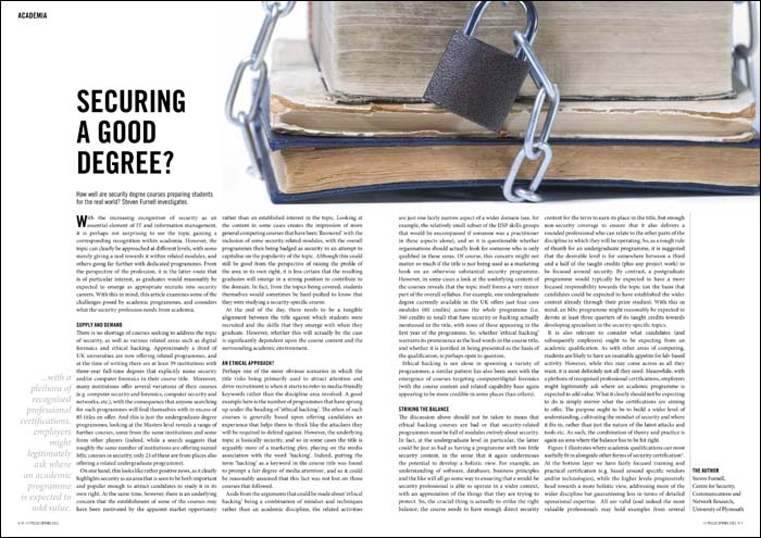
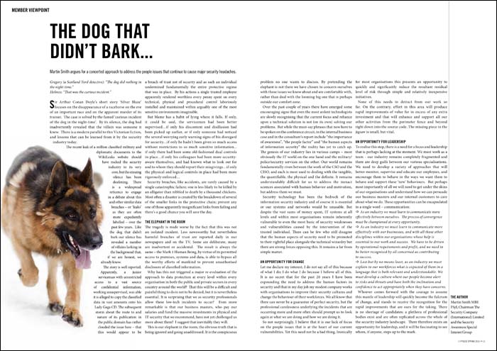 So, there’s a middle ground. It’s possible to get interesting professional magazine design on a budget. It’s a line of work that can be really enjoyable, too. I think what makes Pulse a success is that I’m pretty much left to get on with it – and I find that when clients have that level of trust, designers can really step up to the mark.
by Frank | Feb 18, 2011 | doodles, illustration, thoughts
I haven’t blogged for a while. I feel bad about that. Therefore, this post is on the subject of discipline.
Judging by how frequently it happens, I can’t be the only person who works from home to hear the words “You must be very disciplined” all of the time. My response is generally that I don’t consider myself to be so. Look at those crazy 9 to 5-ers – getting up at the same time every day, ironing their clothes (pfft! what?), applying makeup, making packed lunches and even removing their dressing gown before starting work. That’s discipline.
I work to a more, ahem, flexible pattern.
Some days I’ll be up with the birdies, watching the sun come up and the lorries deliver bread and milk to the supermarket across the road. I’ll be doodling new illustration ideas, thinking about how to improve my website, cursing myself for not thinking up that awesome design solution before that brochure went to press. Or I’ll use that early-ness to go surfing, or practise yoga.
Other days I’ll wake up about the same time the rest of you are shuffling into your offices. I’ll blearily check my phone for emails and mooch into the next room to start the day. There’ll be a hiatus for a few hours in the evening when I go to my Welsh evening class and then I’ll work again until late upon my return.
What I’m starting to wonder is: is this right? Is this healthy? Is this me at my most productive? I don’t need discipline at all to do my work. None whatsoever. It’s my top priority – there is no other option. Even at my most stressed, I keep on. I may as well have a gun to my head, I’m that dedicated. What I do need discipline for is the other stuff – making time for washing up and riding waves. I’m waking up to the fact that these things are necessary – just as vital as money for the mortgage.
These are the things I need to have in order to be at my most productive/creative:
• clean & tidy environment (housework)
• clean & tidy mind & body (yoga, meditation, surfing, walks in the park, etc)
I’m beginning to appreciate the meaning of that clichéd mantra short-term pain, long-term gain (I’m a slow learner sometimes). Discipline, for me, is regularly doing the things you don’t have to do, because you know they’ll make things better in the long run.
And that is something I don’t have nearly enough of. But I’m working on it…
Anyway, apropos of nothing, here are some little close-ups of stuff I’ve been doing, plus a doodle of a pterodactyl-skull-shaped putty rubber doing a song and dance routine. I’ve got a few projects on the go, so I can only show you selected highlights for now…


by Frank | Jan 10, 2011 | illustration
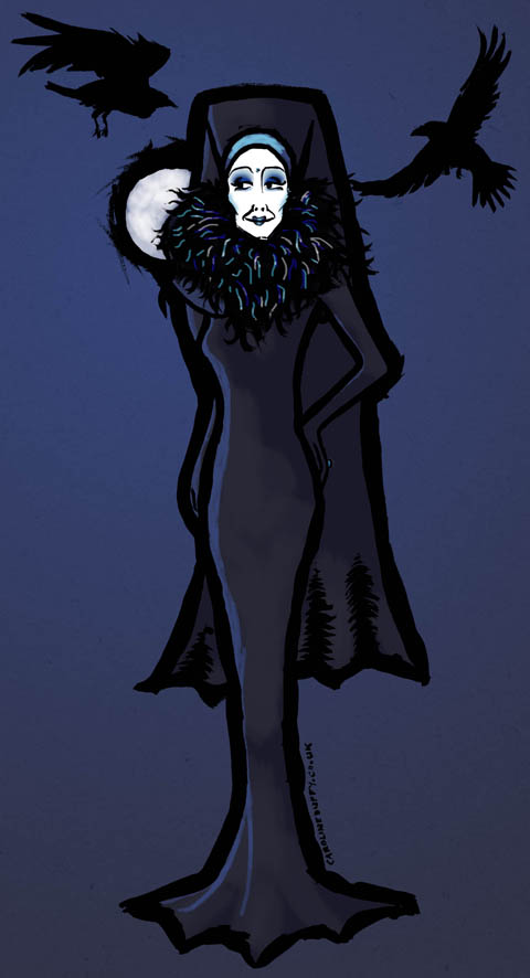
Here’s a quick post to show you a fun little illustration I did for Sister Raven Lunatic of the Sisters of Perpetual Indulgence. It’s being used on t-shirts and other sorts of caboodle what those feisty Sisters are selling to raise money for their important charitable work.
I drew this work in pencil, over-worked with indian ink and brush, and coloured up in Photoshop.
Creating a caricature/illustration of someone you have never met is a little scary, but Sister Raven’s friends insist I have captured hir perfectly. Yay!

by Frank | Jan 4, 2011 | CIO Connect, graphic design, illustration, magazine design

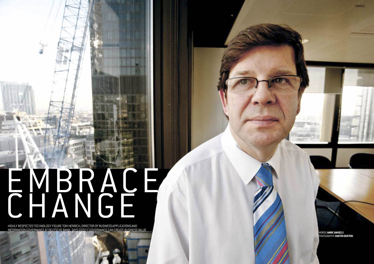
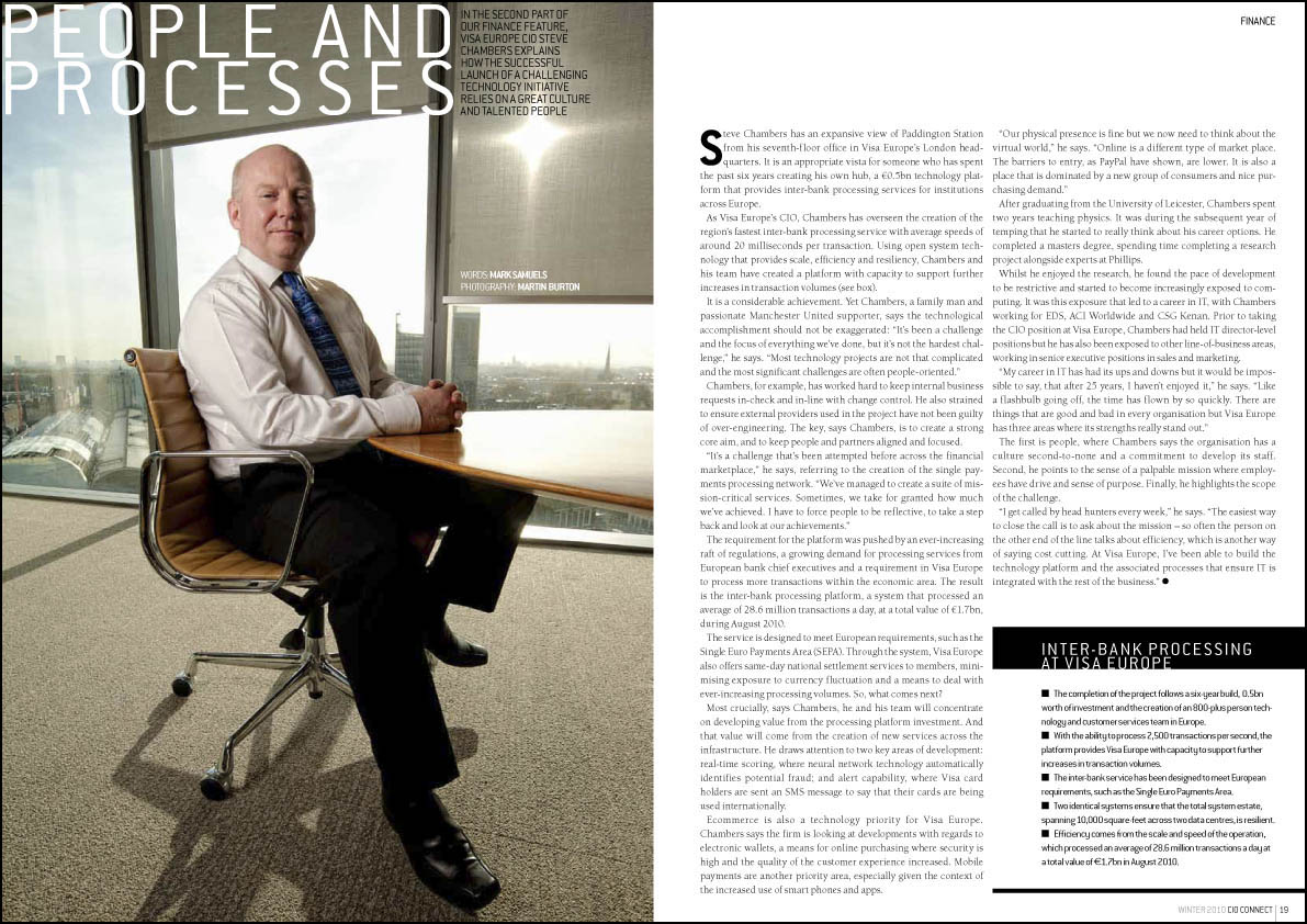
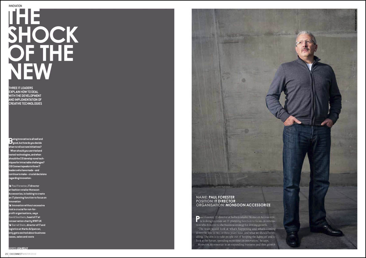
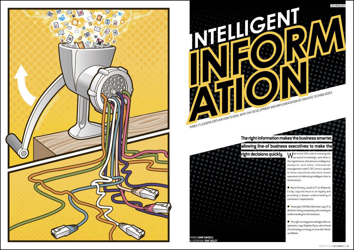
I never get bored with designing CIO Connect magazine. I’ve been doing it since 2003, the year I went freelance, and every time I start a new one I try to improve on the issue before. There’s a real knack to magazine design, I find, and once you’ve got the hang of it it’s one of the most satisfying design jobs out there.
You’re creating something that has to have a coherent look and feel and, in this case, complement the branding of CIO Connect the organisation. But each article must stand out in its own right as a unit separate from the rest. It’s getting this balance right that’s the difficult, and fun part. My aims are to keep the magazine looking fresh, elegant and dynamic, and to have the design reflect both the tone of the text and the various photography and illustration we use.


I’m particularly proud of this issue. It’s my favourite so far. I don’t feel I can claim too much credit though – I find the photography of Martin Burton and the illustrations of Tony Sigley very inspiring – they (to me) make it obvious how the rest of the article should look.


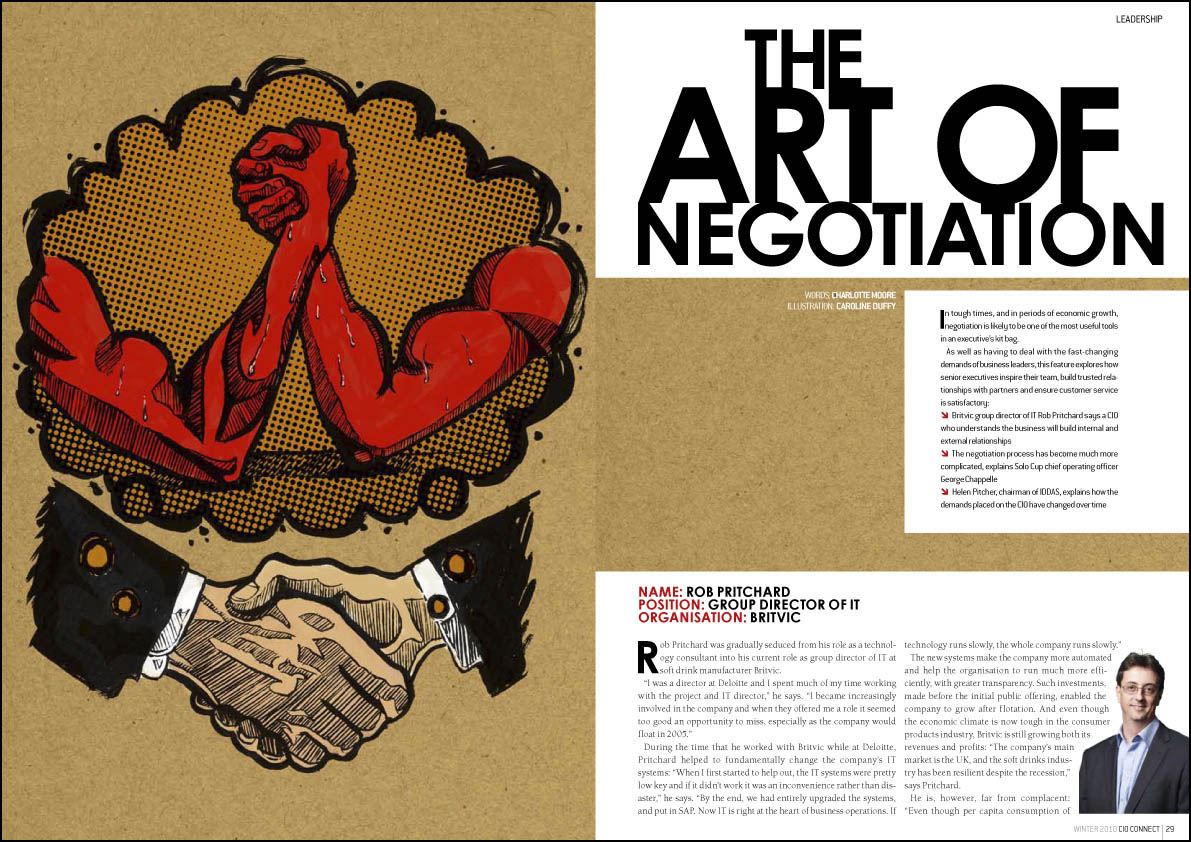
One thing that I image is a headache for all art editors is getting a consistent quality of photography from all contributors. Unless your Vogue magazine or some such, it’s often logistically impossible, for budgetary or distance reasons or whatever, to get a good photographer to the subject, so we have to rely on photos supplied by the interviewee or their PR. Some PRs seem to understand that if they send an amazing photo through, their client is more likely to be given priority in a spread. Unfortunately, most have yet to grasp this sacred truth, so the majority of photos I’m sent are low-resolution atrocities taken by amateurs, or at best, wooden head and shoulders shots taken in front of one of those terrible backgrounds photographers usually reserve for school photos. Puh-leeeze! I’ve been sent a passport photo in the past. No word of a lie. Anyway, for one particular spread we didn’t have many decent photos, so I did an illustration, and used the photos small. I’ve done illustrations for CIO Connect before, but only smooth glassy “brand” type ones of the marbles they have in their logo. This was my first splotchy ink-and-brush affair for them, on the subject of negotiation, and I’m rather happy with it. By the way, you can click on any of the images to see a bigger version.

by Frank | Dec 9, 2010 | illustration
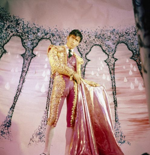
Superlative online fashion publication Amelia’s Magazine put out a twitter call for illustrations for a review of cult 70s homoerotic film Pink Narcissus and I thought it would be fun to have a go. I was asked to illustrate a still from the matador scene, where our devastatingly beautiful hero /muse “bullfights” with a handsome young man on a large motorcycle. As you do.
 The film itself is a masterpiece of kitsch, shot on 8mm film, opulent saturated colours burning into the retina. It was created over seven years in a New York apartment, released without the permission of its (long-time anonymous) creator James Bidgood, and has been a highly-influential underground classic. In fact, after watching the bits available on YouTube I noticed that my music-video-making friends Casey Raymond and Ewan Jones Morris referenced some of that saturation and stop-motion animation creatures from it in their excellent video for Cate Le Bon’s single “Hollow Trees House Hounds”. The little thieves.
Anyhow, here’s my take on the still. The image was composed and sketched out in pencil, solidified with ink and brush, scanned into Photoshop where cardboard and fabric textures were added along with the intense colours. My aim was to retain the kitsch and the camp of the original, along with the colour, without losing the erotic power and active dynamism of our matador – although objectified, he is no passive wallflower. Click on the image for a bigger, more detailed look.


 Stock imagery is often difficult to use without it being a touch cheesy. I try to circumvent this by the use of interesting cropping and wrapping text around. Where possible I don’t choose the obvious image, but of course I am limited to what the image libraries can supply. Keeping everything clean and aligned to a grid adds needed class.
 So, there’s a middle ground. It’s possible to get interesting professional magazine design on a budget. It’s a line of work that can be really enjoyable, too. I think what makes Pulse a success is that I’m pretty much left to get on with it – and I find that when clients have that level of trust, designers can really step up to the mark.
