I’m always doing a big song-and-dance about CIO Connect magazine, for the simple reason that it’s a dream to work on. The editor is top class (I understand he was recently named as one of twitter’s top 100 journalists to follow – number 91, if you credit that sort of thing) they use a wonderful photographer and professional journalists, it’s beautifully-printed and the end product is always something I’m very proud to have been involved with.
But all that glitter and gloss costs money. What about the companies that don’t want to spend so much, but still desire a handsome regular publication to share with their members, customers, shareholders or what have you?
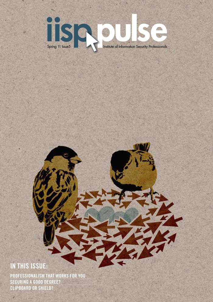
Never fear, it can be done. There’s a step up from the self-produced mediocrities begat by Microsoft Publisher, Comic Sans and clip-art. It’s possible to get a rather smart-looking result, using a skilled designer, cheap stock images and custom illustration. I design and illustrate such a publication. I’m not entirely sure if you’d call it a newsletter or a magazine. It’s a 16-page quarterly thingumy. The client supplies stories that their members have written along with thumbnail pics of the authors, an editor edits and collates, I illustrate a cover incorporating the arrow of the client’s logo and a reflection of the subject matters covered or the season we’re in. This season being Spring (and as I type, the sky is obediently blue, the daffodils obediently flashing upon that inward eye which is the bliss of solitude, and the sparrows obediently chirpy), I done made a nest of arrows and what-not. I have a thing about cardboard backgrounds (have you noticed? You have?) as they lend texture and earthiness to vector-based illustrations which can often be toe-curlingly clean and false. Here’s the cover (click on the image for a bigger version if you like):
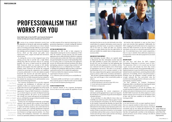
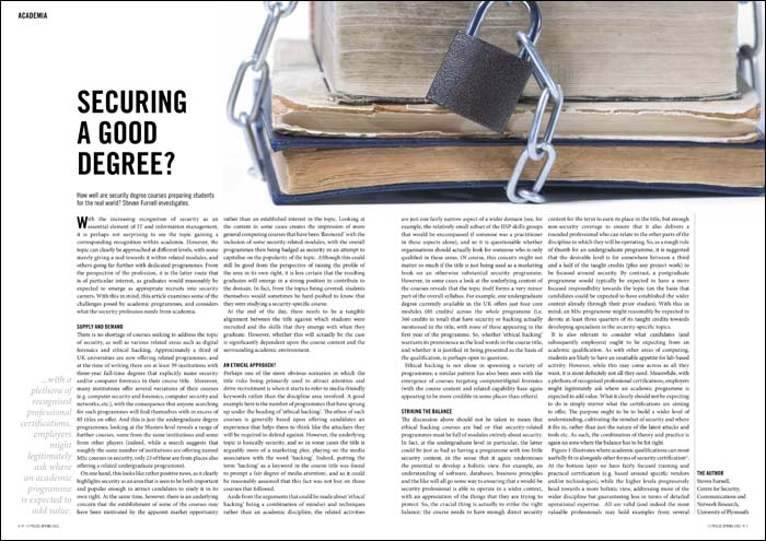
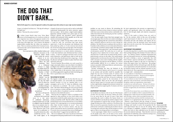
The illustration avoids us having to source what could be a very expensive cover photograph, plus it helps give style and character to the thingumy. Inside, I’ve kept everything very clean and clear, devising a layout which is quick and simple for me to lay out, thus saving money:
 Stock imagery is often difficult to use without it being a touch cheesy. I try to circumvent this by the use of interesting cropping and wrapping text around. Where possible I don’t choose the obvious image, but of course I am limited to what the image libraries can supply. Keeping everything clean and aligned to a grid adds needed class.

 So, there’s a middle ground. It’s possible to get interesting professional magazine design on a budget. It’s a line of work that can be really enjoyable, too. I think what makes Pulse a success is that I’m pretty much left to get on with it – and I find that when clients have that level of trust, designers can really step up to the mark.
