I never get bored with designing CIO Connect magazine. I’ve been doing it since 2003, the year I went freelance, and every time I start a new one I try to improve on the issue before. There’s a real knack to magazine design, I find, and once you’ve got the hang of it it’s one of the most satisfying design jobs out there.
You’re creating something that has to have a coherent look and feel and, in this case, complement the branding of CIO Connect the organisation. But each article must stand out in its own right as a unit separate from the rest. It’s getting this balance right that’s the difficult, and fun part. My aims are to keep the magazine looking fresh, elegant and dynamic, and to have the design reflect both the tone of the text and the various photography and illustration we use.
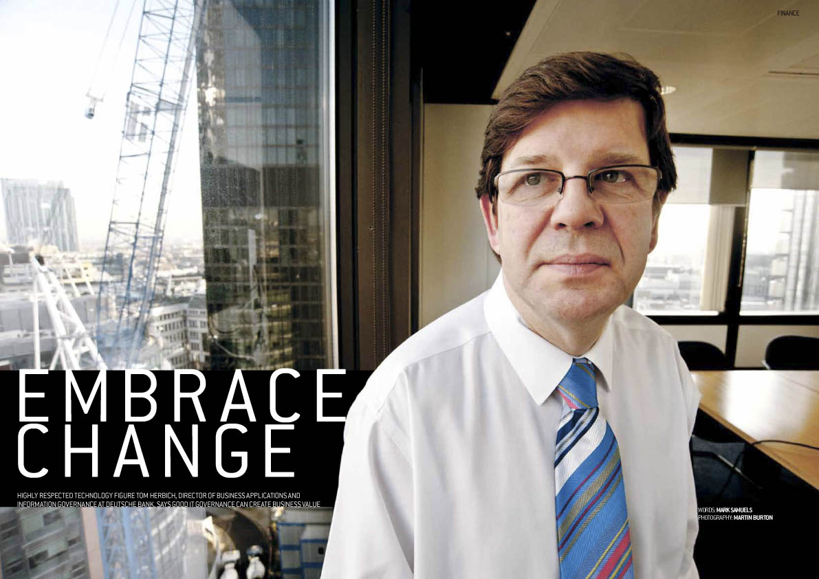
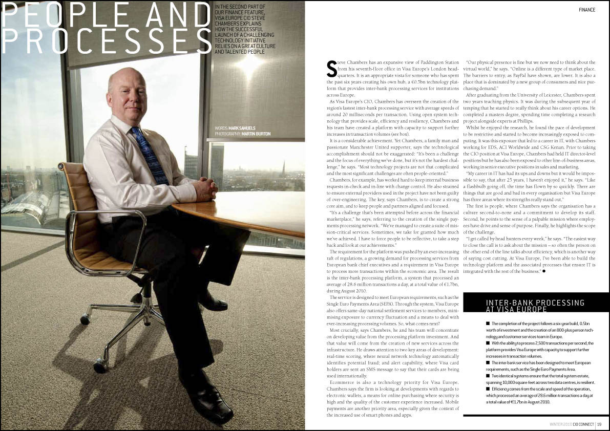
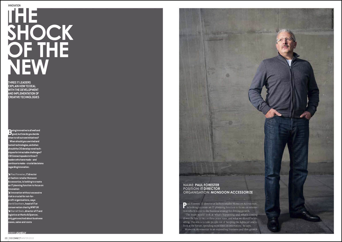
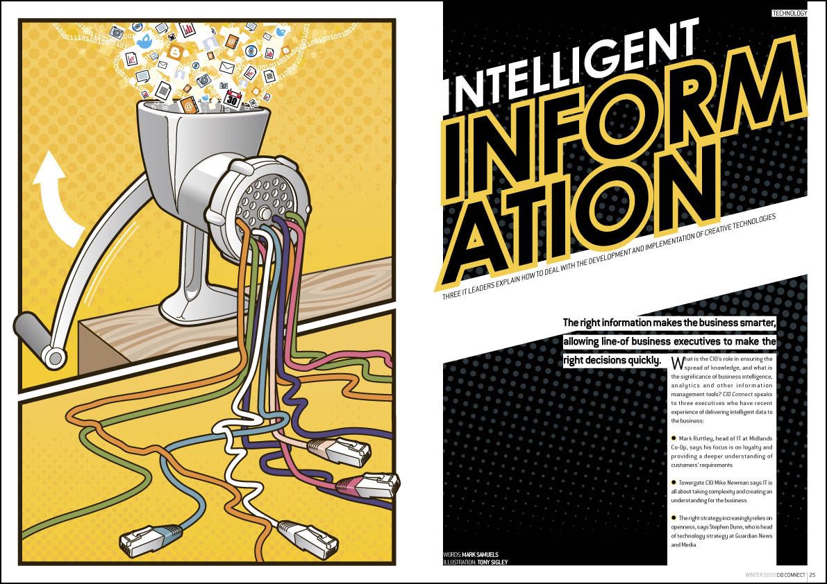
I’m particularly proud of this issue. It’s my favourite so far. I don’t feel I can claim too much credit though – I find the photography of Martin Burton and the illustrations of Tony Sigley very inspiring – they (to me) make it obvious how the rest of the article should look.
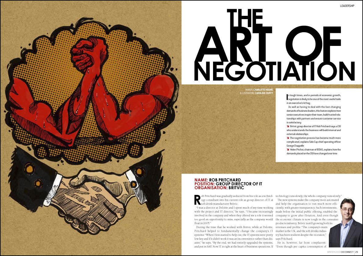
One thing that I image is a headache for all art editors is getting a consistent quality of photography from all contributors. Unless your Vogue magazine or some such, it’s often logistically impossible, for budgetary or distance reasons or whatever, to get a good photographer to the subject, so we have to rely on photos supplied by the interviewee or their PR. Some PRs seem to understand that if they send an amazing photo through, their client is more likely to be given priority in a spread. Unfortunately, most have yet to grasp this sacred truth, so the majority of photos I’m sent are low-resolution atrocities taken by amateurs, or at best, wooden head and shoulders shots taken in front of one of those terrible backgrounds photographers usually reserve for school photos. Puh-leeeze! I’ve been sent a passport photo in the past. No word of a lie. Anyway, for one particular spread we didn’t have many decent photos, so I did an illustration, and used the photos small. I’ve done illustrations for CIO Connect before, but only smooth glassy “brand” type ones of the marbles they have in their logo. This was my first splotchy ink-and-brush affair for them, on the subject of negotiation, and I’m rather happy with it. By the way, you can click on any of the images to see a bigger version.

