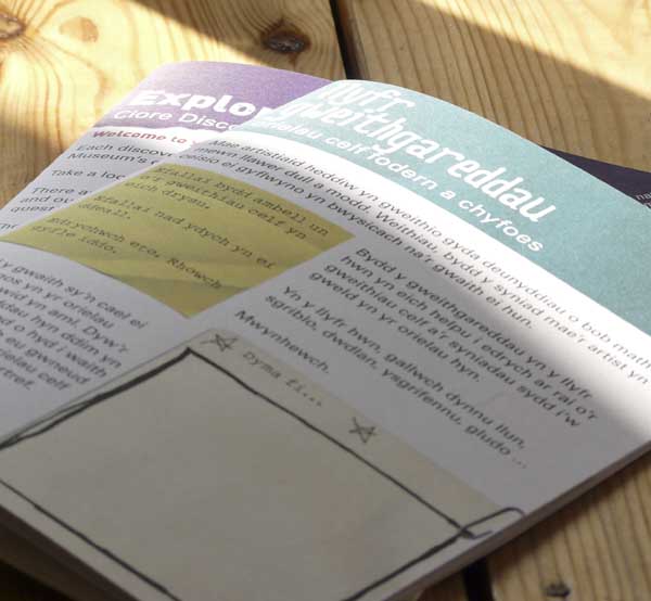
 I received a very handsome surprise package in the post today. Handsome surprise packages always light up my life, but the contents of this one made me hop up and down with joy. Within, you see, were bundles of printed file copies of a couple of lovely jobs I’d just completed for the National Museum Cardiff. They’re activity books, designed and written for children visiting the museum, and very exciting.
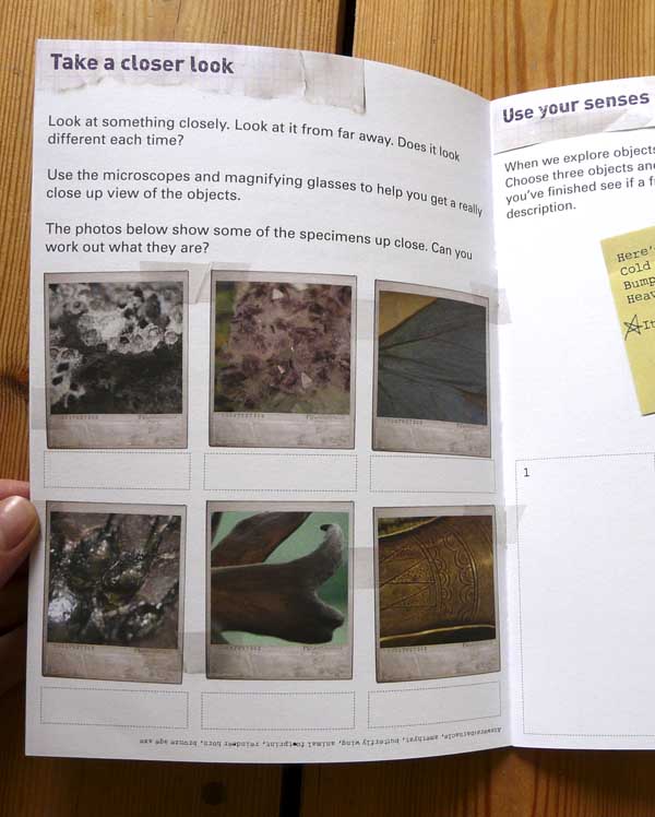
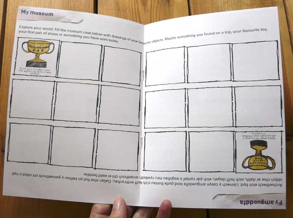
I was asked by staff in the Learning Department to come up with designs that looked a bit like scrap books, while still retaining the Museum’s branding style. The two booklets – one for the Clore Discovery Centre and one for the newly re-opened art galleries – are thus filled with scanned scraps of paper, post-it notes, paper-clips, sellotape, Polaroid photos and blu-tak.
 I used three typefaces on each project – Univers, which is the Museum’s standard typeface, to ensure brand consistency, a rough typewriter font (one that works with the ŵs of the Welsh language, too – hooray!) for highlighted text, and crumpled playful grungy fonts for the headers.
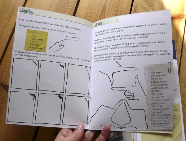
The booklets are Welsh one side and English the other, with a united page in the centre spread that works for both.
 I did plenty of fun quick little illustrations for each booklet – starred asterisks, inky boxes, felt-pen trophies and hands pulling shapes.
  Click on any pic for bigger.
The challenge for this sort of work is two-fold. Firstly, the booklets were to be interesting and engaging and have this rough, curated feel. I was shown examples of other museums’ efforts and asked if I could produce something that didn’t copy them but had the same hand-finished feel. Yet the booklets still had sit within the Museum’s branding and not feel at odds with the rest of their publications. This is achieved with the band at the top of each cover, and with the Museum’s own typeface as body-copy, as mentioned.
Secondly, when presented with a request to create something that feels hand-made and cobbled together, there’s a real risk of a lack of balance. It’s pretty easy to enter the perilous realm of the dog’s breakfast. The thing to do is to establish some rules. I stuck to a rigid three-column grid with 5mm margins. Overall, colours are fairly limited, margins are always adhered to and there is a consistency of inky line all the way through. The post-its are regular little notes to encourage readers to act, and all the pages are given structure with standard headers.
Hope you like these as much as I do!

Hi Caroline
Just wanted to say the booklets are fab and have been really well received by our visitors. You came up trumps again!
x
Why thank you! Always a pleasure x