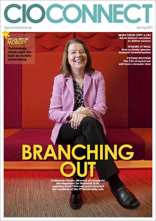
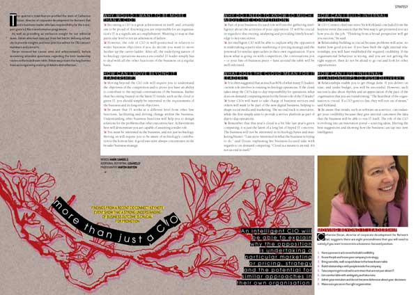
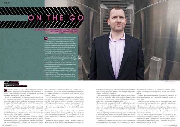
Yes, I do. It’s possibly my favourite thing to do. It’s all about retaining a united look for the whole publication, but differentiating articles from each other. Tis a fine balance. My general rules of thumb would be:
• choose a few key fonts. I’ve cut down the amount I use for each publication over the years; at present I probably use three font families with CIO Connect magazine, and two with Pulse. Body fonts, header fonts, subheads, captions and general page-furniture should all fit nicely together. Contrast the old with the new; pay attention to the rhythm and shapes of combinations of typefaces.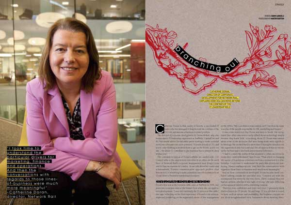
• restrict the palette of colours used for each article. Echo or juxtapose with the main imagery.
• and while we talk about imagery – the better this is, the better your publication will look. It’s not impossible, but it is time-consuming, frustrating and demoralising to polish a turd. If you’re relying on other people to send photos to you, get them your specs early and remind them often. Request professional photography. Nevertheless, you will be sent blurred dark low-resolution images. It’s a fact of life, like aging and Jimmy Carr.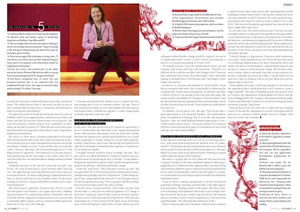
• never underestimate how much structure – and therefore beauty – one can add with clever page furniture. Page numbers and kickers might seem like dull must-haves but, if done well and used with elegant column and margin proportions, they really lift and frame a page. They are like the eyebrows of the magazine, if you like.
As ever, click on the pics for bigger versions. And if you’d like me to design your magazine to look this good, get in touch!

