by Frank | Feb 11, 2013 | illustration
As part of their Wolf Inside exhibition about the origins of domestic animals (for which I also did this lovely thing) National Museum Wales asked me to do some simple line illustrations of a wolf along with various dog breeds for a children’s workshop. I gladly obliged. Here they are! As per usual, the dogs were drawn in pencil (copied from an enormous book on breeds I got from the local library), inked up, scanned and cleaned up. The dogs are daschund, standard poodle, chihuahua, West Highland terrier, greyhound, jack russell, and old English sheepdog. You can click for a bigger version.
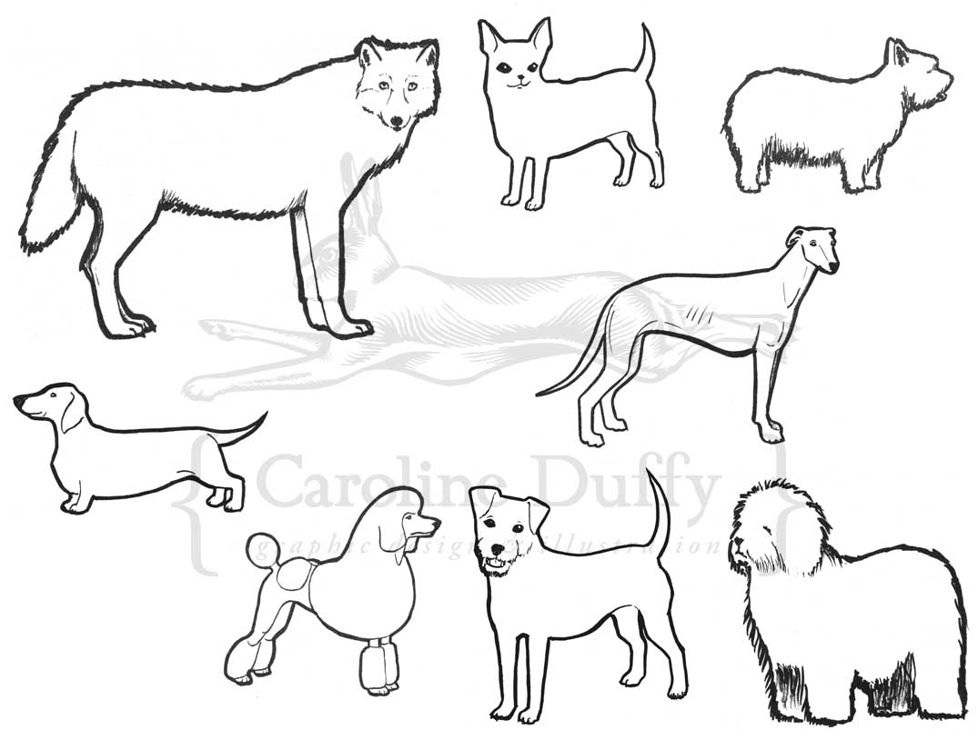
a wolf and its strange descendants
by Frank | Feb 11, 2013 | illustration
So, I heard some rather exciting news a few weeks ago. Those of you who “like” my Facebook page may have seen that a workshop what I did the illustrations for aaaaaaages ago (old blog post featuring illustrations here check out my old hair cut) is being made into a book, and the children’s workshop (called Sounds of the Dinosaurs, written by Grace Todd) which has been presented at the museum zillions of times to the delight of children and teachers alike, will be presented at *gasp* Hay on Wye festival! and the book will be sold there too! Here’s hoping I get a ticket to that…
Anyway, as part of the publishing-in-a-book thing, Grace asked me to do a couple more illustrations for her. One has yet to be signed off, but t’other is a size comparison chart showing the differences between the various critters featured in the book – alamosaurus, tyrannosaurus rex, hadrosaur, pteranodon and frog, along with a camper van and some children. Each gridline represents one metre. You can click on the image for a bigger version.
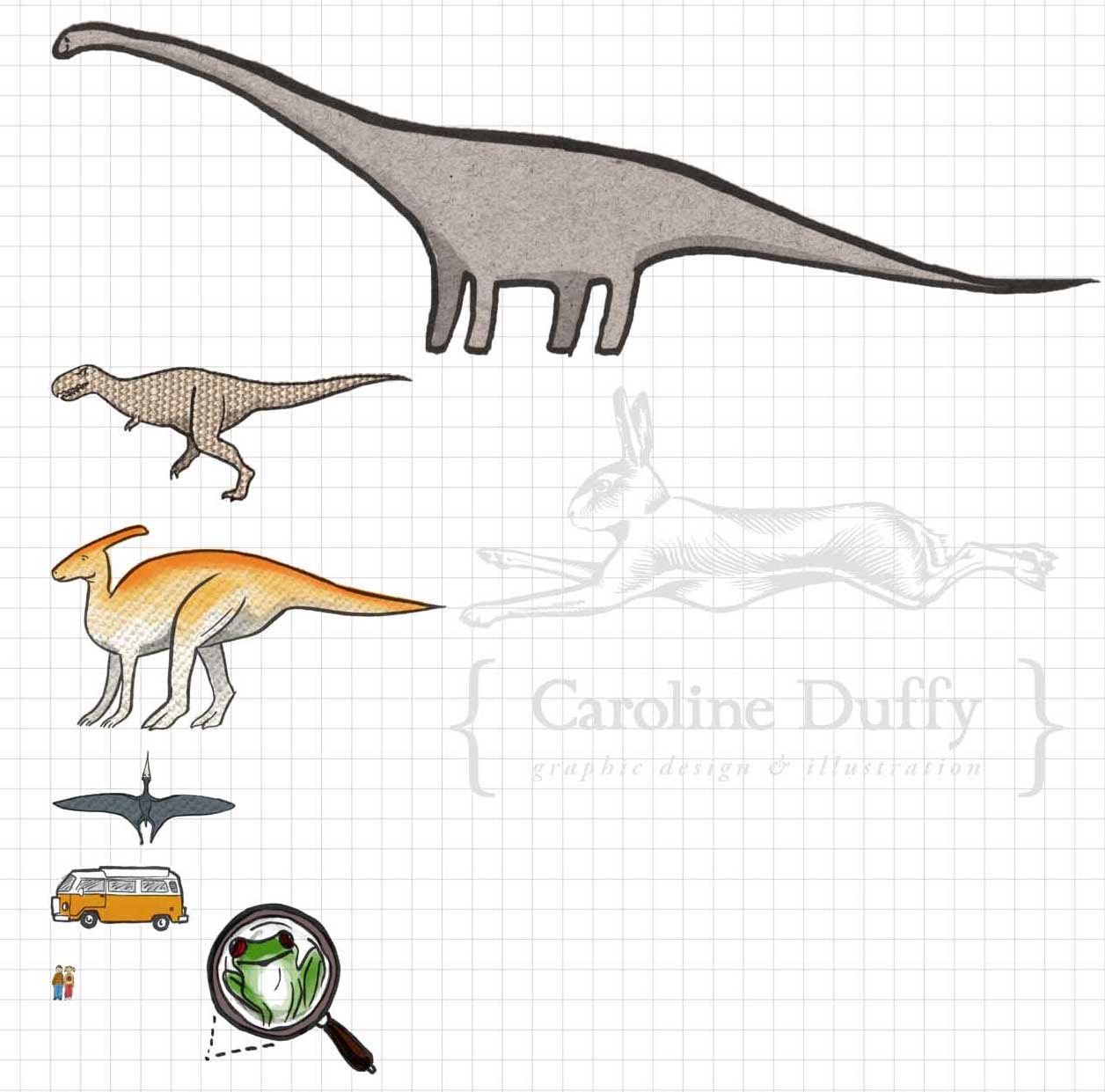
dinosaur size comparison chart
Sometimes I get a bit overexcited by the fact that I get paid to draw dinosaurs and I have to have a little sit down.
by Frank | Feb 11, 2013 | graphic design, illustration, interpretation, slider
Happy new year! I have lots to share with you so this will be one of many blogs in the next few days, January having been full to the brim with work and February having been half full with a kidney infection (I don’t recommend them) from which I am nearly 100% recovered.
Anyway first up is this cheerful leaflet what I designed and illustrated in English and Welsh for Gareth Bonello at National Museum Cardiff. They’re having an exhibition about the origins of domestic animals called The Wolf Inside and Gareth had mocked something up in Publisher which he wanted me to design. I came up with this:
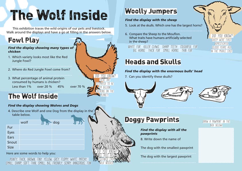
Family trail – design and illustration – for National Museum Cardiff.
Ac yn Gymraeg:
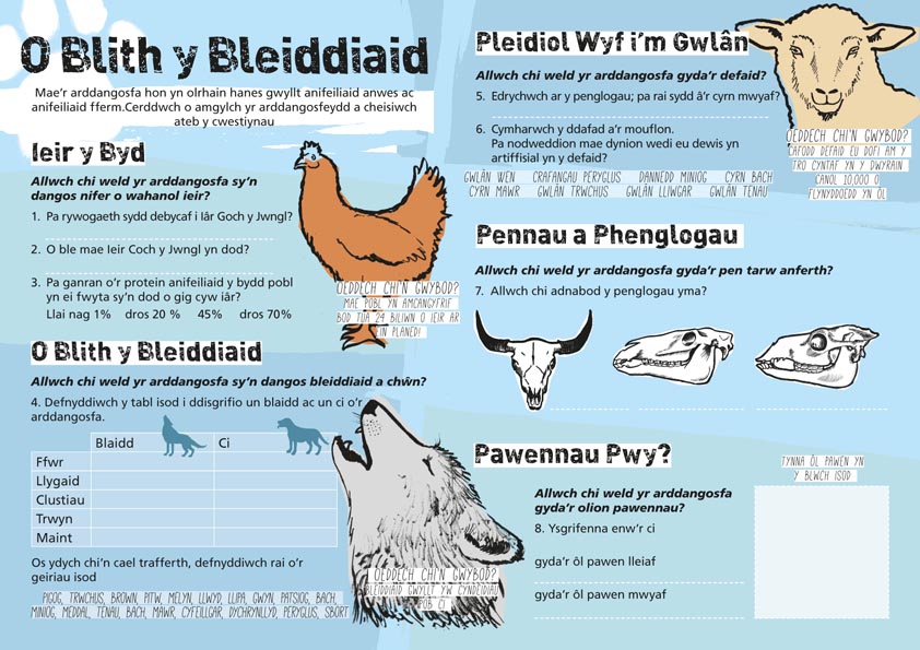
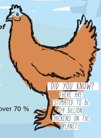
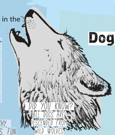
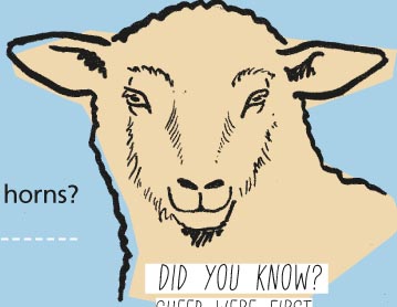
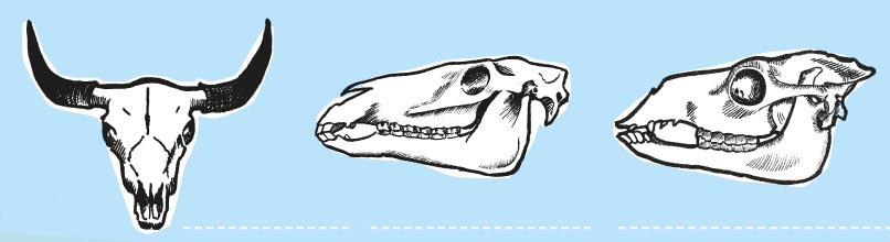
And here are some close-ups of the illustrations I did for the piece. As usual they were drawn in pencil, painted in Indian ink and then scanned in. I cleaned them up, converted to Bitmap Tiffs and then drew simplified coloured boxes in InDesign behind them to give them their colours: grey for the wolf, orange for the chicken, a pale gold for the sheep and white for the skulls.
 Gareth said, “mae e’n edrych yn wych!” (it looks great!)
(If you’re wondering how long I spent trying to think of a pun title for this post based on Wolfie Smith, the answer is about two minutes.)
by Frank | Dec 3, 2012 | illustration, interpretation

In France she would be called La Renarde and would be hunted with only her cunning to protect her
A little quicky to show you this fox illustration I’ve done for the Learning Department at National Museum Cardiff. They’ve designed a winter wildlife trail for kids and wanted a little mascot to go on signposting and stickers for the kids. After a few goes at drawing foxes I sketched out this critter, inked her up with Indian ink and a brush (a Proarte Prolene Plus size 3 is my favourite inking brush – it keeps a lovely point), and then scanned the inked design. I photoshopped out any smudges and dust speckles, and then took this image into Illustrator and live-traced it, which is a good way of turning a basic drawing into a vector file (a vector file is a file made up of mathematical equations and data rather than pixels, so it can be enlarged as big as you like without degrading). You can choose the colour range and detail level in the live tracing; I chose greyscale and a fairly high amount of detail so as to retain the organic nature of the brushstrokes. I then simply drew a red shape for the fur and yellow for the eyes on a layer behind the traced drawing, and added a little white highlight for the eyes. Done!
by Frank | Nov 30, 2012 | graphic design

For sale: Spillers Records calendar. Cat not included.
AAAARRRGGHHH it’s that time of year again when everyone wakes up in the middle of the night screaming WHAT GIFT CAN I GIVE FOR THE CARDIFF BORN OR BASED MUSIC LOVER THAT’S BEAUTIFUL, SUPPORTS INDEPENDENT RETAILERS WHO PAY THEIR TAX, IS GOOD VALUE FOR MONEY AND WILL LAST A WHOLE YEAR?
Scream no more, children, for Spillers Records (the world’s oldest record store, TM) produces a calendar – one for every year, indeed. And this year the lovely Ash and Grace kindly asked me to design it for them. So I did. The front cover features a gorgeous retro design found on an old carrier bag, and the innards boast a veritable wealth of customers’ own photos taken from around the world. Get ’em while they’re hot, innit – pop down to Spillers in the Morgan Arcade and demand your copies now! They’re £5 in store, or if you buy online there are bundle deals with packing and postage here.
(photo features Henry Cat who staunchly refused to get out of camera shot)
by Frank | Nov 28, 2012 | graphic design, illustration

If you live in Cardiff and you’re a Chapter regular you may well have seen this poster gracing their walls. Darkened Rooms presents classic films in unusual locations and, this Christmas, they’re showing Frank Capra’s classic at the Angel Hotel in the city centre.
Claire Vaughan at Chapter asked me to design the poster and I wondered at the best way to do it. I was very busy at the time, so I wasn’t able to create an illustration by hand. I’d have to start with a photo from the movie itself. I asked Claire if there were any legal restrictions on using a movie image in this way, and after she replied in the negative, I google image searched for the most iconic images from the film. There were two directions in which I could have taken it – the happy family ending, or the suicidal Jimmy Stewart about to throw himself off the bridge in the snow. Claire had emphasised that they were going for a family audience, so I thought maybe the whole drenched-having-topped-himself-by-drowning-in-a-river Stewart might not send quite the right message. So the happily-ever-after image it was.
I sketched out some rough layouts while on the Megabus back from London. I couldn’t spend too long on them because sketching on the bus makes me travel sick. Which is nice. I wanted to get in the bells, the angel, the family image and some lovely retro type. Here are my scribblings:

There’s a limit to the size of the images you can find of It’s a Wonderful Life on Google. And movie posters are pretty big. If I wanted said happy-family image to be prominent on the poster without being all blurry and horrible I’d have to crank up Photoshop filters and effects. I enlarged the original black and white image to the size I wanted it for the poster, turned it into monochrome halftone pattern (hence all the dots, see?) and then chose an unusual pallet using the wonderful colorschemedesigner.com.
In Illustrator I created the Angel shape, and then made the snowflake pattern in the background from lots of little angels. I drew the bells and imported Jimmy Stewart, Donna Reed and co as the halftone pattern I’d created in Photoshop. In a layer under them I added stylised colour to show their clothes, hair, skin etc.
I downloaded free retro typefaces World’s Finest and Ballpark Weiner and used them to add all of the text. Done!
by Frank | Nov 22, 2012 | graphic design
I’ve been freelancing full time as a graphic designer and illustrator for nine and a half years now and in that time I’ve figured out a few simple rules – one of which is that I only work with clients whom I personally like, and another of which is that I do not work for any client whose ethics do not sit well with my own*. It seems that the more I follow these rules the more they do for me – right now I’m working for some people whom I bloody well adore, and for organisations and causes I never dreamed I could be a part of. I am very lucky.
This was absolutely the case when my good friend Jay McNeil asked me to create a logo for his new organisation Traverse Research. Jay is a campaigner for trans* people’s rights and Traverse has been set up to support trans* needs through equalities research. He’d scribbled something logo-ish on a bit of paper involving a mountain range and the name and asked me if I could do something with said scribble. As someone who identifies as gender-queer and who frequently experiences frustration with heteronormative assumptions and the gender binary, I said yes I was more than happy to. Here is the result:

Of the logo, Jay said, “Seriously, that’s fucking great!” Which is nice.
 Jay then asked if I’d like to get involved with designing the Trans Mental Health Study 2012 – the largest of its kind in the WORLD. It’s harrowing but compulsive reading and I really think everyone should take a look. It’s very well-written and not at all in the dry academic style we’ve come to expect from these sorts of reports. You can download it in full here. It was a bit of a last minute job; it had to be designed and proof-read and edited in I think about 48 hours and that included all of the diagrams and graphs and what-not! By the time I had got around to designing the cover I’d been staring at the screen so long I had no idea if it was even any good at all! Luckily I think it turned out okay 😉
You can watch a short (7 minute) moving and heart-felt speech by Jay discussing the report at the Sheffield event for the Transgender Day of Remembrance here. TDoR is on 20th November every year and commemorates the lives of those people worldwide who have been murdered because they were transgendered.
I am very proud to have been involved, in my small part, with this vital project. Thank you so much to Jay for asking me and all the best and brightest wishes for the future of Traverse Research x
*In the past I’ve turned down work for an angling supplies company (I’m vegan) and the opportunity to pitch for Vodafone (I’m pretty much into companies paying tax), among other things. (You may choose to read into this that I’m some kind of bleeding-heart tree-hugging hippy liberal type – I couldn’t possibly comment)
by Frank | Oct 12, 2012 | CIO Connect, graphic design, illustration
Here is Professor Brian Cox presenting at this year’s CIO Connect annual conference. He is stood in front of the conference branding, designed by yours truly. Hooray!
Picture credit goes to the fantastic Martin Burton

by Frank | Sep 10, 2012 | CIO Connect
Hey, just waiting for my computer to update some software so thought I’d show you these quickly – a couple of ads I did for CIO Connect. They’re for News International’s iPad app and featured in last weekend’s Sunday Times (9th September 2012).

vertical iPad ad for CIO Connect
Obviously when designing an ad for a device like the iPad it has to work horizontally and vertically.

Horizontal ad for CIO Connect
by Frank | Sep 5, 2012 | blog news
Just a little missive to inform y’all that, after a bit of a hiatus, my newsletters will be getting right down in your inboxes again from this weekend. They’ll be brief but full to the brim of recent work, inspiring things I’ve unearthed from the internet and maybe even some kittens. So there!
You may sign up here, if it pleases you x
