by Frank | May 6, 2011 | graphic design, thoughts
Frustration comes from expectation. Remove the expectation, you remove the frustration.” – Sister Shelby Hellbound
I’ve been thinking a lot about expectations lately. Not the real, tangible, obvious ones (a client asks me to create a logo for them, I agree, therefore they have an expectation that that’s what I’ll do), but more the sort of hopes-and-dreams-and-pie-in-the-sky-stories we all tell ourselves, and how they can impact on business relationships. A couple of books I’ve had my nose stuck in this week have helped me explore this thorny ground and expose how clear, honest communication from the start is the best solution: one is How to Run a Successful Design Business edited by Shan Preddy; the other is The Surprising Purpose of Anger by Marshall B Rosenberg PhD.
I’ll start with the latter. Rosenberg, founder of the Center for Nonviolent Communication (oh dear, they use Comic Sans in their logo, way to go to make me feel peaceful there), posits that anger is a warning signal: when properly made conscious it is possible to realise that the trigger of and the reason for your anger are separate things – and that the reason for it is always your own judgmental thoughts about the trigger situation. Anger’s warning is an indication that in some way your needs are not being met.
Let’s take an entirely hypothetical situation.
My boyfriend is late meeting me at the cinema and we only just catch the start of the film. This triggers my anger. The reason for my anger is that I have enduring negative thoughts around his lateness being a lack of respect for our time together, and of how much I wanted to see this film and that he was bound to let me down again, and also a general frustration at his lack of ability to get his shit together. Thus, I have insecurities about how much he values the relationship and my unmet need requires him to convince me that he takes the relationship seriously. (Thinking all of this through in the heat of the moment might be difficult, though). In this scenario I need to manage my own expectations (he is always late – relax about it) and communicate to him how his lateness triggers my insecurities – which he could then choose to address.
So what do my entirely hypothetical relationship problems have in common with graphic design, hmmm?
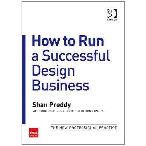 Well, on to Shan Preddy’s book. It is a massive and invaluable resource and every designer and agency should buy it as you will bloody learn something. It’s divided up into lots of little essays by various experts about different aspects of the business. The bit I am reading now is about project management – setting up a process, taking things step-by-step, allowing contingencies, etc. All common sense stuff.
The part that struck me was this: that client and agency expectations for the project should be made clear from the start.
What does this mean?
The client will have expectations – often unspoken – about the agency. They will have made their choice to use the agency based on a myriad of things – the marketing, the initial meeting, the price, the pitch, the mood they’re in, the weather, whatever. So it’s a good idea that I, the agency, ask them about their expectation. Get them down on paper. Make sure that all parties are 100% aware of the job remits and the required outcomes.
I might also have expectations and assumptions – that the client knows what they’re doing and how to work with me on every step of our journey. So, importantly, I should list my own requirements, too: A clear, coherent brief. Honest and timely communication. Prompt payment.
Managing expectations – getting them out of the realm of foggy wishes and ineffable feelings and down on paper – enables both parties to know where they stand and enables everyone’s needs to be met, thus avoiding frustration and even anger. Yep, there’s still room for feelings and intuition and creative design, but obligations on all sides are clearer, allowing for a more secure relationship and providing a solid grounding for the magic to happen.
Plagues of vagueness
I learned this lesson recently with a client who wouldn’t write me a brief, (despite downloading a copy of this) and then became increasingly frustrated with me as I continued to miss the mark. Shan Preddy’s book has some invaluable advice for this sort of situation. What it suggests the designer do in this case is to offer to write your own brief from your client’s woolly instructions, and send it to them for their agreement before proceeding. It also cleverly suggests that you tell them you are charging extra for this service. A reasonable client will realise that their vagueness is giving you a tonne of extra work, and either get their head out of the clouds to construct a brief, or agree to pay you to commit their ramblings to paper-form.
An unreasonable client will cry holy hell – and you can walk away, without having wasted too much time.
I wrote a guide (you may have heard me mention it) to help design-buying newbies write briefs. People say it’s helped them understand how designers work and what we need from clients, but I’ll be going further and firming up my communications to ensure that I and my clients have as much chance as possible of living happily ever after.
by Frank | Apr 19, 2011 | branding, thoughts
Those of you who subscribe to my newsletter will know that I have recently been despairing at the way some companies communicate with their customers and prospective customers. I am saddened, and sometimes angered, by poor communication. I think of how much better it could have been if the sender had thought for a moment and reviewed what they were about to do.
This is a subject I’ve been considering a lot lately. I think the issue is authenticity.
I have learned the hard way over the years to be authentic. By that I mean to show clients who I am and what I stand for. I am not going to try to pretend to be someone else. The work I produce and my work ethos I take 100% seriously; the rest of life I do not. You’ll see from my Twitter feed that I swear a bit, rant a bit, talk in LOLcat sometimes, laugh a lot, and discuss and debate new ideas with people. That is who I am. I used to be afraid of showing myself – I used to think clients would want something else. Something more normal (whatever that means). Which is silly, because clients who want someone creative are expecting that person, that one who thinks along strange lines, to be – how shall we say? expressive.
If you are not trying to get to know your clients – if you just want to take their money from them – you will behave in strange ways
Thinking along these lines enables you to see your clients as not just clients. You encourage the authenticity in them too. This is important, because if they cannot show you who they are, you are not going to see them and be able to give them what they want, which in my case, is sort of to reveal – to enable the revealing – of the visual dimension of whatever they are trying to communicate.
Thus, talking in LOLcat once in a while makes me a better designer. QED.
But seriously (SRSLY), let’s take this step one further. If you are not trying to get to know your clients, if you are not interested in their authenticity, if you just want to take their money from them, you will behave in strange ways. You might sign them up to your newsletter or marketing crap without calling and asking first (this is illegal in the UK, by the way), in the assumption that they actually care about what you’re selling. No, they won’t care, they’ll think you rude, and they may well report you to the Information Commissioner’s Office for spamming. You might treat them badly because they’re leaving your services. You might forget that word-of-mouth is probably the most important marketing tool you have, and that your reputation is possibly your greatest asset, and that annoying the fuck out of people damages both of these.
Be yourself, and communicate from yourself, not from some made-up droid you think your clients want (because those are not the droids they’re looking for). And don’t treat them like droids either. Sure, create a logo and a brand which reflects the market position you’d like to occupy. Be aspirational. But make sure it’s still you, albeit a dead fancy and successful you. Because, well, I probably don’t know you, but I’m pretty sure you’re just fine the way you are.
by Frank | Mar 24, 2011 | graphic design, illustration, magazine design
 I’m on holiday for ten days tomorrow and my brain has given up work already, so instead of some clever-yet-groanworthy dad-pun of a title, you can have a Monty Python quote, as I couldn’t think of anything else. This post was nearly entitled “Romans they go to the house”, but I feared it was too tenuous and only actually funny in my own head, being a grammar nerd who’s attempting to learn Yr Iaith Cymraeg.
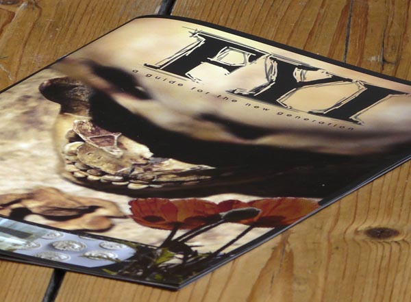
Anyhoo, what happened was last summer the National Roman Legion Museum in Caerleon contacted me about a newly-conceived project involving a magazine by young people for young people that would help illustrate parts of Roman history relevant to the lives of teenagers. “We want it to look a bit like Kerrang!,” they said. “No problem,” I said.
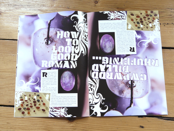
The main differences between Kerrang! and this little publication are that a) FYI only has six pages per language (it’s a bilingual flip-and-turn type thing) and b) Kerrang! has an awful lot more information on each page. Luckily we managed to source some interesting photos, and with a little photoshop magic to increase the grunginess I think FYI captures some of the action.
It took a little while for the students to arrange the subjects and copy they wanted including, so the project developed slowly over the months, and finally went to press in March. Many of the images were supplied by the Museum, some I found free on websites like Stock Exchange and some I provided or illustrated myself. Inky and charcoaly lines, lots of textures and halftone patterns and a limited colour palette help roughen the look.
 For extra interest, the little mag is 90% of the size of A4 (it’s a good thing to note how much more attractive non-standard-sized publications are to readers) and is beautifully finished on silk stock, thanks to sourcing print via my brilliant independent print sales expert. The Museum emailed me to say that they are really happy with the finished product. Phew!
by Frank | Mar 4, 2011 | graphic design, illustration, magazine design, slider
I’m always doing a big song-and-dance about CIO Connect magazine, for the simple reason that it’s a dream to work on. The editor is top class (I understand he was recently named as one of twitter’s top 100 journalists to follow – number 91, if you credit that sort of thing) they use a wonderful photographer and professional journalists, it’s beautifully-printed and the end product is always something I’m very proud to have been involved with.
But all that glitter and gloss costs money. What about the companies that don’t want to spend so much, but still desire a handsome regular publication to share with their members, customers, shareholders or what have you?
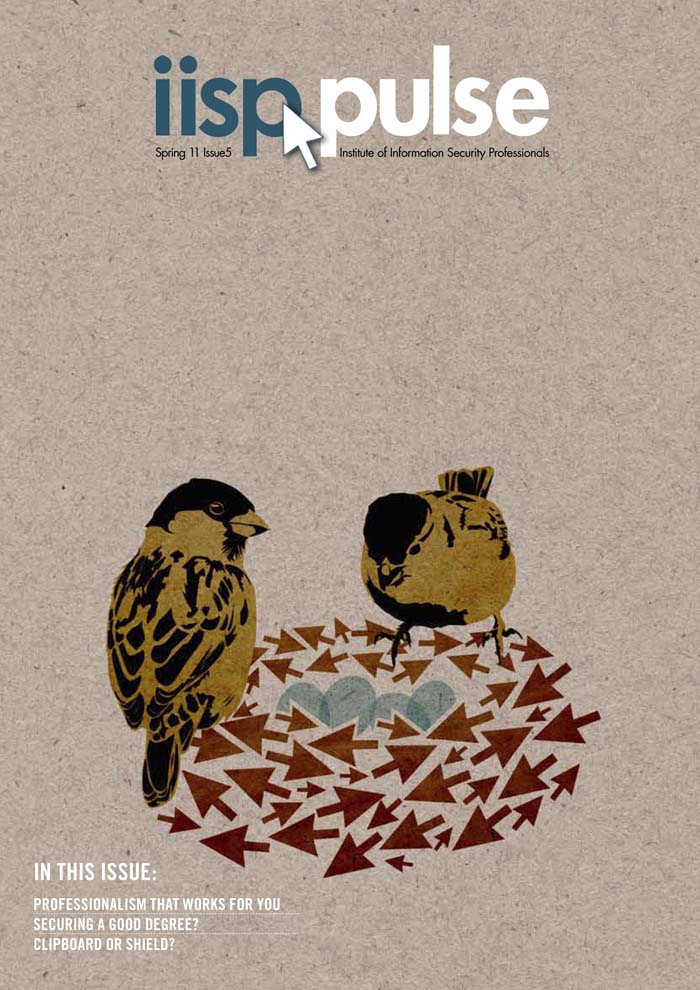
Never fear, it can be done. There’s a step up from the self-produced mediocrities begat by Microsoft Publisher, Comic Sans and clip-art. It’s possible to get a rather smart-looking result, using a skilled designer, cheap stock images and custom illustration. I design and illustrate such a publication. I’m not entirely sure if you’d call it a newsletter or a magazine. It’s a 16-page quarterly thingumy. The client supplies stories that their members have written along with thumbnail pics of the authors, an editor edits and collates, I illustrate a cover incorporating the arrow of the client’s logo and a reflection of the subject matters covered or the season we’re in. This season being Spring (and as I type, the sky is obediently blue, the daffodils obediently flashing upon that inward eye which is the bliss of solitude, and the sparrows obediently chirpy), I done made a nest of arrows and what-not. I have a thing about cardboard backgrounds (have you noticed? You have?) as they lend texture and earthiness to vector-based illustrations which can often be toe-curlingly clean and false. Here’s the cover (click on the image for a bigger version if you like):
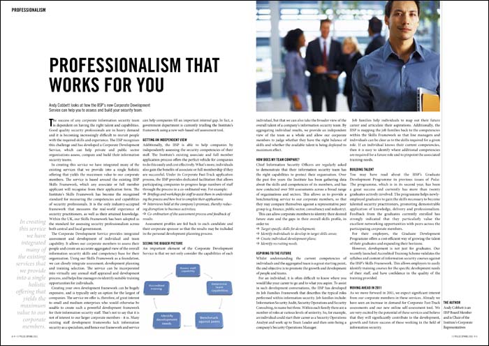
The illustration avoids us having to source what could be a very expensive cover photograph, plus it helps give style and character to the thingumy. Inside, I’ve kept everything very clean and clear, devising a layout which is quick and simple for me to lay out, thus saving money:
 Stock imagery is often difficult to use without it being a touch cheesy. I try to circumvent this by the use of interesting cropping and wrapping text around. Where possible I don’t choose the obvious image, but of course I am limited to what the image libraries can supply. Keeping everything clean and aligned to a grid adds needed class.

 So, there’s a middle ground. It’s possible to get interesting professional magazine design on a budget. It’s a line of work that can be really enjoyable, too. I think what makes Pulse a success is that I’m pretty much left to get on with it – and I find that when clients have that level of trust, designers can really step up to the mark.
by Frank | Feb 23, 2011 | blog news, thoughts, Uncategorized

A groundhog
A few months ago I updated my website. Now I’m considering doing it again. Say what?
The last update was an emergency thing (sort of. No-one’s house was burning down or anything). I wanted to add a contact form and other bits and pieces to the site, and the theme I had used originally was dragged down by ancient PHP-coding which flat-out refused to allow me to add a simple little plugin. So readers couldn’t subscribe to my newsletter or download my little guide to working with designers. Pah.
A quick update to the theme, retaining a lot of my original design, and after a weekend of bleary-eyed coding I came up with this site.
Which is okay. But not perfect.
The whole point about good design is that it engages people. It takes dry text and brings it to life. It shows rather than tells. It needs to show the world who you are.
So it’s vital to regularly review how you present yourself to the world. And although I’m not in love with this site, I couldn’t work out in which direction I wanted to travel. Until I saw this documentary on Parkour, and it all became clear. And now I hold an image in my head – a concept, rather – and I know how to move forward.
I knew this site was too wordy. I know that at present, I tell rather than show. Which is a bit silly, for a designer. But I know that a lot of people find design a bit scary, and get put off by the uber-minimalist image-led focus of many designers’ sites. So I wanted to talk to people and tell them about me, about what I do, and about the way I work. But I think I’ve got the balance wrong.
This site doesn’t suit me any more. I’ve grown leaner, fitter, stronger – and it hangs heavy around me.
My new site will be agile. Curious. Engaging. It will present my vision to the world (oh, it sounds hella precocious, I know, but I promise it won’t be so bad!). At the moment I’m all, “this is my business, you should hire me”. I want to be, “this is the energy and attitude I bring to the world – you want some?”
But, as doctors make the worst patients, graphic designers are their own worst clients. It’ll take time. I am blessed with a very busy period at the moment, but hope to have the new site launched for my birthday at the end of May.
Ah – the possibilities! One could drown in them.
 Well, on to Shan Preddy’s book. It is a massive and invaluable resource and every designer and agency should buy it as you will bloody learn something. It’s divided up into lots of little essays by various experts about different aspects of the business. The bit I am reading now is about project management – setting up a process, taking things step-by-step, allowing contingencies, etc. All common sense stuff.
