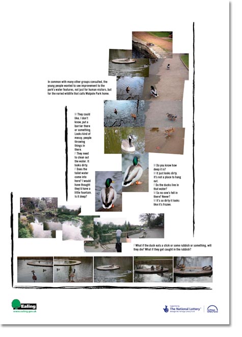
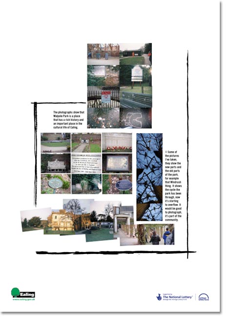
Sara (cf. previous tree work for Ealing Council) asked me to come up with A1 posters for an exhibition of photography by a young persons’ group in Ealing, London. She wanted lots of white space, black text, but most of all they had to look cool. “Cool” is a terrifying word to a graphic designer, mostly because it means different things to different people.
Also, I’m not too old to realise that a lot of the design that’s aimed at people in their late teens that attempts to be cool is toe-curling. It tries real hard but it ain’t quite hip, as the song goes.
So what this 32-year-old graphic designer in Cardiff, c/o The Provinces decided to do for the urban youth in London was just to keep it simple. Careful arrangement of the images and text (using Trade Gothic Condensed, a typeface which is ineffably cool already), gracefully contained in some inked lines. I love them. I hope they do, too…


