by Frank | May 23, 2017 | illustration, thoughts
 Some of you will know that I’m studying for a part-time Master’s degree in Illustration: Authorial Practice at Falmouth University. I can say, hand on heart, that the decision to do this is one of the best choices I’ve made. It’s pushed and shaped the ways I’ve thought about illustration and my own approach to it much further than I ever anticipated – and I’m only a quarter of the way in.
 I handed in my first essay recently – the first I’ve written in 17 years. I was really proud of it – it is definitely the best thing I’ve ever written, but most importantly it was the first time in the whole of my academic career – from GCSEs, A-level, Art Foundation and BA Hons, that I’ve written an essay and learnt and developed from it, rather than it just being an exercise where I jump through a hoop and get a grade reward.
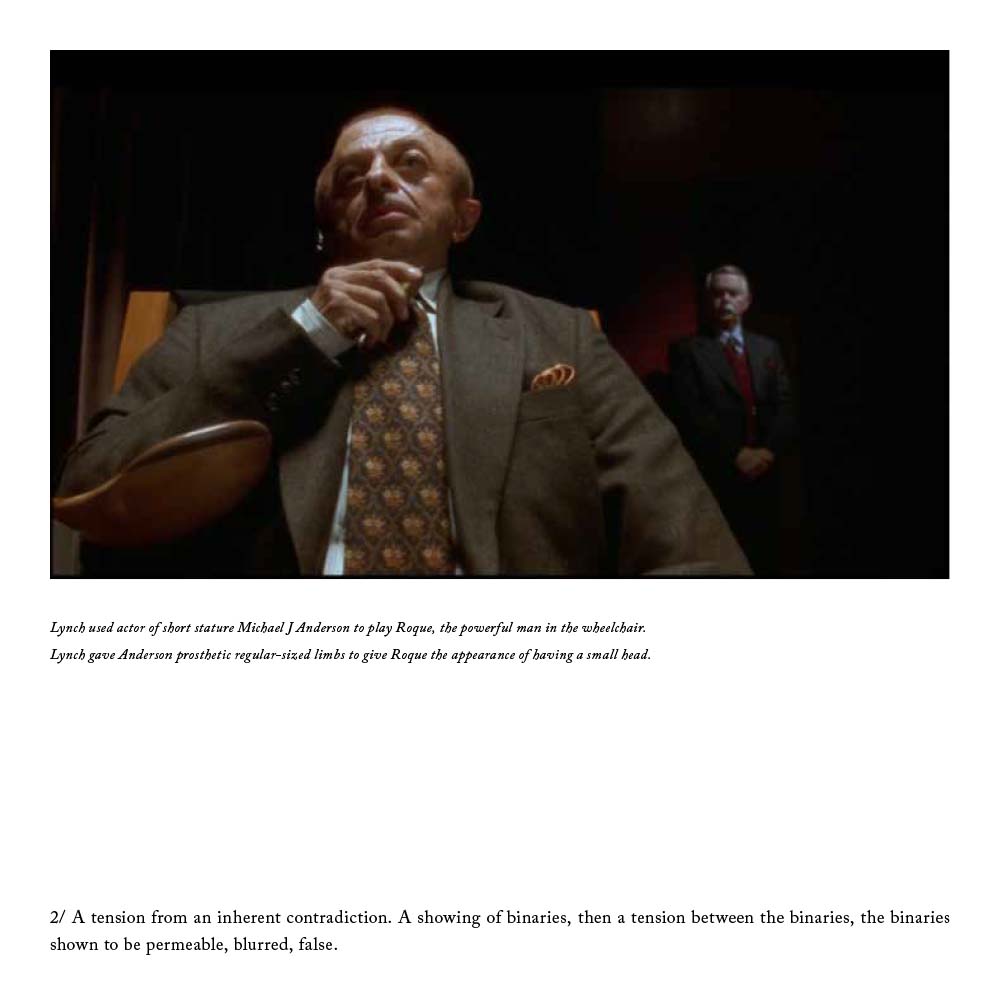
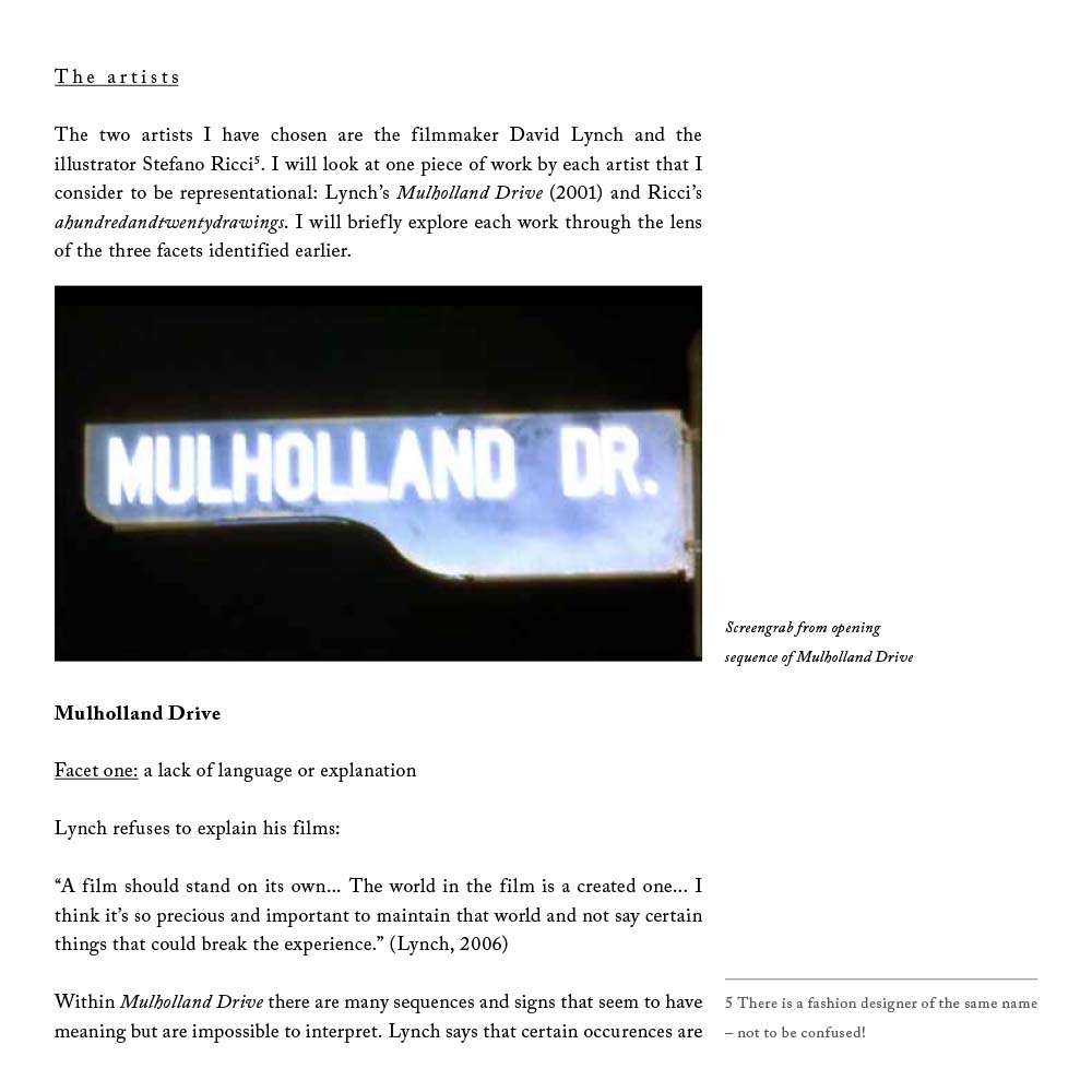
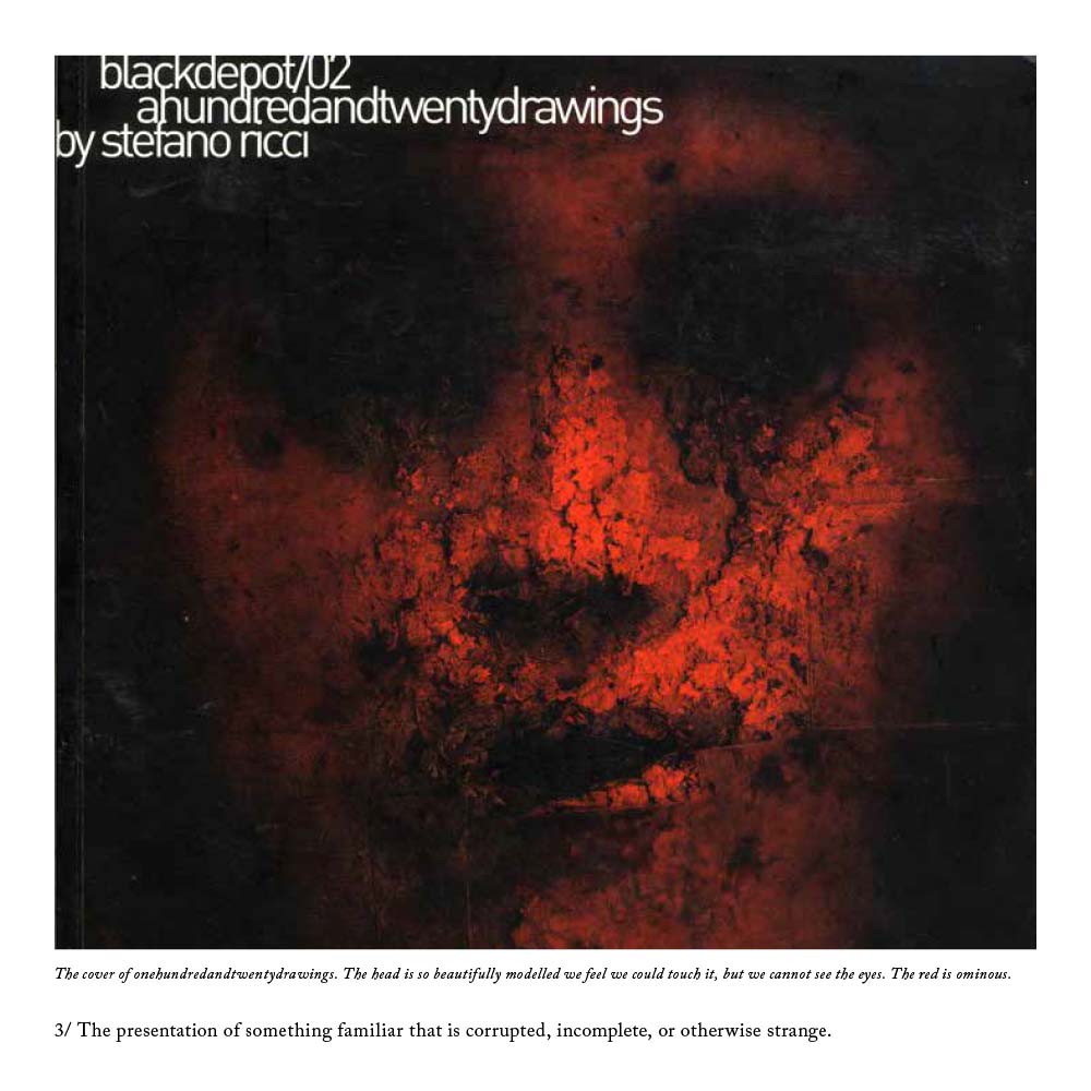 I wrote it about uncertainty in art, and took Twin Peaks director David Lynch’s Mulholland Drive and illustrator Stefano Ricci’s Depositonero as case studies. I looked at the use of uncertainty – something I’m fascinated with – through the lenses of queer theory, Jungian psychoanalysis and deconstructionism and showed how I was using it in my own practice. A percentage of the marks given were for the design and presentation of the essay – it was supposed to reflect the content. I printed it on tracing paper, cut it to loose-leaf squares and handed it in in a black hand-made cardboard box. I wish I’d taken some photos now!
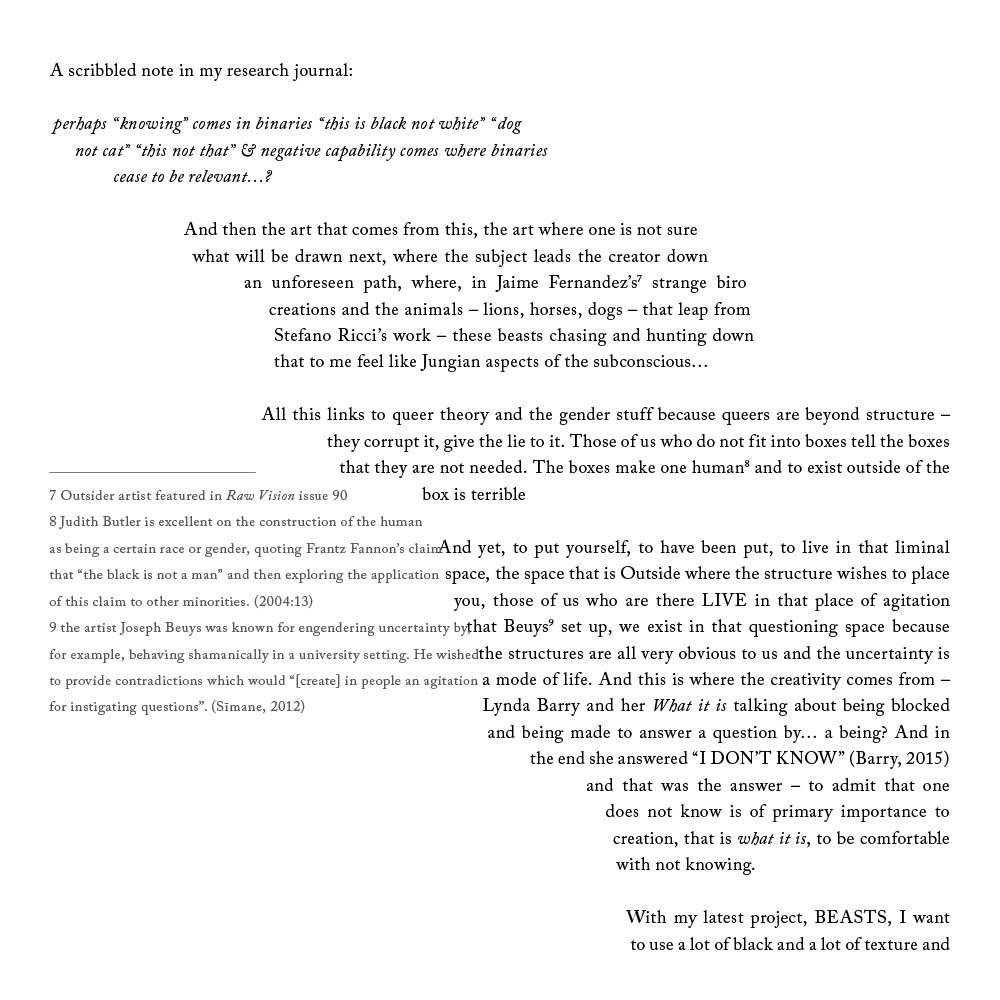
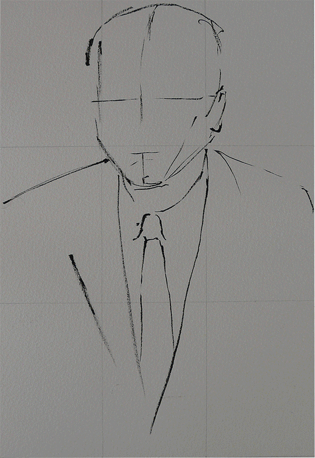
 I just got my marks back. 50% is a pass, 60% is a merit and 70% is a distinction. I got 80% which is the best mark I’ve got for anything since my GCSEs. It’s amazing what you can do when you’re passionate about something! We were encouraged to be creative with the essay-writing process, so while the first two chapters were fairly standard in their academic writing style, the third was fully-referenced stream-of-consciousness, and the layout reflected this, the main body text flowing through the page and the footnotes bashing up against it:
The word count was 3,000 which was torturous – I could have easily written 10,000 words. But it was a truly satisfying process and the discipline of editing is a vital one to develop.
If you’re interested in studying for an MA you can now get student loans to pay your tuition fees. I’m enjoying every moment of mine and I have noticed tangible improvements in the quality of my client work because of it. 
by Frank | May 17, 2017 | illustration
A little post about the project I’m currently working on for my illustration MA at Falmouth University
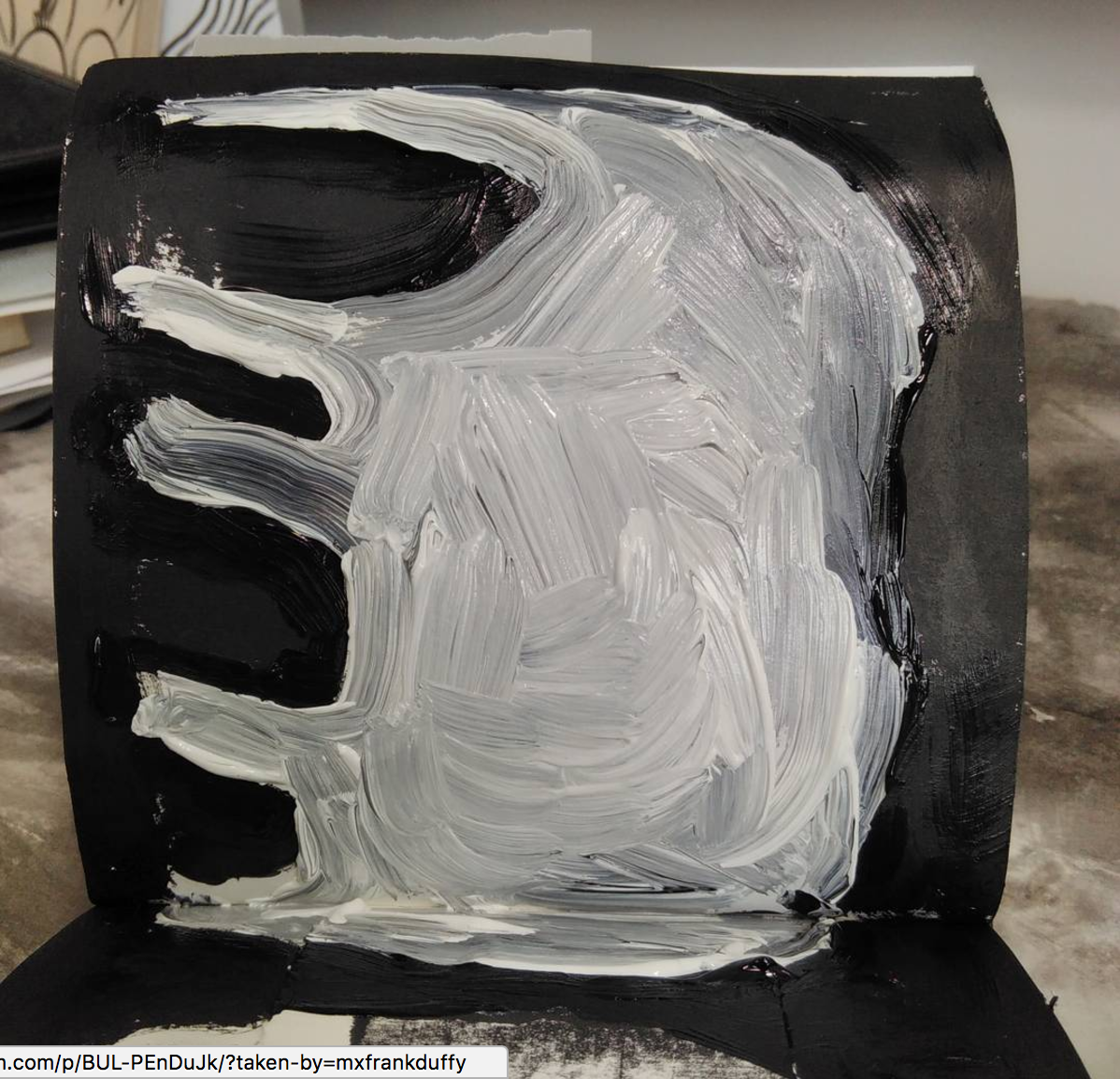
At the moment I’m putting regular callouts for people who produce works on paper – writers, poets, painters, drawers(?) to send me their rejected works.
This is what I’m doing with them: I’m sticking them, fairly randomly, into this little 14cm x 14cm sketchbook, and then I’m working over them in black and white (and blends of both), using oil pastel, brush pen, cheap student acrylic paint, and biro.
The works aren’t credited, but everyone who sends me work will get a big thanks if I ever put it on display.
There are strange beasts and skulls…
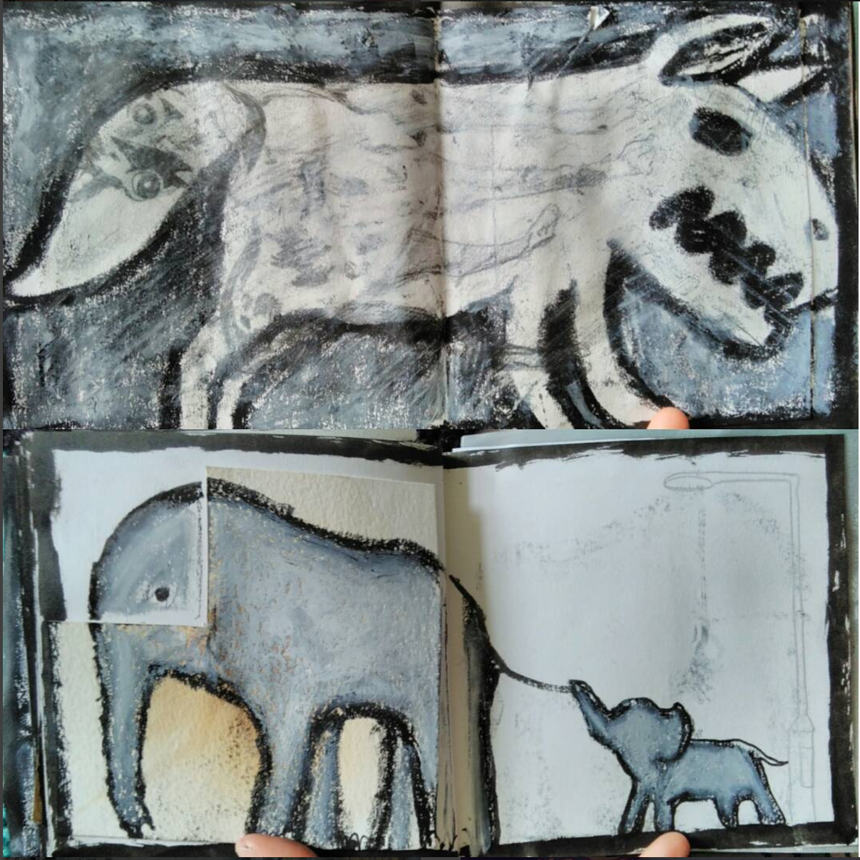
…and the occasional portrait
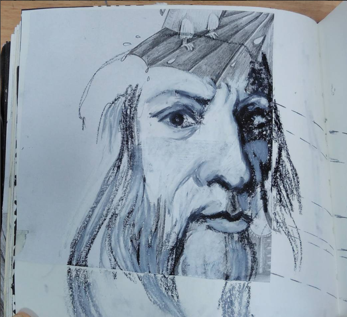
…and sometimes I choose to incorporate or work with the rejected work, and sometimes I decide to ignore it
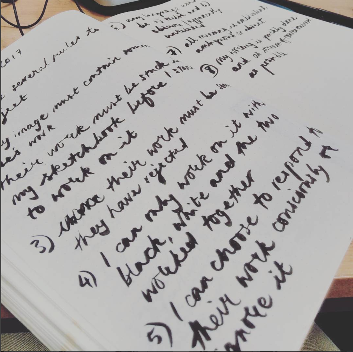
Today I worked out what the rules of the project are
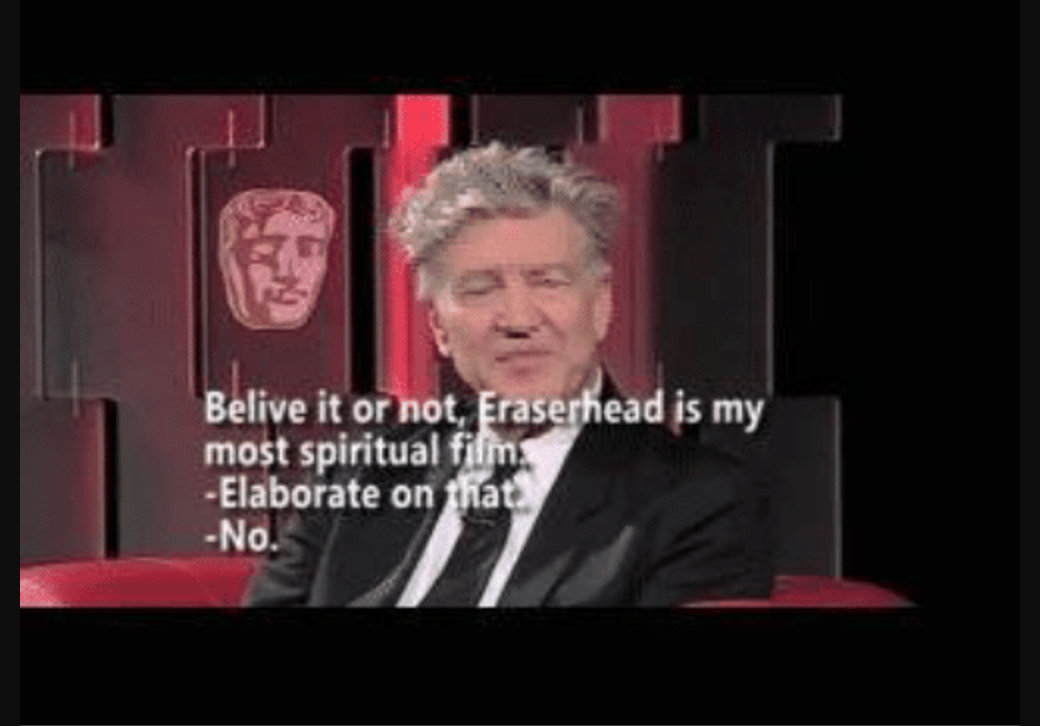
For the moment I am not explaining why I’m doing what I’m doing – I haven’t worked out quite how I want to talk about it, or whether I’ll do that at all. I’ll leave that to Our Lord And Saviour David Lynch:
If you want to follow the project and see more of the images I create for it, you can follow me on instagram. If you’d like to send me some of your rejected work to incorporate into the project, post it to Frank Duffy, Beech Hill House, Morchard Bishop, Crediton Devon EX17 6RF. You can remain anonymous if you like! Here’s hoping you can help 🙂
by Frank | Feb 7, 2017 | illustration, thoughts
Master’s in Illustration: Authorial Practice
Queer Iconography
I thought I’d share the first project I worked on for my master’s. It’s completely different from anything I’ve ever done before.
What I’ve done is create three 60-ish second looped animated gifs of icon-like works of art becoming and undoing. The subject of each work is a queer person. This is what I wrote about the first one, of Divine, in my research journal:
Every frame of each GIF is a stage in the process of making and unmaking an image of Divine from the publicity still of his breakthrough film Pink Flamingos. The image is never complete – I use different media, stick paper and images to it, paint over, pull the paper off, scrape paint off – and all the while the image jerks and warps because I took each photo from slightly different angles. I wasn’t attached to perfection and decided to be playful. There are some frames that show a quick flash of a religious icon of the Madonna and Child – a smiling reference to subliminal imagery, and to reinforce the fact that this work in continual progress is a religious icon itself.
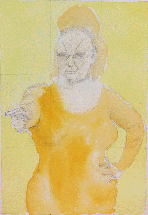
Divine
Why?
Reading J Halberstam and Judith Butler, I have shown how queer lives can be seen as continually constructed and reconstructed, asserted and reasserted, in response to the monolithic societal norms. So I showed Divine in process, never whole, never finished.
Why Divine?
In Pink Flamingos Divine is “the filthiest person alive” and the whole film, billed as “an exercise in bad taste” attempts to be as abhorrent and offensive as possible. Divine is in competition to be the filthiest person with another couple, and naturally wins. The movie still is iconic – Divine is powerful, monstrous, beautiful in some weird way. My proposal aimed to focus on bringing the deviant into sacred space and Divine here is the epitome of deviance. Divine himself was someone who endured a huge amount of stigma because of his sexuality and I felt this powerful and tragic figure was irresistible for this project.
Why religious icons?
Because I love them. I love the low gold glowing from them as they flicker in the candlelight of Russian Orthodox churches. I am not Christian and was not raised that way but there is something numinous about them. More importantly, for this project, they represent something to aspire to – the lives of the saints are there to give moral instruction and support. Using Divine in this context is not ironic (although yes, I’ll grant you, it appears this way!) which leads me to…
Billy Tipton
What is this illustrating?
This project is my response to Mark Aguhar’s poem “Litanies to my Heavenly Brown Body”. The litanies express what is sacred – those things that are regarded often as profane – the queer, the fat, the people of colour, the unknowns. The litanies are assertions and reassertions of the inherent value, the inherent humanness (cf. Judith Butler) of the liminal people. I wanted to create a sacred space for queer liminal types, a space where they would be honoured and valued and yet still representative of the notion that queer lives must be continually made and remade in the face of heteronormativity.
Marsha P Johnson
How would this be displayed?
Ideally I would have four minute-long animations, that is, four animations that are 60 seconds long each, one queer saint for each. I submitted three in total – Divine, Billy Tipton (a jazz band leader who achieved some fame, married several women and only after death was discovered to have been assigned female at birth), and Marsha P Johnson (a black queer femme who is alleged to have started the Stonewall Riot). I imagine they would be back-projected through something like Polydraw, about a metre high, on the four walls of a small dark square room. There would be candles and incense. I imagine the space being a cube of two metres at every edge (though, it occurs to me, it would need a door).
I’ll finish this post with a quote from Judith Butler, from Undoing Gender:
“[Queer persons] make us not only question what is real, and what “must” be, but they also show us how the norms that govern contemporary notions of reality can be questioned and how new modes of reality can become instituted. These practices of instituting new modes of reality take place in part through the scene of embodiment, where the body is not understood as a static and accomplished fact, but as an ageing process, a mode of becoming that, in becoming otherwise, exceeds the norm, reworks the norm, and makes us see how realities to which we thought we were confined are not written in stone. Some people have asked me what is the use of increasing possibilities for gender. I tend to answer: Possibility is not a luxury, it is as crucial as bread. I think we should not underestimate what the thought of the possible does for those for whom the very issue of survival is more urgent. If the answer to the question, is life possible, is yes, that is surely something significant.”
by Frank | Jan 29, 2017 | blog news, illustration, Uncategorized
Just a quickie to say that I’ll be drawing a humorous monthly column illustration about single parenthood by Jonathan Taylor in local lifestyle magazine Exeter Living. I’ve created plenty of magazine illustrations in my time but never before for a column so this is a wonderful new first for me – I can’t wait to see my work in the magazine & really excited about reaching a local audience.
by Frank | Dec 6, 2016 | doodles, illustration

So what’s with this owl, then? As some of you may know, I’ve started a part-time MA in Illustration (Authorial Practice) down in Falmouth School of Art. I’ve been working on my first Negotiated Project – a combination of illustrated piece and a research journal to, in mathematics parlance, show my workings. The illustrated piece I’m working on is deliberately imperfect, incomplete, changing (it’s an animation) – it’s inspired partly by the writings of Judith Butler and J Halberstam* around queer theory and how queer lives and queer identities must continually be made and remade in the face of heteronormativity.
Well, I hear you ask, that’s all very interesting, but what has it to do with this child’s birthday card made from bits of scrap out of a bin in five minutes flat?
I spend a long time carefully getting the lines – their shapes and thicknesses – just how I want them in my illustrations. I create pencil workings and then work over the top of them. I ink slowly and deliberately and love the way my brush pen responds to pressure and angle.
In my animated college project, I’m being quick and playful and I am not attached to the outcomes being perfect. I go over things and I change things and I show what’s going on underneath – I show the structure of the image, the skeleton of it, where I’ve gone wrong and where I’ve covered up. And the project has really loosened me up – I didn’t know quite how much until I made this card.
I’d bought 12-year-old Jacob a book about birds for his birthday; he’d spent the day itself at a hawking centre watching the raptors being flown and looked after and learning all about them. I realised I hadn’t got him a card and so I pulled a cardboard sleeve out of my recycling bin, cut it to shape, found some squared paper, cut that into a rough owl shape and then stuck it to the cardboard. I flicked through the book I’d bought until I found a photo of an owl that would fit the space and with my brush pen I scribbled and a minute or two later there was this. I coloured the legs in with tippex, coloured the branch and leaves in a little with fineliner and there you go. And it’s the best damned thing I’ve done in ages. It’s loose and fluid and evocative and not overworked at all.
So I think I’m going to rethink the way I do illustrations. It’s not to say that I won’t prepare – I’ll still do pencil roughs, but maybe I won’t ink over the roughs. Maybe I’ll use collage more. It’s pretty bloody exciting!
*Jack Halberstam is his current name; the books I have read of his were published under his dead name, the first initial of which is also J, so I use the initial to get around the which-name-to-use etiquette!
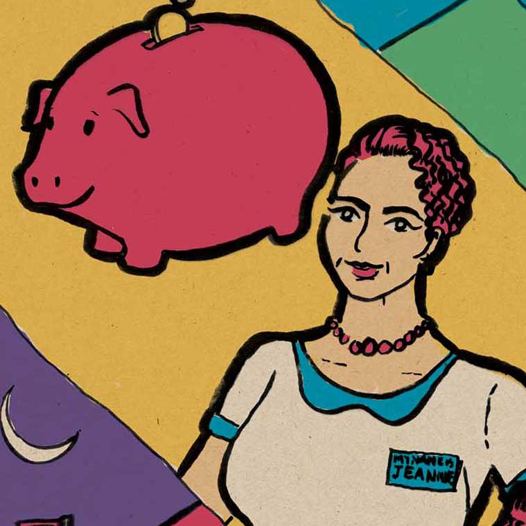
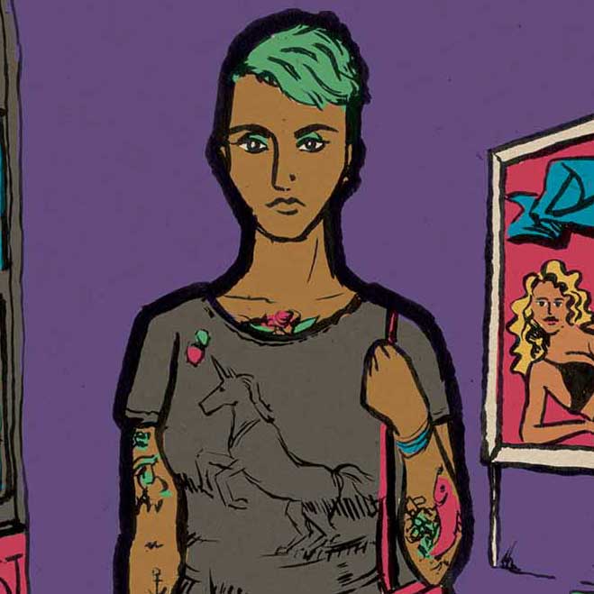
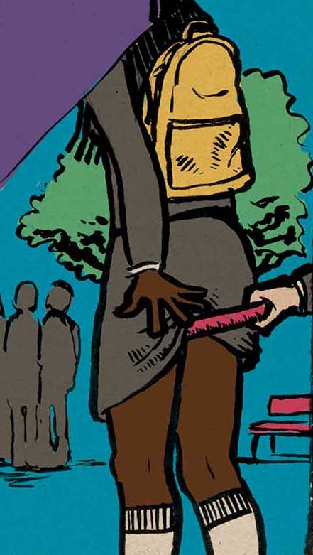
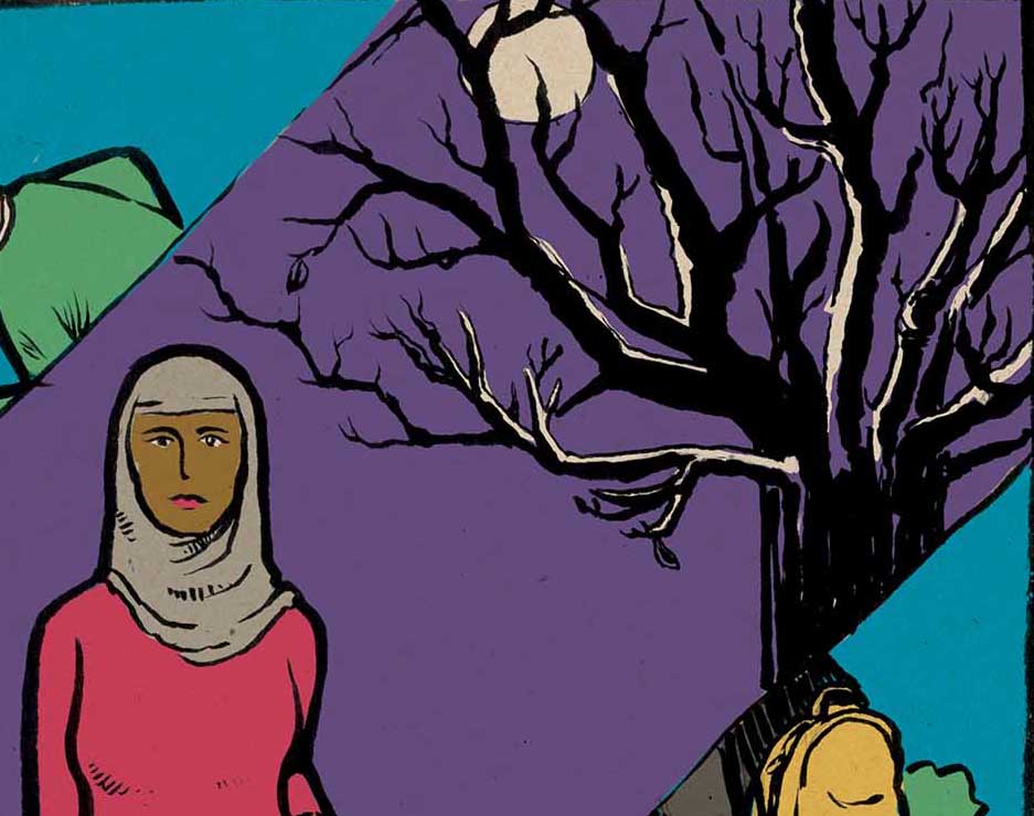
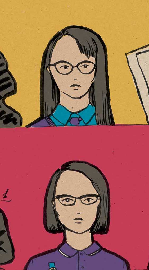
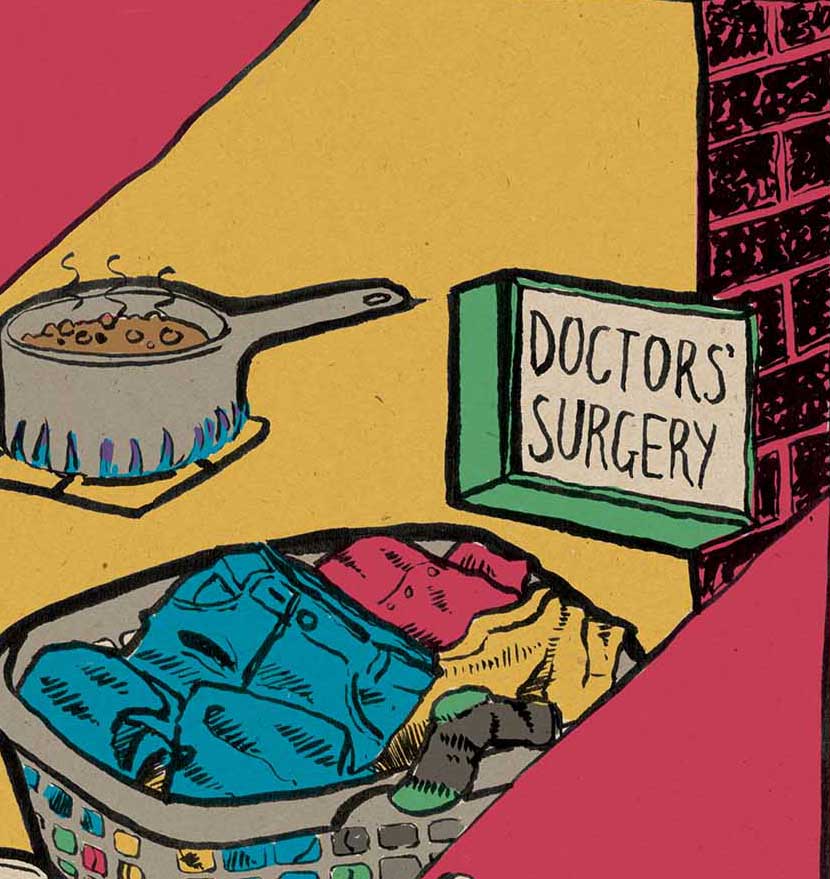
by Frank | Aug 31, 2016 | illustration
I thought I’d share snippets of some illustrations I’m working on for a non-profit organisation. They use a simple colour palette based on the client’s brand colours. The brief was to make them characterful and activisty.