by Frank | Apr 22, 2015 | graphic design
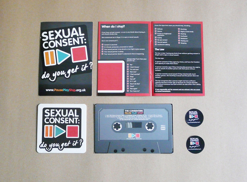 I’ve been involved in an ongoing project with Somerset and Avon Rape and Sexual Assault Support – an intiative attempting to raise awareness of the importance of sexual consent among different population demographics. Post the infamous behaviour of footballer Ched Evans, the I Get Consent campaign seeks to inform what consent is and what it is not, according to the law.
Together, we created:
- the pause, play, stop logo
- the website design, along side coding genius Gwyn Fisher of Agave Web
- a free A6 booklet sharing facts, suggestions and advice
- a promotional cassette-style postcard
- various promo items – stickers, beermats, badges
- advertising for local press, to go in taxis and on the backs of receipts
Jorden at SARSAS said: “Thank you for all your help with this campaign, we have had great feedback regarding the design”.
You can visit the pause-play-stop website here, and follow the campaign on Twitter here.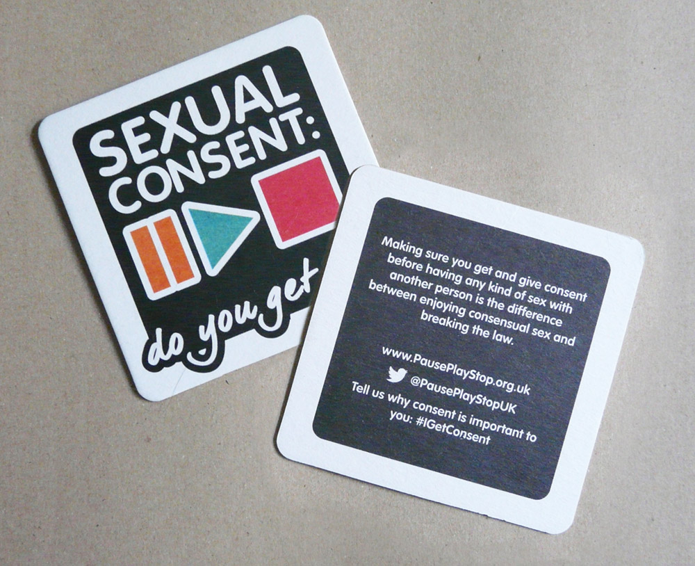
by Frank | Apr 21, 2015 | graphic design
I don’t know if this is a Cardiff-specific thing or whether it’s true across the board for graphic designers, but there seems to be very little, if any, feelings of rivalry or competition between local freelancers. I count several in my circle of friends and acquaintances and we’ll often recommend each other to clients if we are busy or feel we’re a poor match for the work in question.
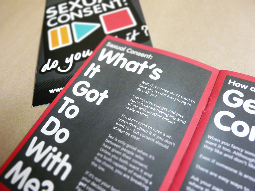
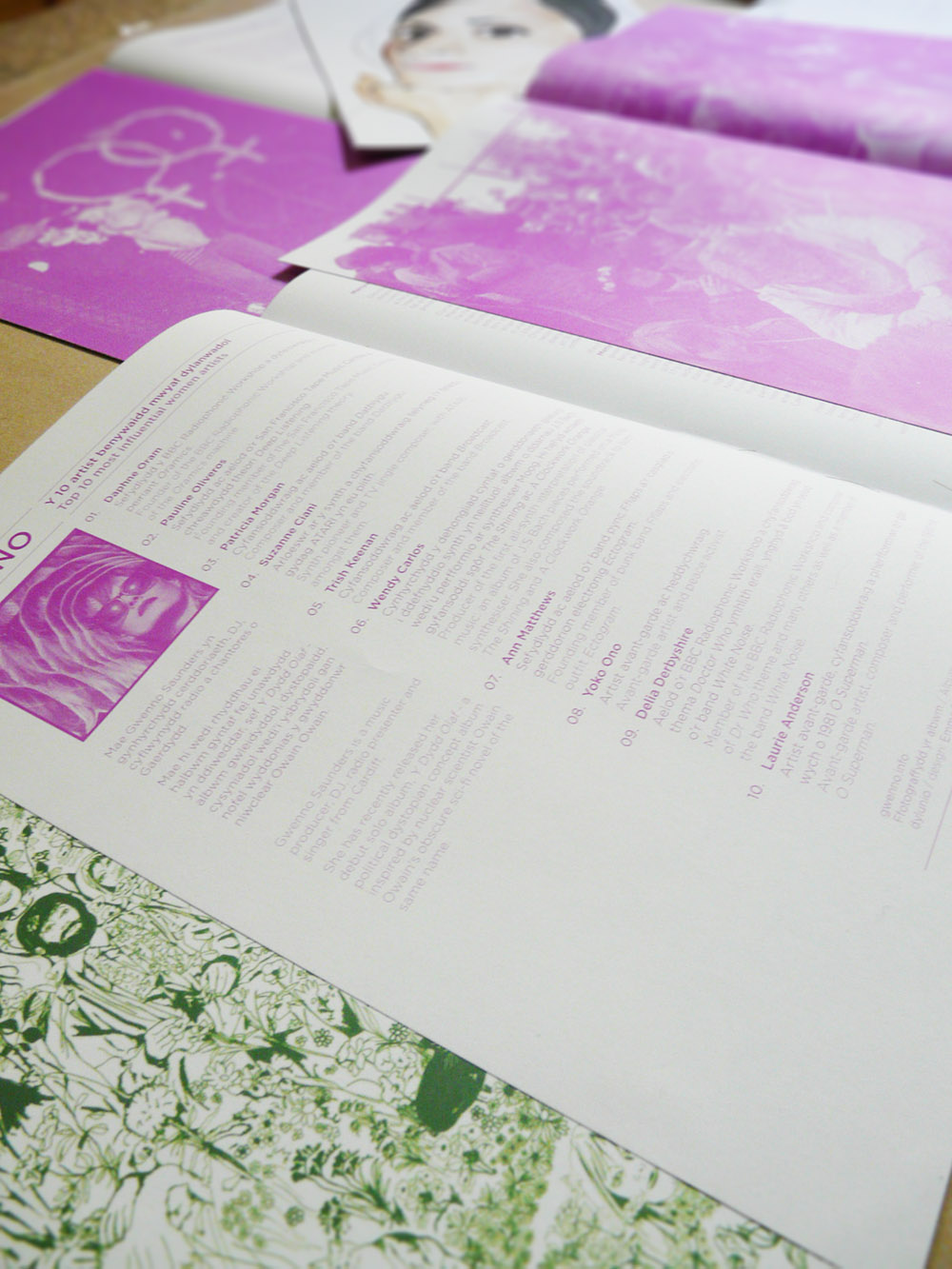
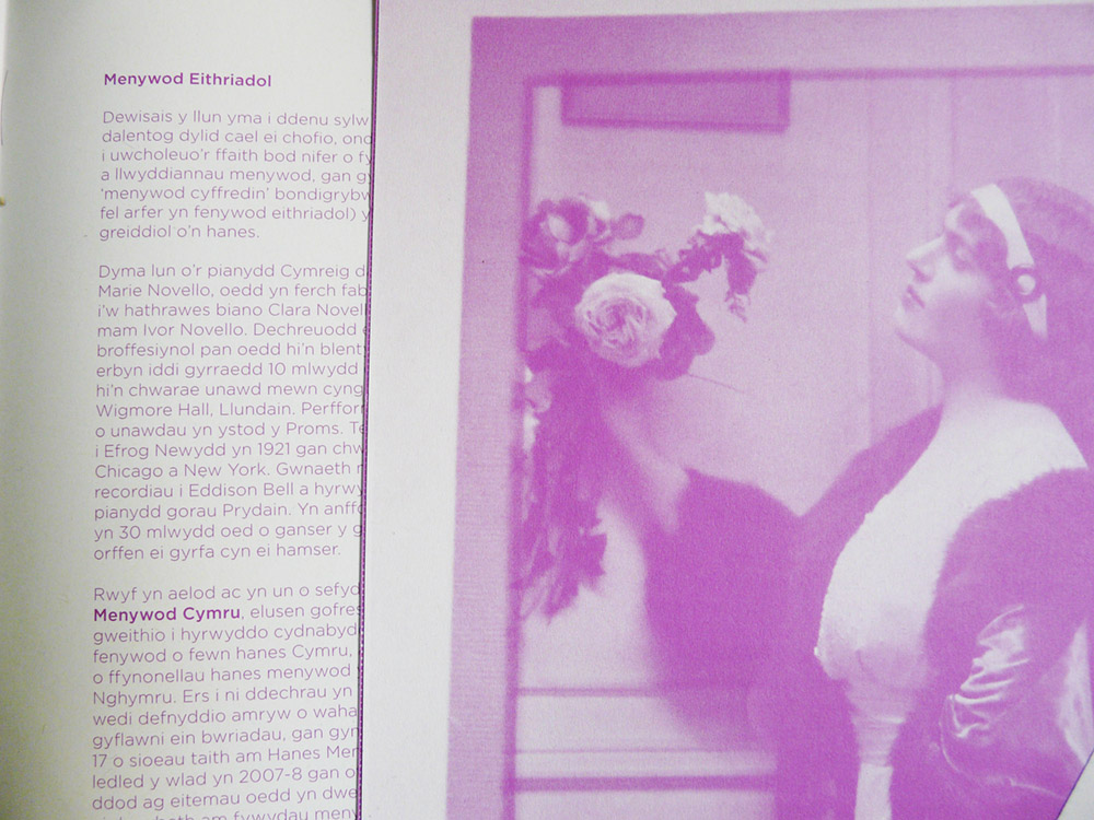
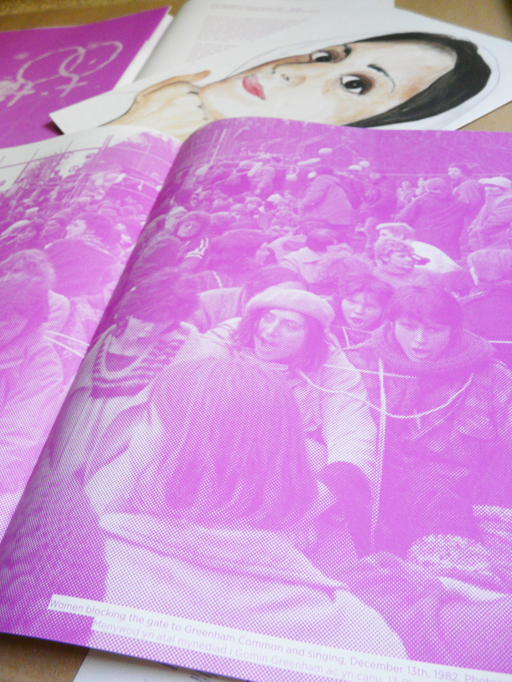
So it was with this zine – the lovely Adam Chard recommended me to Melissa Hinkin who works for the international art prize Artes Mundi and who, in her spare time, curated a number of wonderful pieces for a zine put out to coincide with the celebration of the Women of the World festival in March 2015 at the Wales Millennium Centre.
Several things had already been decided – Melissa had strong ideas about the kind of work that she liked, she knew how she wanted the inside and outside covers to look and she had decided that the innards should be printed in a single colour – Pantone purple. Melissa wanted the piece to be an artwork in itself, she wanted the order and prominence of the two languages used to shift playfully and she wanted it specifically not to be traditionally feminine / girly. But the rest was up to me.
Hand-on-heart this has to be one of my favourite creations. The quality and variety of Melissa’s selections, the freedom to design something entirely un-commercial and our shared vision of both the role of the zine and the way it should look and feel made this project an absolute joy to work on. I am very grateful for having had the opportunity.
The zine is loose-leaf (unstapled) and was printed on 100% recycled Cyclus Offset by PCP printers in Port Talbot.
And there’s further exciting news…
by Frank | Feb 3, 2014 | CIO Connect, graphic design, illustration, magazine design
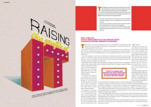
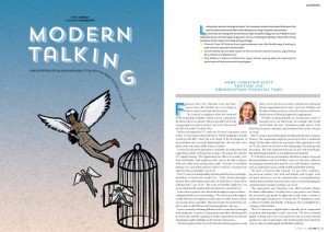
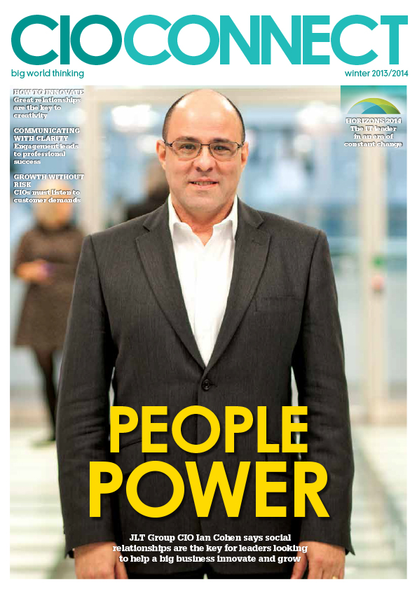 This issue of CIO Connect magazine seems to be quite focused on growth. The economy (we are told) is improving, apparently, so a couple of the articles are about how to get the best out of that growth. Thus, two of my illustrations feature plants – a big tree with speech bubbles for leaves (showing how growth can be made more solid when everyone’s opinions are taken on board) and a watering can nourishing seedling employees and helping them be more creative.
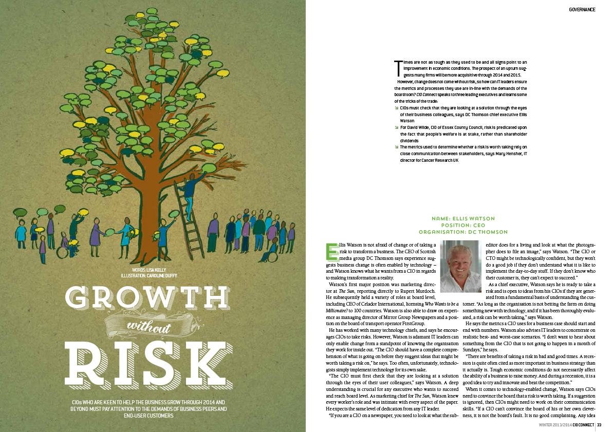
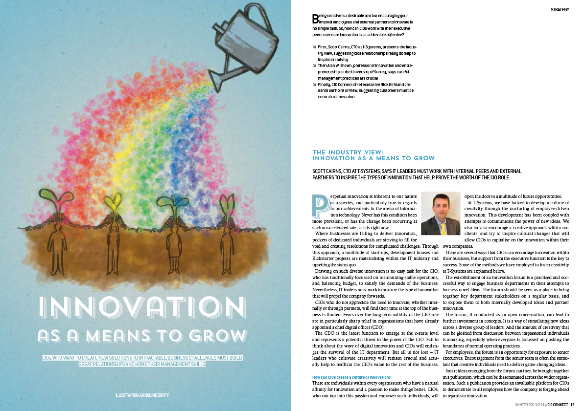
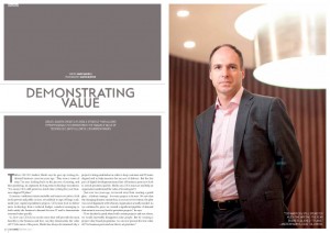
As ever there is some stunning photography from Martin Burton who makes my job so much easier.
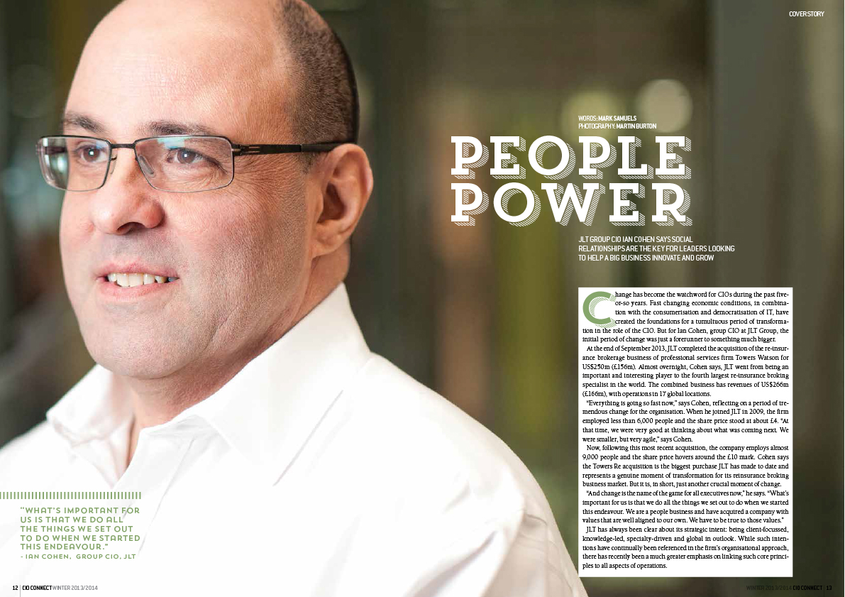
You can view the whole issue digitally here
by Frank | May 14, 2013 | CIO Connect, graphic design, magazine design
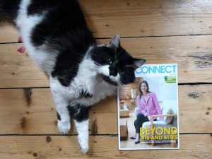
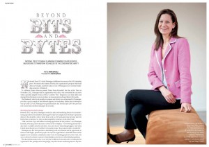
Henry the cat presents the latest issue of CIO Connect magazine
Well hello my lovelies! Now that it’s summer *looks out of window* I mean, now that it’s MAY, the latest issue of CIO Connect magazine is dropping on to doormats and desks across the world. And I designed it! Here is a picture of the magazine, with a cat.
I guess some people might think that designing a magazine about IT would be boring. It’s quite the opposite. It’s about IT leaders and how they solve problems (solving problems being one of my favourite things to do) and the editor Mark Samuels lets me have a bit of a free rein with the design. We want to keep it fresh and interesting and have the personalities of the people interviewed jump out at you. Because I’ve been designing it for so long I feel I know their readership quite well, so I have a lot of fun creating illustrations and spreads for the magazine.
I guess my best advice for those thinking of publishing a magazine is to invest as heavily in images as in copy – good photography and illustration make the world of difference. They bring life to the page and really draw the eye in. You can go the other extreme and have a periodical with few photos at all – and still have wonderful design – but bad photography is really worse than none.
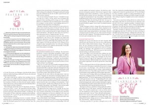
More spreads below for your viewing pleasure (click on anything to make it bigger), and the full issue of the magazine can be read online here!
by Frank | Apr 18, 2013 | branding, graphic design, illustration
I’ve heard a few people recently devaluing the work of graphic designers. One of these people, unbelievably, is a designer herself. Instead of defending what it is that we do, I’m instead going to show you the process I’ve been through with my most recent branding exercise.
The client-designer relationship
I’ve been working for CIO Connect pretty much since I became a full-time freelancer nearly 10 years ago. Their magazine editor Mark Samuels jokes that I am their longest serving employee. In meetings with them I will often tell them things they didn’t know about the company – like the fact that the magazine used to be bimonthly instead of quarterly, or that I didn’t do their original company branding (I’ve been working for them so long everyone just assumes that I did!). I’ve been doing their conference branding for five years (last year I did this for them). So, I know them pretty well, I know their audience and I’m used to working with them – all things that are rare in logo design. Usually the company and its designer are new to each other at this point. So, I should be able to bash something out in half an hour, right? Hmm.
The brief
Emma at CIO Connect commissioned me to brand their 2013 conference, to be entitled “the Game-Changing CIO”, along with a brief description of what that meant, and I went to work a-scribbling.
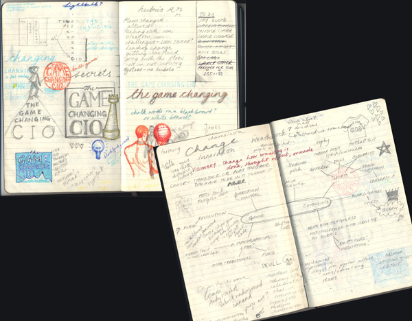
scribbles, or, the frightening things inside my head
Initial concepts
I came back with these three rough ideas based on three aspects around the idea of game-changing – risk-taking, leading and pioneering.
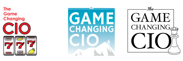
initial rough ideas
Second concepts
Thanks, said CIO Connect, but could we have something that looks like an app logo, such as you get with the iPad, etc? I went back to my drawing board and came back with these little squares in CIO Connect’s brand colours:
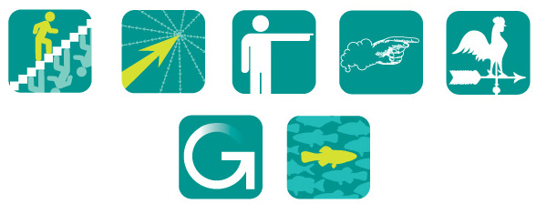
app-style ideas in the rough
You have to be fairly clear and clean and simple with an app logo – it’s expected to work very small. Hence the stylised nature of these ideas.
Developments on second concepts
We like the stairs and the pointy hand – can you develop, said they. So I did.

Here are four developments – all fancied up, said I. One of the stairs and three various colour-ways of the pointy hand, which I had spent a long time drawing and inking in before scanning and tracing in Illustrator and of which I am very proud.
Third concepts
Hmm, we’re not sure about the app thing, said they. Can you go back to the drawing board again, said they? Think about someone who changes the nature of things. And also can we look at the stairs again but with different colours? So I did, and I sketched up these roughs. The second is a chameleon changing his colours and the third is a leopard changing his spots.
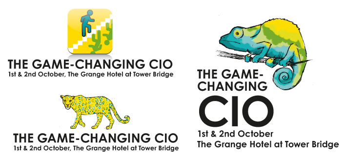
more scribbled concepts
Fourth concepts
Well, we sort of like the leopard, they said, but we’d really rather go back to the app idea, and look at images of actual people standing out from the crowd and maybe with our logo ball involved, they said.

Standing out from the crowd concepts
Yes! they said. Number three, they said.
Phew, I said. And here it is:

the finished logo
Of course, there was a little bit of back and forth about the font and the text position too, but I think I’ve made my points: that these things can take weeks to get right, that even the clients most experienced in briefing designers can change their minds, and that having even the closest of client-designer relationships does not mean the designer can get it right first time.
In conclusion
Some might infer that the client company needed to clarify its intentions – that confusion as to aims was why the process took quite a long time despite us knowing each other well. In its defence it is a reasonably-sized organisation with a several people making the final decision. Also, it’s common that a client will request that I work on one particular idea only to realise that it doesn’t work for them in the flesh, so to speak. I would say that I could perhaps have asked more questions at the initial briefing – my relationship with them made me a bit complacent about being able to hit the sweet spot straight away – and in future I will be interrogating them much more forcefully for a more detailed brief, with a big bright lamp and maybe some waterboarding too*, to make sure I have all the information I need.
In truth the process above, as drawn out as it seems, is not dissimilar to the process we designers go through for a lot of logos. It is work that is specialised. It is work that requires intuition, lateral thinking, a knowledge of what works graphically across various formats from websites to twitter avatars to twenty-foot banners, software skills and of course drawing skills. It requires time (obviously), expensive hardware and expensive software, not to mention years of training and experience. And this is why I won’t do logos for £50. Designer Renato Pequito sums it up beautifully from a different angle here with a blog post about public misunderstanding surrounding the cost of branding a government entity, while I finish with a (perhaps apocryphal) story which illustrates this wonderfully:
Pablo Picasso was in a park when a woman approached him and asked him to draw a portrait of her. He agreed, and quickly sketched her. When he handed her the finished work she was pleased with the likeness and asked how much money she owed him. “$5,000” said he. The woman screamed, “but it took you only five minutes!” The artist replied, “No, Madam, it took me all of my life.”
*Joke, of course. I actually only torture the clients who don’t pay.
by Frank | Feb 11, 2013 | graphic design, illustration, interpretation, slider
Happy new year! I have lots to share with you so this will be one of many blogs in the next few days, January having been full to the brim with work and February having been half full with a kidney infection (I don’t recommend them) from which I am nearly 100% recovered.
Anyway first up is this cheerful leaflet what I designed and illustrated in English and Welsh for Gareth Bonello at National Museum Cardiff. They’re having an exhibition about the origins of domestic animals called The Wolf Inside and Gareth had mocked something up in Publisher which he wanted me to design. I came up with this:
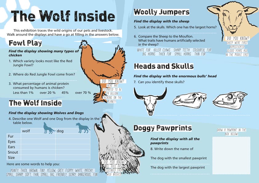
Family trail – design and illustration – for National Museum Cardiff.
Ac yn Gymraeg:
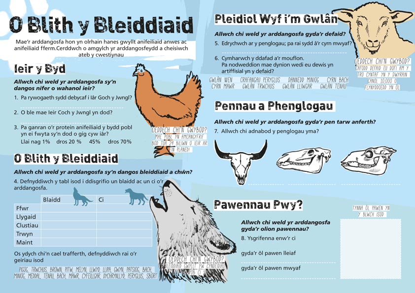
And here are some close-ups of the illustrations I did for the piece. As usual they were drawn in pencil, painted in Indian ink and then scanned in. I cleaned them up, converted to Bitmap Tiffs and then drew simplified coloured boxes in InDesign behind them to give them their colours: grey for the wolf, orange for the chicken, a pale gold for the sheep and white for the skulls.
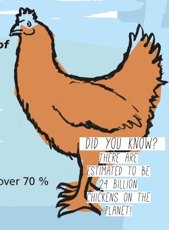
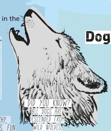
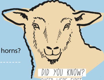
 Gareth said, “mae e’n edrych yn wych!” (it looks great!)
(If you’re wondering how long I spent trying to think of a pun title for this post based on Wolfie Smith, the answer is about two minutes.)
 I’ve been involved in an ongoing project with Somerset and Avon Rape and Sexual Assault Support – an intiative attempting to raise awareness of the importance of sexual consent among different population demographics. Post the infamous behaviour of footballer Ched Evans, the I Get Consent campaign seeks to inform what consent is and what it is not, according to the law.


 Gareth said, “mae e’n edrych yn wych!” (it looks great!)