by Frank | Jul 2, 2015 | graphic design, illustration, interpretation
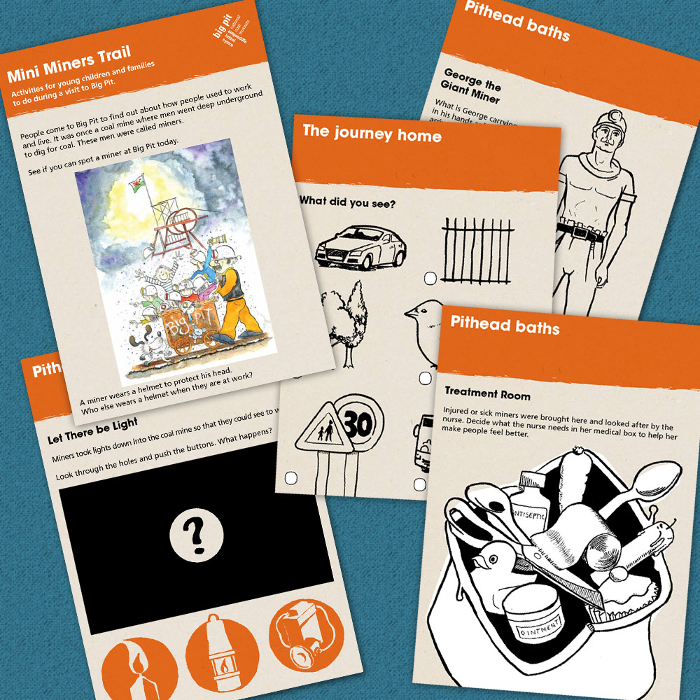
Big Pit National Coal Museum commissioned me to do the design & illustration of a trail booklet that families could follow as they made their way around the site. It’s now gone to press – I can’t wait to see it in the flesh!
by Frank | Jun 8, 2015 | doodles, illustration
Following on from last week’s blog post about trying new illustration media, here are two lunchtime doodles with the fineliner I used to hate. Working out how to get the best of it is fun!
Pulling things out of my head – the pen can do clean lines and fine shading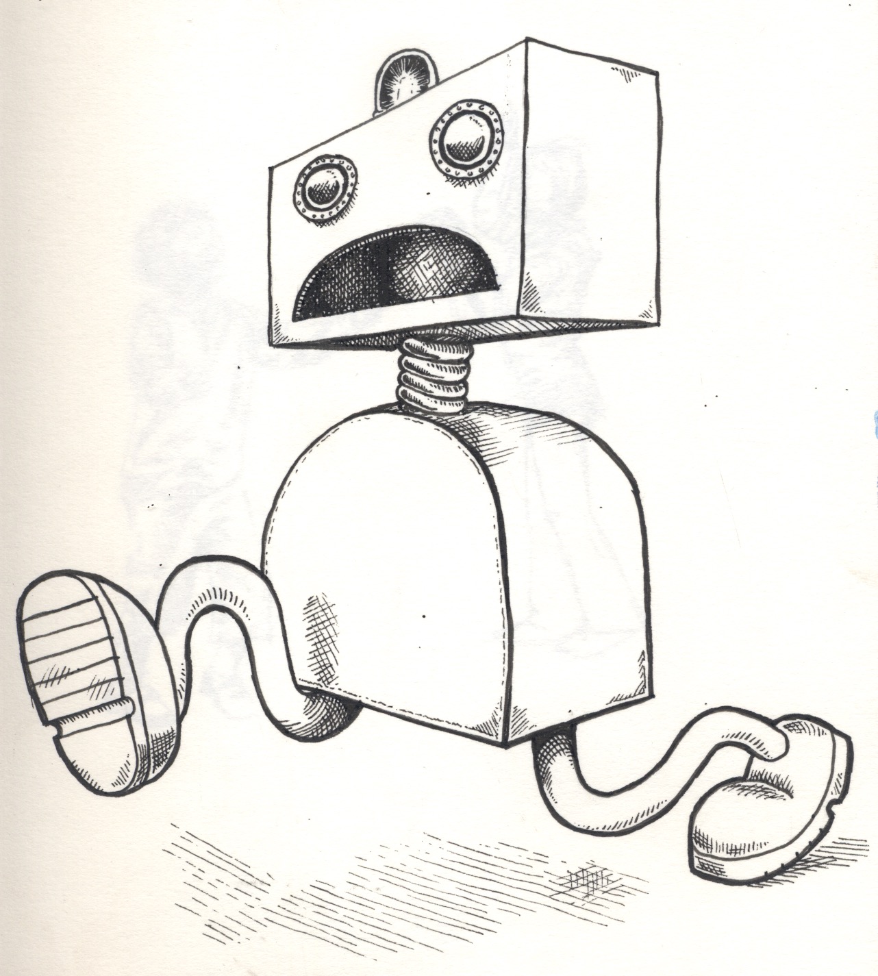
but it’s nice for creating loose rough sketches too, with plenty of energy and movement (these are some children from an ad in a magazine):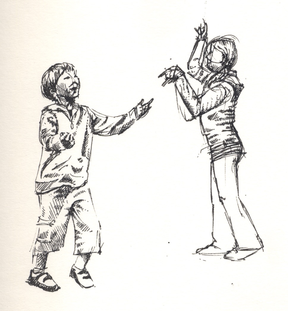
by Frank | Jun 5, 2015 | doodles, illustration, thoughts
I’m a bit conservative when it comes to trying new methods. My job is often limited by time so I tend to do the things that work. But that gets boring after a while.
When I was in art college I tried lots of different things but my butterfly brain would not persist with any of them – “can’t do that – too hard” *throws toys out of pram*
Now, with a little age and experience under my belt, I’m looking at new ways of doing things – ways I’d rejected before but remained curious about.
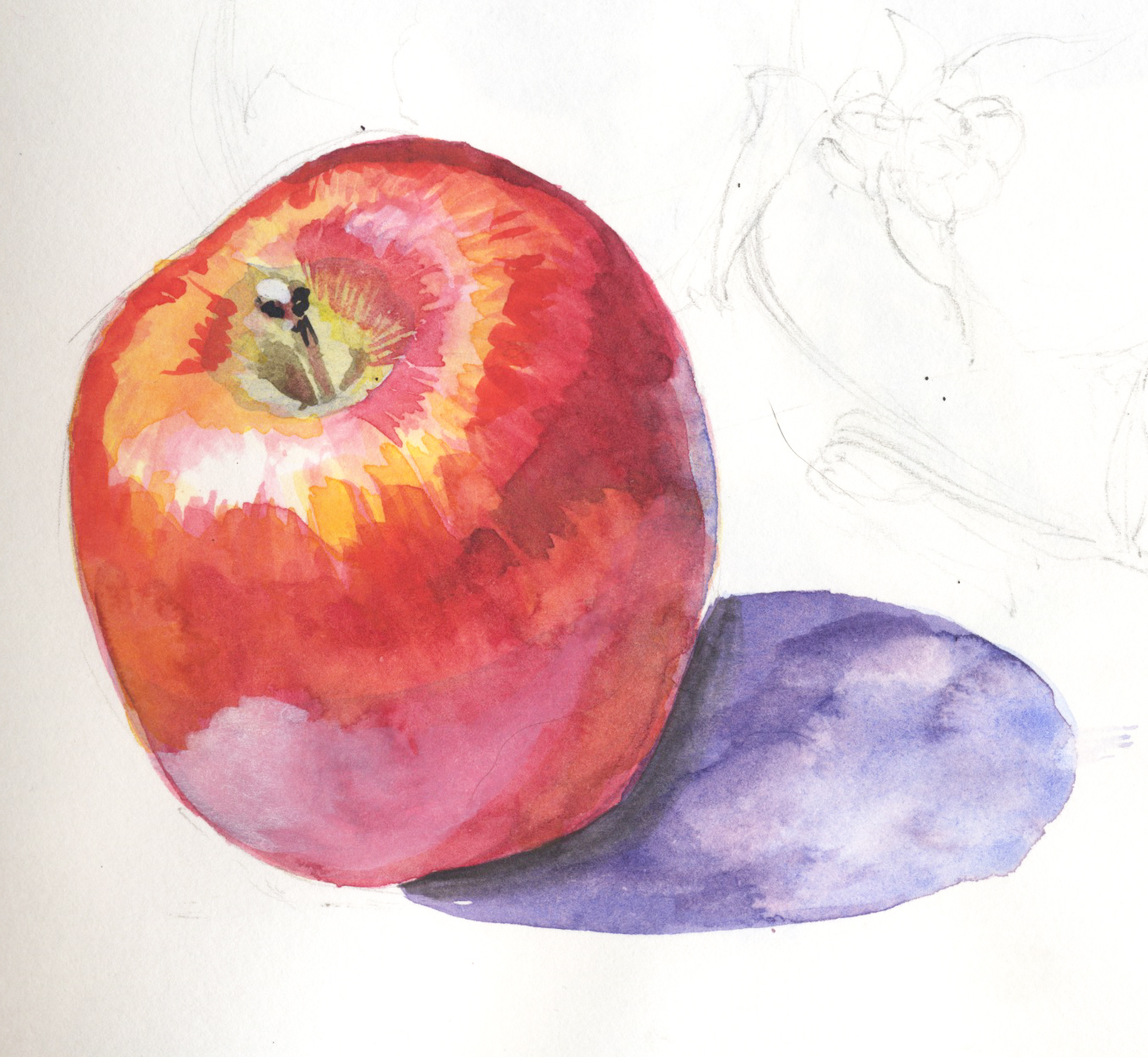
Last winter I signed up for a botanical illustration course – hoping to apply some discipline to my splishy-splashy style, and also to learn how to paint with watercolours, one of the most difficult mediums to master.
The Very Precise Style isn’t really me, but I’m enjoying it anyhow…
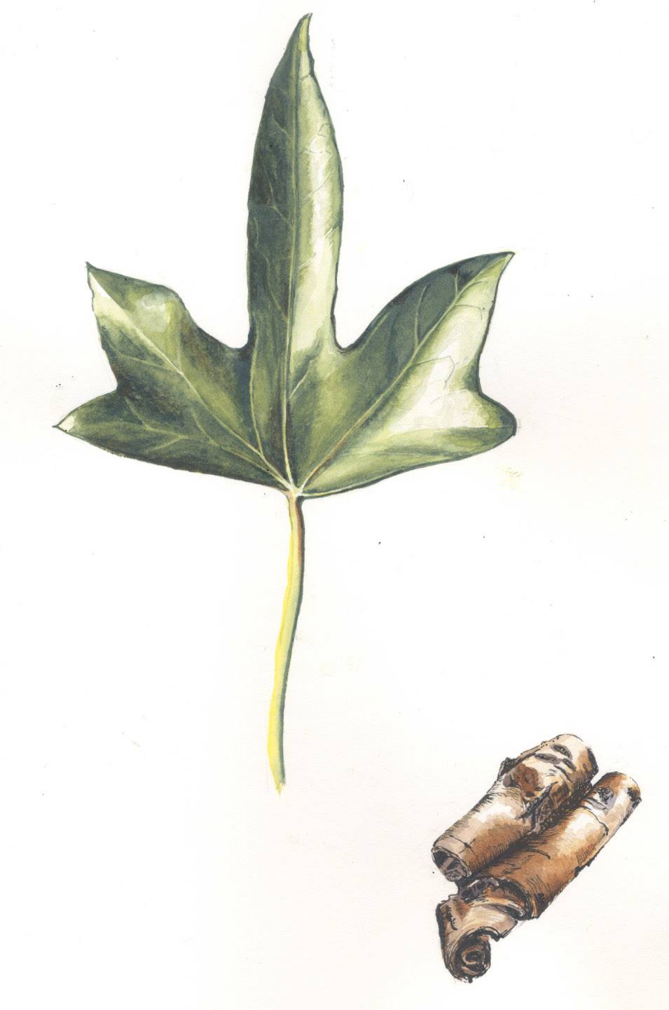
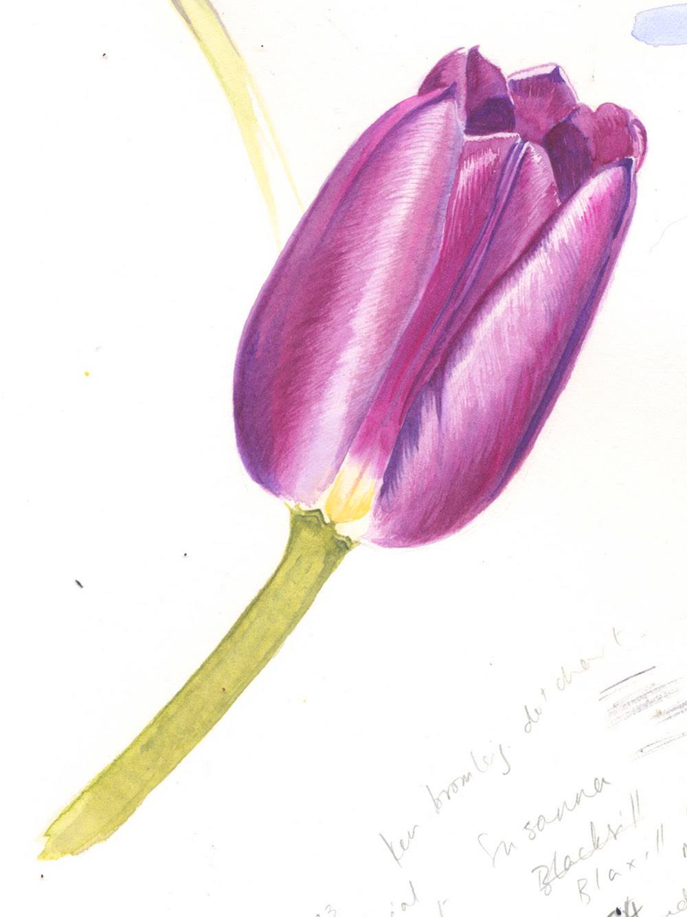 ...and learning about watercolour has enabled me to use those skills to work out how to represent things in a more expressive way…
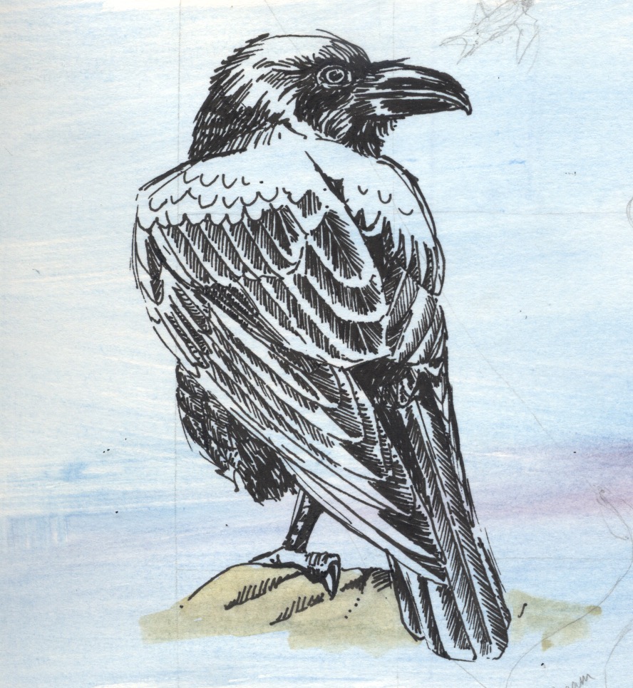
All this has prompted me to try other new ways of doing things. One of the materials we were asked to buy for the botanical course was a black fineliner artists’ pen. I have never liked such things, finding them clumsy and limited and difficult to use with subtlety, preferring a Bic fine biro for such tasks *cue singing of hosts of heavenly angels – best pen ever*
However, I’ve been using it more and more, and just now I created this raven. I would have been able to create something very accurate with a Bic pen – shaded and shiny and the filaments of all the feathers present and correct. However, the fineliner adds a character, an expressiveness, that I might not have been able to capture if I’d used a more subtle pen. There’s a solidity about her – her hulking form, her strength, the shine of her feathers. I’ve had to think much more carefully about how to represent her to get around the limitations of the pen, and it’s taught me a lot. I remember reading about a champion surfer who’d learned to ride waves on her brother’s broken board – if you can make something special out of whatever materials you have to hand then you’re on your way.

by Frank | May 29, 2015 | illustration
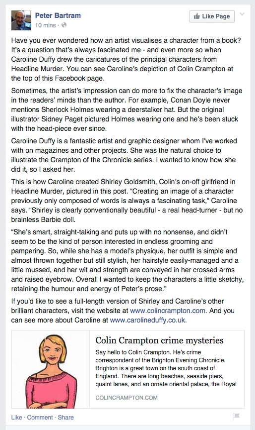
Peter Bartram has written some rather lovely things about our work together last year for his Colin Crampton books. He asked me to write a few lines about how I created the illustration of Colin’s girlfriend Shirley, and the result was this facebook post:

You can see the other illustrations I created for Peter at the Colin Crampton website here, and read more about his Brighton-based humorous crime fiction tales too.
by Frank | Apr 22, 2015 | ethics, illustration
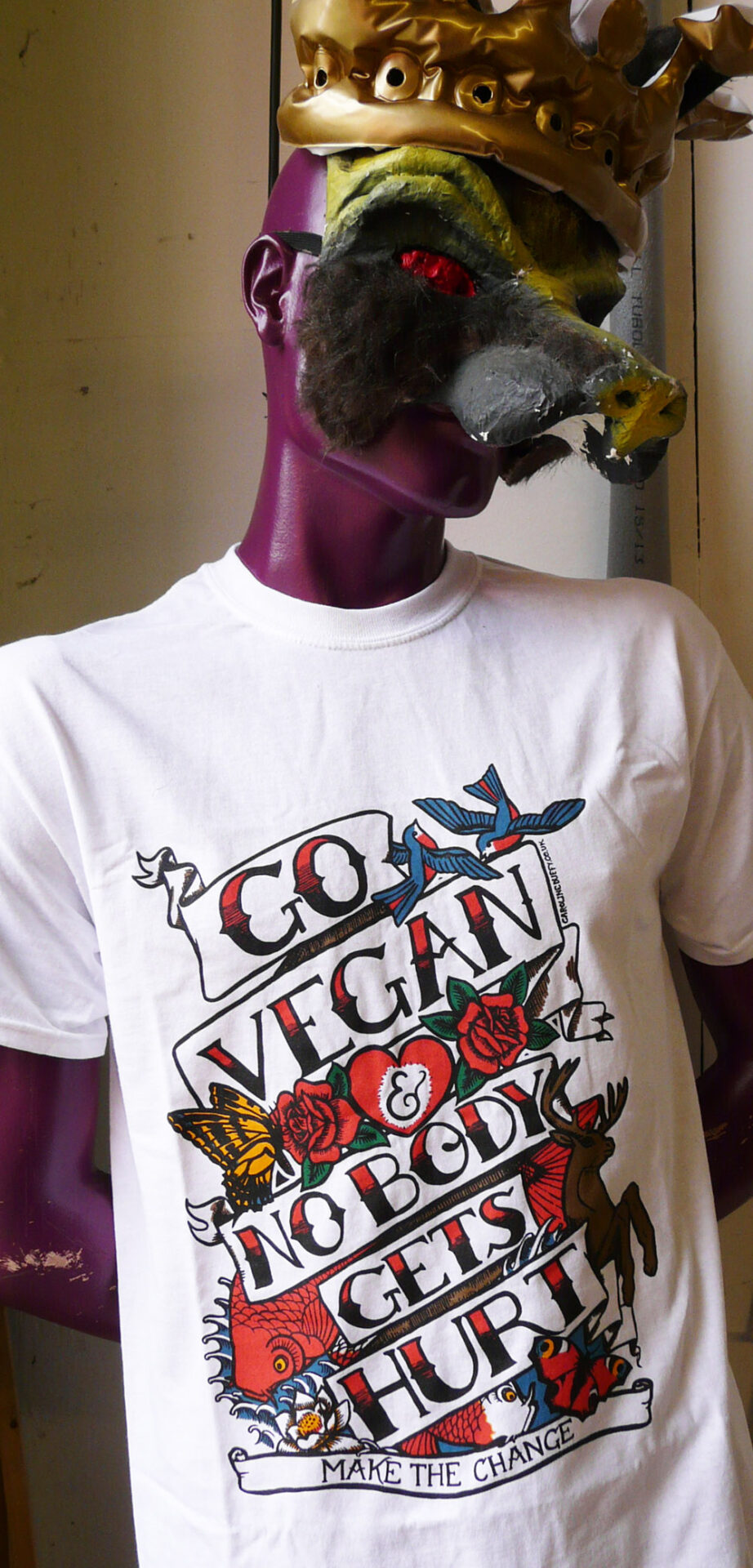
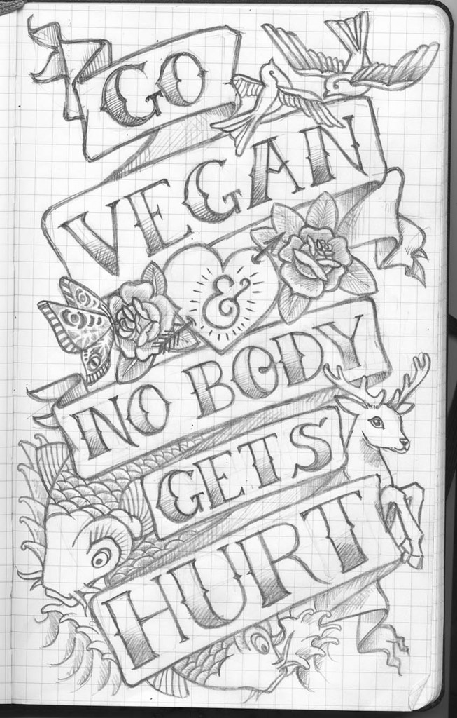
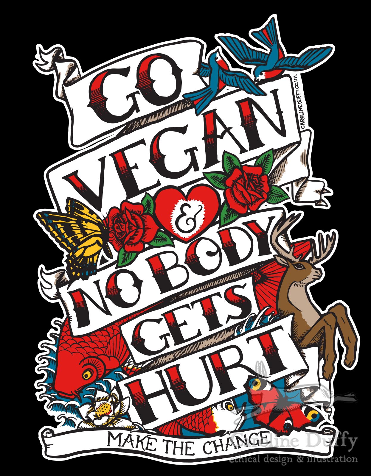
 I’ve finally got around to photographing the tattoo design t-shirt I designed for the lovely Andy at Naturally Kind Foods (with a little help from Purple Wolf King mannequin at The Printhaus).
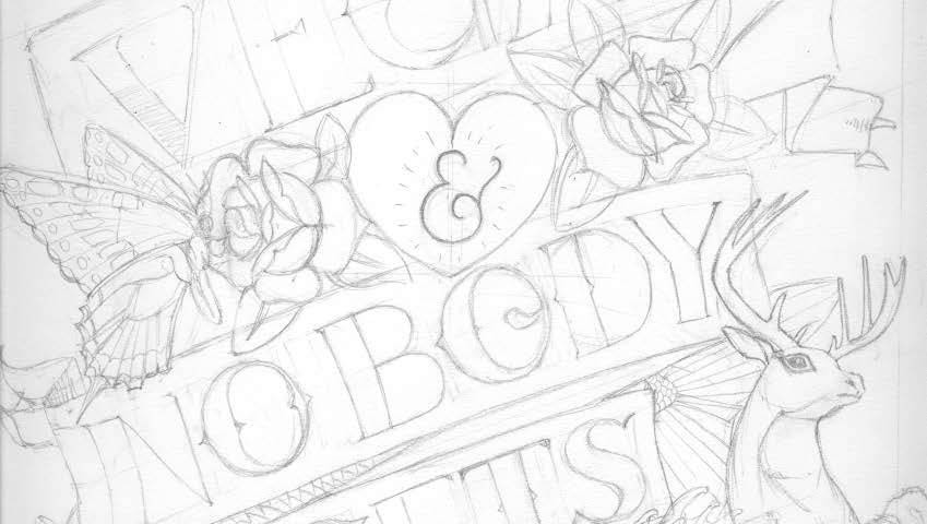
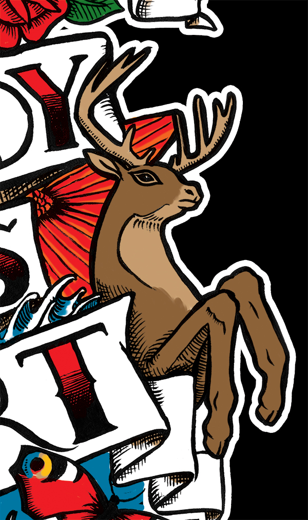
I created the illustration with some serious nodding in the direction of vintage American tattoo styles. I worked the design in pencil, inked up and then scanned, traced in Illustrator and coloured up. It was then sent off for screen printing and here it is! You can buy them here.
Edit: March 2017: I’ve created a new design and you can buy on t-shirts, hoodies, mugs and all sorts at Redbubble here

the original sketch

the cleaned-up pencil sketch

a snippet of the final design coloured up
by Frank | Jun 23, 2014 | illustration
So I’ve been cooped up inside bored as hell on a Saturday with hay fever and I fell down a YouTube hole watching videos about hand lettering and I thought I’d share my favourites with you because I’m nice like that.
You may have seen some of the projects where I’ve used hand lettering, most recently this tattoo-style t-shirt design for Naturally Kind Foods

then there was this guide, Top Tips for Working with Trans People for TransBareAll

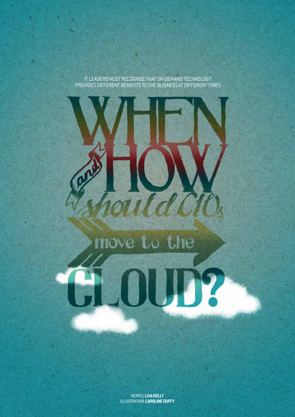
and I also did this illustration for CIO Connect magazine a while back which is probably the first time I tried it.
1) Go with the flow
So anyways, first thing first is getting your hand flow right – the way you hold your hand and the way your arm moves across the page. Here is someone who goes by the name of Cream5 on YouTube and I like him because he has a very sexy voice and occasionally swears. But possibly more importantly than these things is that he convinced me to go back to basics with some really simple shapes and to concentrate on getting more flow into my work.
2) Write letters
The next step once you’ve got your drawing hand all limber is to practise your lettering skills. Here is a guy just messing around with a brush pen and he just makes it look so easy. It’s soundtracked by Radiohead’s song Daily Mail which is somewhat discombobulating but hey, go with it.
3) Lettering how-to
If you’re new to hand brush lettering then it is totally worth watching some videos featuring Glen Weisgerber. He looks amazing – like he was a roadie for Frank Zappa – and he paints exquisitely. I guarantee that watching this video will make you at least 15% more masculine.
4) Lay it all out
The next step is to work on the layout. This is a good video by someone called MadeByMarzipan. I’m not the greatest fan of her style and the music is so twee it makes a vintage photo of a pug wearing a sailor suit look like something by H R Giger. But she’s got a good way of explaining how she comes up with the layout of her pieces so it is totally worth a look.
5) Preparation is everything
In this short video – not exactly a tutorial but useful still – we can see all of the intricate guidelines and preparation that Christoph Mueller lays down before inking his spectacular work. The amount of prep you do is entirely personal and also will depend on the style of lettering you’re using – have to confess I don’t know if I’d have the patience for this but my it is beautiful.
6) Take a tablet
Here’s a great video by Laura Coyle about hand-lettering directly into Adobe Illustrator using a Wacom tablet. I don’t know if it’s a way I’d ever want to work – I just love drawing by hand too much – but I might give it a go seeing how quick it is.
7) Be a goddamn genius
Hand-inking, tracing, scanning, photoshopping, jaw-dropping. This is the level of skill and dedication we’re aiming for, my good people.
So anyway, those are the vids I liked the best. Hope you enjoyed them as much as I did.


 .
.